For this exercise we had to produce a line visual around one of the following words: Sea, Extraordinary, Building or Journey. Before I started. I had a look through some of my books to find examples of black and white or high contrast illustrations. I have included a few of these here. These are from the book: Masters of Sketching by 3Dtotal Publishing.
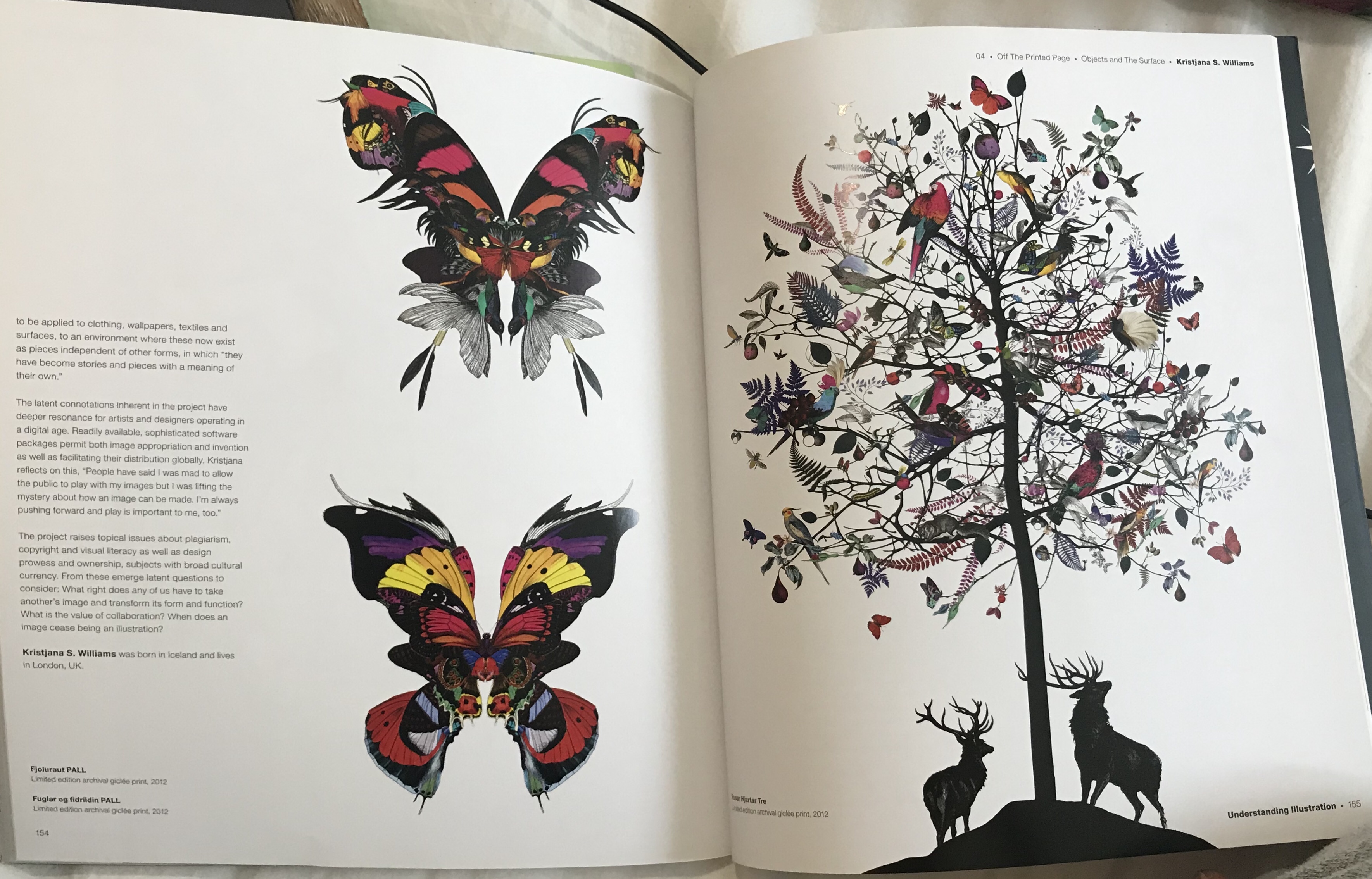
Kristjana S. Williams
Victoria & Albert Museum interactive print journey.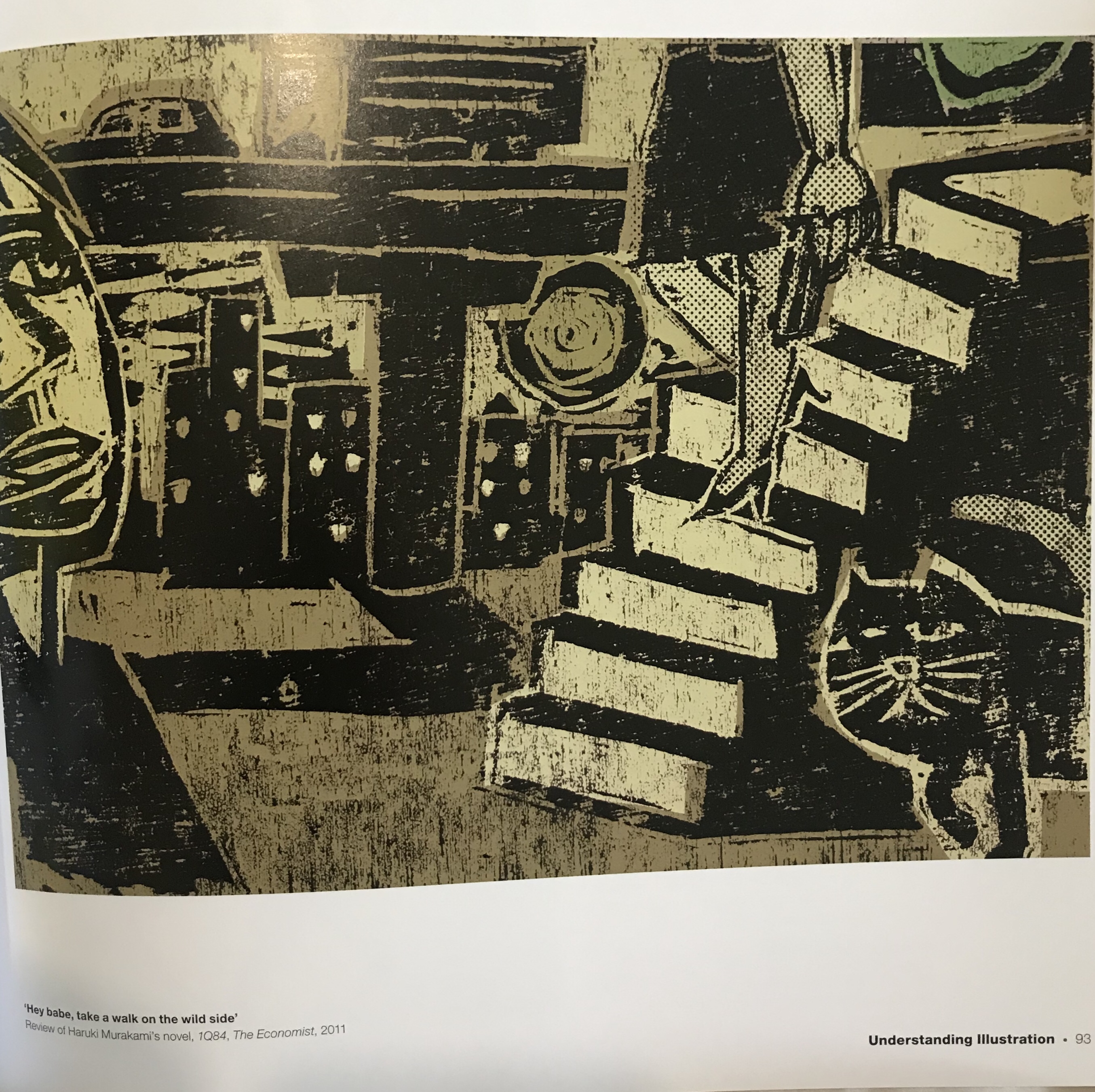
Daniel Pudles
Nuclear Power and the Greenseditor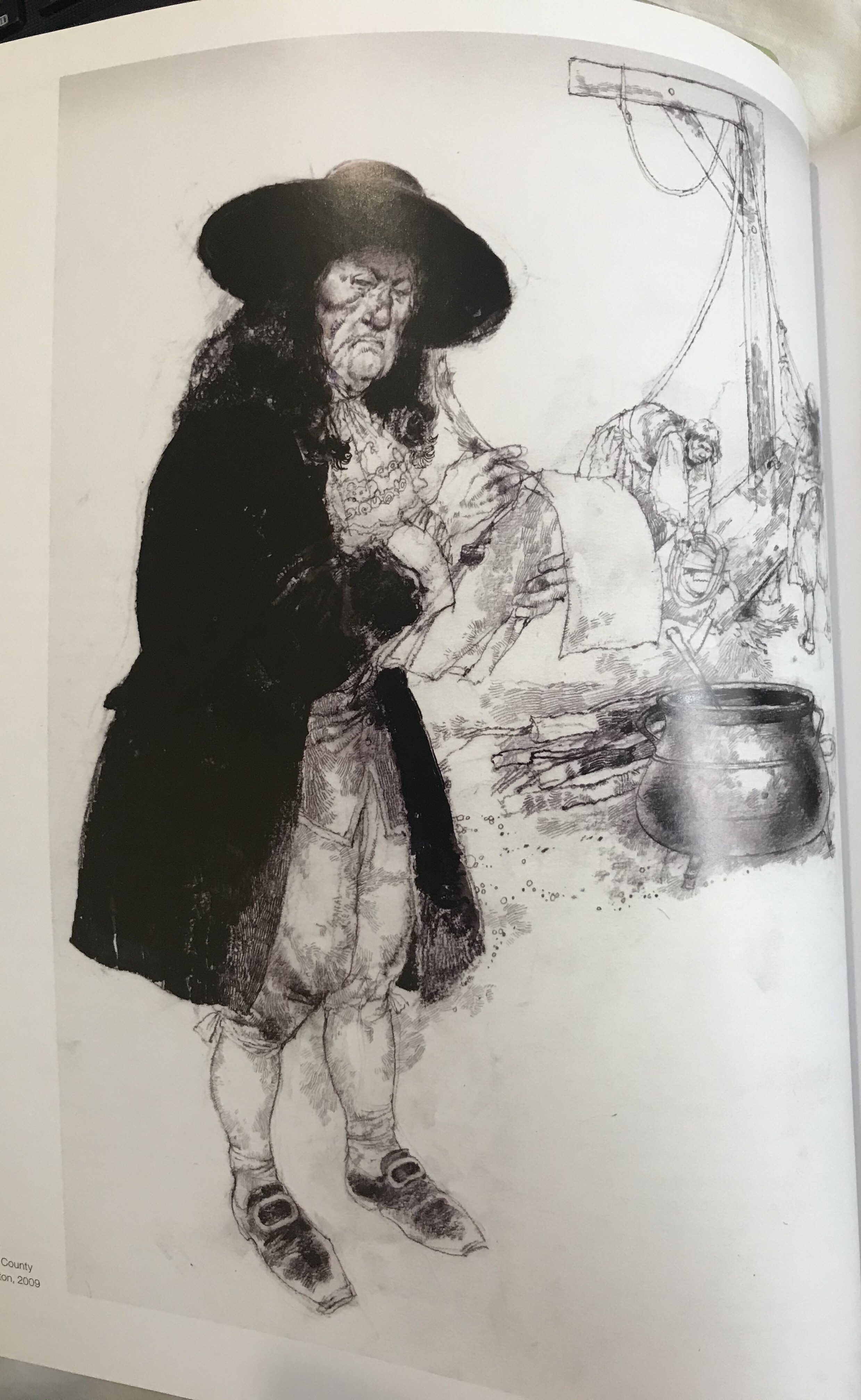
Victor Ambrus
The Battle of Hastings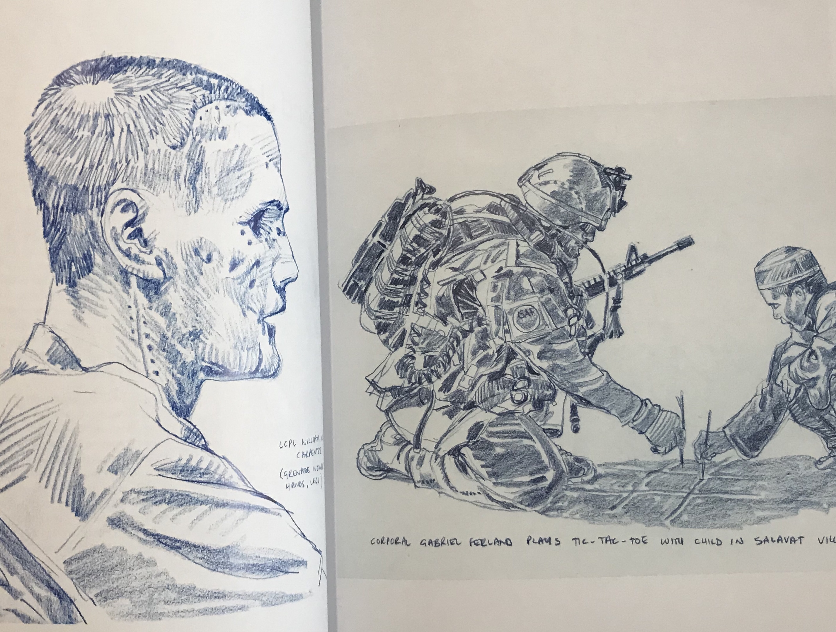
Richard Johnson
Afghanistan reportage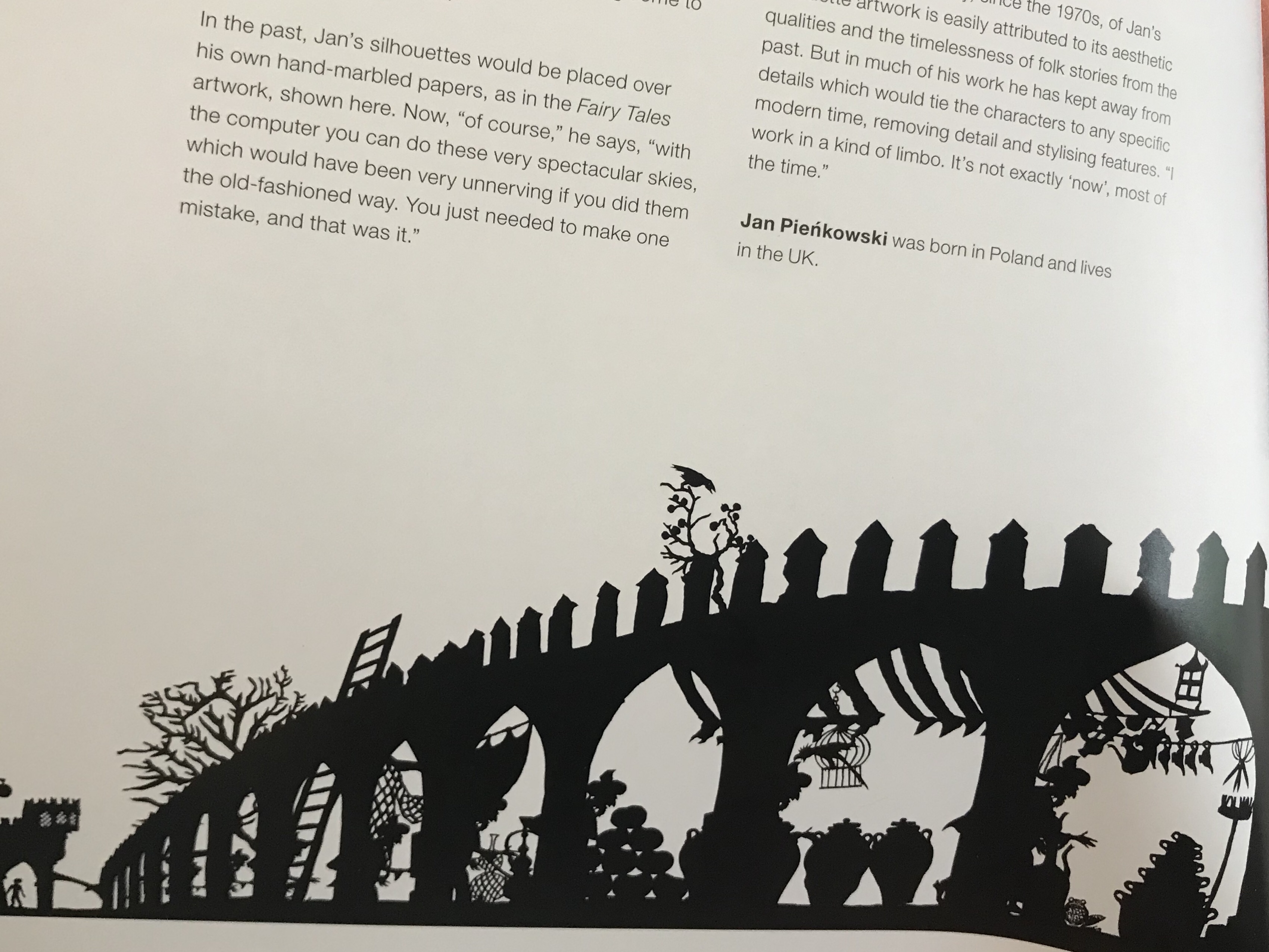
Jan Pienkowski
The Thousand Nights and One Night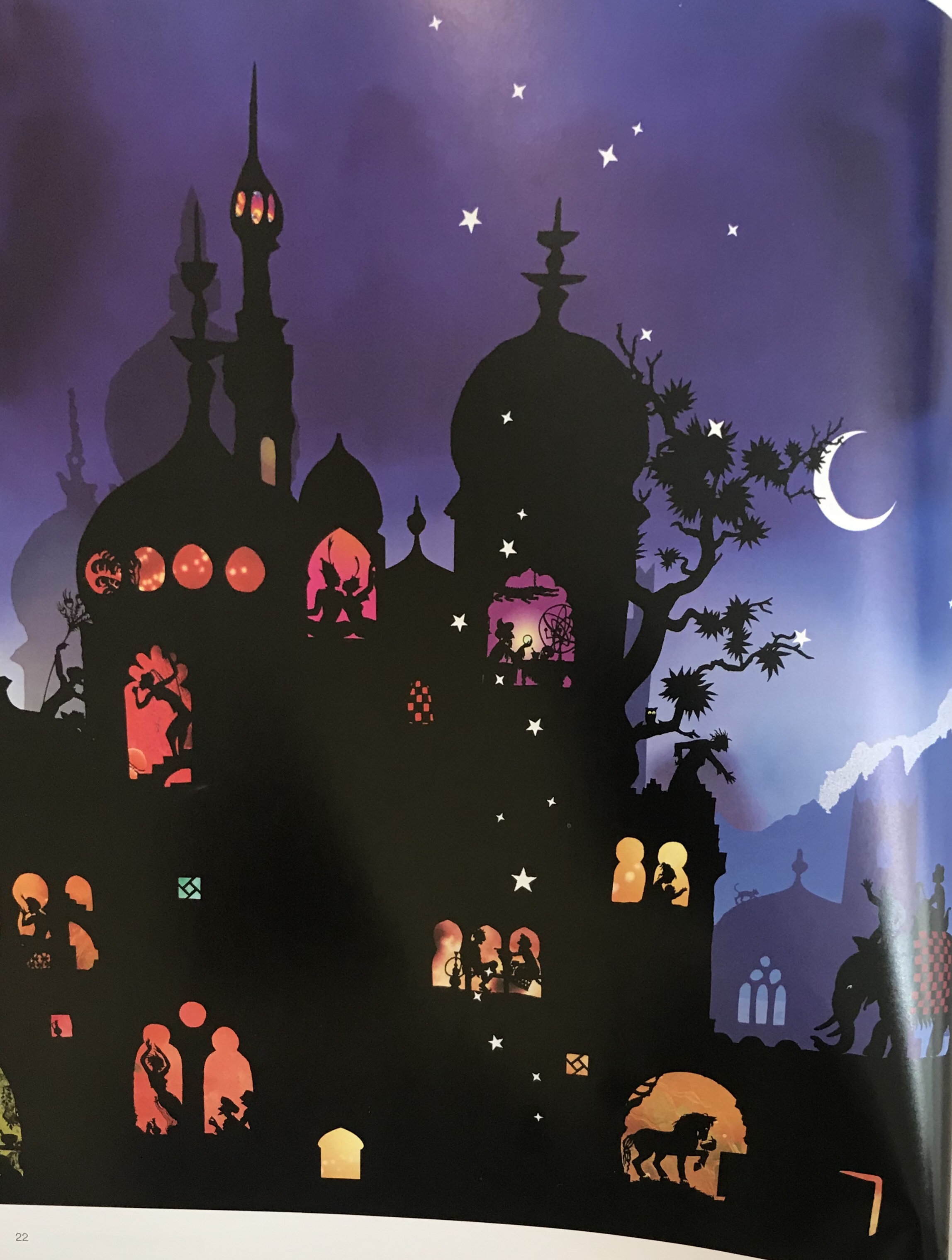
Jan Pienkowski
The Thousand Nights and One Night
I chose images that I liked and that were all quite different. The ones that stood out in reference to this assignment were the images by Daniel pudles and Jan Pienkowski. Daniel pudles work because it is a lino print and therefore lends itself very well to a two colour palette. I really love Jan Pienkowski’s illustrations and although one of them has colour. The main portion of the image would work also in just black and white and uses very interesting silhouettes and lots of varied shapes, that created a piece that really captures your attention. I really took my time looking at it thoroughly, to see all of the different elements and characters within the image. I did also look at some other lesser know artists on Instagram and on a general google search to find other examples until I felt more confident about what I was trying to acheive.
I then started by brainstorming each of the words so that I could come up with some ideas and choose the word I wanted to use for my image.
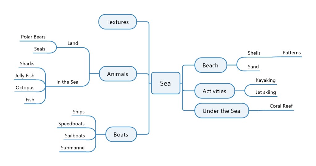
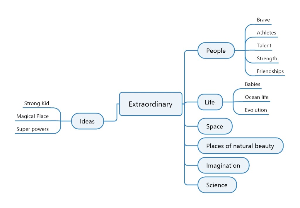
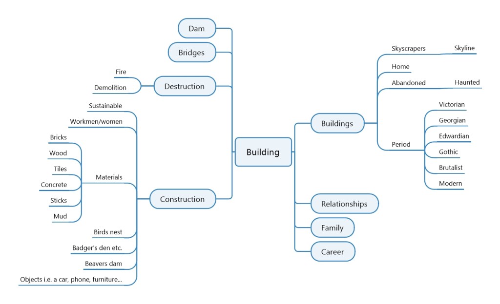
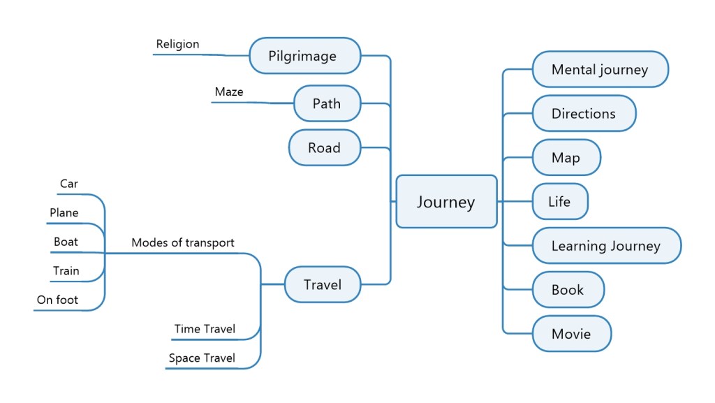
Once I had done my mind maps I chose a few of the ideas and did some quick sketches to see what would work and which ones I liked that I would want to develop more.


I liked the idea of under the sea, however, I could not think of an idea that would work with this style. The idea I had of the man walking down the street would have worked very well with the style, yet I did not want to create a piece that looked dated. I wanted to try creating something with the old style, but with subject matter that could represent the current day. I therefore settled on the scene with the toddler on a tricycle.

I took my initial sketch and did a perspective drawing. Once I was happy with how it was looking. I then inked over the pencil markings to create the final line drawing and rubbed out the pencil markings. After this I scanned it onto my computer and put it into Photoshop, where I removed the background so that only the line drawing was left and saved the file and printed a copy. I then changed the colours so that they were inverted, I saved this as a new file and then printed two copies.


Once I had both my original and my inverted copy, I then started to cut out shapes from my inverted copy and place them onto my original copy. I used white tack to keep the pieces in place. Whilst I experimented with the placement.


I really struggled with choosing the colours for the toddler and his tricycle as it was hard to see what balanced him well. I therefore spent a lot of time changing his clothes and hair around to see which would work best. The tricycle tyres dictated to some level, what colour I could use for the boys clothing, as I felt it important to keep the tyres black as this made more sense. I would have liked to have the car tyres black also, but then they would have been invisible against the road and the road was more important to have black. This was so that the grass surrounding it and the pavement stood out in contrast.

Reflection
I spent a lot of time trying different layouts with the cutouts and found this to be quite challenging to get it to look right. I think that now I have tried the exercise I would perhaps have used a simpler design or designed it in a way that it was easier to colour. However, I would not have understood how to do this until I had tried the exercise myself and learnt from the problems I encountered. I am not entirely sure if I met the brief as it said that there should be no lines left by the end of the cutting and pasting. However, I found this impossible to do and do not think that I could achieve this or know how to achieve this on this particular drawing. In doing so, I would have lost a lot of the important elements like the curb and some of the details on the boy and his tricycle. I found this brief very difficult to and do not feel that the instructions were clear. It would have been helpful to have a simple example of the technique.
In conclusion, I can see how important it is to think more about the design process for each image I am producing. Overall, I am happy with my image, especially as it is the first time I have tried something like this and it is very different to my usual style and type of work that I do.
References: 3dtotal Publishing (2017) Masters of Sketching. (s.l.): 3DTotal.com.
