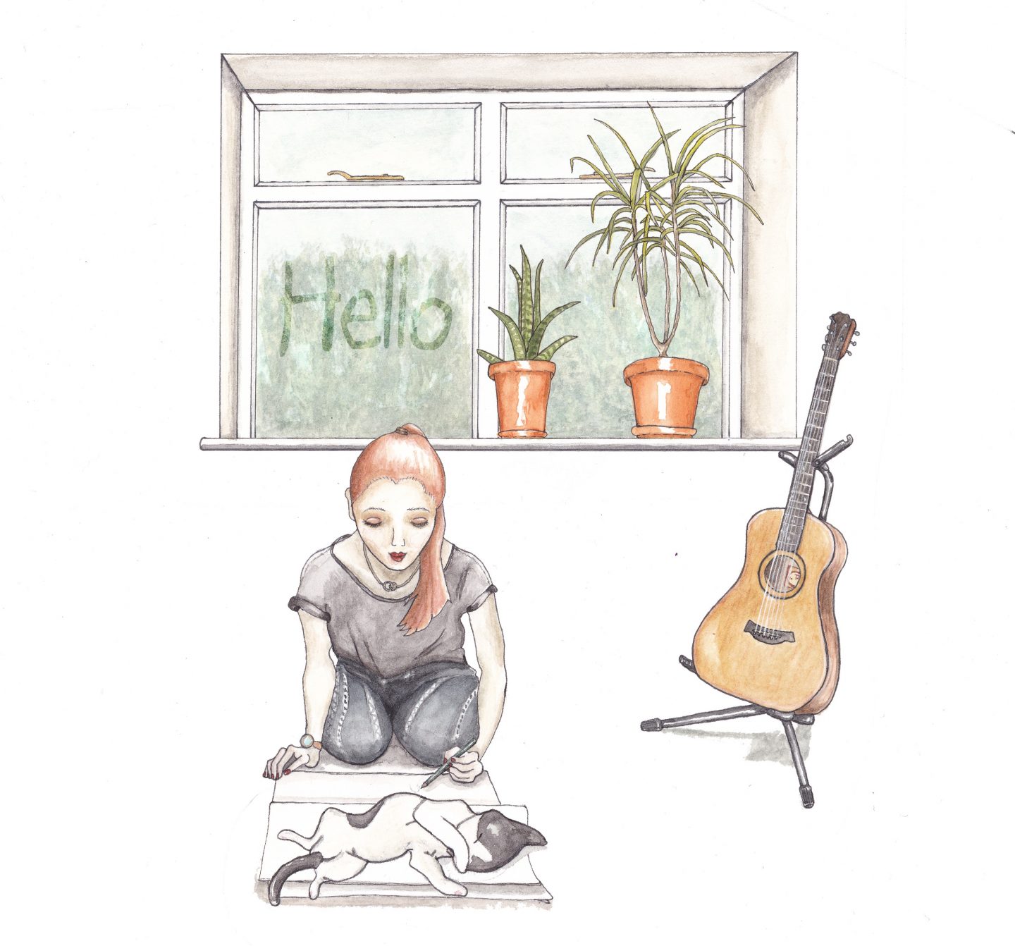
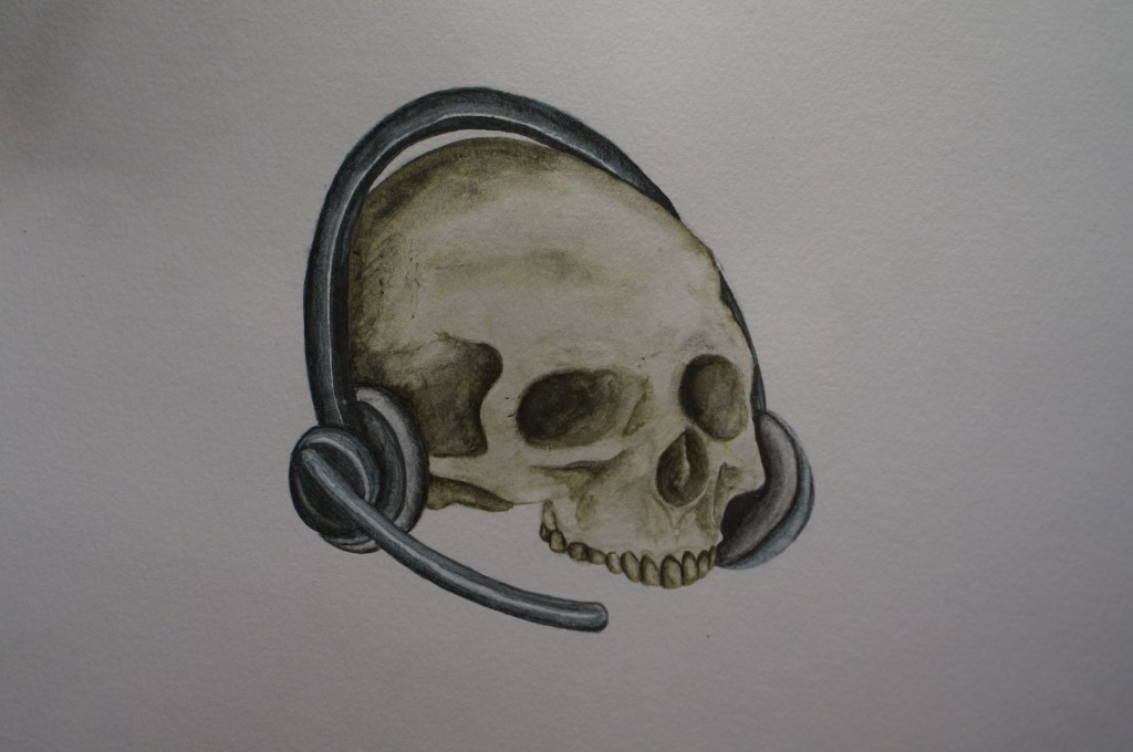
I wanted to push assignment 4 a little further after getting my tutor feedback. My tutor suggested that perhaps I do not need to add the magnifying glass to my arrangement. I initially put the mug and magnifying glass there as the brief had asked for, a collection of still life objects from around the home. However, I did feel that I put the objects there as I thought I should add to the skull and headphones, rather than because I really saw a big part for them. I recently had a study day with a student group of OCA students from a wide range of disciplines. This was lead by Diana Ali and Michelle Whiting. I showed a version of my assignment 4 piece to the group and the feedback I receive was that there was a strong enough message that everyone could relate to and that the skull and headphones alone was enough. They suggested I play with the background to see what I could do with this. Originally I had removed the background so that the image would be directly on the magazine page.
Background exploration
Research
I did a bit more research on the types of things I could do with PhotoShop backgrounds and came across a website that has downloadable templates to. I not use them, but had a look through to find out what kind of things were possible and decided to make my own. One I saw was a pattern with a word repeated over and over evenly spaced letters and another was rough vertical lines. This lead me to the idea of using words. I started to write down a list of words that related to Covid-19 and then asked other students and family members what words they associated with covid. This expanded my list to include ‘homeschooling’ amongst various other words, which, although aren’t applicable to my situation, it is something that is very relevant to a lot of people and other OCA students.
My process
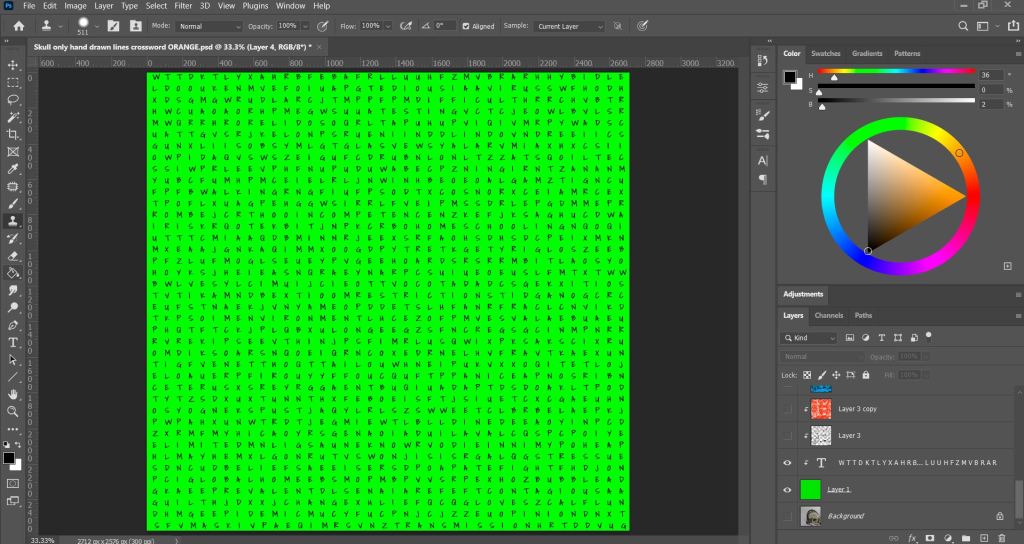
I found a wordsearch generator and created a 40 by 40 letter wordsearch with my list of words. Initially I had the words going in all directions, but then realised in order for this to be easily viewable they words needed to be easier to find.
I copied the letters over to photoshop and added them to my background.
Screen shot 1 – Working progress
I then marked off words to highlight the context, with the font I chose it was very hard to pick out any words and I was struggling to find them myself, so this took some time. However, I liked that the font become something more asthetic than just a regular wordsearch and helped this blend into overall image more.
Screenshot 2 – Working progress
I used various brushes in photoshop to add crossed out words, ink splatters and marks on the background to give it a grungy and more edgy feel. Taking inspiration from some of my mood boards and mark making practices from earlier in this module.
Finished background
I added more breakdown to the page to create more interest and make it less stark. I did do other colour tests as seen below, but decided after showing it to my fellow students for critique that the green worked the best. My intention was also that the bright green represents a hazardous/virus element. However, I do think that this could be achieved with most colours, providing they are bright, with also luminous, neon colours working best. These are the shades we mostly relate to toxic materials due to the popularity in comic books and film, such as the bright green slime in the original Ghostbusters movie and the bright green toxic chemicals Joker falls into in the DC Comics.
Colour variations
My final Image
Conclusion
I am much happier with my illustration now than my previous attempt. I am grateful to my tutor to keep pushing me to go further. This was really out of my comfort zone, but when I found a source of inspiration and an idea, I really had fun putting this together and just trying things and seeing what worked. This also makes me appreciate how digital software can really enhance my work and give me the tools to try things that are easily undone. I could also do a hand drawn version of this now by using this as my blueprint, which would likely take far less time than if I tried to work this all out on paper and not use PhotoShop at all. I am keen to keep exploring digital software and find ways for this to use it to add to my work and use it more for preliminary sketches and colour tests in the future.
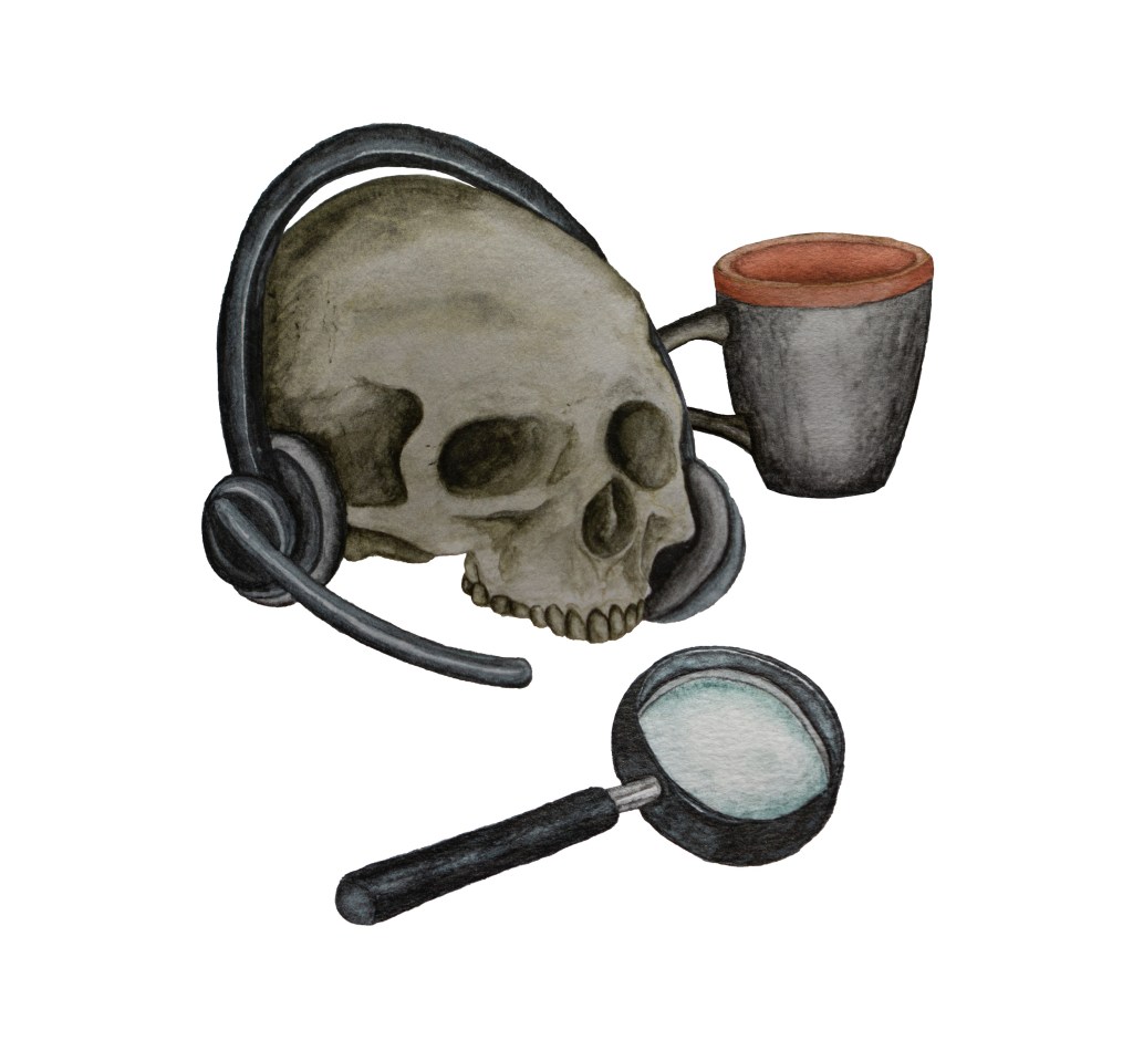
For this assignment I was asked to create an illustration for a magazine based on a still life for one of the following topics; Lost, Disaster, Discovery or Guilty Secret. The brief states that I ‘have the freedom to select the items for the still life and are given creative free rein. The rest of the content, the method you use to produce it and the colours you use are all for you to decide.’
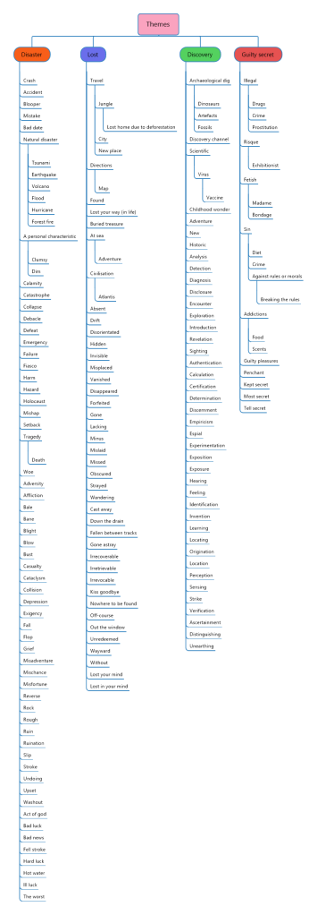
This brief is very much open to interpretation, therefore I started with a mind map to explore my options for each topic.
Research:
Mind Map
Aim: Create a mind map to explore the topic headings.
I started by thinking of words associated with each topic, and then I used a thesaurus and an image search for each of the topics to find additional words and associations.
With the completed mind map as a guide, I looked around the house to find inspiration for my object selection and to see which category I felt I was able to undertake best. In my studio I found a skull and my headset from work. I found items for my still life that were most interesting to me. The skull was one that I cast from an old mould at the SFX studio that I worked at a few years back. The headset is mine from my current job where I work from home. I thought it may be amusing to have the skull wearing the headset and it made me think of how I feel at work sometimes, being ‘worked to the bone’. With the impact of Covid-19 it has created many challenges around working from home. We have come up with many effective solutions to overcome these, but overall I am finding my job increasingly difficult. Processes which were more straightforward, have become more in depth and tricky, with lots of new additional tasks being added to the processes for each process. This has meant that my work load has increased tremendously and that without the social aspect of going into the office and working directly with my colleagues, I feel very much like a cog in the machine, a robot and a hamster on a wheel etc. I chose the magnifying glass as a symbol for discovery and the mug was to create a sense of ‘normality’ by using a commonplace object amongst the more unusual.
Outcome: I used the mind map to inform my brief and create associations for each topic. This helped me explore ideas and find options that I otherwise would not have considered, which gave me a larger range of ideas. I found associations by visualising concepts. I visualised an idea of the skull wearing the headset and decided to make my illustration for the topic of discovery. I thought about ideas and headings for this selection of objects and the idea of working from home and the effects of this on your health. This was the narrative I chose for my brief.
Researching Magazine Layouts
Aim: To look at different layout options to help inform my choices.
I looked at a range of magazine layouts which helped inform my brief and discover layout choices. Below is a small selection of layouts which I thought were effective and seemed typical of most of the magazine layouts I looked at. I also feel that these are most effective and would work well for an illustration that is to go alongside a piece of writing. I like the way that the image is placed so that it is clear but does not detract or take over from the text. This is different to the illustrations/photographs seen in fashion magazines that are more likely to take up a whole page as a focus point, with the text being on the opposite page. I found that the images that took up the most space were those used to advertise a product or a service.
Outcome: I decided that my image would be intended to be placed on the upper left hand side as my image is to accentuate a piece of writing and is not the main focus.
Makeup Artist Magazine
Makeup Artist Magazine
Makeup Artist Magazine
Tesco Magazine
Examples of magazine layouts
Extending the Brief:
Aim: To create a more in depth brief to help guide me and create more of a framework to refer back to whilst I worked.
Usually questions would arise from reading the brief, that would be discussed with the art director etc. I therefore had to answer these questions myself. Below is a result of that process and is intended for self-clarification purposes.
My brief:
To create an illustration for a health and wellbeing magazine that explores the idea of the discovery of the effects working from home has on your health.
Your illustration is to fit within an A4 format, which is to include text, including a header and a body of text (the article).
Create your image so that it can be positioned on one side of the page at either the top, middle or bottom.
Your image can be in any colour, bearing in mind it will be on a white background.
Your image is to be a set of objects in a still life.
Feel free to interpret these and distort the image as you wish.
Outcome: I created a brief that I could refer back to and that clarified and laid out rules that I set for myself for this project. This helped me to stay on track and I could check that I had a clear intent for my illustration.
Layout
Viewpoints
Aim: To experiment with view points to find which layout would work best for my illustration.
I experimented with composition by taking photographs of my still life, testing different layout variations and camera angles.
My composition layouts
It was difficult to achieve an interesting layout or view of the objects. I ended up raising up the skull so that it was not directly laying on the desk as it was causing the skull to be in a flat position which made it hard to draw. This is partly due to the jawbone of the skull being missing.
I decided to start working on my drawings and the visual aspects of the project. I have found that working globally and visually helps me to better generate ideas and visualise a concept and decide what type of image and mediums would be most appropriate.
Studies
My Line visual drawing from my still life
Once I had found a setup that I liked, I drew my still life as a line visual. I liked the impact of the negative space around the objects and tried to place them so that I created depth in the illustration., to make sure it was visually appealing. I wondered what impact this image would have on the audience and about how it would be received. My colleagues did comment on this piece of work when I showed it to them and asked ‘is that us?’ I believe this was a positive indication of the illustrations success.
Outcome: I created a line visual to work from after experimenting with different layouts and camera angles to see which worked best. I chose what I felt was the most visually appealing setup to me and then moved on to painting.
My final piece
Aim: To create individual paintings of each of my objects that I could then photograph and edit in photoshop to create my final piece.
I traced each object from my line visual and painted each item on a separate sheet of watercolour paper. I used Derivan Liquid Pencil Paints in Blue, Yellow and Grey as my main colour palette and used my Derwent Graphitint Paint pans for subtle pops of colour where needed to stop the image from looking flat, to create more contrast and to make the image visually appealing. I decided upon this medium as I thought it would lend to a magazine illustration and wanted to explore these paints as they are new materials that I have just purchased. I really enjoyed using them and felt more free with my marks and was not so precious as I am usually with my paintings. This was due to the unique texture of the paints that lend itself well to natural forms such as skulls. They were more difficult to use to create the smooth textures of the mug and magnifying glass due to the texture of the paint. However, I think the overall look is effective. I really enjoyed this process and the outcome.
My final paintings
I did each object separately so that I could edit them in photoshop and play around with the composition more if needed. Also so that I could remove the background ready for printing in the magazine.
The objects with the background removed, ready for layering.
Once I had removed the backgrounds of the images individually, I then layered the images. I choose to move the objects slightly from my original line visual, placing the mug slightly behind the skull so, that I created more depth and interest to the image. This is because I realised that by placing the objects with negative space around each one, I was not using the objects to their full advantage by creating a sense of relationships between the objects. They all seemed like separate objects before I moved them rather than one illustration. I showed this illustration to a few people and was happy to hear the meanings that they took from the image. It was slightly different from person to person depending on their circumstances, but overall the responses read the image as it was intended. I note that my image could also read as being related to death with to the current situation with Covid and death and loss being a big part of life that everyone is dealing with and we are all very aware of at this time.
Outcome: I am happy with my final image and that feel that I have captured what I had intended. My paintings worked well and were easy to edit in photoshop and prepare for a printed format.
Finished image in Photoshop
Finished Image as a JPEG
Wider advantages of completing this project
I have enjoyed this assignment and feel like I am starting to develop my process into an effective way of working. I am finding this is making it easier to start and complete projects and is preventing me from getting stuck.
I am happy with how my illustration turned out. I managed to let go of my self-placed restrictions on the technical aspects and therefore created an illustration that was more free and expressive when compared to my previous work, without compromising on the standard. This is something I have been struggling with, as I felt the quality of my work recently has not been to my full potential. This is mainly due to the tasks being outside of my usual remit and these have pushed my boundaries considerably. This has, however, lead to some realisations about my work and caused me to grow as an artist.
I realised that for different genres of illustration, sometimes a different style or medium is needed, therefore it is difficult to find my style when completing such a wide range of projects. I found this particularly evident in the exercises in part 3. I have found that my style is not as well suited to posters, editorial illustration. I was pleasantly surprised with this particular exercise as I feel I was able to pull off a convincing magazine illustration. I have gained a new confidence from this assignment and feel more able to tackle such a brief in the future. I believe that by completing more exercises and assignments, my styles will start to develop further until they are more consistent. I also have been observing my current strengths and weaknesses and have been actively doing regular tutorials to try to improve these areas. The exercises from my course are giving me the skills to make better judgements and act more quickly and effectively now when approaching a brief. This has made a huge difference to my process and development as an artist. I now feel like I have a good foundation of knowledge, tools and structure to allow me to experiment more freely.
Research and referencing – I have become curious about other processes and have found that looking at and enquiring about the work and processes of professional artists and fellow students has fostered an exploration phase, that has helped me to develop my own preferences and this has caused me to feel excited about my work and more engaged with my work and my process. This has also expanded my view of the possibilities in all aspects of my work. The process has shifted my mental boundaries and introduced the possibilities when I have looked at others work or have done the exercises. My process has helped me to notice my responses, bringing a more conscious awareness of subconscious processes and impulses. This is evident in my selection of objects for this assignment as I noticed my background in film influenced the objects I was drawn to and the narrative that I developed. Choosing a cartoon type style and pushing away from the hyper-realistic style I am used to trying to achieve during my film career has caused me to explore and experiment with many aspects of my work and has caused me to develop a lot in my processes and style.
Overall I am finding that the more I integrate with the art community and my fellow students, I am finding new ways to communicate, analyse and be inspired by the work of others and in interpreting my own work. I am looking forwards to expanding and building upon all I have learnt in the final section of this module.
Reflection of the brief:
I am satisfied that I met the requirements of my brief. I feel that the illustration would fit well into a lifestyle magazine and fits its intended purpose and my intended audience. I initially thought I would struggle to come up with an idea, with such a loose brief, however from using the various techniques that I have learned so far during my coursework, such as mind maps, I was able to generate ideas and felt confident with my process. The final image as shown here on the blog is not on a background therefore the white of the webpage is showing through. However, this image is intended for a magazine page, which tend not to be stark white and the image is able to be layered on to any colour background.