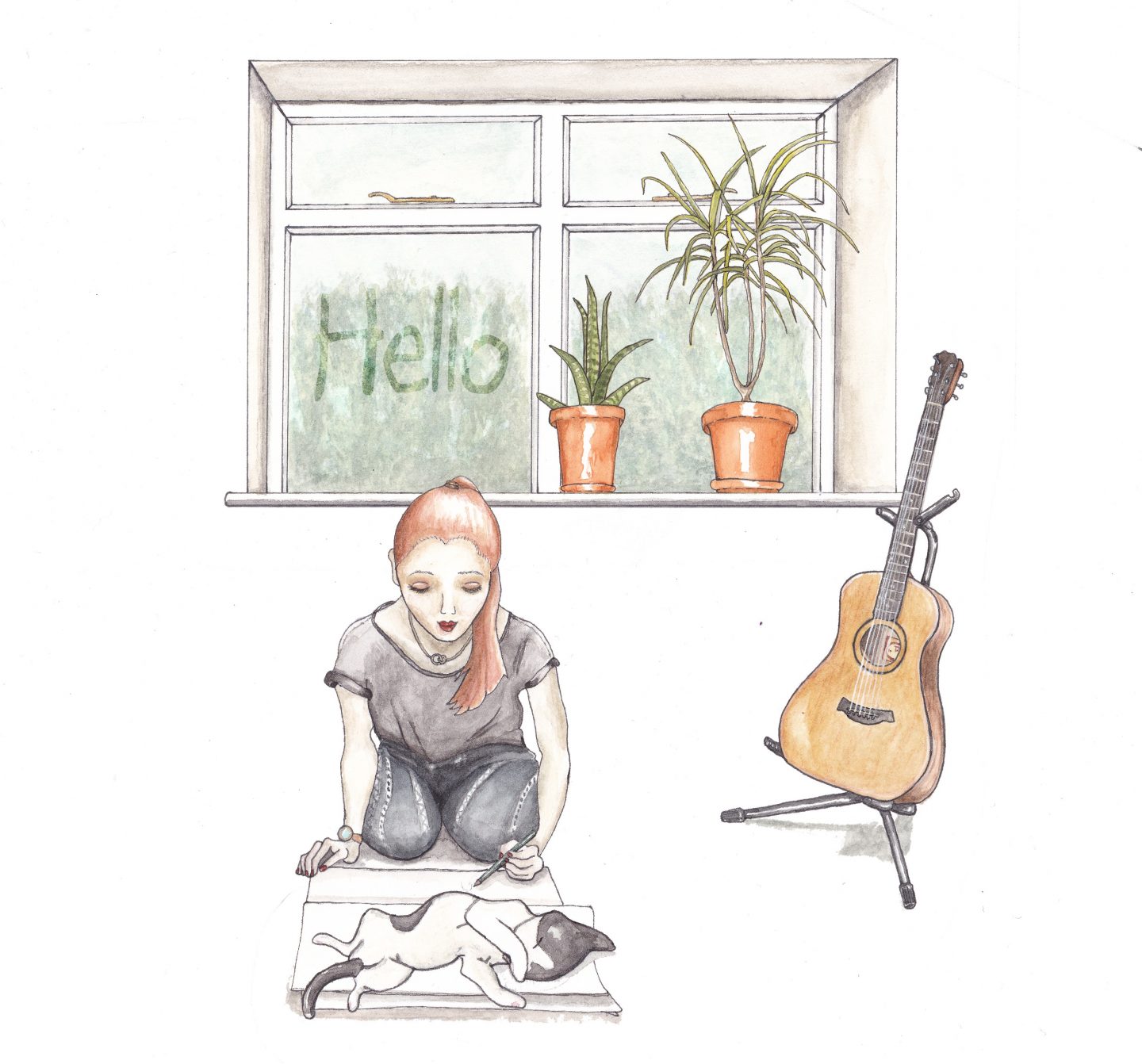
The brief for this assignment was to create images which will be used within a campaign for a supermarket to package and promote a range of seasonal foods.
We had to create an illustration of fruit or vegetables. One illustration for each of the ranges; summer and autumn.
These images were to be objective and based upon direct observation. The brief asked us to consider putting ourselves in the place of the customer and asking, ‘does this look edible?’, ‘Would I like to eat it?’ They asked us to be especially conscious of the way we use colour to describe tone, shadow and surface marks as poor colour choices can result in good-looking, mouldy, battered or ultimately unappetising.
I considered these questions and remember reading or hearing about this topic before with making sure that colour and texture are considered in food illustration to make sure look appetising.
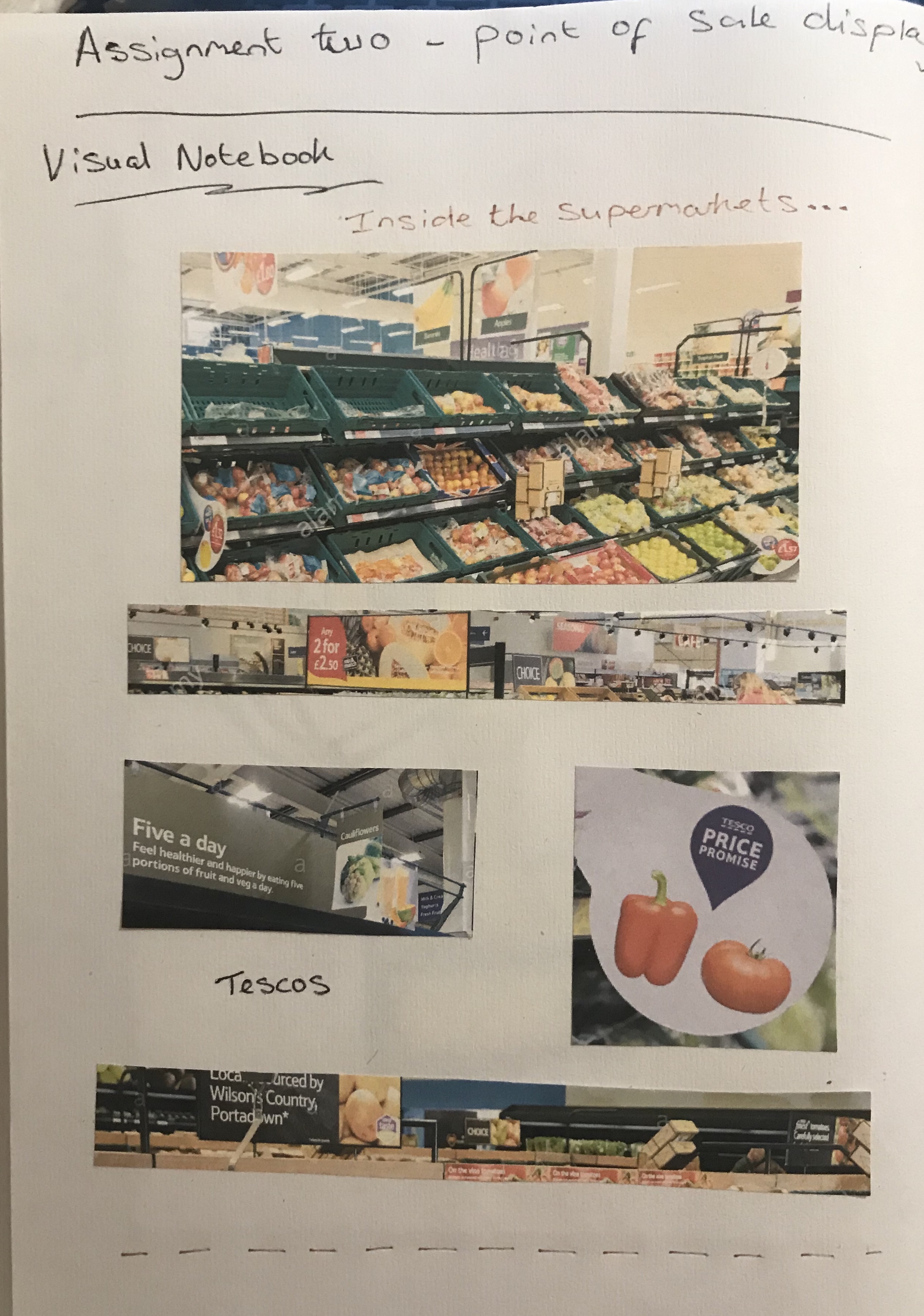
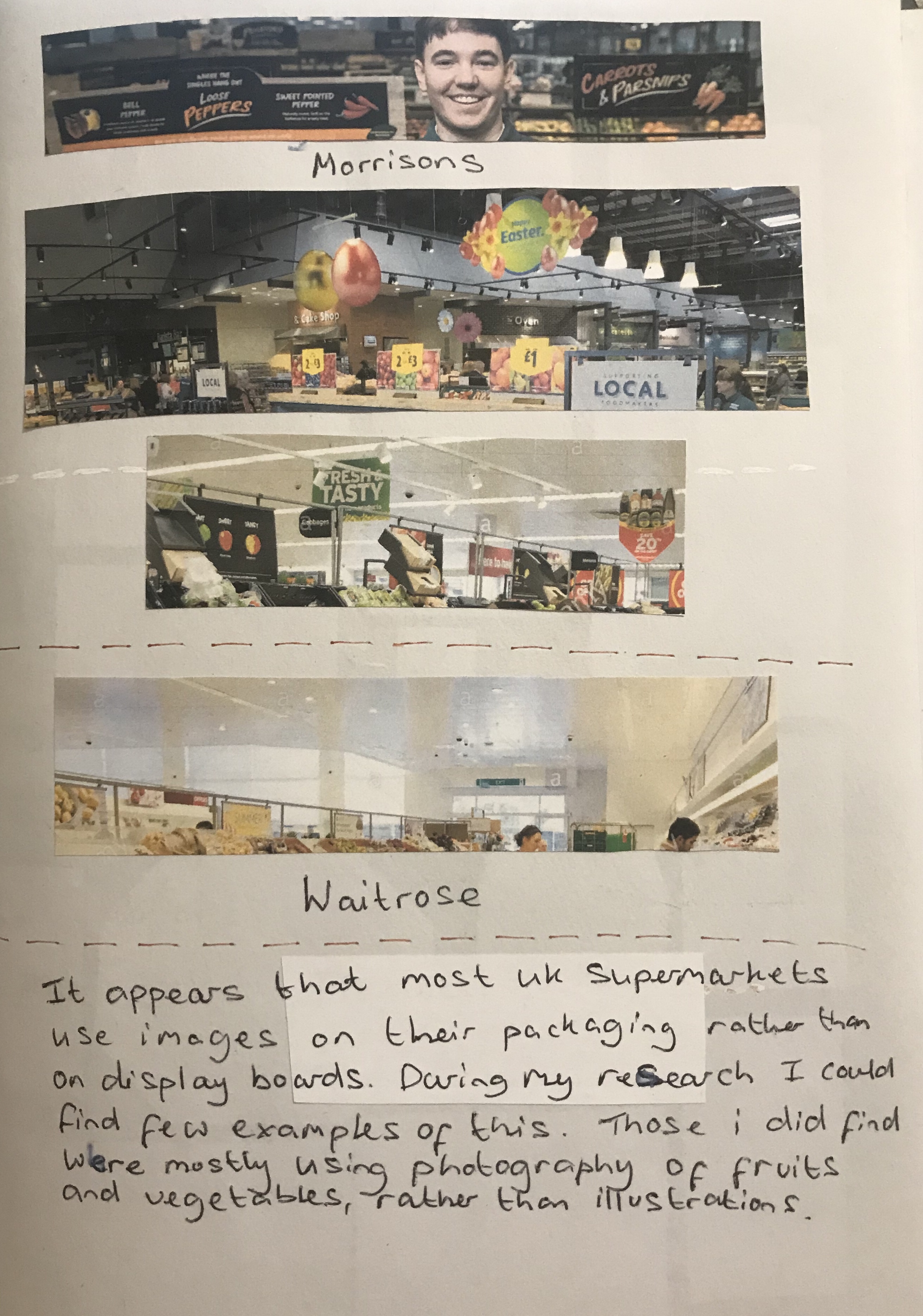
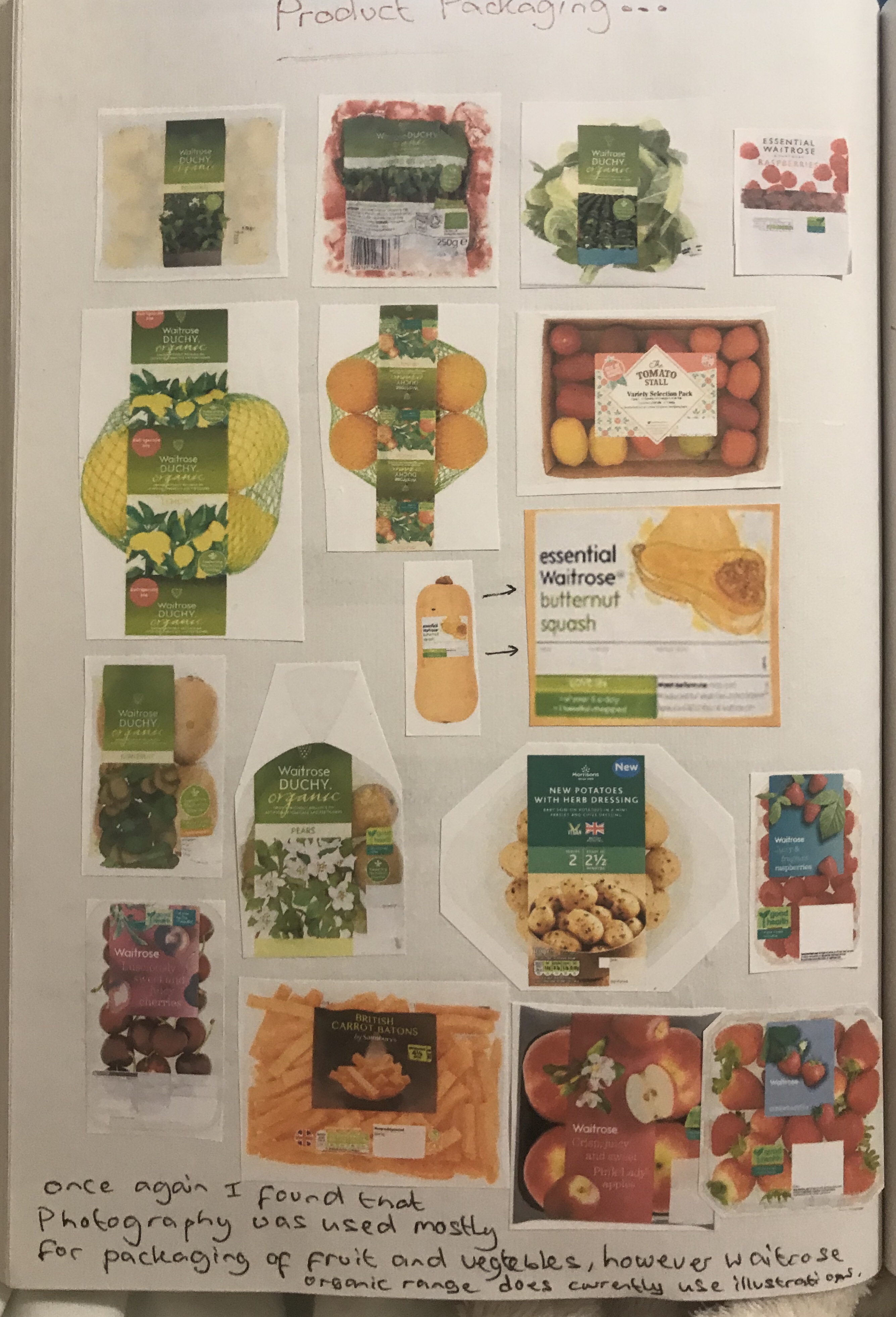
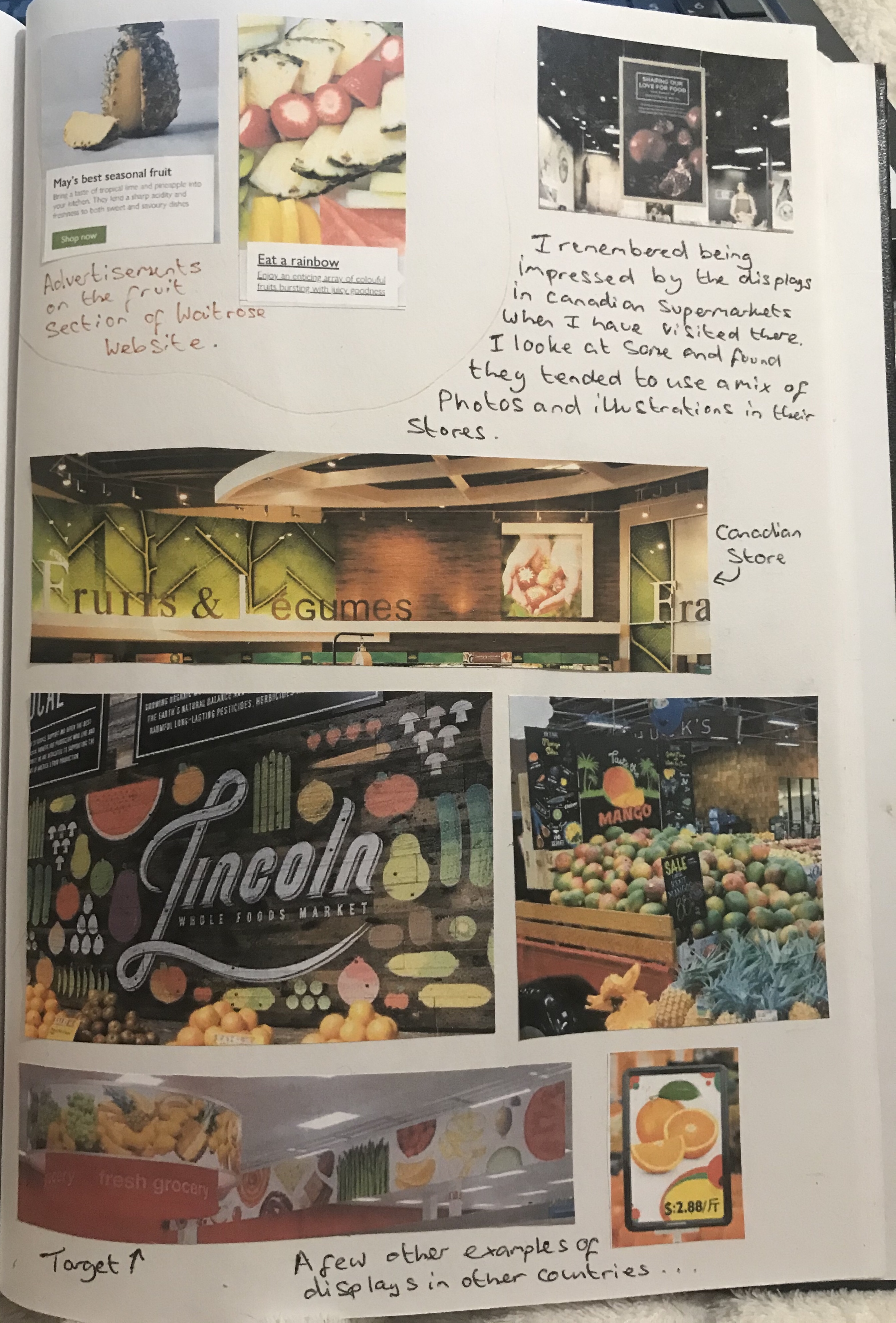
With a visual notebook and used the Internet to find photographs from inside supermarkets. I would have gone to visit some stores, but due to Covid this was not going to be practical and I was definitely not able to take photographs in store. I did struggle to find examples of display boards and illustrations on fruit and veg packaging in the supermarkets. Partly this was due to the fact that most of the supermarkets actually use photographs rather than illustrations for their display boards and illustrations in hand display boards are generally used for other items in store and other sections more than the fruit and veg aisles.
I did however find a few examples and found that Waitrose in particular does use illustrations on the packaging and I looked at the artist’s work on her agents website which showed these illustrations. The majority of examples of more elaborate display boards using illustration, I actually found in other countries such as Canada and America.
I looked at food illustrators work and found varying styles, some of which I did not like so much and some of which I really loved such as Liz Pepperell. Her colour palette is really rich and I love the way she makes food look tasty, particularly the one she did with the orange pieces that look really juicy. Another artist’s work that I loved is Liam O’Farrell. I really love the colour palette uses and the style of his illustrations. They remind me of another artist named Holly Exley that I have seen do food illustration, amongst other types of illustration. She tends to use lots of blues and purples in her shading, so her images are not realistic, but the colour palette is very beautiful and interesting.


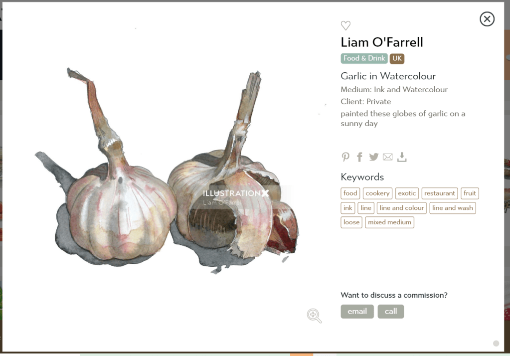
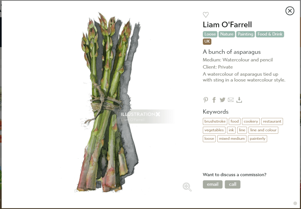


I had a go at copying a couple of the artists illustrations or illustration style. However, this did not go well. I found it extremely difficult to decipher what it was they were doing with their paint and realised it was better that I did not try this and just tried my own being inspired by their colour pallets rather than trying to use too much of their styles.

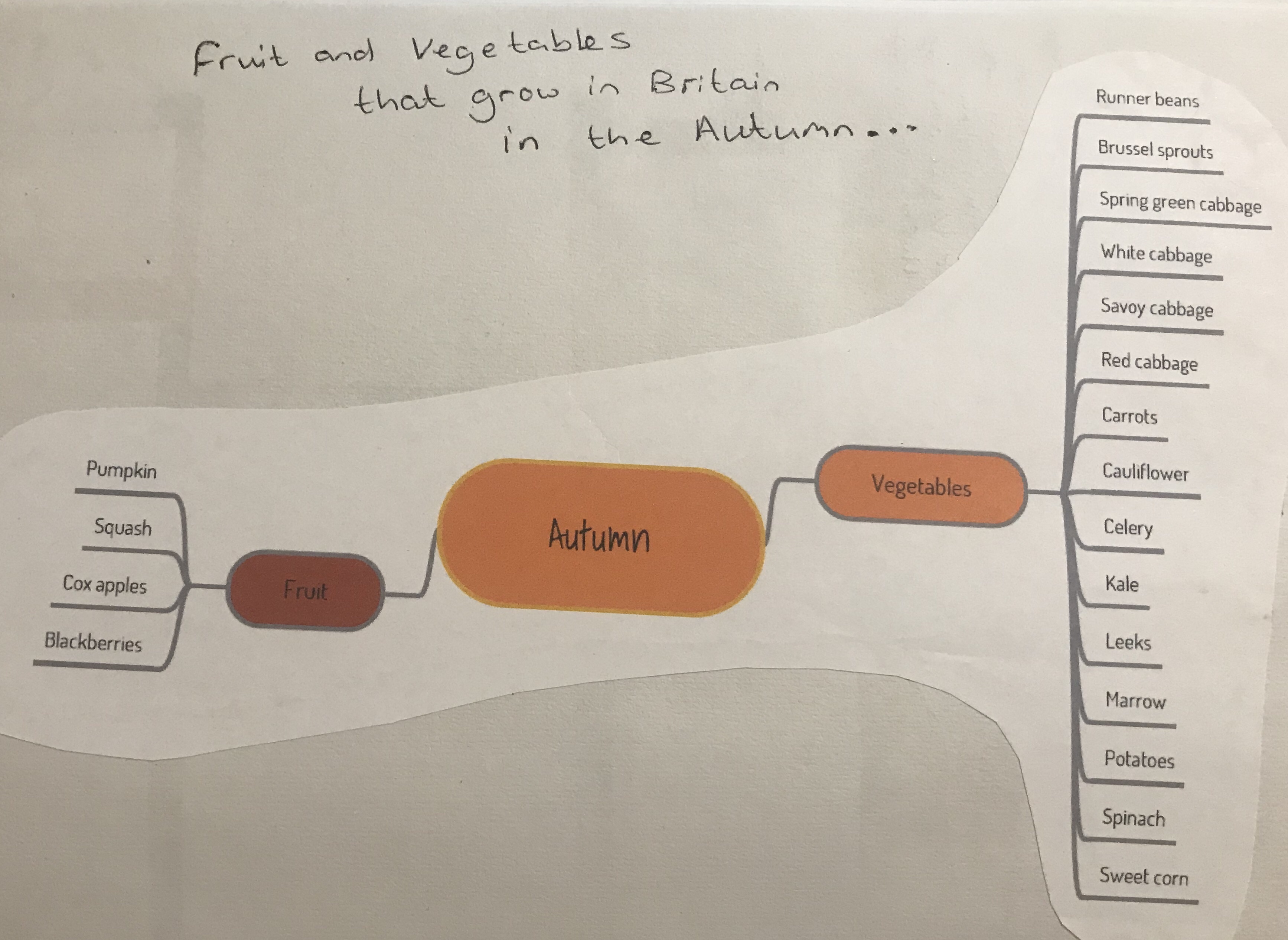
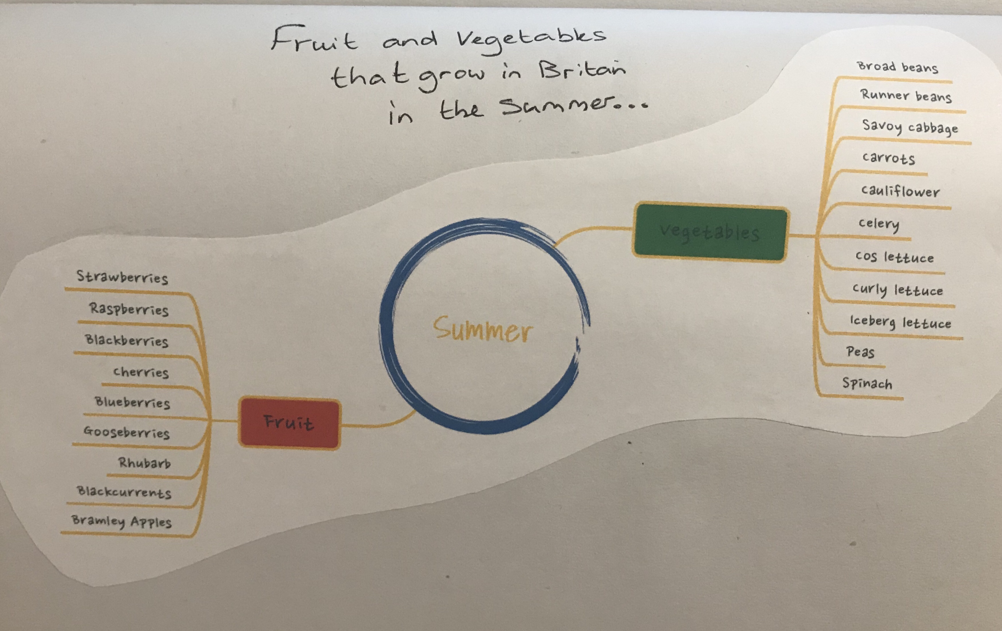
I did some mind maps of both autumn and summer fruits and vegetables to find out what grows in Britain during each season. From this I selected the fruits and vegetables to include in my mood board. I decided to go with summer fruits and autumn vegetables. This is because the autumn fruits list is a little sparse, whereas the autumn vegetable list is very long and therefore it made more sense to do it that way round. I was also quite keen to do fruit for my summer illustration.


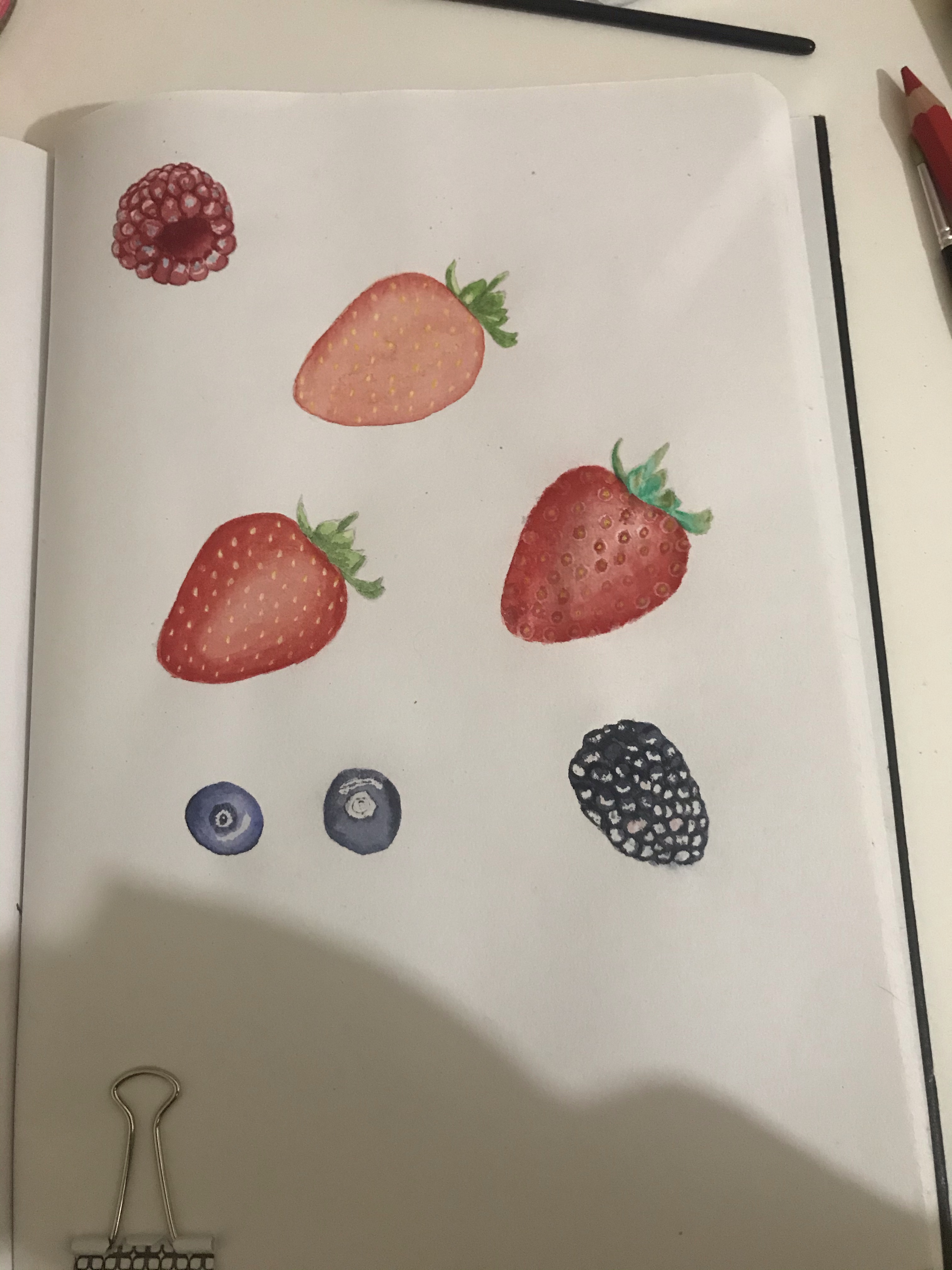
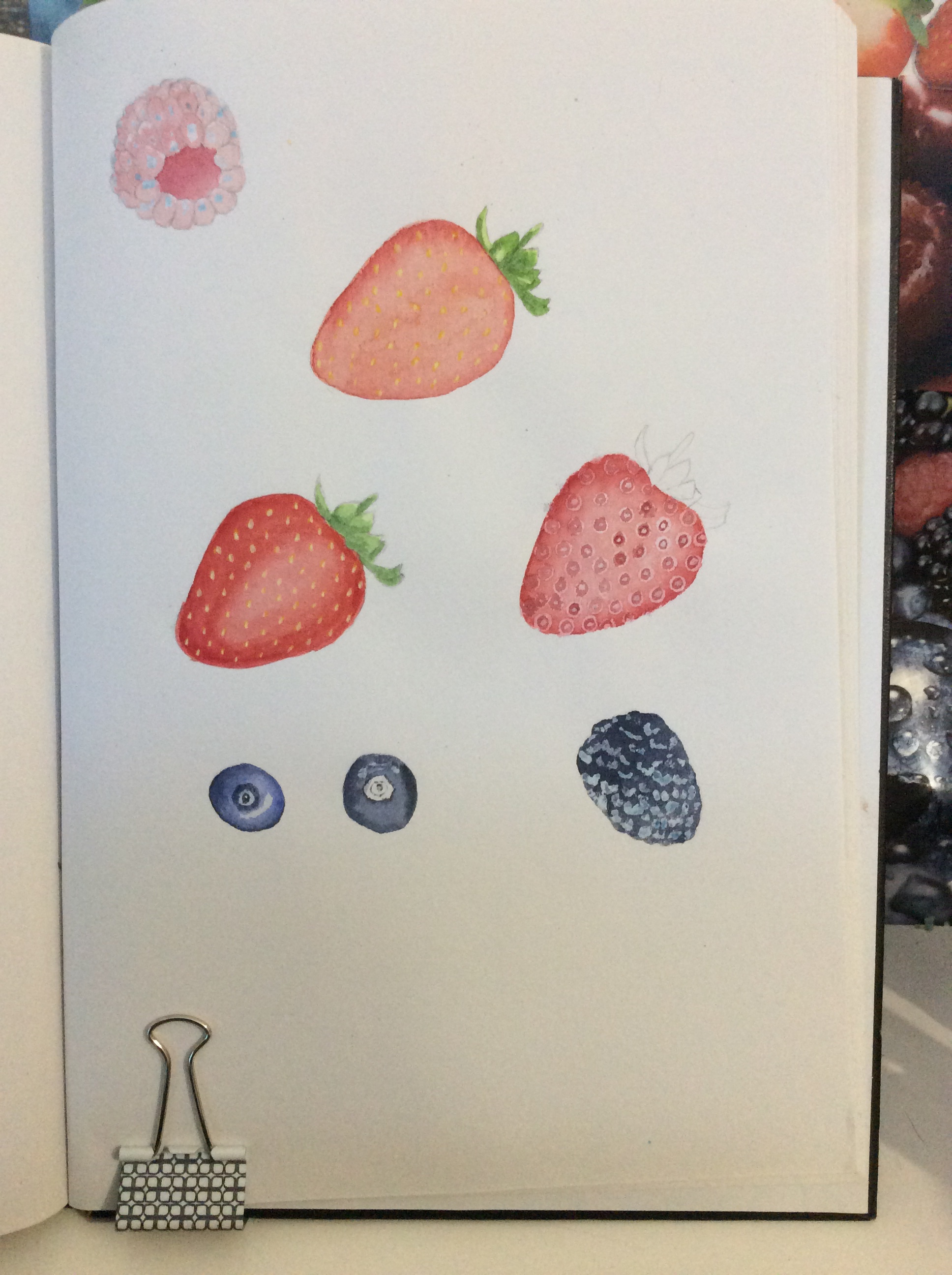
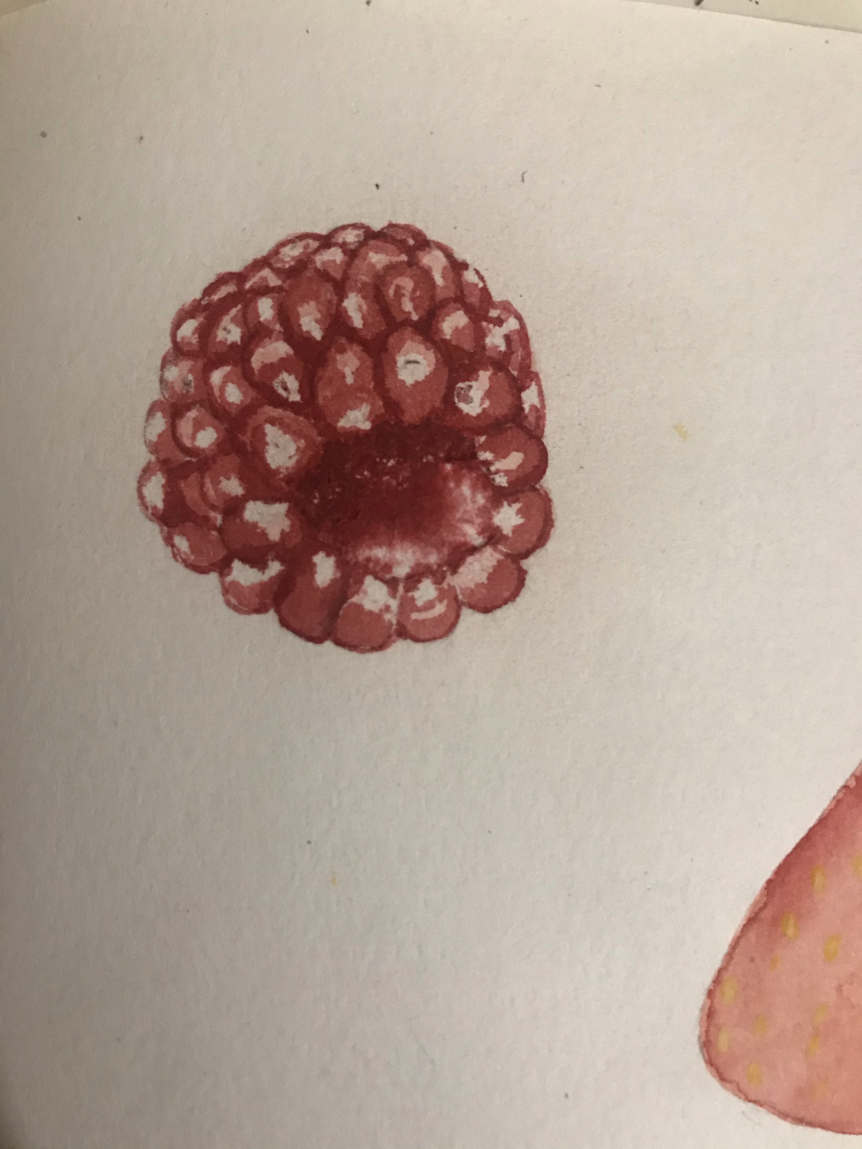
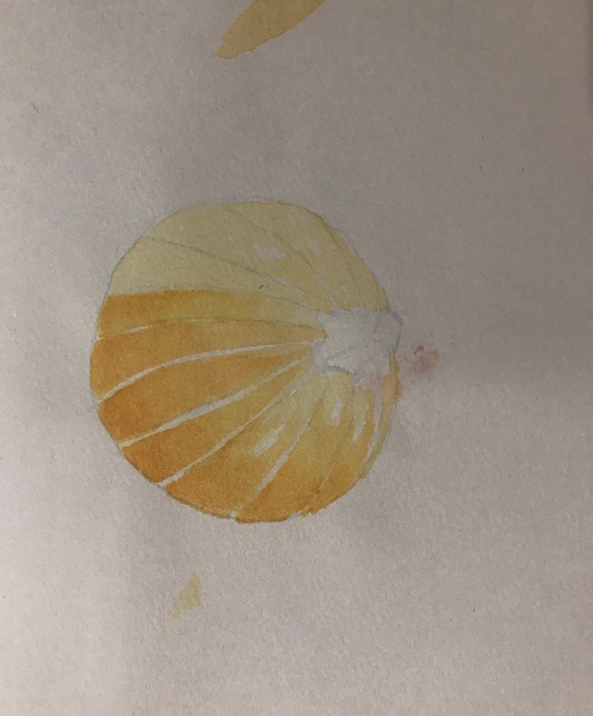
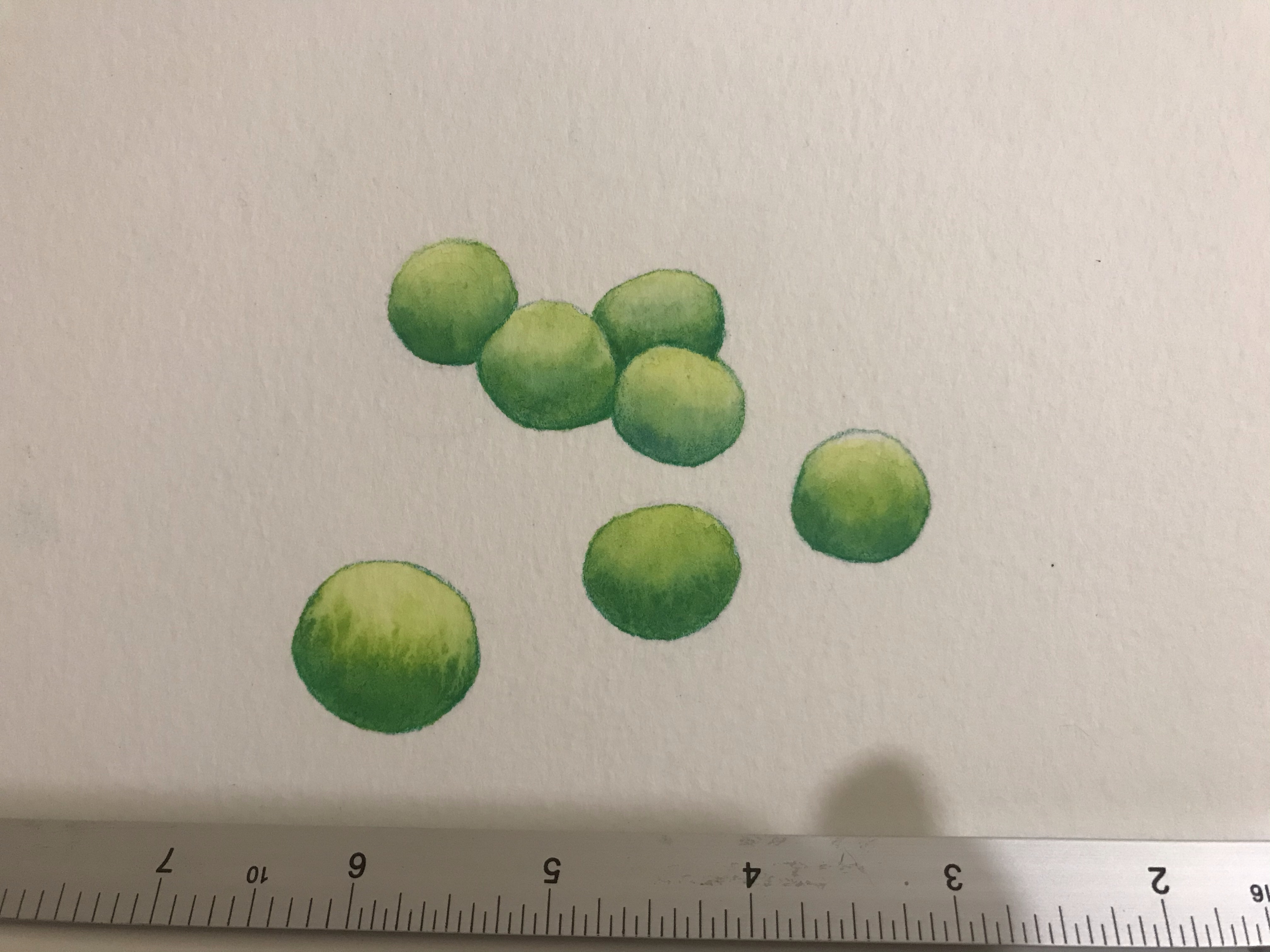
My test paintings of the autumn vegetables went quite well. I was happy with how they came out. I participated in a group session with OCA tutor Bee Willey and after showing her these images and discussing with her. She suggested that I work a lot larger so that I am able to create fine details easier and also to try acrylic inks to paint as I mentioned that I was concerned with watercolour and gouache that it will sometimes struggle to get the paint colours as bright as I want them to be. I said that I do have a tendency to work very small and that this is a habit that I would like to get out of, but also that I really would like to experiment with working on a bigger scale to see how that affects my work. For my test paintings. I used masking fluid on some of them to keep the highlights and then painted over the top. I did a few different versions of the strawberries until I found one I liked the look of. However, I did quite like my Rasberry, but I wasn’t sure about how strong the highlights were. I decided that I would work on a large scale for my final piece, so I would not use masking fluid. I would just leave out the highlights.
I have acrylic inks in my supplies, but I have only used them to paint on a very small scale. I hadn’t considered them as an option for this project until it was mentioned by Bee. I therefore did a small test with them before I started painting my final piece, and I found them to paint very smoothly and will easily blendable. After my test I was very happy with how it looked and was now confident that acrylic inks would work for my painting.
To show the scale 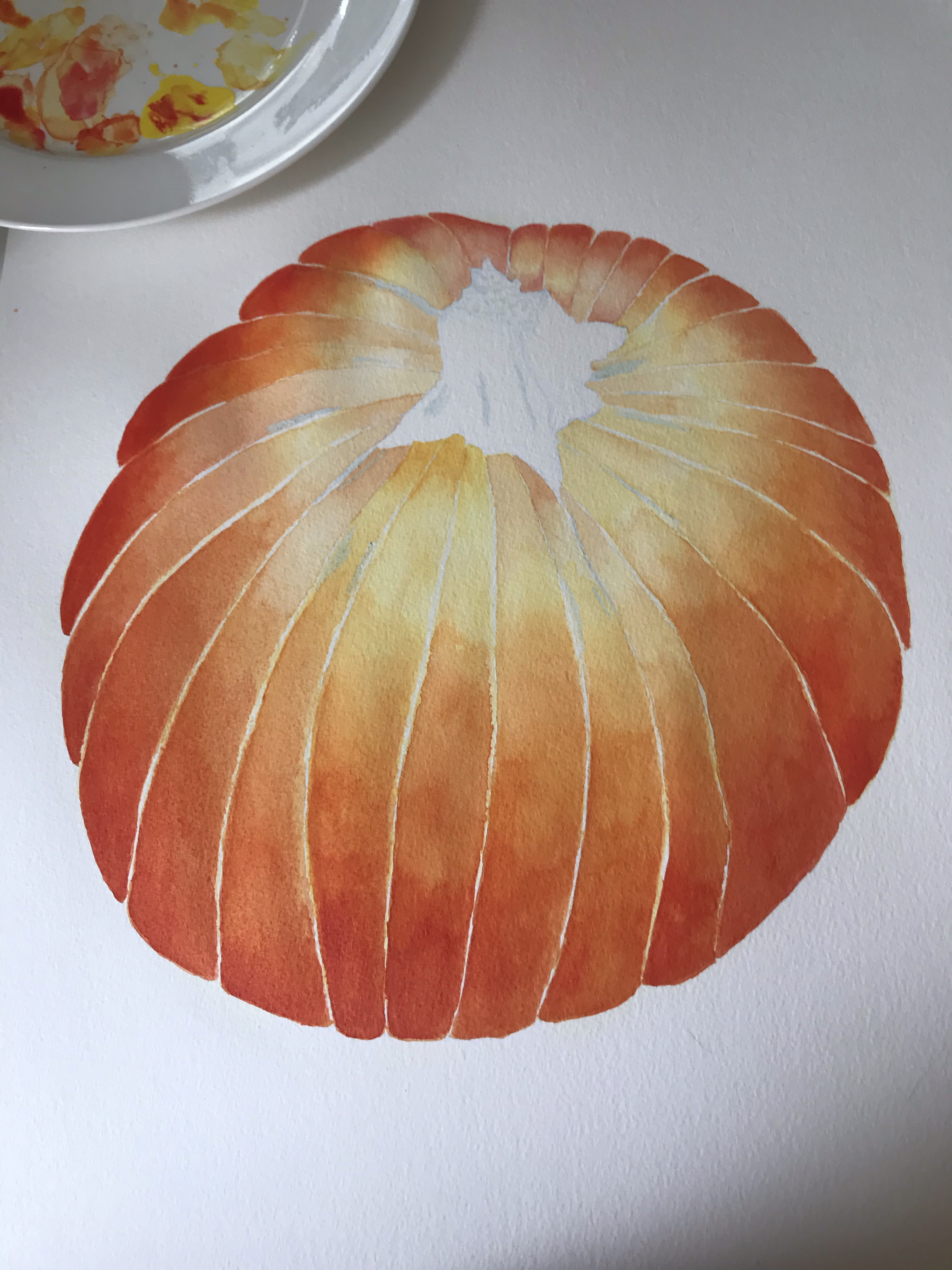


Failed attempt 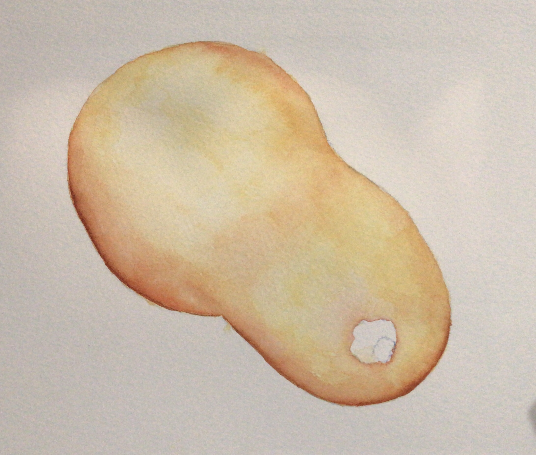
2nd attempt 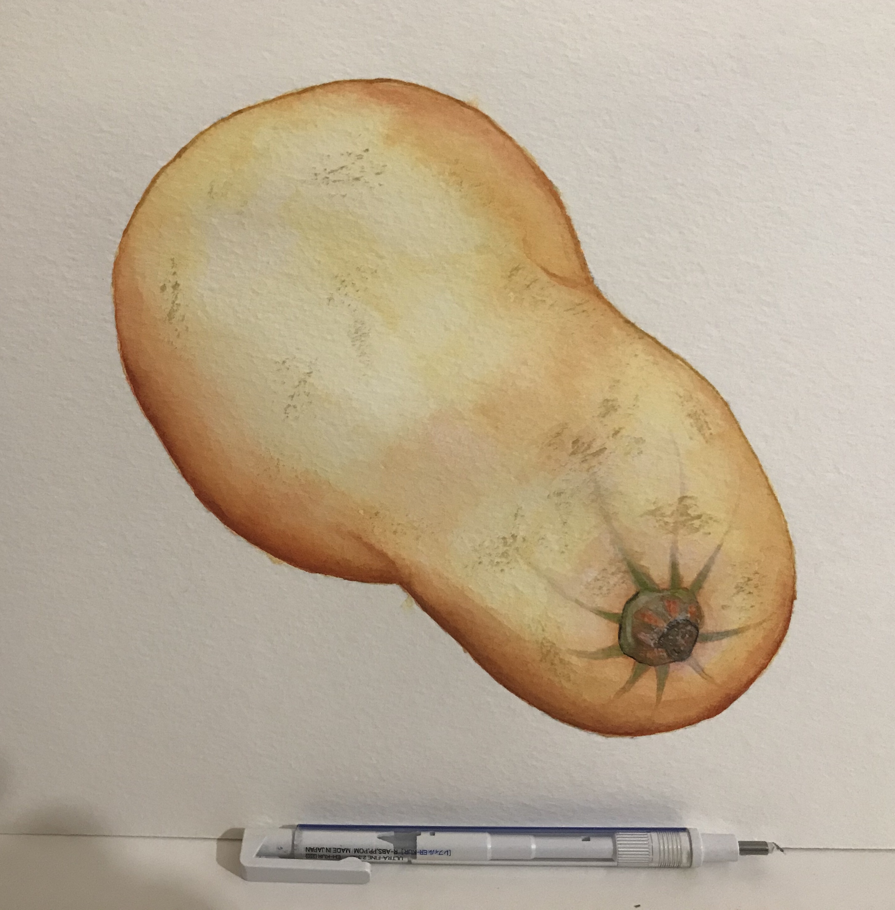
2nd attempt 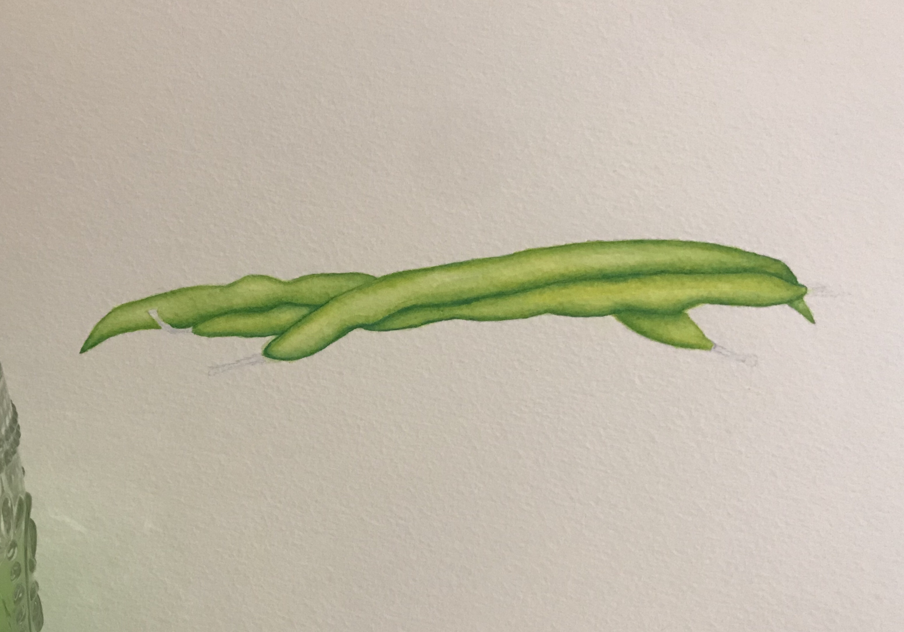
Testing the composition
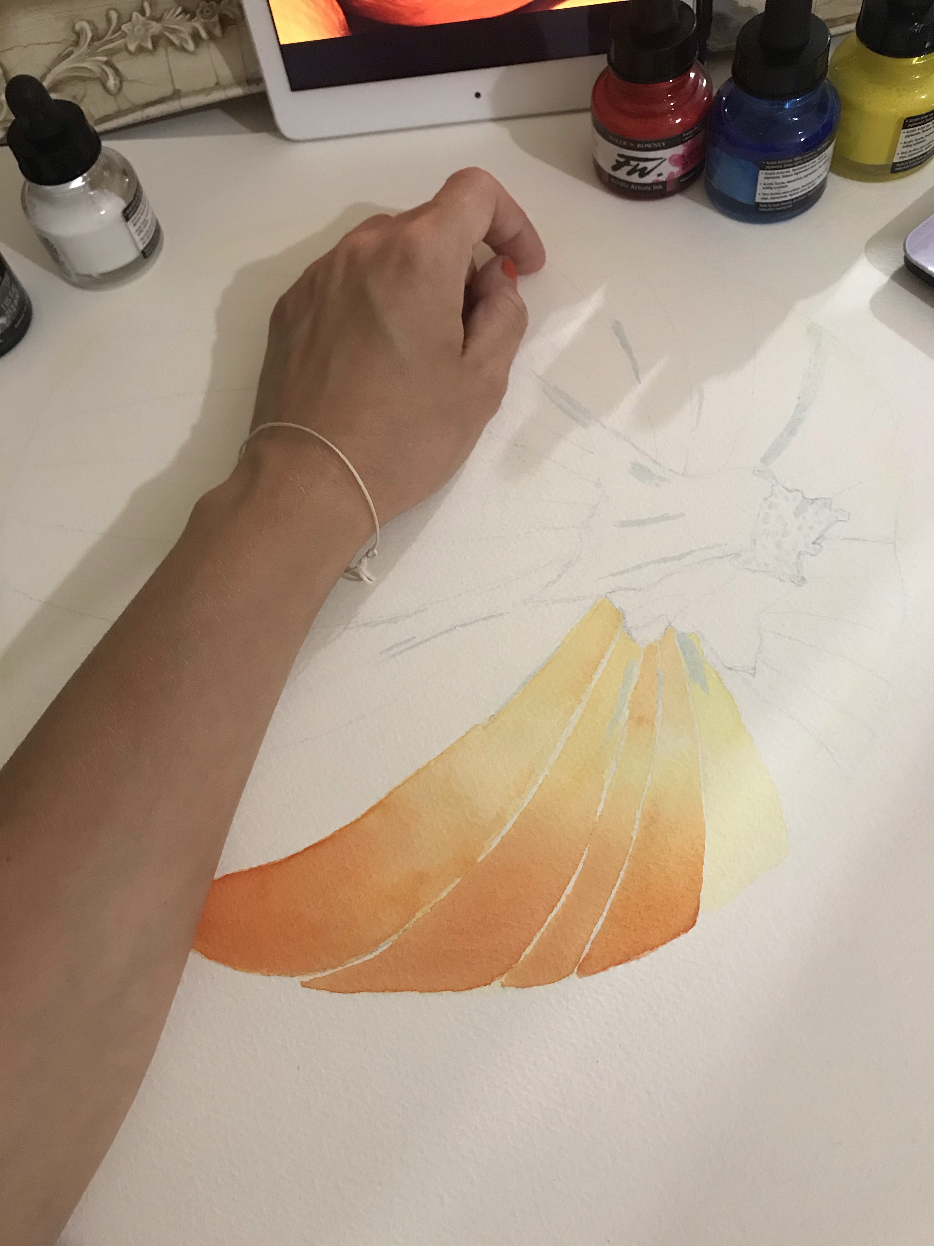
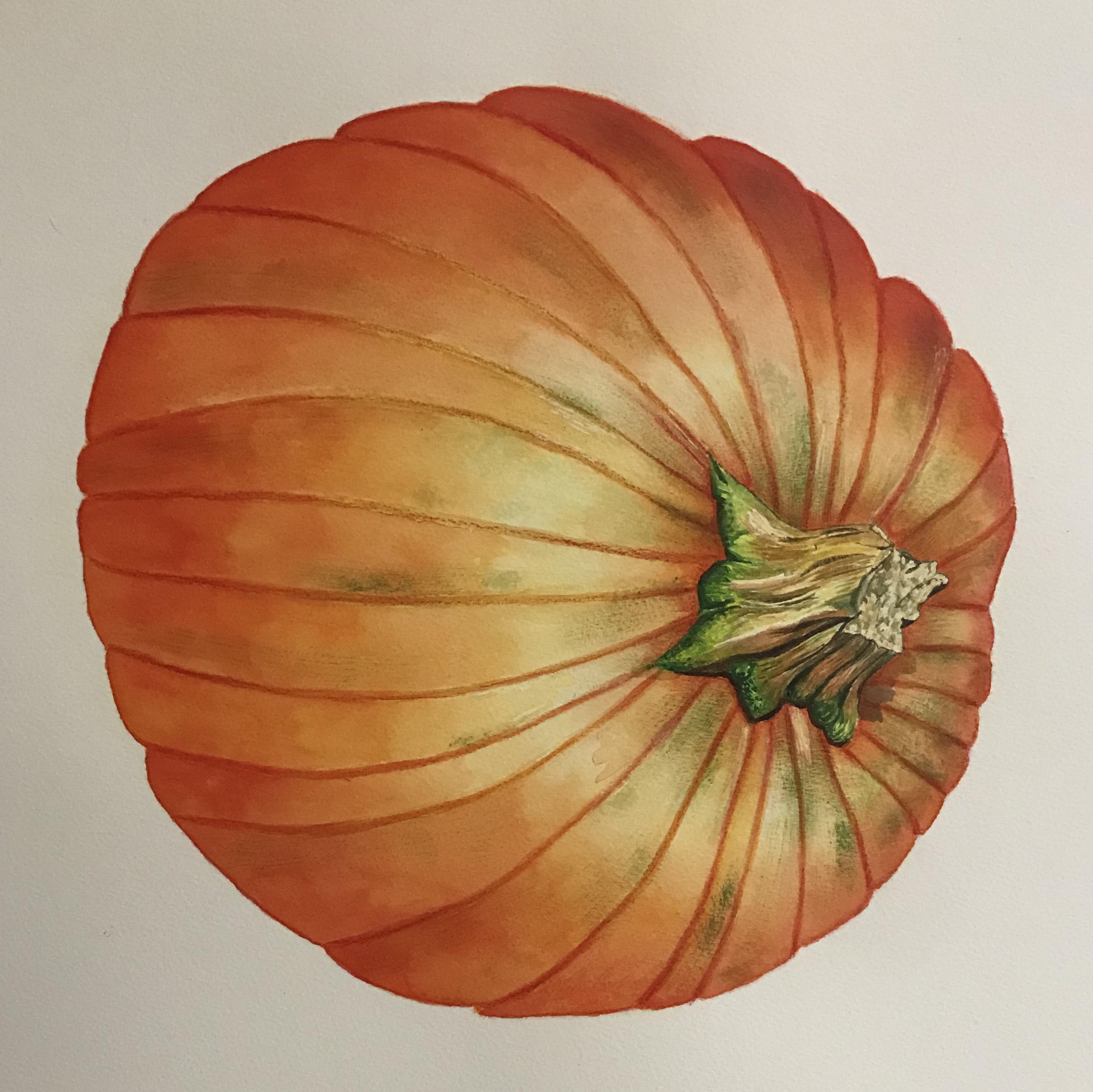
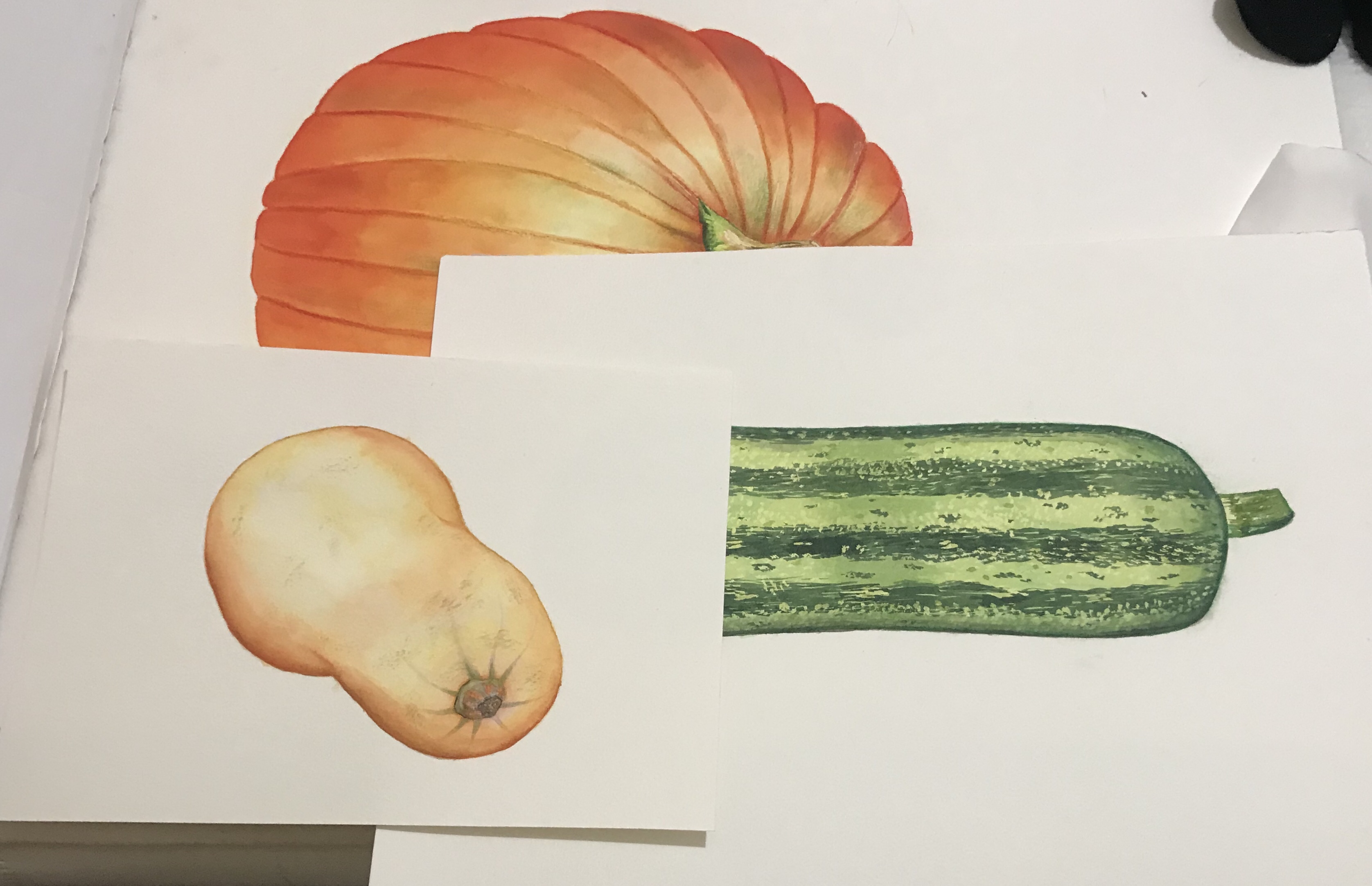
I decided to work on each vegetable as an individual painting rather than altogether, so that I could work on a larger scale and because if I was to make a mistake on one of them. I would be able to redo them without having to redo all of them. I only had to redo one of them, which was the butternut squash that was because I was not happy with how it was coming out and messed up with the shading. This resulted in the image looking muddy and the shading harsh and not blended well. This took quite a long time to paint, but I did enjoy painting them. I was happy with how they turned out, especially as apart from my practice pieces. This was the first time I’ve ever painted vegetables and I was using acrylic inks, which are not particularly familiar with. I do really like the vibrant colours and was sure to not use black unless I really had to, to darken the colour so that they did not become muddy and caused the food to look mouldy or unappetising.
Once I had painted each of the vegetables. I then layered them to test roughly how they would look to see if it was going to work. I then started to photograph them and put them into photoshop as raw files. At this point I was mainly just removing the backgrounds and correcting the colours so that they matched the original colours. I edited each of the paintings individually 1st to remove the backgrounds and then I compiled them onto a 12 x 12 image and move them around to find a composition that I liked. I did struggle with this a little bit as I realise that perhaps I should have done the marrow on a slight angle as it looks a bit flat just being on the side. However, I found a composition that was not too bad and that is what you see below.

I then started to play around with background colour to try to find one that would not overpower my paintings. It took a little while as the colours I would associate with autumn that I would ordinarily have used were already in my painting. When I used a green or an orange, for instance, it did not enhance the image and I could not seem to find a contrasting colour that worked for this image. I eventually settled on the light peachy colour as this did not overwhelm the image.


I needed to find a way to fit some text into the empty space. There wasn’t quite enough space to have the text horizontally as this would have resulted in it being quite small. Therefore, I decided to try carving the text so that it fit with the shapes of the vegetables. I also wanted it to be clear and readable, so I did not want to go too elaborate.
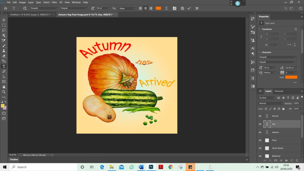
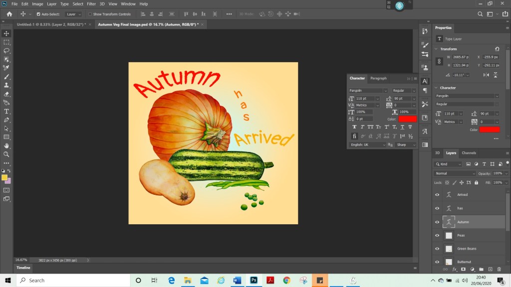


For my final image above. I learned how to add shading on Photoshop, although I’m not entirely sure how successful that was, for this particular image, it is now a new technique that I have in my skill set that I can use for later projects.

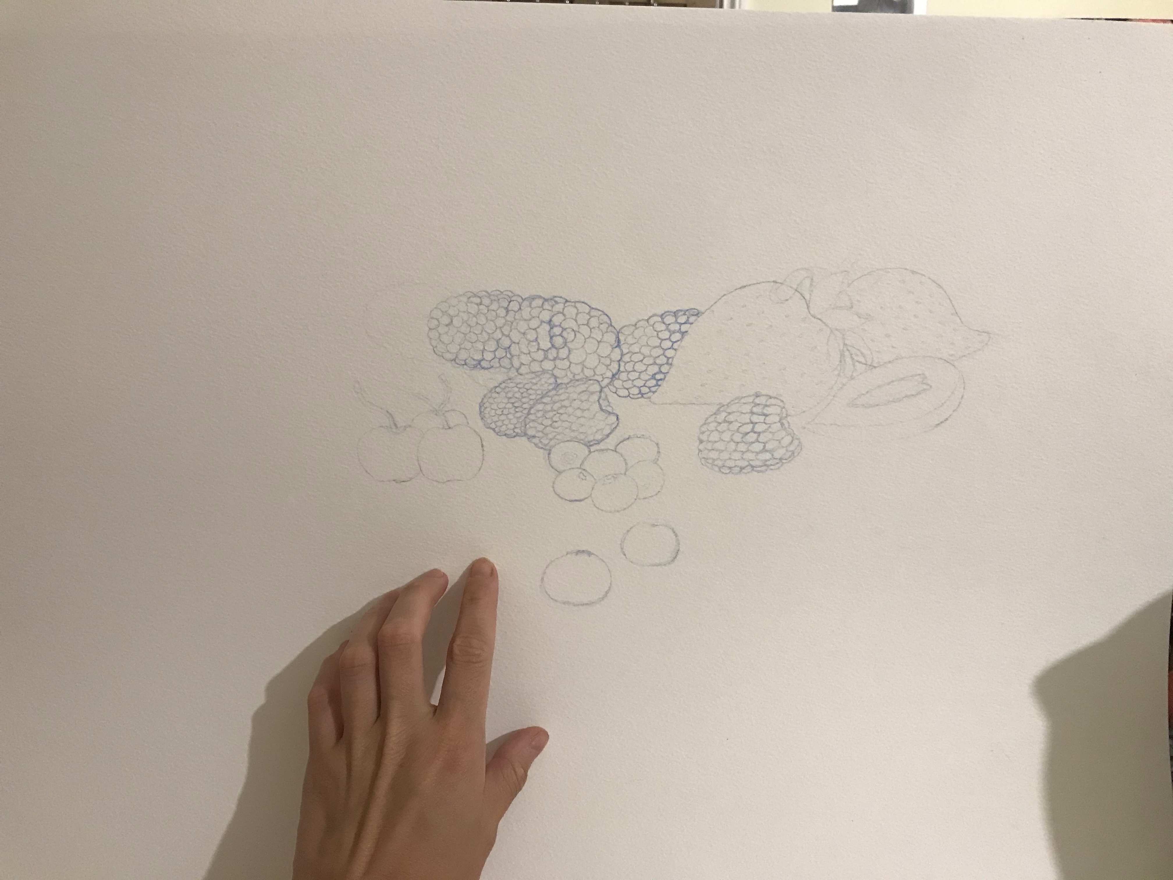


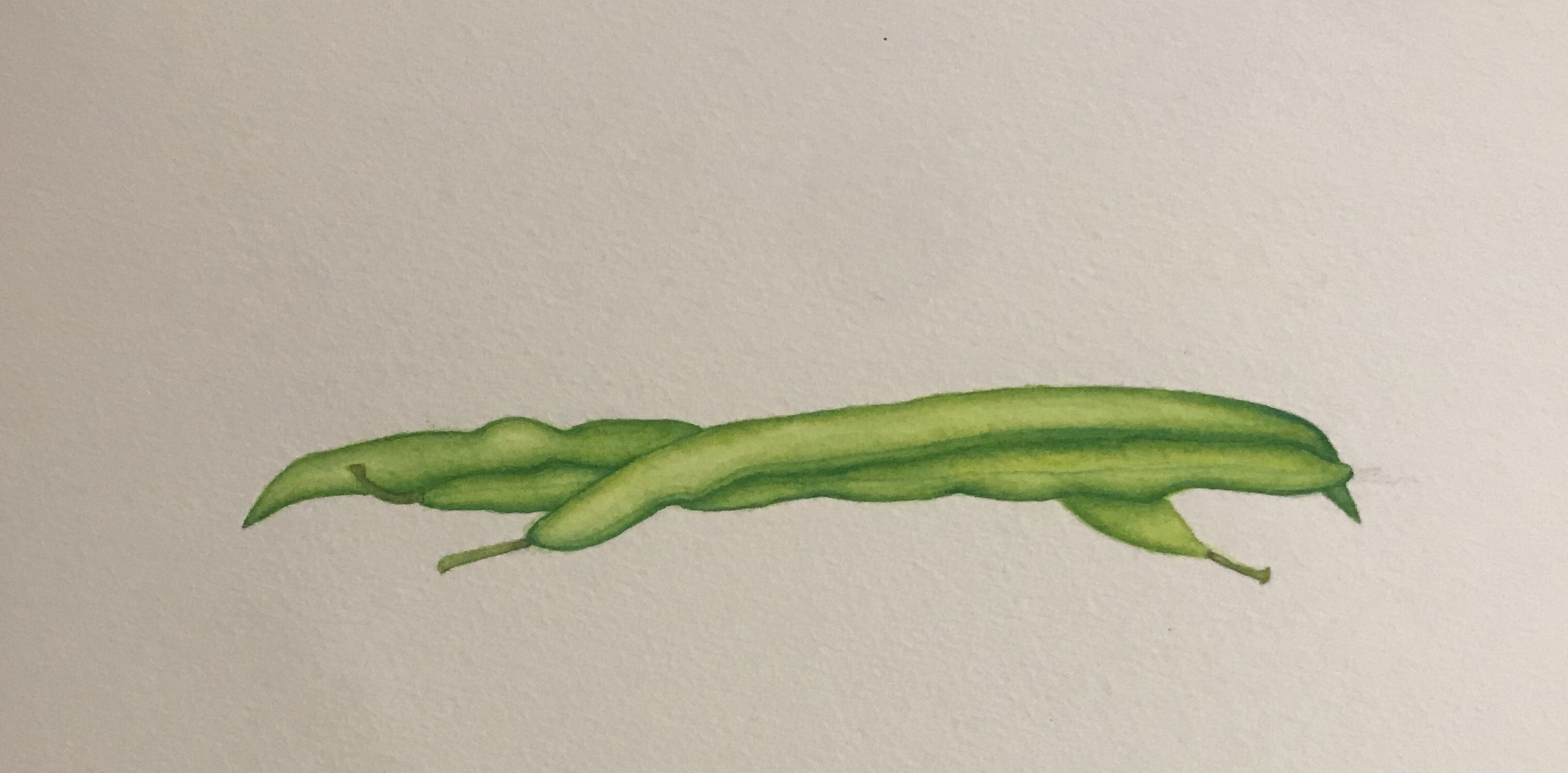
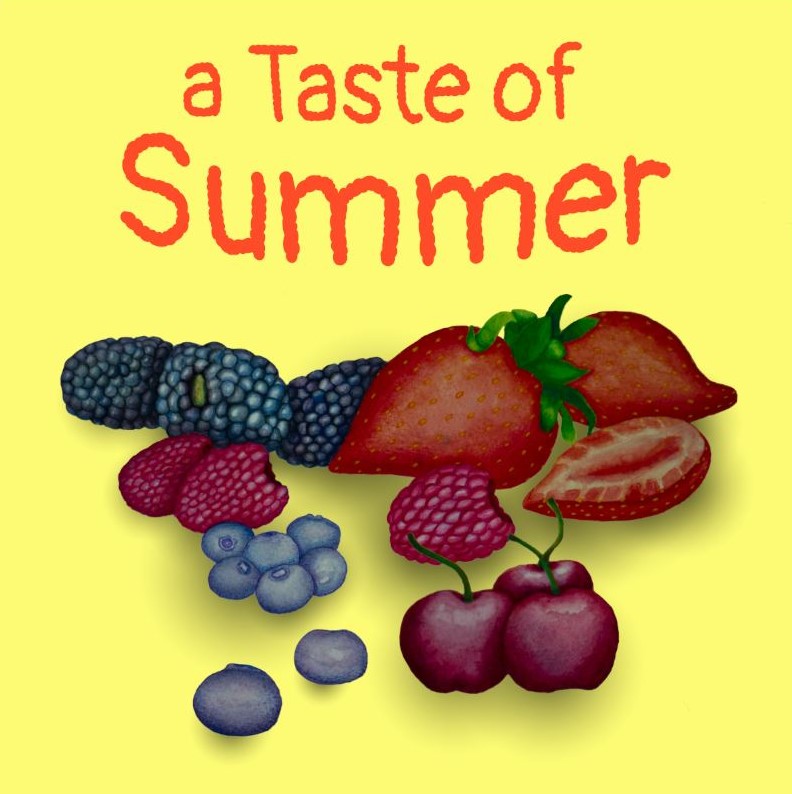
To get started on my Summer Fruits project, once I had collected all my research and did some tests, I started to sketch out a loose composition sketch to try to plan how my painting should look. Once I had done this, I used the reference material and moodboard. I had collected and begun a fresh sketch on A3 watercolour paper. For this I used a watercolour pencil, so that my colours did not become grey or muddy. Once this was done, I started to paint with acrylic inks as I had done with my vegetable paintings.
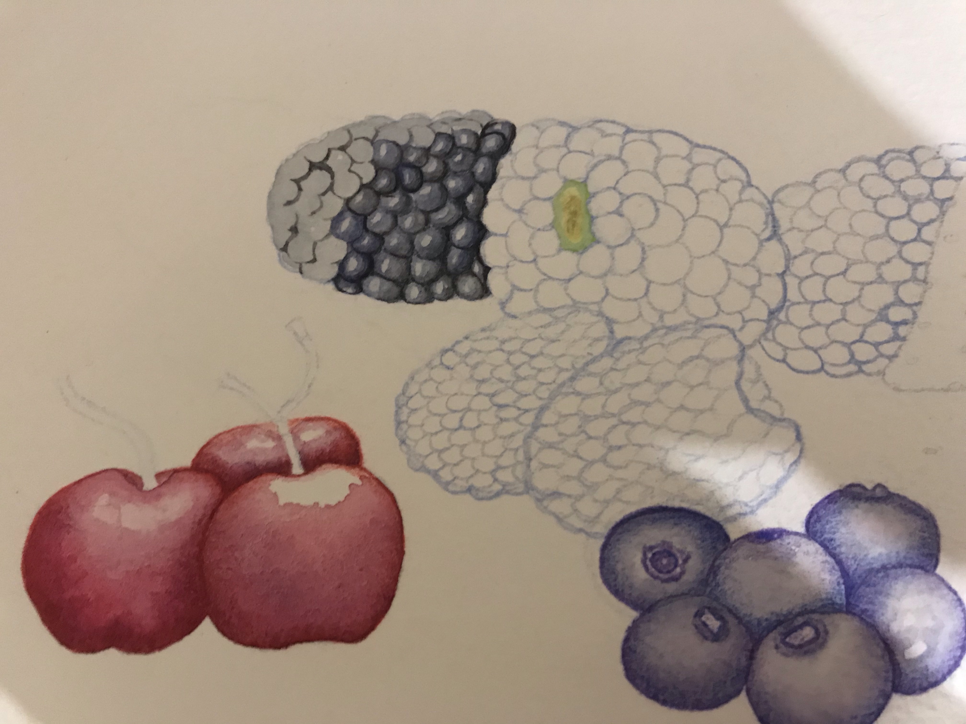
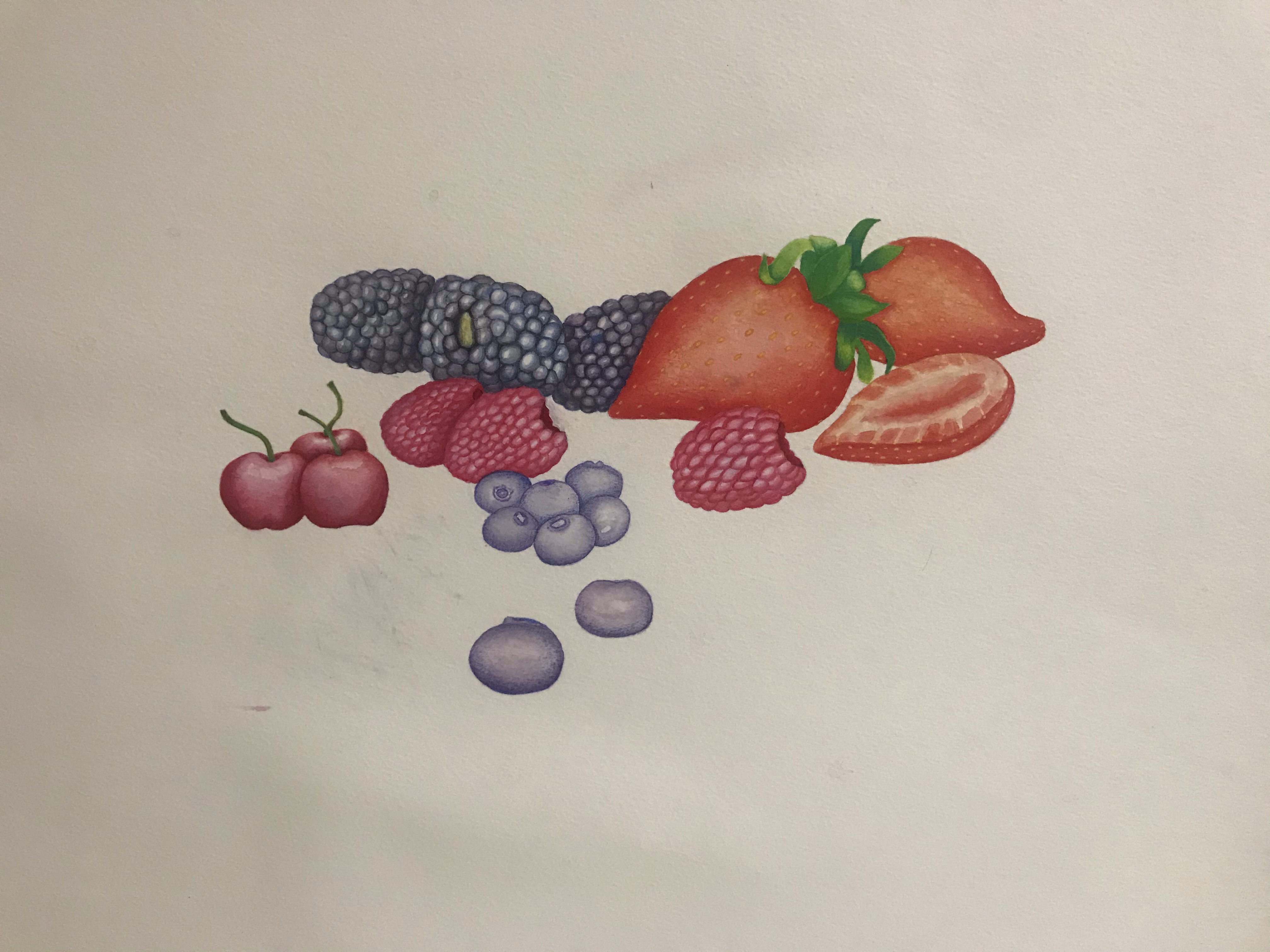
I decided to paint the fruit as one piece, rather than individually. I had hoped that this would save time, however, in the end, I think it took just as long as the vegetables did. Maybe even longer due to the fact that the objects were smaller, so the details were trickier to paint. The berries were generally much more time-consuming and difficult to paint and the vegetables, as it took some time to paint the blackberries, for instance, due to the nature of their make-up. I was trying to give them a 3D effect, however, I was not aiming for them to be realistic and was trying to strike a nice balance.
I had to change my composition a little bit once I had put it onto Photoshop because it was not going to work with the square, 12 x 12 format. I therefore moved the cherries so that they were in a different place. This also gave me the chance to resize them as I felt that they were a little small on my original painting.


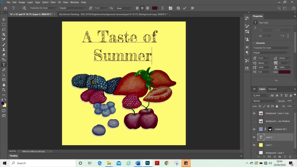
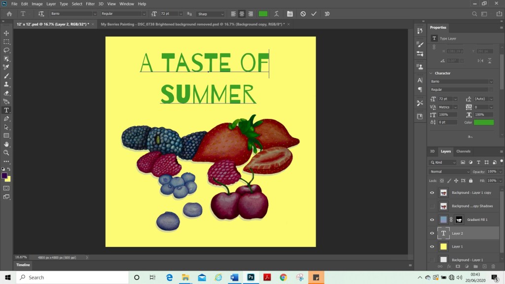


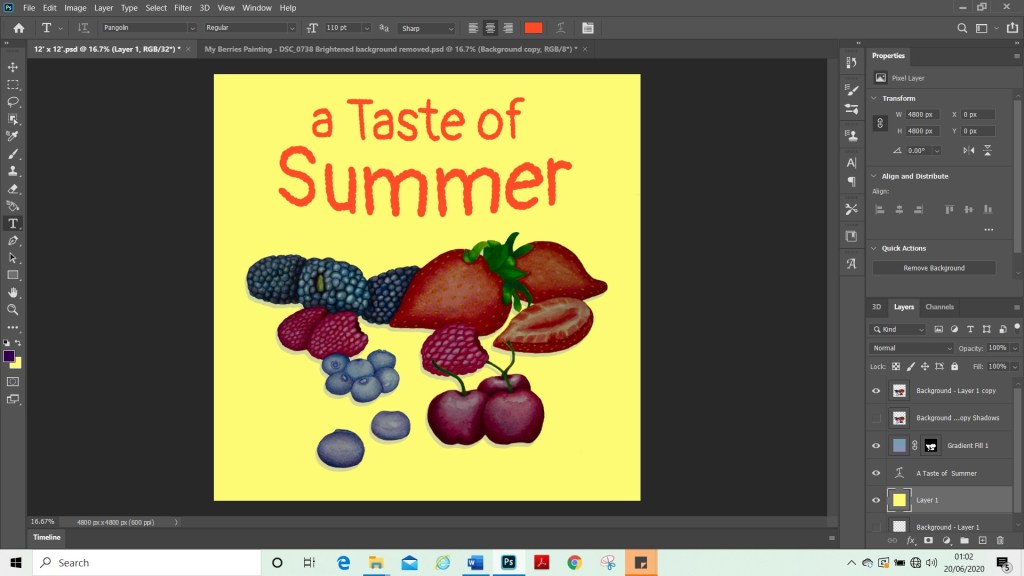

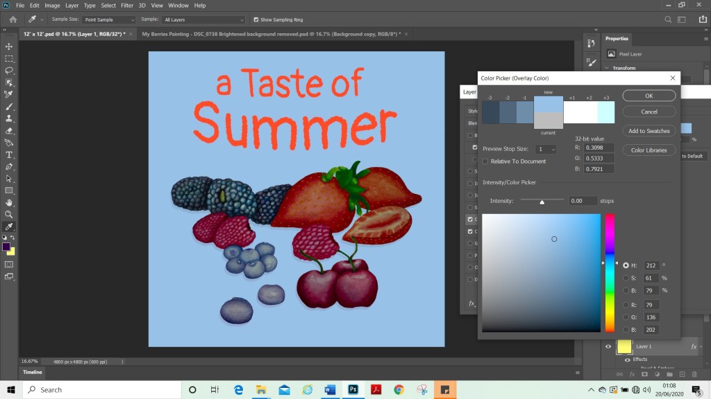
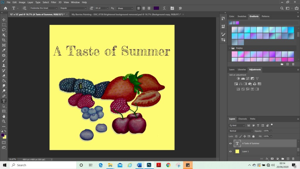
Once I was happy with my composition and had adjusted the colours to how I wanted them. I started to add a background layer and try out colours. I added the text and tried different fonts and sizes to see what would work alongside my image. I tried various colours and fonts until I found one that I was happy with. Above are some examples of these.
Reflection
For my final image. I added shadows in the same way I had with vegetables. This was to try to ground my painting so the berries did not like they were floating. I wonder if they would have looked better if they were a blue or purple colour rather than black shadows. I would have done this if I was painting them, but as I was following instructions and learning how to do them for the first time, I did not change the colour. I realised during this assignment that my computer does not have a good screen as I really struggled to see the shadows as I was adding them. And yet when I viewed them from another angle, they looked very heavy. Also, once I had transported my final image into another format and viewed it on my phone, the image background was a lot brighter than it had shown in Photoshop.
Overall, I am happy with my images and I feel that I met the brief. I did find this assignment challenging, as I am still new to Photoshop. Therefore, once I had put my images into Photoshop, I found that my skills limited my possibilities for what could be done with the final pieces. I am happy that I learnt some new techniques. I also learned my current limits (or some of them) for using Photoshop. I did try to use the 3D tool to create more interesting text. However, I was unable to do so as my computer could not run it and unfortunately just froze. On looking at my paintings. I am happy with how they look, in particular with the fruit. I really liked the biggest strawberry and I liked the way the blackberries came out. I did not manage to capture the juiciness of the berries which is something, perhaps, that is lacking in my image and could have improved it. This is something I could explore further with my painting and perhaps do some tutorials to learn how to do this.
Key Steps Part Two – In Summary
Key steps part two has been quite a challenge and I have enjoyed the exercises and doing this assignment. I have learnt many new skills and techniques, that I can now take on to other projects. I finally feel like I have found a pace for my course and feel like I am progressing. When I look back over the past two months I have done a lot of work in a short space of time and feel quite a sense of achievement about this. This makes me excited to continue on to part three and I am looking forward to the next set of challenges and opportunities for growth in my learning.
Key steps part two has been quite a challenge and I have enjoyed the exercises and doing this assignment. I have learned many new skills and techniques, that I can now take on to other projects. I finally feel like I have found a pace for my course and feel like I am progressing. When I look back over the past two months I have done a lot of work in a short space of time and feel quite a sense of achievement about this. This makes me excited to continue on to part three and I am looking forward to the next set of challenges and opportunities for growth in my learning.
This year and especially since my study trip to Lisbon. I have really immersed myself in my course and in OCA life. I have really enjoyed having a group of peers that I can talk to. This gives me a sense of community and support, and I do not feel isolated in my studies anymore. We keep in contact via a WhatsApp group and have a second Lisbon catch up session coming up with the tutors in August, which I’m looking forward to. The Lisbon students are from a mixed range of disciplines and I am the only illustration student amongst the group. I have been very inspired by their work and they have helped me to view art from different perspectives and not be scared to try new techniques and make a mess. I have also been participating in group sessions with OCA tutors, which have been very helpful and once again build a sense of community and help me connect with fellow students. I have been connecting with my fellow illustration students a lot more, this past month, which is very helpful and nice to feel like part of the OCA community and no longer just an impostor. (Now that I am actively studying.) I do struggle a lot with self-motivation and communicating with my fellow students and tutors has really helped me find motivation and purpose.
I do tend to struggle at first understanding the briefs and have to re-read some of them over and over and ask others how they interpret them, to see if I am understanding them correctly. This does cause me to hesitate on starting a project and I really have to push past my fear of failure and perfectionist tendencies. Although helpful in some instances, it does tend to hold me back.
I am finding, however, that now that I have processes in place. I find it easier to start projects, as I have steps that I can follow i.e. Research, moodboards and mind maps. These steps, stop me getting stuck procrastinating and mean that I know what I need to do to get started. Once I have started, I have no trouble continuing. It is just the initial starting of a project. I am happy that I am finding a way around this and I hope that this will continue to improve as time goes on.
