I have now finished my first module (Illustration: Key Steps in Illustration). For uni, we create a new blog per module. I noticed I have quite a few followers here so I wanted to let you all know that I am going to be continuing the next leg of my journey on: https://spaces.oca.ac.uk/ashleysdrawing1 It would be great to see you all there, I can’t wait to get stuck into my next module, which is Drawing Skills 1. I can also be found on Instagram at: @ashleysart
Thank you for following my journey so far. I hope to see you soon. For now I’ll leave you with a picture of my little puppy, because he’s the cutest and who doesn’t love a wittle pup!
After receiving my tutor feedback for this assignment I wanted to implement some of the changes she had mentioned and push my illustrations a little further. I really enjoyed working on this assignment am quite keen to keep developing these characters and see how they evolve over time, as I learn more and more during the duration of my course.
Reflecting on my research
My tutor had asked me to take time to consider my research on comic strips and discuss what I had learned about this area. When I used to get the train in London, I would read the comic strips in the Metro Paper, my original layout idea was inspired by this. I was thinking of displaying my images in one continuous strip so that they could be intended for a space at the bottom of a page in a newspaper. However, when I tried this I realised I had too many images to work this way, as the images would end up too small in order to fit across the page. Therefore, I decided to place them in two rows instead, after looking at reference of comic layout.
My research lead me to look at and consider different types of layouts and think about how I could explore this further in my next modules. The comics I looked at, such as newspaper strips, Garfield and Beano tended to have evenly spaced lined boxes or could have no spacing at all. Some of the characters were drawn extending outside of the boxes. Boxes tend to be uniform or various sizes. However, they were always clearly defined and neat. This makes them easy to read. As this is the first comic strip I have done, I decided to keep mine to a simple, clean layout. This was a challenge in itself to get everything evenly spaced and lined up.
The comic strips I looked at, tended to have a simplicity in the visual information contained. They tend to be line drawings, some black and white and some with colour. Most contained backgrounds. My original images did not contain a background so I added this to see how it would look. My tutor had also mentioned this is something I should consider. I much prefer the versions with the background. It gives the strip more substance and context and adds more life and colour into the images. It also shows the cats being inside a house which helps give context, for example, if my comic strip was called, ‘Toby gets a new friend’ etc., which is the idea behind my narrative, it should be clear what is happening in the comic. I could have shown this within the illustrations by perhaps adding a bow to the neck on the first image to give the impression of the female cat being a present. When I showed my DSA study tutor, she had said that because they didn’t have a background, she pictured a background for herself and imagined the cats were in her home. I found this quite intriguing and that got me thinking about the audience and how much of their own imagination they contribute to illustrations they see. Before I re-worked these I did a lot of sketches to learn comic styles using two new books I bought. These are; Sha, B. (2015) Doodle Dogs and Sketchy Cats: fun and easy doodling for everyone. (First Edition) Ash, Ohio: North Light Books. and Hart, C. (2009) Humongous book of cartooning. New York : Lewes: Watson-Guptill Publications ; GMC Distribution [distributor]. From these I learned different head shapes, how to draw different expressions and emotions and I learned to be more confident and bold with my shapes and move away from realism. I did tests to see how different line styles would look, but decided to stick with the line style I had originally used as I liked the soft effect better for this particular set of images.
Another thing my tutor had mentioned was that all my images were from one view point. I looked at the examples she provided as well and revisiting my composition and viewpoint exercise and re-worked some of the drawings so that they included a more varied range of viewpoints. I think this made it harder to create clear context, however, I think as a whole the story can still be read as intended. I am glad I tried this as it has made me think differently and include another dimension to my illustrations.
Sketch book pages showing character development and visuals with new viewpoints
Line style and colour experiments
The stories in comic strips are told effectively without words by exaggerating expressions and keeping the images simple and not too busy to distract from the intended point of each frame. A comic strip is a continuation of an evolving story, that each image builds upon. I did show my images to other students and family to check that the message of my comic was well received and the feedback was positive.
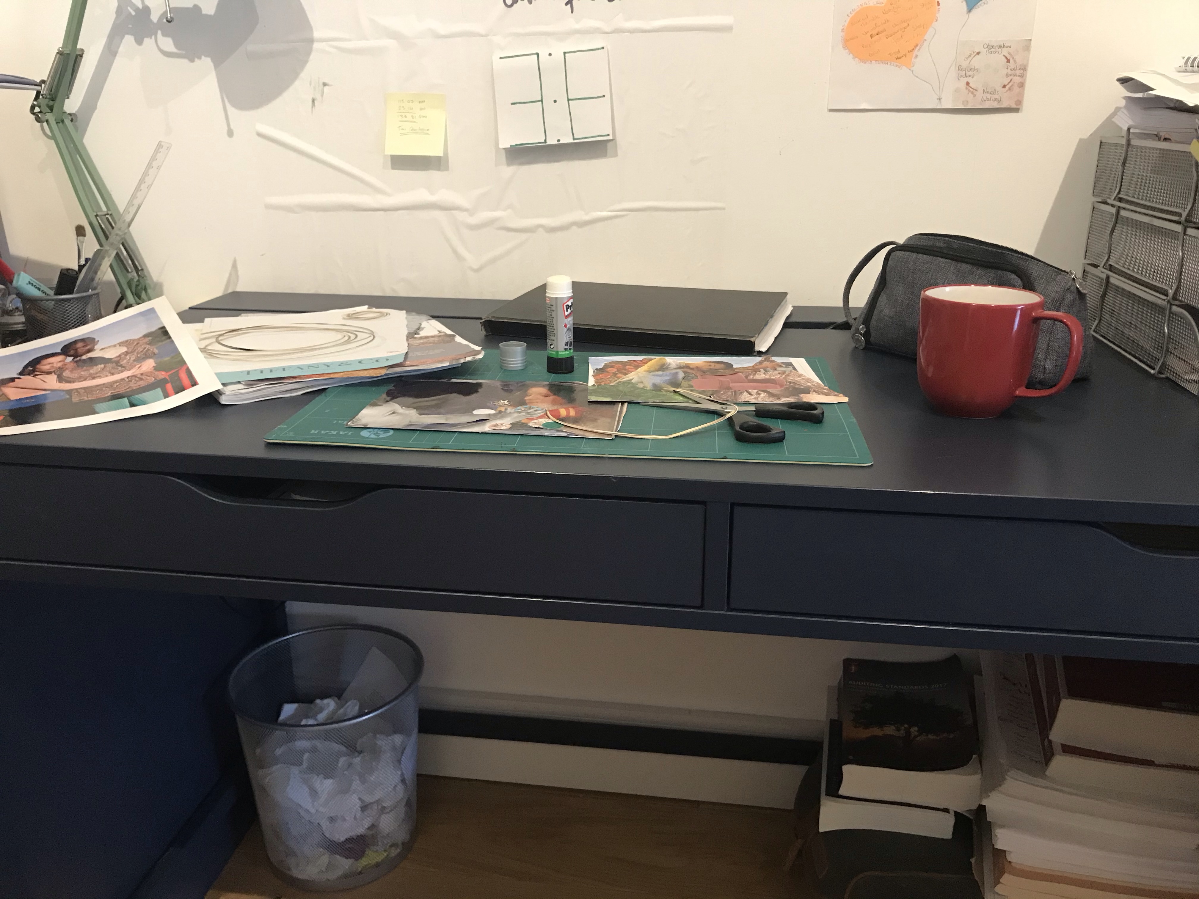
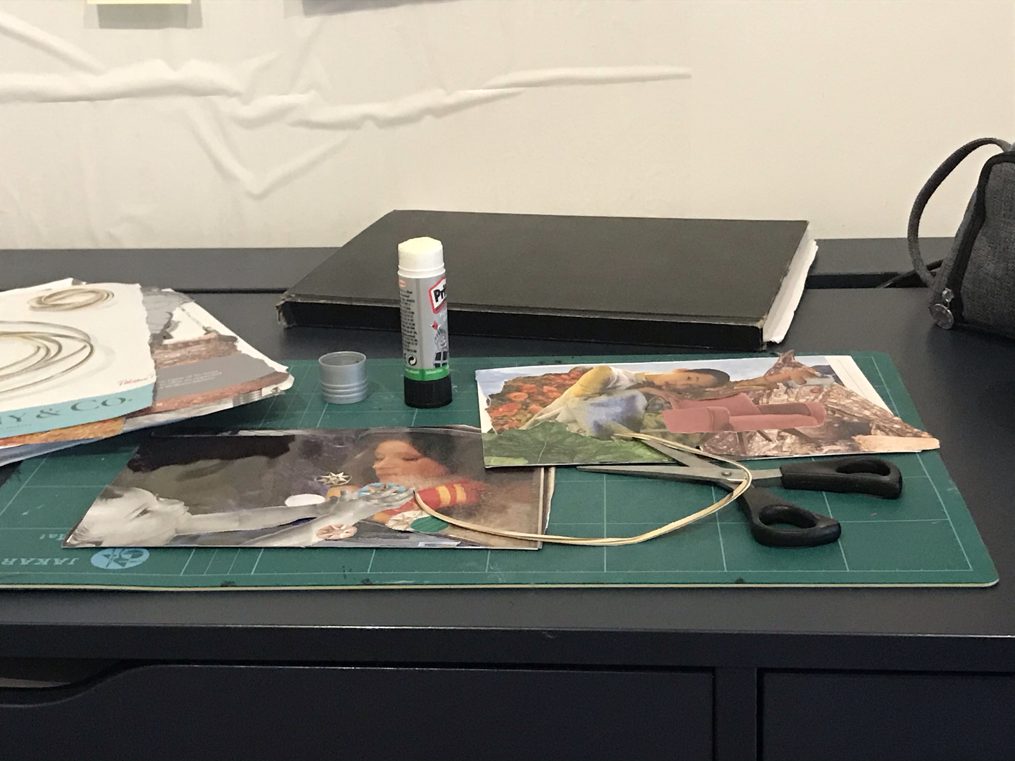
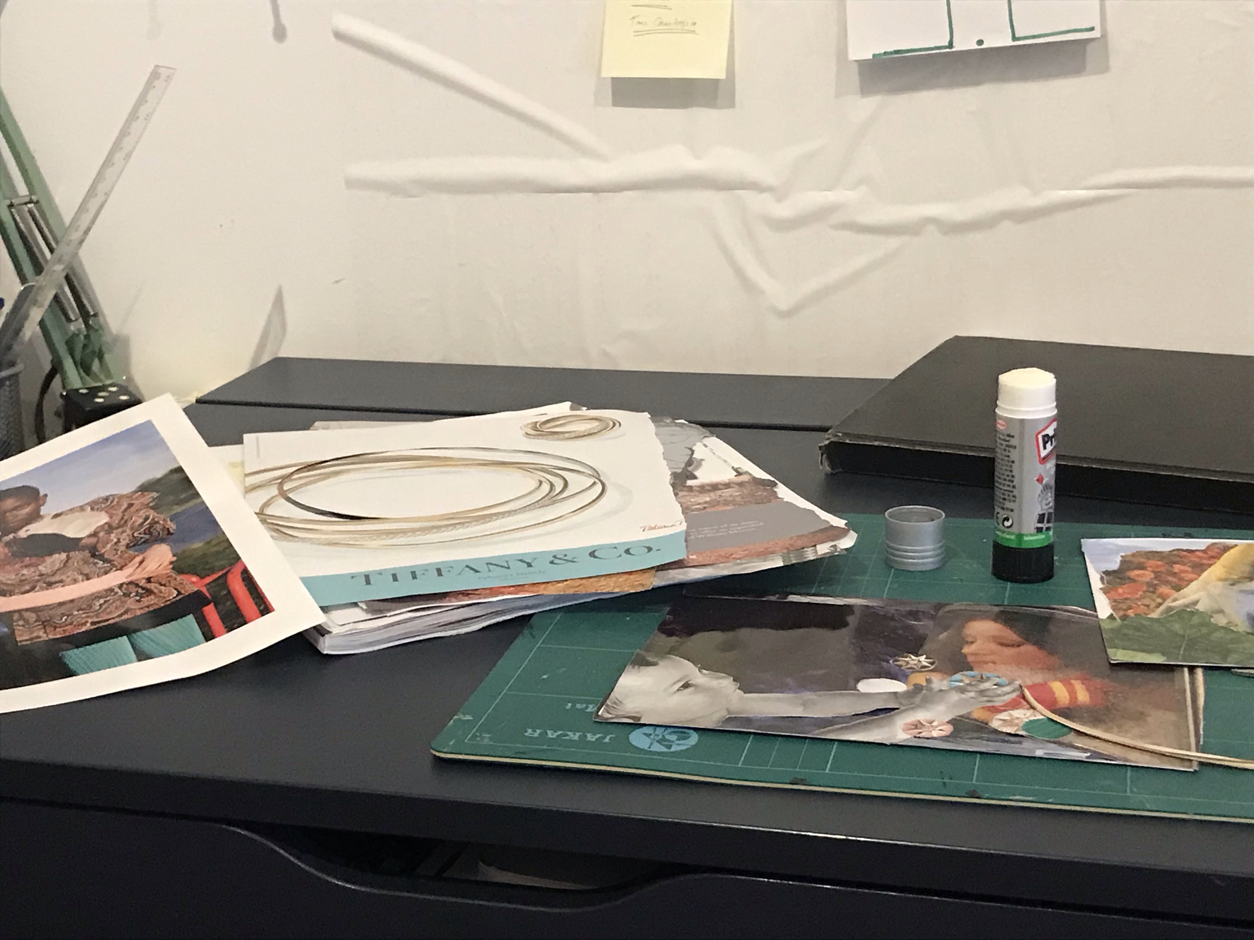
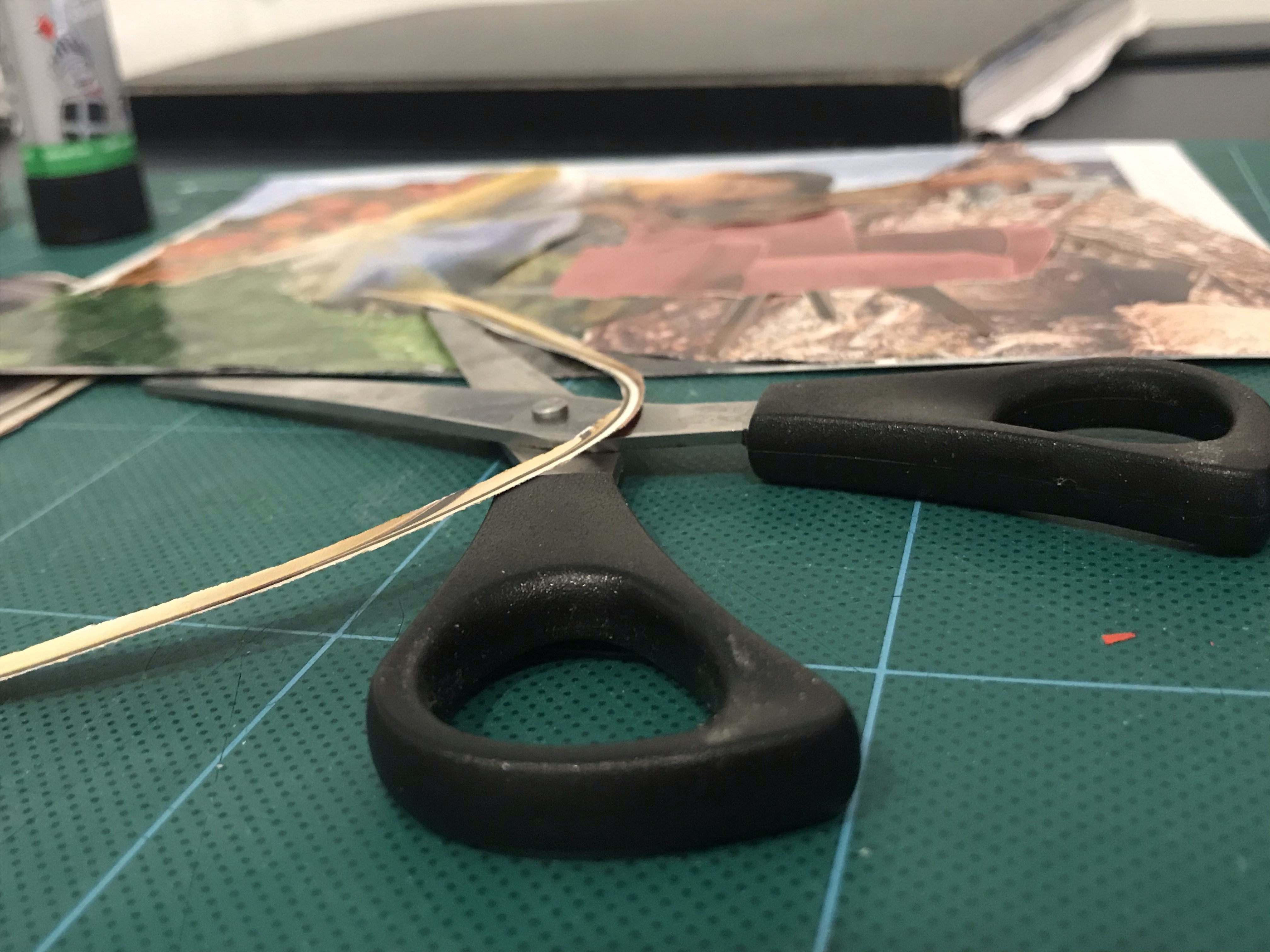
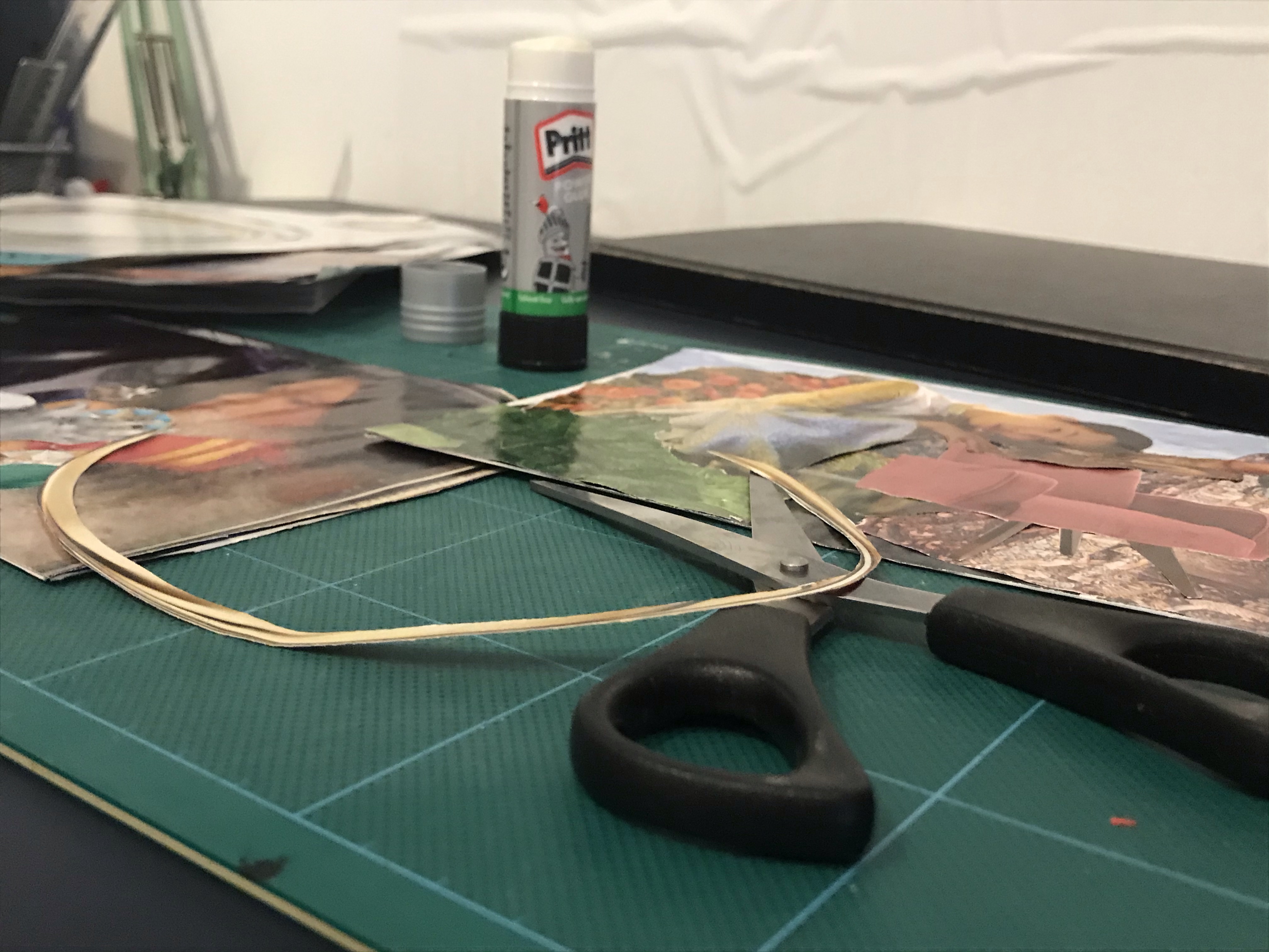
I worked in watercolour and then finished the images in PhotoShop.
My Final Images – Photographed version – Layout variationFinal Version – Closer Spacing
I photographed my images to get them into photoshop, I do not have my camera and lighting set up with me at the moment and therefore had difficulty getting my photos clear enough with just my phone. The paper texture is very clear and the images have a grey hue that is not in the originals. Despite altering the colours in photoshop I could not find an effective way to correct the grey hue nor the texture, without losing the image quality. I therefore also did a second version where I scanned the images, however the scanner bleached the images. Even though this corrected the paper grain issue, like I had expected, it left the images with limited colour. I lowered the brightness, but still preferred the original painted version as I was unable to get the pink colour back in the images.
Final Images – Scanned version originalFinal Images – Scanned version Colour adjusted
Additional colour testsFinal Image with Title
Conclusion
I learned a lot by reworking this project. However, I can still see much room for improvement and space to push this further. Part of doing so would require me to learn and improve, as some of the things I would want to do, I do not know how yet or else cannot quite get my hand to do. I am overall pleased with the outcome and much prefer this version of my comic strip. I am grateful for my tutors advice and direction on how I could improve my work and am excited to take this knowledge onto my next module.
I started on assignment 5 today, which asks me to write myself a brief for a project entitled ‘Seven days’. It says;
‘These can be the seven days of the week or random days that tell a story. Your interpretation can be objective or subjective. You can produce seven separate, one large diagrammatic or a continuous strip illustration. You can decide on the media and methods you will use; the context – magazine, newspaper, book, brochure or poster; and the intended audience. You need to write yourself a brief that is clear and challenging but manageable.’
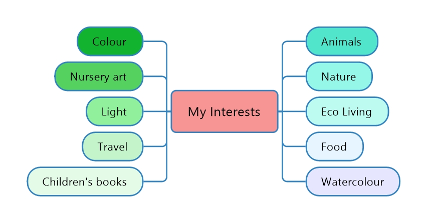
I started out by creating a mind map of my areas of interest to as the assignment brief says this assignment gives me a chance to explore the areas that interest me. I have been thinking alot about this recently, as I had started to realise what areas of illustration and which genres I am most passionate about.
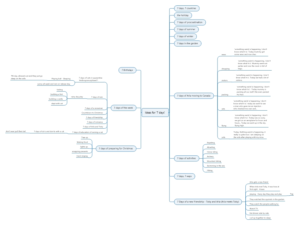
Once I had done this I did another MindMap of ideas. I have just gone on holiday to Canada so have a range of ideas around that and my cat’s journey who is here with me for the winter. Also, perhaps her friendship with our other cat here. I am just about to compete my quarantine so that is a subject area that would be relevant to me and many others during this time which I could create illustrations around.
I typed ‘Seven DAYS’ into google IMgw search to see what come up. I found mainly illustrations for teaching children the days of the week, but also album covers and movie posters, which I can see working very well with the topic by doing a single illustration to go with the title of a film, song or album.
I made files on my computer of stock images of cats, sleeping, eating and playing etc and the did some loose sketches from these photos and of my own photos of my cats.
I then did some watercolour paintings, however, I did not like how these turned out. They were on a tiny scale so I found it difficult to do details and feel i ruined them when I did the eyes. I realised I needed to now do some research into other artists work and also do some tutorials an practice to improve my watercolour and find a style that will work for my illustrations.
I looked at work from Eve Farb who is an artist I love. She works digitally and she tends to draw animals in a cutsey way. They are really soft however, so they look like watercolour paintings to a degree. She also draws people in scenes and will sometimes distort them so that the characters are way too tall for the surroundings etc. She has a very soft and whimsical style and tends to use a soft colour palette. She has recently painted a cat so this was great for me to see how she approached this. https://www.instagram.com/eve_farb/?hl=en
After searching for general watercolour paintings of cats and not finding relevant images for the style I wanted to see, I searched for cat illustrations in children’s books. I found an artist called Jen Borror who’s style I liked for its simplicity. Technically, however, her work must be very time consuming as she uses micro dots in pen to produce illustrations. https://dribbble.com/shots/11224697-Cat-illustration-childrens-book
I looked at work from Anita Jeram who illustrated the popular giftware, card brand ‘Guess’ and children’s books, with the ‘Guess how much I love you’ being the most recognisable with the brown bunny with big lop-ears.’. I have always been a fan of these illustrations. Her illustrations look like they are done in watercolour and are lined in ink in strategic places to emphasis areas. I feel inspired by her work as one of the subjects I love to illustrate the most are animals and i like the simplicity to her work and the way she leaves out the backgrounds, sometimes in full or part. Her colours are soft as her audience is mainly children. https://anitajeram.com/
I stumbled across an artist called Birgitta Sif, I hadn’t heard of her before, but I instantly fell in love with her work. Her pretty ever so slightly limited colour palette and her mixed media techniques in which she produces some beautiful rough textured, expressive line work, which creates a lot of interest and depth in the images. https://www.birgittasif.com/
I researched comic strips as I though that this would work well for my images. I used to read comics as a child, but I have not looked at them since, therefore I collected reference images to compare layouts. Rather than a picture book, I wanted to do a short series of images. A short story.
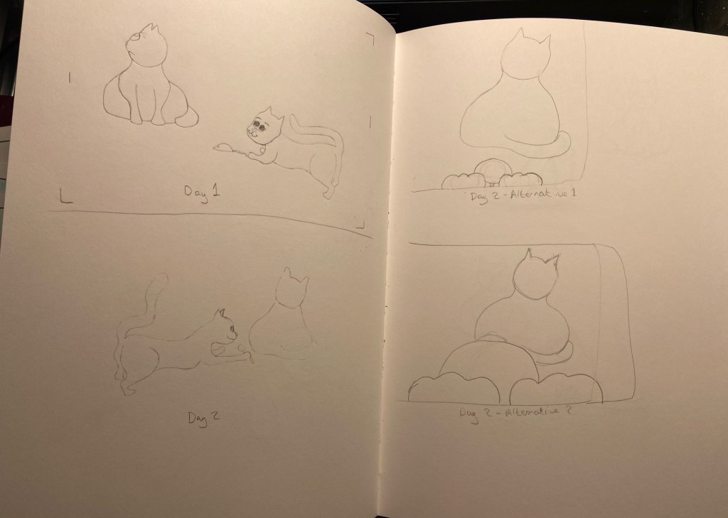
I decided to use my cats as reference for my characters. I decided to do set of images, showing a cat attempting to play with the other household cat. Initially, I thought I could do 4 illustrations for each of the 7 days in order to show the story effectively. But after some thought and writing down the 4 images per day I realised I could condense this down to just 1 image per day and then present them as a sequence of 7 images telling a story with no words. I wrote out a brief to help guide me.
Brief:
To create illustrations for the title 7 days.
To create a set of 7 illustrations, one of each of the 7 days of the week.
Your subject matter can be of your choosing.
Create a continuous strip illustration to be published in a newspaper.
The medium is of your choosing.
Tell your story with pictures only and do not include any words.
The final images will be printed to fit a 25cm wide column for the strip of 7 illustrations altogether, With the maximum height being 7cms.
The illustrations are to be in colour and will be printed on a white background.
I decided to simplify this in to one illustration for each day.
Sketchbook pages
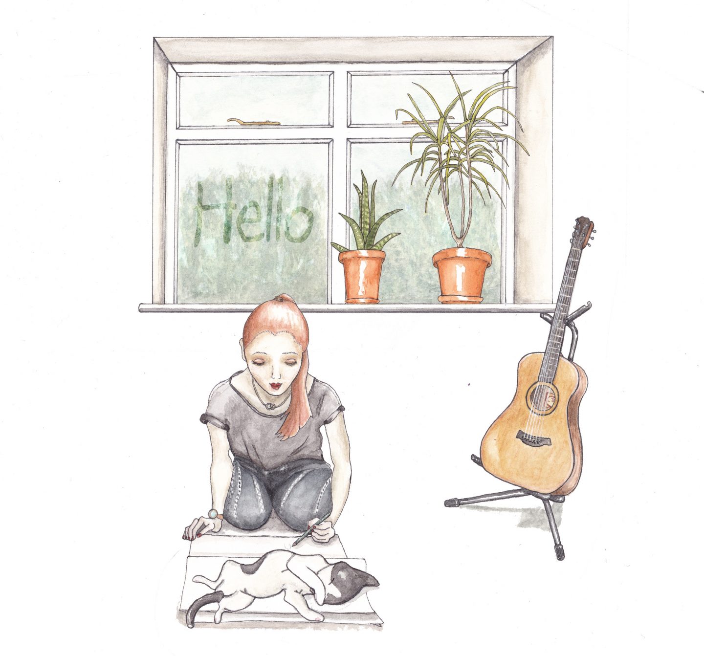
I did lots of tests and character development. This is the first time I have tried drawing characters with emotions of any kind, so I found this challenging. This is something I would like to spend more time on and develop as I found this assignment very enjoyable. I am unfortunately out of time for this module, so have to submit this today. I am happy with my illustrations as a starting point, but I feel there is much to be developed and more variations I would like to try over the next couple of weeks. I struggled with the female cat’s features and need to keep practicing how to draw a cartoon cat’s face. My cartoon strip shows a new female cat trying to make friends with the male cat.
My Final Illustrations in order of sequence
I did lots of tests for these to try to get the right colour combinations and to try to get the characters to feel more cohesive as a pair as I felt that they originally looked like they were from separate worlds. I feel like they are much more cohesive after reworking the female cat, but I still know I need to do a lot more to improve that character and also so that I can draw her easily from all angles. The male cat was much easier to draw due to him being round and not having an angular face. I am becoming much more confident with watercolours, so these illustrations were much quicker than usual and I did not have to repaint any of them due to errors or smudging so that is quite an achievement for me. I think this was helped that I did tests beforehand. I have had feedback from my tutor that I need to re-evaluate my final illustrations and re-do and re-think them in order to push myself further, which I now see how to do that and how much further I can push myself. Previously I have been struggling with my coursework due to not understanding assignments and not having a process. I would get stuck and take too long at the beginning stages. Since recently starting sessions with my study tutor I am managing to get going on exercises and assignments much easier. I now have methods of how to break down briefs and how to extract the important information so that I do not get lost in it. I am feeling much more confident going forwards with my studies and I am gutted that I ran out of time for this module. I have learned a lot of lessons from my poor time management and lack of study skills, which has been a big frustration for me my whole life and something I am keen to and trying to overcome. I feel like I will be able to tackle the next module with much less difficulty, now that I have support for my dyslexia. Because of this, however, my work has been rushed to meet timelines, to make up for the time I lost at the beginning. As they say ‘, ‘with hindsight’… which I have now to take forward on to my next module.
I am aware I could have pushed this assignment much further if I had more time. I would have really enjoyed doing so too. I am planning on doing some more character development and will find some tutorials that can help me gain some techniques that will help me improve. The two characters I created here I will continue to develop further and see how far I can push them and use them to learn how to portray different emotions and movement etc… I have really enjoyed Illustration Key Steps 1, as I have been tasked with many exercises for things I have never done before and would very likely never have done if I hadn’t have been doing this course. I am grateful for the opportunity to step put of my comfort zone and try new things, even if I have been overwhelmed at times and left my fear of failure get in my way. This first module has been a steep learning curve and I really had no idea of what to expect with doing a degree. This year has been a big wake up call and also has lead me to start finding my way in illustration and realising the areas and topics that are of interest to me and that I would like to develop further. Thank you to my OCA tutor for being so patient with me whilst I bumble around!
For this assignment I was asked to create an illustration for a magazine based on a still life for one of the following topics; Lost, Disaster, Discovery or Guilty Secret. The brief states that I ‘have the freedom to select the items for the still life and are given creative free rein. The rest of the content, the method you use to produce it and the colours you use are all for you to decide.’
This brief is very much open to interpretation, therefore I started with a mind map to explore my options for each topic.
Research:
Mind Map
Aim: Create a mind map to explore the topic headings.
I started by thinking of words associated with each topic, and then I used a thesaurus and an image search for each of the topics to find additional words and associations.
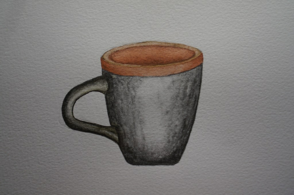
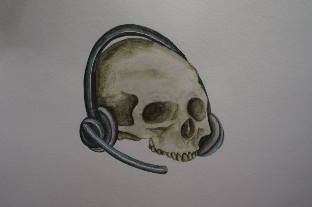
With the completed mind map as a guide, I looked around the house to find inspiration for my object selection and to see which category I felt I was able to undertake best. In my studio I found a skull and my headset from work. I found items for my still life that were most interesting to me. The skull was one that I cast from an old mould at the SFX studio that I worked at a few years back. The headset is mine from my current job where I work from home. I thought it may be amusing to have the skull wearing the headset and it made me think of how I feel at work sometimes, being ‘worked to the bone’. With the impact of Covid-19 it has created many challenges around working from home. We have come up with many effective solutions to overcome these, but overall I am finding my job increasingly difficult. Processes which were more straightforward, have become more in depth and tricky, with lots of new additional tasks being added to the processes for each process. This has meant that my work load has increased tremendously and that without the social aspect of going into the office and working directly with my colleagues, I feel very much like a cog in the machine, a robot and a hamster on a wheel etc. I chose the magnifying glass as a symbol for discovery and the mug was to create a sense of ‘normality’ by using a commonplace object amongst the more unusual.
Outcome: I used the mind map to inform my brief and create associations for each topic. This helped me explore ideas and find options that I otherwise would not have considered, which gave me a larger range of ideas. I found associations by visualising concepts. I visualised an idea of the skull wearing the headset and decided to make my illustration for the topic of discovery. I thought about ideas and headings for this selection of objects and the idea of working from home and the effects of this on your health. This was the narrative I chose for my brief.
Researching Magazine Layouts
Aim: To look at different layout options to help inform my choices.
I looked at a range of magazine layouts which helped inform my brief and discover layout choices. Below is a small selection of layouts which I thought were effective and seemed typical of most of the magazine layouts I looked at. I also feel that these are most effective and would work well for an illustration that is to go alongside a piece of writing. I like the way that the image is placed so that it is clear but does not detract or take over from the text. This is different to the illustrations/photographs seen in fashion magazines that are more likely to take up a whole page as a focus point, with the text being on the opposite page. I found that the images that took up the most space were those used to advertise a product or a service.
Outcome: I decided that my image would be intended to be placed on the upper left hand side as my image is to accentuate a piece of writing and is not the main focus.
Makeup Artist Magazine
Makeup Artist Magazine
Makeup Artist Magazine
Tesco Magazine
Examples of magazine layouts
Extending the Brief:
Aim: To create a more in depth brief to help guide me and create more of a framework to refer back to whilst I worked.
Usually questions would arise from reading the brief, that would be discussed with the art director etc. I therefore had to answer these questions myself. Below is a result of that process and is intended for self-clarification purposes.
My brief:
To create an illustration for a health and wellbeing magazine that explores the idea of the discovery of the effects working from home has on your health.
Your illustration is to fit within an A4 format, which is to include text, including a header and a body of text (the article).
Create your image so that it can be positioned on one side of the page at either the top, middle or bottom.
Your image can be in any colour, bearing in mind it will be on a white background.
Your image is to be a set of objects in a still life.
Feel free to interpret these and distort the image as you wish.
Outcome: I created a brief that I could refer back to and that clarified and laid out rules that I set for myself for this project. This helped me to stay on track and I could check that I had a clear intent for my illustration.
Layout
Viewpoints
Aim: To experiment with view points to find which layout would work best for my illustration.
I experimented with composition by taking photographs of my still life, testing different layout variations and camera angles.
My composition layouts
It was difficult to achieve an interesting layout or view of the objects. I ended up raising up the skull so that it was not directly laying on the desk as it was causing the skull to be in a flat position which made it hard to draw. This is partly due to the jawbone of the skull being missing.
I decided to start working on my drawings and the visual aspects of the project. I have found that working globally and visually helps me to better generate ideas and visualise a concept and decide what type of image and mediums would be most appropriate.
Studies
My Line visual drawing from my still life
Once I had found a setup that I liked, I drew my still life as a line visual. I liked the impact of the negative space around the objects and tried to place them so that I created depth in the illustration., to make sure it was visually appealing. I wondered what impact this image would have on the audience and about how it would be received. My colleagues did comment on this piece of work when I showed it to them and asked ‘is that us?’ I believe this was a positive indication of the illustrations success.
Outcome: I created a line visual to work from after experimenting with different layouts and camera angles to see which worked best. I chose what I felt was the most visually appealing setup to me and then moved on to painting.
My final piece
Aim: To create individual paintings of each of my objects that I could then photograph and edit in photoshop to create my final piece.
I traced each object from my line visual and painted each item on a separate sheet of watercolour paper. I used Derivan Liquid Pencil Paints in Blue, Yellow and Grey as my main colour palette and used my Derwent Graphitint Paint pans for subtle pops of colour where needed to stop the image from looking flat, to create more contrast and to make the image visually appealing. I decided upon this medium as I thought it would lend to a magazine illustration and wanted to explore these paints as they are new materials that I have just purchased. I really enjoyed using them and felt more free with my marks and was not so precious as I am usually with my paintings. This was due to the unique texture of the paints that lend itself well to natural forms such as skulls. They were more difficult to use to create the smooth textures of the mug and magnifying glass due to the texture of the paint. However, I think the overall look is effective. I really enjoyed this process and the outcome.
My final paintings
I did each object separately so that I could edit them in photoshop and play around with the composition more if needed. Also so that I could remove the background ready for printing in the magazine.
The objects with the background removed, ready for layering.
Once I had removed the backgrounds of the images individually, I then layered the images. I choose to move the objects slightly from my original line visual, placing the mug slightly behind the skull so, that I created more depth and interest to the image. This is because I realised that by placing the objects with negative space around each one, I was not using the objects to their full advantage by creating a sense of relationships between the objects. They all seemed like separate objects before I moved them rather than one illustration. I showed this illustration to a few people and was happy to hear the meanings that they took from the image. It was slightly different from person to person depending on their circumstances, but overall the responses read the image as it was intended. I note that my image could also read as being related to death with to the current situation with Covid and death and loss being a big part of life that everyone is dealing with and we are all very aware of at this time.
Outcome: I am happy with my final image and that feel that I have captured what I had intended. My paintings worked well and were easy to edit in photoshop and prepare for a printed format.
Finished image in Photoshop
Finished Image as a JPEG
Wider advantages of completing this project
I have enjoyed this assignment and feel like I am starting to develop my process into an effective way of working. I am finding this is making it easier to start and complete projects and is preventing me from getting stuck.
I am happy with how my illustration turned out. I managed to let go of my self-placed restrictions on the technical aspects and therefore created an illustration that was more free and expressive when compared to my previous work, without compromising on the standard. This is something I have been struggling with, as I felt the quality of my work recently has not been to my full potential. This is mainly due to the tasks being outside of my usual remit and these have pushed my boundaries considerably. This has, however, lead to some realisations about my work and caused me to grow as an artist.
I realised that for different genres of illustration, sometimes a different style or medium is needed, therefore it is difficult to find my style when completing such a wide range of projects. I found this particularly evident in the exercises in part 3. I have found that my style is not as well suited to posters, editorial illustration. I was pleasantly surprised with this particular exercise as I feel I was able to pull off a convincing magazine illustration. I have gained a new confidence from this assignment and feel more able to tackle such a brief in the future. I believe that by completing more exercises and assignments, my styles will start to develop further until they are more consistent. I also have been observing my current strengths and weaknesses and have been actively doing regular tutorials to try to improve these areas. The exercises from my course are giving me the skills to make better judgements and act more quickly and effectively now when approaching a brief. This has made a huge difference to my process and development as an artist. I now feel like I have a good foundation of knowledge, tools and structure to allow me to experiment more freely.
Research and referencing – I have become curious about other processes and have found that looking at and enquiring about the work and processes of professional artists and fellow students has fostered an exploration phase, that has helped me to develop my own preferences and this has caused me to feel excited about my work and more engaged with my work and my process. This has also expanded my view of the possibilities in all aspects of my work. The process has shifted my mental boundaries and introduced the possibilities when I have looked at others work or have done the exercises. My process has helped me to notice my responses, bringing a more conscious awareness of subconscious processes and impulses. This is evident in my selection of objects for this assignment as I noticed my background in film influenced the objects I was drawn to and the narrative that I developed. Choosing a cartoon type style and pushing away from the hyper-realistic style I am used to trying to achieve during my film career has caused me to explore and experiment with many aspects of my work and has caused me to develop a lot in my processes and style.
Overall I am finding that the more I integrate with the art community and my fellow students, I am finding new ways to communicate, analyse and be inspired by the work of others and in interpreting my own work. I am looking forwards to expanding and building upon all I have learnt in the final section of this module.
Reflection of the brief:
I am satisfied that I met the requirements of my brief. I feel that the illustration would fit well into a lifestyle magazine and fits its intended purpose and my intended audience. I initially thought I would struggle to come up with an idea, with such a loose brief, however from using the various techniques that I have learned so far during my coursework, such as mind maps, I was able to generate ideas and felt confident with my process. The final image as shown here on the blog is not on a background therefore the white of the webpage is showing through. However, this image is intended for a magazine page, which tend not to be stark white and the image is able to be layered on to any colour background.
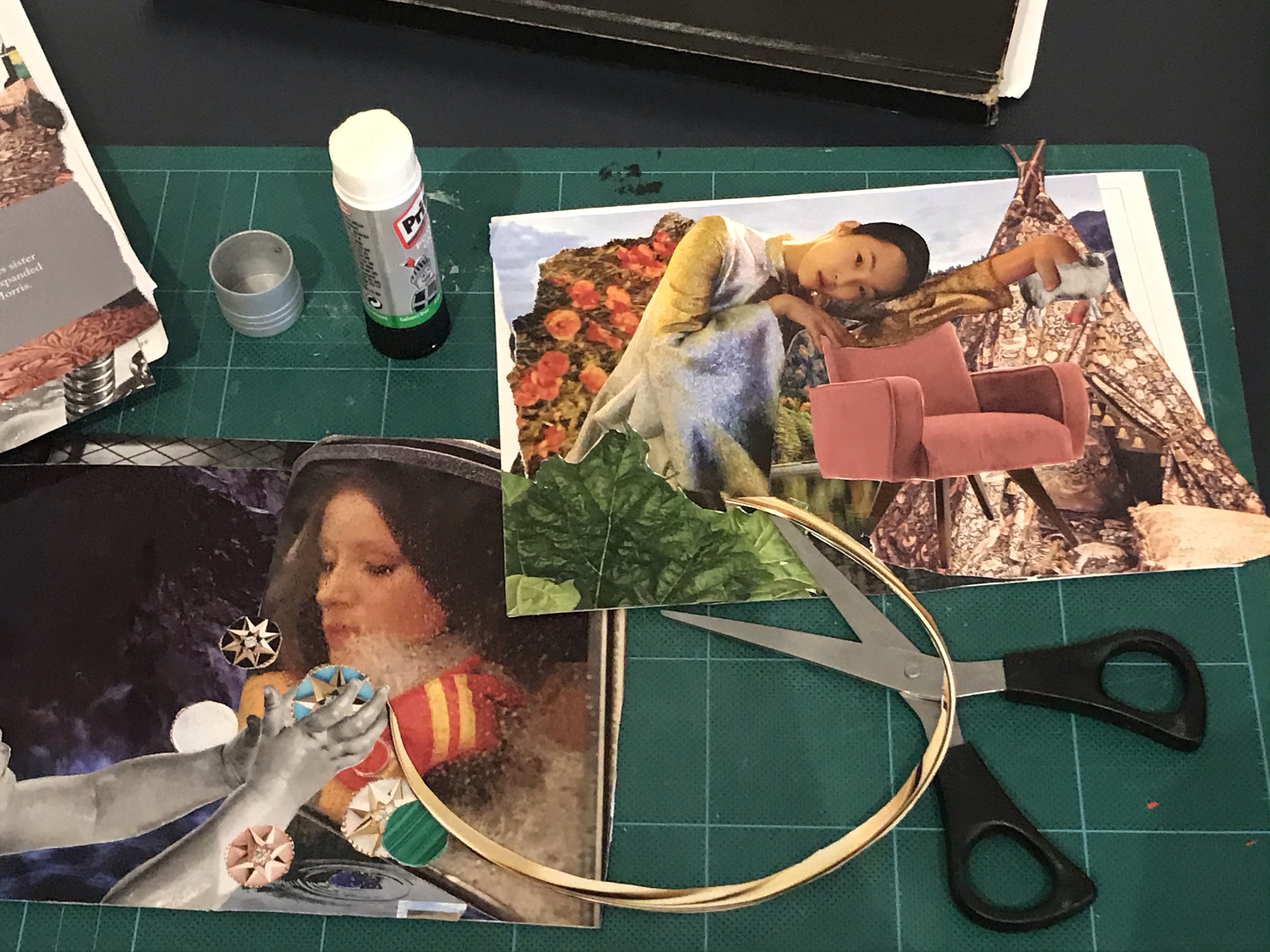
For this exercise I began by researching illustrators that use different mediums. I created folders on my computer for each medium. These were watercolour, digital, collage, ink, pencil and oil paint.
The artists that I researched were the following;
Claire Rollet, Dieter Braun, Tom Bonson, Will Terry, Annie Davidson, Chris Riddell, Chrissie Lau, Jake Parker, Jan Pienkowski, Quentin Blake, Christopher R.W. Nevinson, Kadir Nelson, Raymond Briggs, Richard Johnson, Agnes Ernoult, Beatrix Potter, Carter Goodrich, George Butler, Hannah Davies, Lee White, Lev Kaplan, Peter De Seve, and TS Spookytooth.
To research, I found a good aray of illustrators in Understanding Illustration, (Brazell and Davies, 2014), such as Richard Johnson, who is a reportage artist and travels with the military. His style is very particular and very detailed. He always tends to draw with a Prisma colour blue, indigo pencil and draws his subjects live or within a couple of hours of taking a photo, if that is not possible. He believes this helps him to capture the feeling and a moment in his drawings. He says, however, that he does not distort his images and draws only what he sees.
I browsed agent websites such as, ‘IllustrationX’ (Accessed, 10/10/2020). I found a search option to pick a medium and therefore was able to narrow my search down and find artists of interest, that used specific mediums. I used this to find more watercolour artists as I had collected a few, but none that I was particularly wanting to use for my illustration. The artists I made folders for, I chose because I liked their style or technique. I find Lev Kaplan’s work very striking. He creates images that are very dynamic and that have strong compositions. He tends to use a limited colour palette most of the time, and his subject matter tends to be historical. I do find, however, that his images also look slightly dated as opposed to modern twists on historical subjects. So although these are very beautiful images and extremely well executed technically, I did not select him as my final artist. I feel that my work sometimes can be too stiff and regimented and lacks flow and freedom of marks. Therefore, I was looking for artists that I could use as inspiration that would help me develop a style and move away from this. I catalogued each of the artists in folders with written information on their work and examples of their work, so that I can refer back to these in the future. I categorized them by medium.
I found so many amazing artists that I am feeling very inspired by each of them and eager to explore some of their techniques. I am a big fan of:
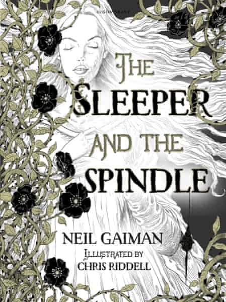
Chris Riddell
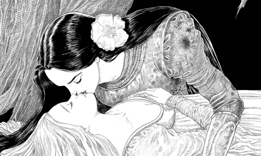
Fig 1.The Sleeper and the Spindle Book Cover (2014)
Fig2. The Sleeper and The Spindle Artwork (2014)-
Fig 3. The Sleeper and the Spindle Text (2014).
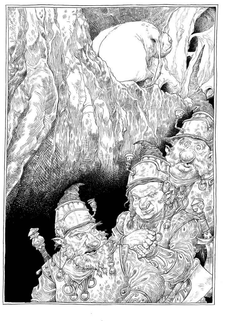
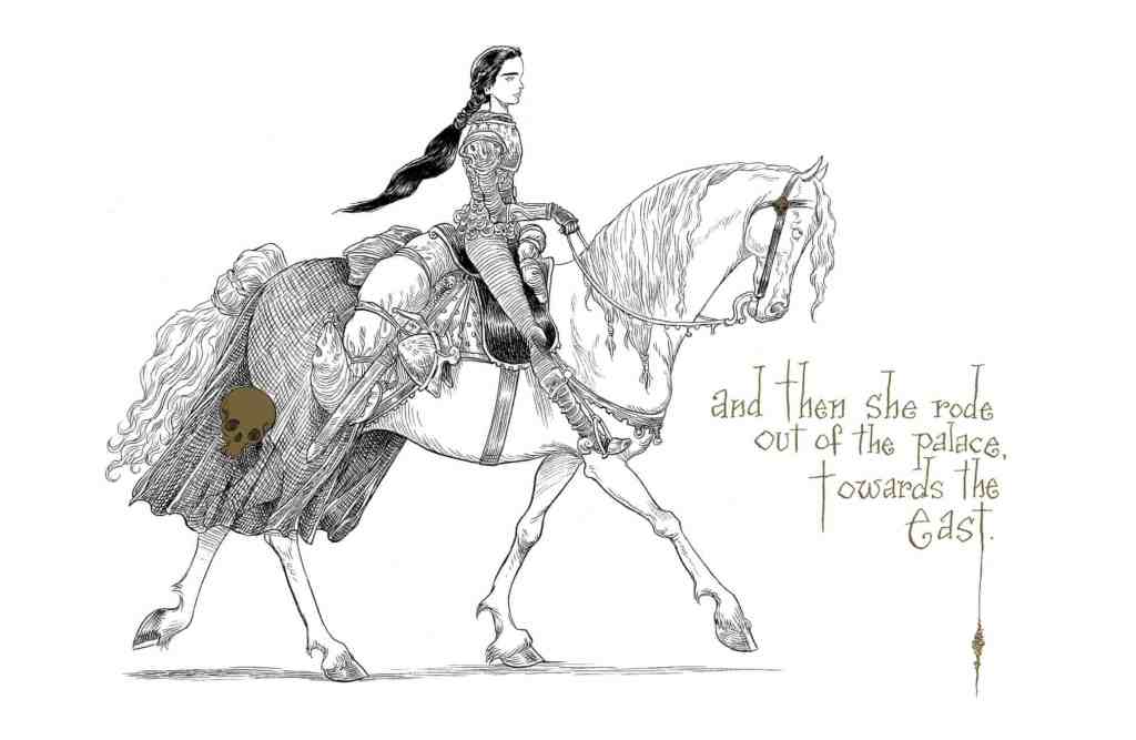
Fig 4. The Sleeper and the Spindle Artwork (2014)
Fig 5. The Sleeper and the Spindle Artwork (2014)
Fig 6. The Sleeper and the Spindle Artwork (2014).
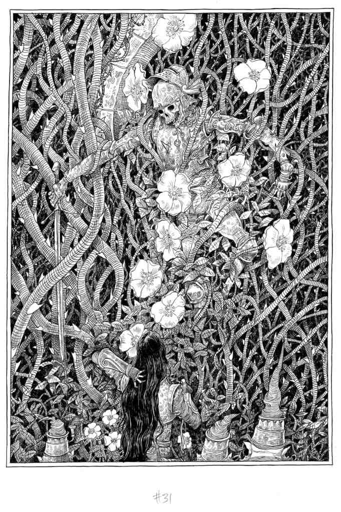
Fig 7. The Sleeper and the Spindle Artwork (2014)
Fig. 8 The Sleeper and the Spindle Artwork (2014).
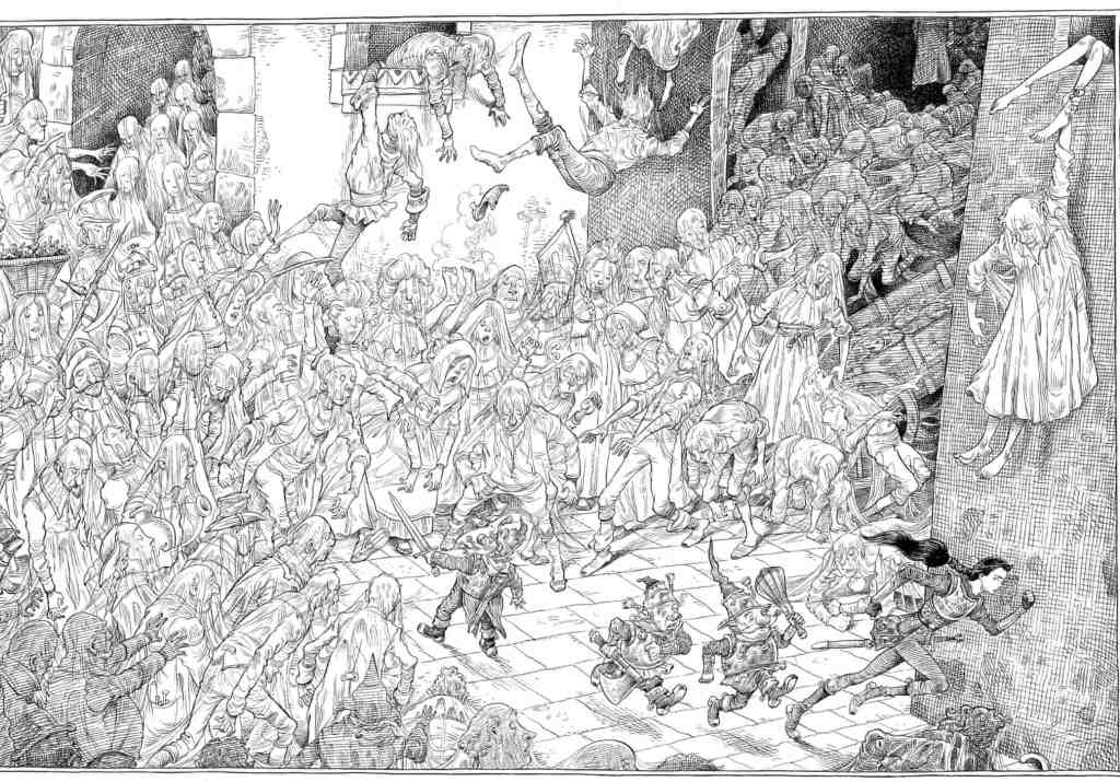
Riddell draws in pencil, inks over the lines with a brush and then adds colour, often blue and yellow, last Rustin, S. (2014) “I’m not a painter by any stretch of the imagination; I’m a dyed-in-the-wool traditional illustrator, and I begin with black and white. If I need colour, I add it over the top. There’s a calligraphic element to it … it’s about the texture of lines on the page.” The hectic schedule for The Pied Piper persuaded him to try a pastel pencil; occasionally he uses an art pen for very fine lines, “though I don’t like using them, because they’ve got a mechanical-looking line; the lovely thing about a paintbrush is its fluidity, it gives a lyrical quality”. The Guardian 19/12/2014. At: https://www.theguardian.com/books/2014/dec/19/chris-riddell-illustrator-neil-gaiman-jk-rowling-russell-brand-books-interview (Accessed 11/09/2020). I really love his graphic style and limited use of colour. He also tends to distort certain elements of his drawings as seen in Fig 7. with the cow that has been drawn with bulky muscles and bowed legs to show that the cow has been worked a lot and is now at the end of its use perhaps and is miserable and fed up. His limited use of colour is also used just where needed to make things stang out or elements to sink back as he has done so in Fig 7. to add depth to the image by placing black towards the back of the image.
Once I had done my research, I chose my artists. I selected two of my previous visuals to work on. The artists I chose were Claire Rollett and TS Spookytooth.
I had started my research with very traditional artists and as my search continued a came across Claire Rollett. Her work stood out from the other artists as it was something quite different that she does. She works with collage by using a photograph of a character and then drawing the background as a line drawing in ink. She uses a loose, sketchy, medium weight line style. From analysing the work I can see that she then adds colour digitally. This results in some really striking images. Sometimes these have colour. Sometimes they are just black and white, however the colour she does use is just in strategic places and never on the whole image, which really helps draw your eye to the characters. After recently doing a collage workshop with the OCA. I am keen to investigate this area further and was another reason for selecting this artist. Roulette seems to place her characters off to one side of her composition, which seems to add interest and create more dynamic images. As seen in Fig 8. She does tend to enlarge her characters slightly in the frame, perhaps to put them into focus and have them as the focal point which would work very well, particularly as these images are intended as part an editorial clothing/style story.
Fig 1. Couple Hotel Reception
Fig 2. Ferris Wheel
Fig 3. Johnny Rocket Jewellery Shop
Fig 4. Lady Bicycle
Fig. 5 Modern City
Figure 6. Portobello Road
Fig 7. Telephone Box
Figure 8. Walking Couple
Work by Claire Rollett.
TS Spookytooth’s style is completely different to Clare Rollett. He is an acrylic artist and creates illustrations for children. His colour palette is very rich and striking and I am in awe of his ability to create striking images that incorporate a lot of texture and contrast. He is also quite unusual and intriguing as I read that no one has ever met him in the flesh. He is also using a pseudo-name. Therefore, he is working as an illustrator with an air of mystery. For this reason however, I could not find any interviews or information on his work other than from his agents page. He is the artist I chose to start with as I really admire his work. He uses a lot of texture in his paintings and shading to create dynamic images that take your eye straight to a focal point in the image. His work is all cartoonish in style and not at all realistic. He distorts his figures quite a lot by using round, large heads and smaller bodies, He also tends to use dots for the eyes and adds very little in the way of realism to the face of his characters. In some of his paintings he does not use shading on the characters and will use block colours, such as their hair and clothing. However, this is not consistent across all of his work.
Fig 9. Dinosaur
Fig 10. Skeleton dog
Fig 11. Beach
Fig 12. Teeth
Fig 13. Moon
Fig 14. Sea
Fig 15. Girl
Fig 16. Crocadile
Fig 17. Statue of liberty
Fig 18. A king
Illustration work by TS Spookytooth
I decided to make a start by doing some tests and experiments in my watercolour sketchbook which I started a while back on the advice of my tutor. I decided to experiment with different techniques to work out how TS Spookytooth created the skies in his illustrations.
My Watercolour experiments.
I then went on to do further tests in watercolour and acrylic paint and ink to see if I could replicate the effects of Spookytooth’s work. I found the tests I did on watercolour paper were much more effective than those done directly in my sketchbook and none of those done in my sketchbook came out well.
Markmaking experiments.A previous watercolour painting I had done this year for my Lisbon group project. I used this as reference when painting as the colours were vibrant and I liked the effects I had achieved with the tree and sky and wanted to try to replicate that, as it was also similar to Spookytooths in subtle ways.
My chosen visuals – (previous work from my course).
I chose to do 2 pieces as I wanted to really see how the artists work would be different with different subject matter.
My first, failed attempts.2nd attempt, this time with watercolour.
I decided to try watercolour as i knew it would be easier to get the type of effects I wanted. However the colours were too weak and the tree blended too well with the background. I do quite like the sky and grass otherwise. But I do not see any of my chosen artists’ styles in it.
Final piece
For my final piece (above) I used acrylic ink and then a brush pen to line in places. I did really struggle to strike a resemblance to Spookytooths work. I tried to use the colour palette from Fig 18. in both of my images to see how they translate. With my first attempt I tried to use the colour palette from Fig 10. however, this did not make sense with my visuals because of the activities of the characters. I feel that I have captured an essence of my chosen artist. I worked simultaneously on my two paintings, working on one part whilst the other was drying. Because of this, I made discoveries along the way and the two are quite different. Also working with more detail and on a smaller scale, such as in my painting below, made the techniques that much a harder to achieve the same results with. I am happier with my painting of the Girl under the tree than I am with the boy on his tricycle.
Once I had completed my first set of paintings I started on my next chosen artist which was Claire Rollett. I love her work as it is very different to what I would usually produce and very different from Spookytooth. I took the same two visuals as before and created artwork using the methods Rollett uses.
Work in progress.
I had already uploaded my visual to my computer as a JPEG, therefore I just needed to remove the background and tidy it up. I then added layers to add colour and I used a stock image which was the closest to what my original drawing was.I could not find anything of a girl in the right pose, as initially I was going to try mesh two photos together to include the fox. In the end, I settled for the photo of the girl and her dog sleeping, which fit quite well into the style of Rollett as she tends to do editorial work and my visual was not editorial in style or design.
My final Image
For my final image i traced over the dog in photoshop so that it was similar to the way Rollett had composed her illustration as in Fig 1. I was quite happy with this work. It is not as polished as Rollet’s work and my access to images were limited, however, it was a quick process and satisfying to work on. I think with more details/props in this scene, this would make a better image and I think the style worked much better with my second visual (below) as there was more going on in the scene. Which interesting was the opposite problem I had with Spookytooth’s style. Too much detail hindered the paintings with recreating his style.
Work in progress.My final Image.
I really liked this image, I think the level of detail works well to create an interesting scene. I could not find an image of a boy on a tricycle from the right angle to fit into my drawing, therefore I opted for this girl on a bike, which was a stock image. On reflection, I think that in order to make the image more interesting and give it more of a story I could add something like a snail to an object to the floor as it looks like the little girl could be looking at something and has stopped in her tracks. This would also make it more like Rollett’s work as she is telling a story with her images.I decided to add this in and am really happy that I did (see below), as it definetely does add a bit of interest and a story element.
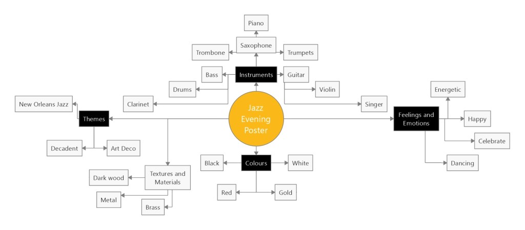
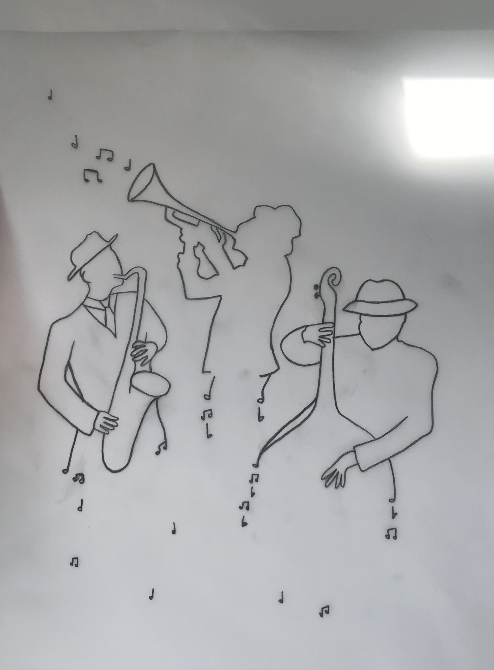
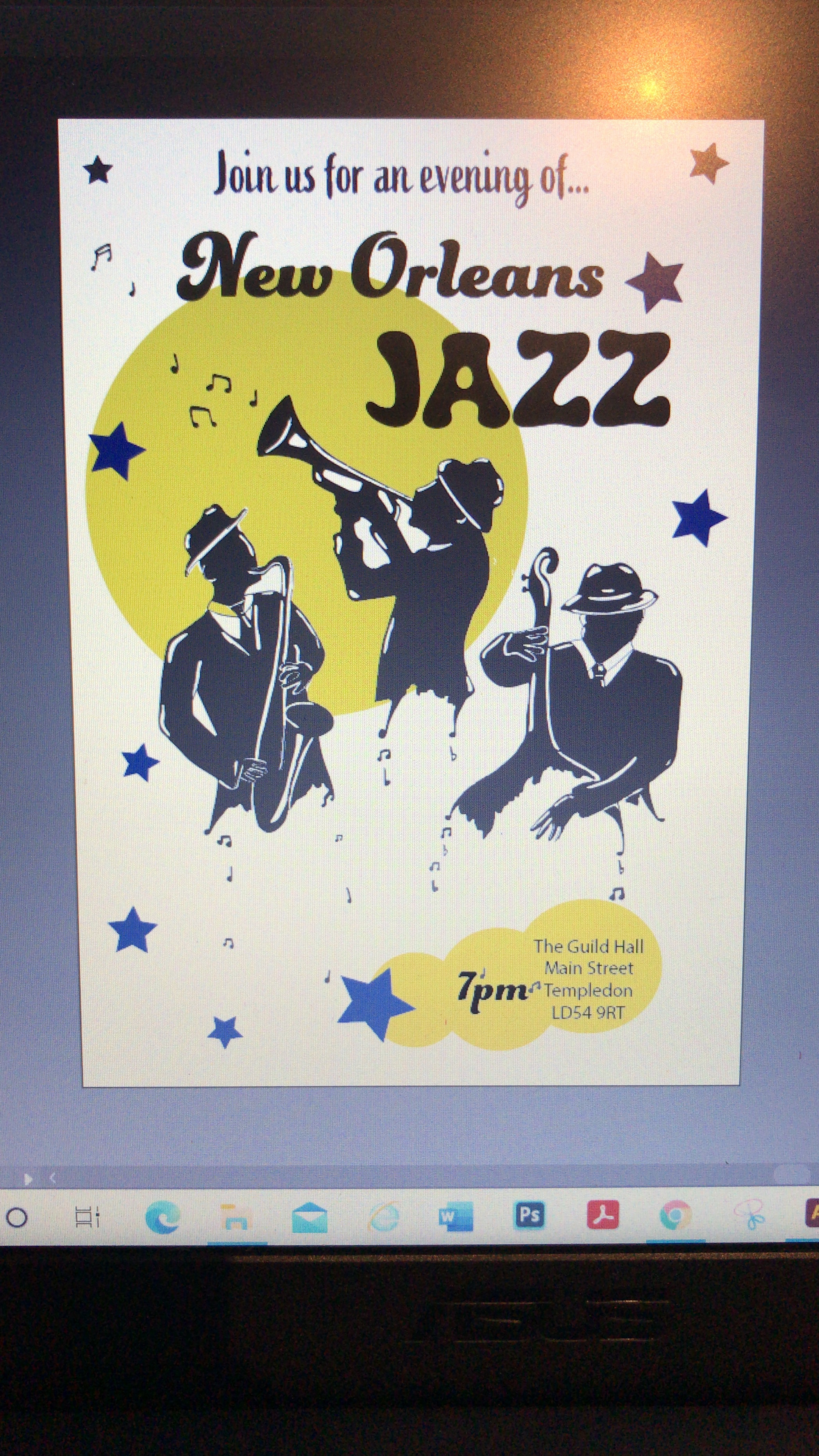
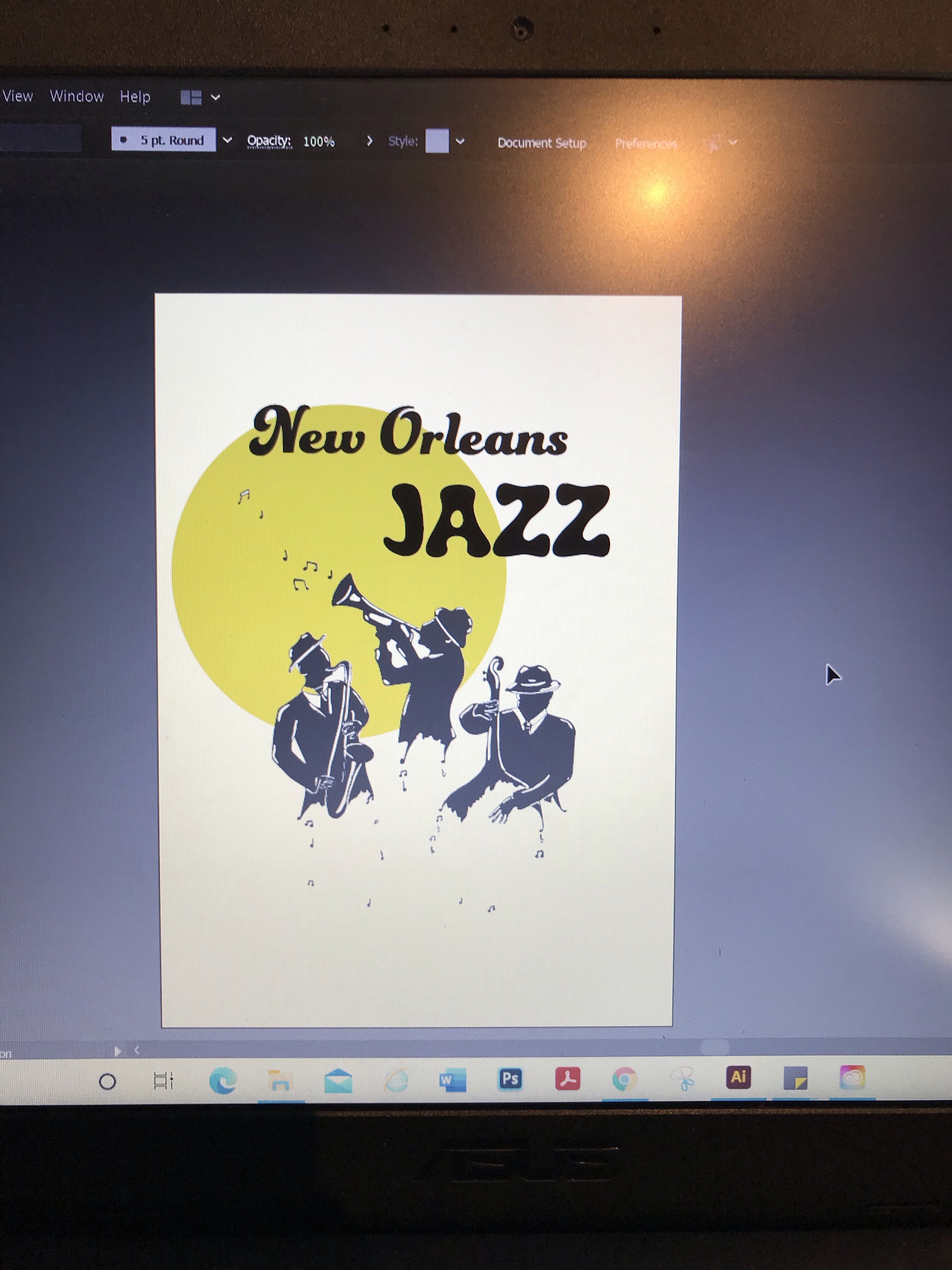
For my third assignment I chose the title ‘Jazz Evening’ for my poster. I started by doing a mind map of the things that I associate with jazz, which helped to give me a basis to start to trigger ideas. I really love the idea of going to new New Orleans and experiencing the culture there; of which music is a big part of. I decided to use New Orleans jazz as my concept and started to collect reference images. One of the first images I came across was a black-and-white image (as below), which had ink drip marks coming from the characters. I was inspired to try my own version of this and see where I could take it.
My moodboard
I collected images for my moodboard and realised that I really liked a simple colour palette. I wanted to have my poster combine old jazz vibes, but have the poster modern and crisp looking. For this reason I decided I would use modern text to make sure that my poster did not look dated. I collected images to use to for the poses of my characters from Adobe stock images. Quite a few of the ones I had found on my Google search were also on there.
Thumbnails
I started working on some thumbnails to develop my ideas. I was drawn to the thumbnails that included a group of individuals the most and selected my two favourites to try out as visuals.
Visual 1
Visual 2
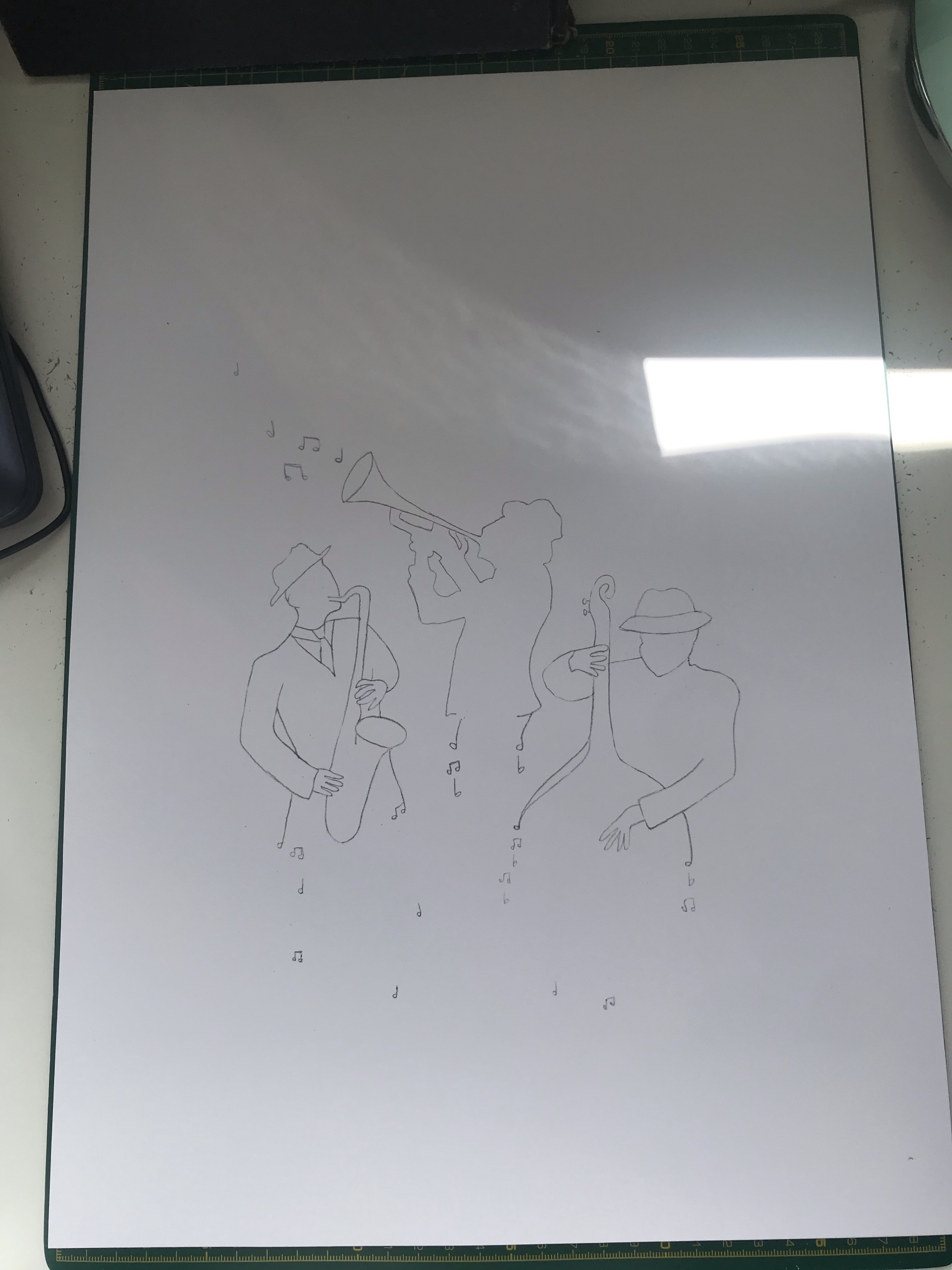
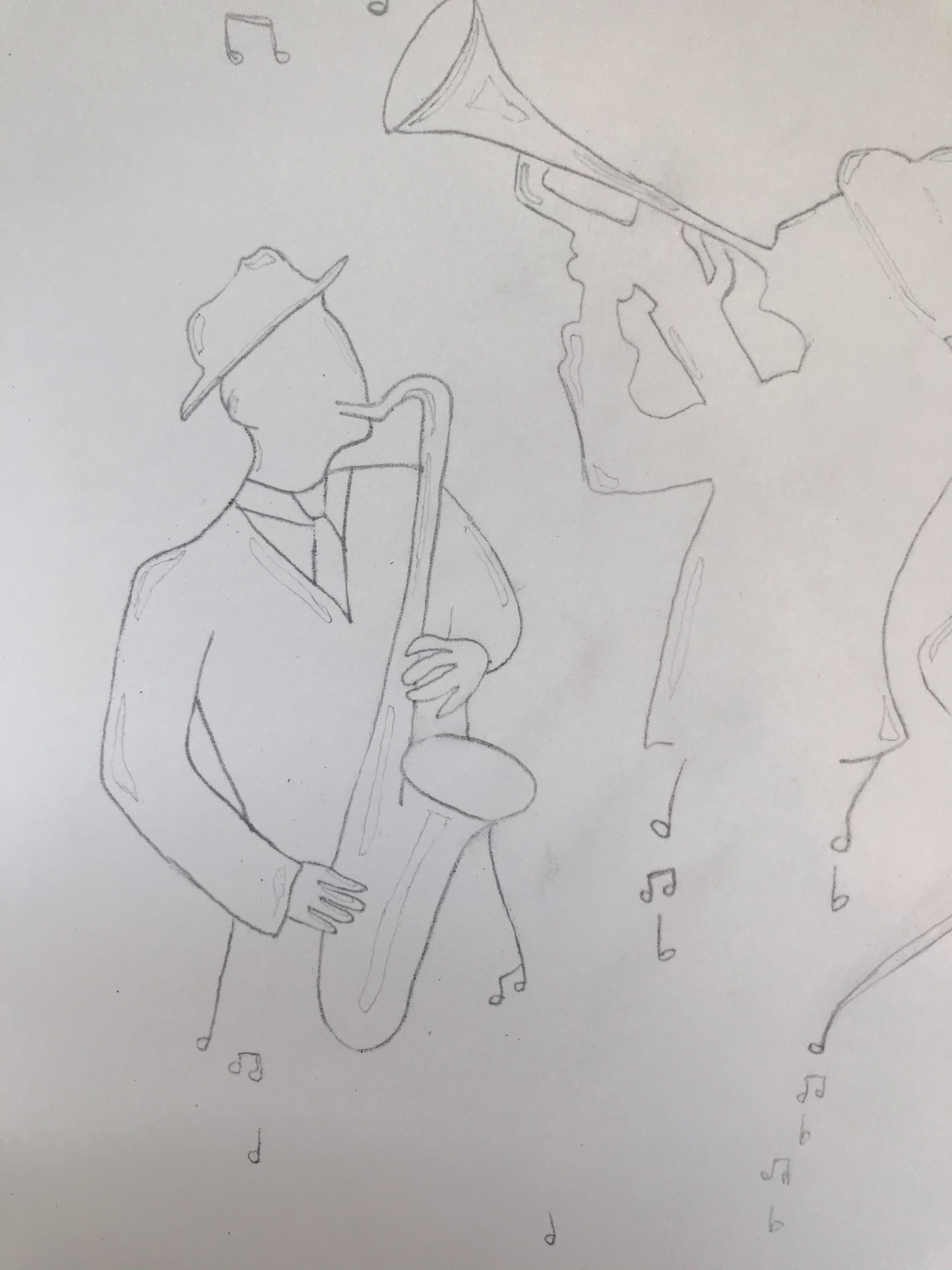
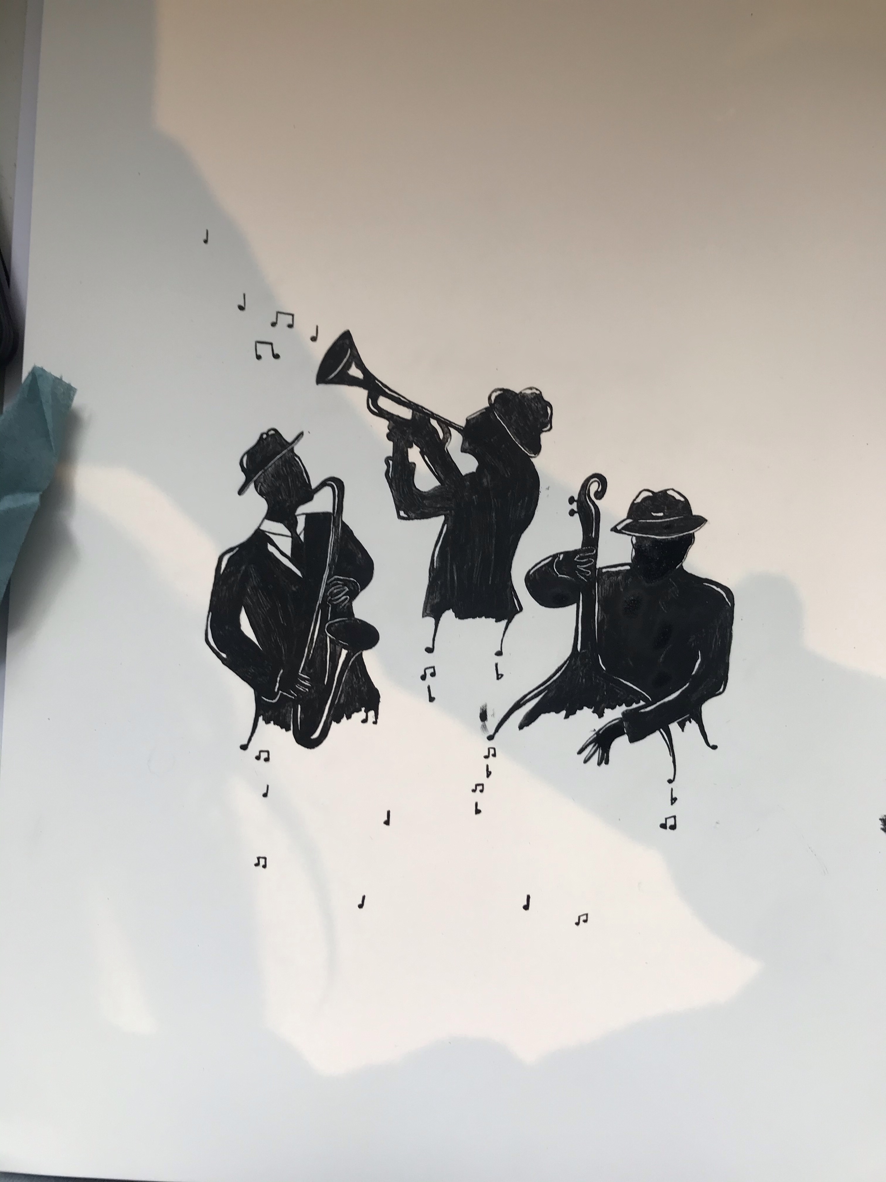
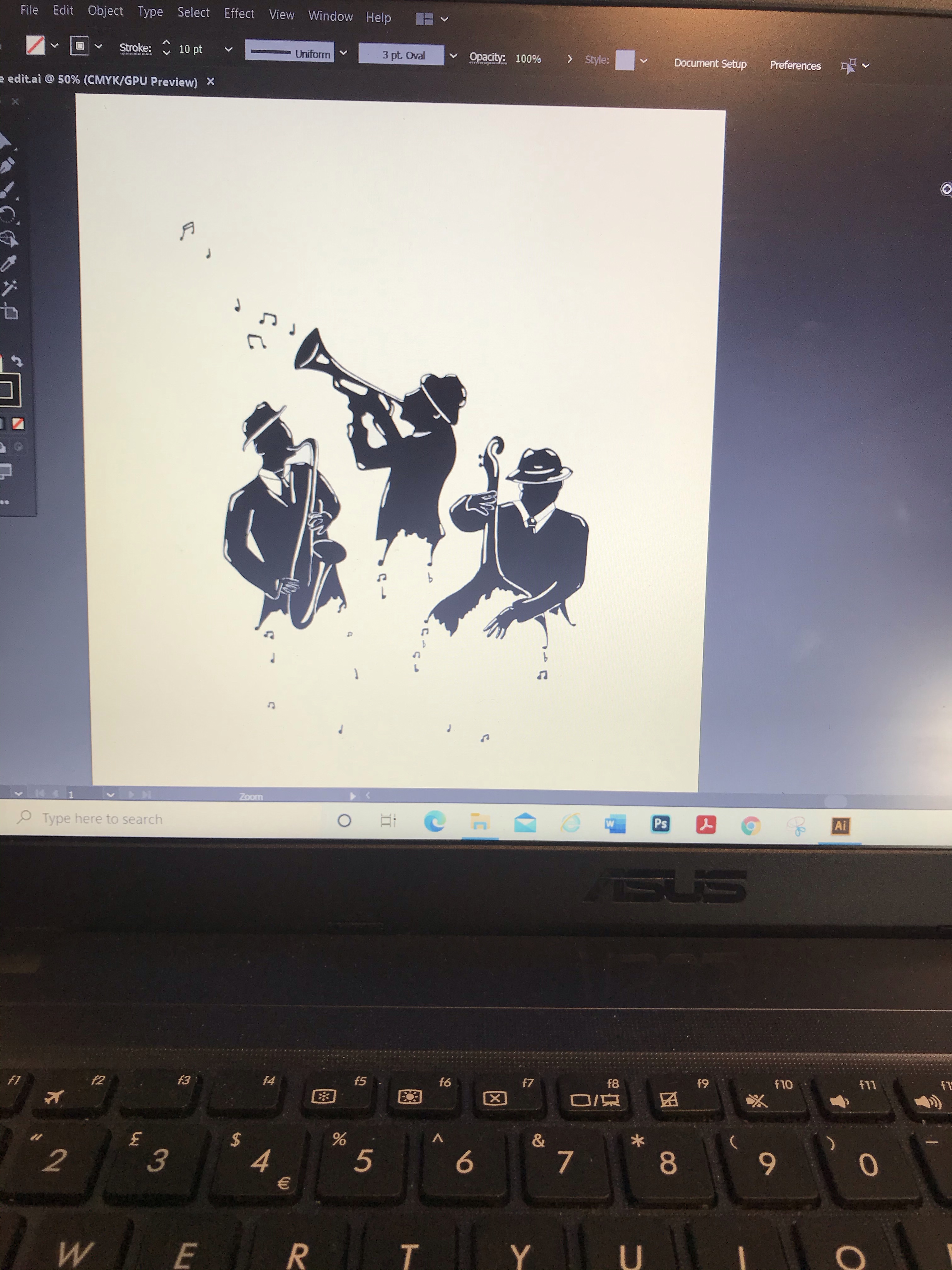
Though I liked the idea of having a pianist in my drawing for visual no.1, I did not feel that this would work for a poster and that the drawing had too much detail and too much going on. However, I really liked visual no.2. The design is more simplistic and stylised. I had done my visuals on A3 paper so was able to do a tracing of my chosen visual and used this to place my image onto fresh paper. I ended up doing three attempts of my final artwork. Originally I was trying to do this in India ink with dip pens on Bristol board, but the paper surface was disturbed when inking. Therefore, it was not working and I did not like the texture. On my second I switched to cotton watercolour paper to see if that worked any better. However, I was still not happy with the results. I ended up using acrylic ink on watercolour paper, using dip pens for smaller details and a paintbrush for the rest. I did ink the outline first in a technical ink pen. Before I got to my third attempt I kept making mistakes and this led me to think about my technique and process and rethink how I was working. I ended up going back and sketching in all of the areas that I needed to leave white so that I was not making decisions as I went and I had a clear guide of where to colour, and when not to. This lead me to think about the black and white exercise I had done previously and how much that also needed planning. I also worked from the left side of the page down and then across to the right so that I did not smudge my work. These were such simple things that I could have done from the beginning, but I guess not having done any illustrations like this before. I was not aware of these rookie mistakes. I have definitely learnt some good lessons from this assignment that have led to a more structured approach and forward planning.
Work in progress
My Final Illustration
I am really happy with my final illustration. Although there are a few things that I would possibly tweak now looking back and did try to tweak once I had put them in photoshop. However, I did not want to spend any more time on the ink drawing as it was a very tricky process and I was going to be putting it into Adobe Illustrator anyway where I could edit it further if need be.
Screenshot from working in Illustrator.
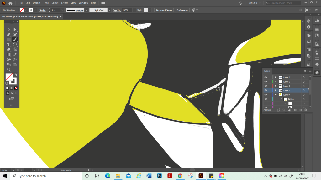
Once on Illustrator. I cleaned up the image as it did not scan very well and I pretty much had to redraw over the top of the whole thing to put some of the details and edges back in and recolour it as I went. At this point, I realise that although I had a strong plan and idea for my main illustration I did not actually have a plan as to how the poster would look as a final piece nor had I included these in my thumbnails. Partly this was due to my limited software knowledge and I wanted to just have a play with Illustrator to see what the possibilities were for me and to go from there. However, as I become more skilled with software programs, I know that this is something I will be able to plan more thoroughly at the beginning. I played around with different shapes such as stars. However, I felt that this made the image too busy and detracted from my illustration which I wanted to be the focus, and to make sure that the notes that are part of the image were clear and visible. Therefore, I decided to keep the poster more simple. Once I had found my final composition, I zoomed in again and did my final edit. Such as cleaning up the black-and-white sections and correcting where the background had come through on my illustration.
My Final Poster
In Summary
I am really proud of what I achieved with this assignment. A poster is not something I have done before. I also managed to master the basics of Adobe Illustrator, which I’ve been trying to learn. I did this by using short tutorials to learn different techniques and just played around with the different elements and fonts from the online library. I was unsure at first if my poster was too plain, or if a white background was the right way to go, but I had tried using different colour backgrounds also, and it did not look good.
Through doing this assignment, I feel it has given me more confidence. Although illustration part three has given me very valuable skills to carry on with, it did not lead me to produce any work that I was particularly proud of. It was also quite challenging for me as a lot of the exercises were more commercial types of artwork which I did not quite have all the skills to pull off successful illustrations in the style needed. I’m still working on developing a style and recognise that this is still early days. Sometimes this makes me feel a bit lost when it comes to some exercises as I have not developed my ways of ‘working’ yet. I am looking forward to moving on now to part four and continuing to develop my skills. Part three has made me feel more prepared for what is to come and that I am starting to develop processes and a way of working. Therefore, I am excited to see what is next.
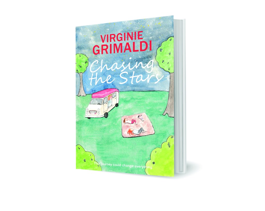
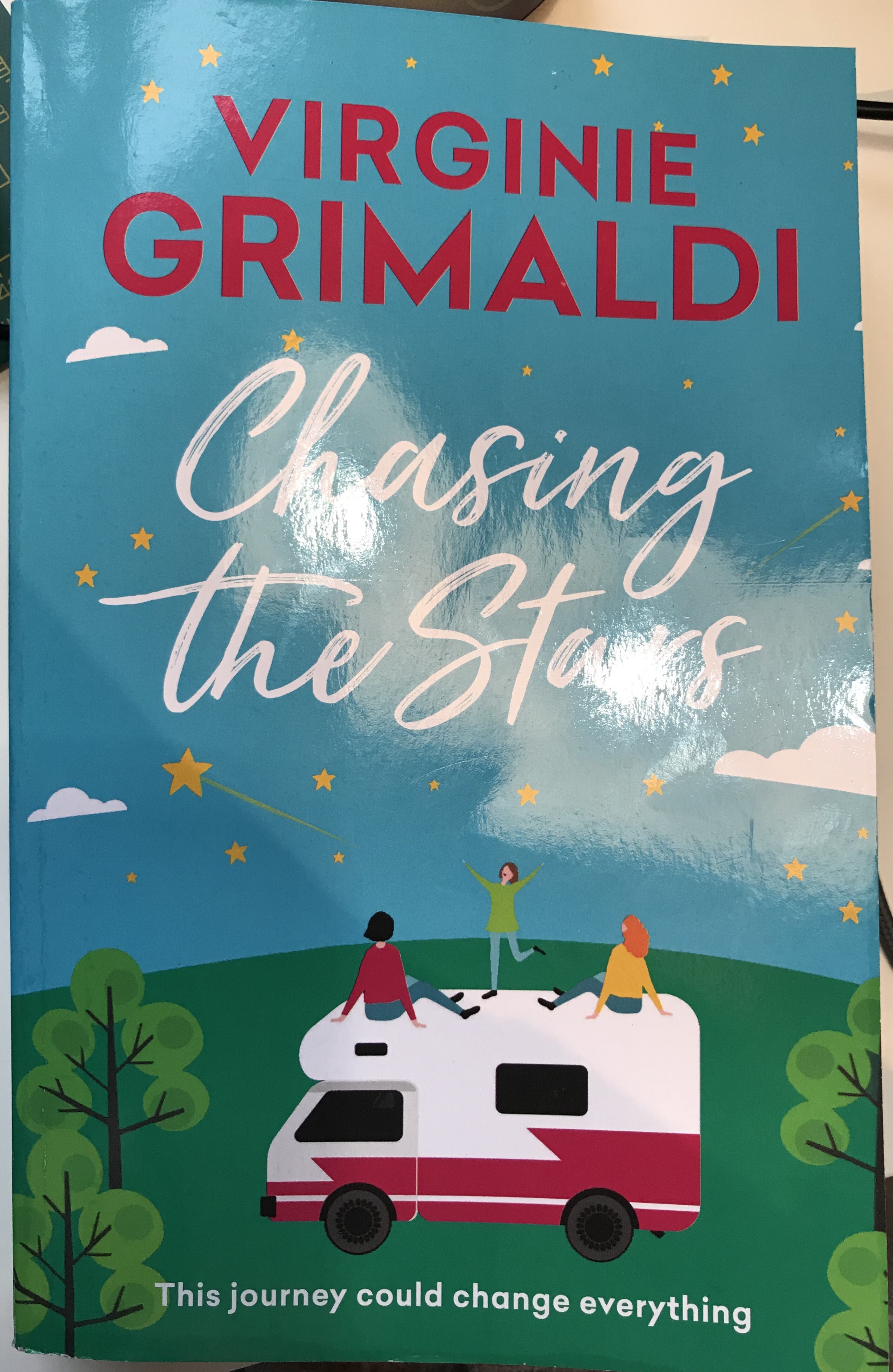
For this exercise I chose a book that I have just finished reading. From reading the book and the back cover. The title of the book does not necessarily reflect the book’s content in a literal way, as what the characters are actually chasing is the Northern lights, as opposed to stars. This is a story of a mum and her two daughters who take a campervan and go travelling in Europe. Because of the title. I felt like stars needed to be incorporated into the cover of the book. However, from the storyline I would have chosen to draw one of the scenes and places travelled in the story, or else the Northern lights had this had not been the case. I imagine that the stars, the characters and the campervan were the brief for the book cover. As well as the age and hair colour of the characters.
Ideas
My final design
I decided to draw my version of the cover based on the characters in the book and the way that I had imagined them as I had read it. Although I was not happy on a technical level with my drawing, once I had placed the text and created the mock-up. I did feel that it made a convincing book cover. I decided to create my mock-up in Adobe Photoshop and used a mockup template from Adobe Stock images. I am not sure how to add the cover so that it works correctly as a mock-up, but did the best I could and positioned it so that it did the job well enough. I decided not to print it as a mock up as my printer would not be capable of making it look realistic enough.
I used darker colours on the cover to show that it was night-time. I had originally planned to paint a soft light from the van over the characters. However, due to redrawing the van, due to a technical issue with the prospective, it did not end up being in the right position for this. However, now that the image is completed. I do wish that I had re-drawn the van in the original position I wanted, as the way the characters were positioned was more interesting and generally worked better overall. I feel like in my final image, the scene is a bit fragmented and there is too much distance and not enough interaction with the characters and the environment.
My finished book cover
I am quite happy with the outcome of this exercise, as part of the obstacle was to just have this completed and to have made something out of my illustration. Quite often I will critique my work as a simple image, however, now that I have had the experience of using my image for a purpose, I feel slightly less critical. When I critique other artists work. I am not as harsh as I am with myself and although I do not feel that my work is not where I want it to be yet technically, I can see that it is also not as bad as I think or at the very least, it can work.
For this exercise I looked at a range of books that I had most of which were adult book covers. Then I found a Roald Dahl book that I bought that has three of his stories and it. From this I chose my favourite Roald Dahl tale, which is the twits. This is a childhood favourite of mine and made this a very fun exercise to do.
I did a line drawing on A3 paper at 2.5 times the size of the original. Quentin Blake’s style is very simple. Therefore, it made this task easy. After I traced the image I’d made and redrew it on a new sheet of paper, adding back in only the most important lines in an attempt to simplify it even more so.
I love Quentin Blake’s style and from doing this line drawing, I see that his line-style combined with his beautiful watercolour work is what gives his work, its individual style and makes it stand out from his competitors work.
I then moved on to an illustration of the front cover of ‘Life of Pi’ by Yann Martel. This image was a little more complicated than the last. Due to the many number of characters in illustration. I did this in A3 in pencil at 2.5 times the original size and then inked over the top.
Pencil sketch
Final Image
This image ended up being a very simplified version of the cover. However, I wonder on reflection, if I should have added more details as it would have helped the image be clearer. Such as by adding the trails from the water to show that the fish were in fact swimming in the sea. My image is very one-dimensional and I think with this particular image. The colour is important to make this work, so that the sea animals are muted and the boat with the main characters are the focus of the image.
When reflecting the first image of Quentine Blake’s, I think that apart from the line work needing to be more interesting. The image works as a visual and shows what needs to be shown.
I have read most of the Dark Tower series. The story line could have presented with many different options for cover of this book. However ‘the dark tower’ is a focus point for the story, being a destination that the main characters are trying to reach. Each cover is the same image, but a different Hue. I think that the brief would have been to capture an otherworldly feel and the moody skies that are described in the book. I think this image effectively creates a sense of mystery about the tower, which is a good reflection of the storyline.
I found it difficult to find adult books with illustrations and found that most are photographs instead. I believe this illustration is trying to show a woman that is free, confident, happy and at her best. The book is a woman’s story interlaced with facts and figures and discusses biases and stigmas attached to women that are not in a relationship. I think that the illustration fits the purpose and gives the viewer a sense of freedom and calm from the image. Unless you are scared of diving like me, then it could also represent something risky and scary and be reflecting that side of being single.
I have not read this book, but was really attracted to its cover. The almost collage feel to the line drawings or perhaps Lino cut illustration is very striking and the limited colour palette is very clever. There is so much going on that you can spend quite some time looking at the image. I wondered what this image has to do with the title and now feel compelled to read it to find out what the salt path is. From reading the blurb I wonder if the cover is perhaps trying to represent freedom and a beautiful sight, but at the same time reflecting turmoil with the busy line work and almost overwhelmingly busy illustration. I assume that this scene is one of a place that is visited during the character’s journey.
For this exercise I chose ‘workshop’. It was, not the most exciting theme from the selection. However, as I was staying at a friend’s house at the time I had very limited resources to create a collection of objects. I did have a desk that I was working at with my art equipment, which is why I chose this theme.
A selection of my shots with a digital camera
I tried to be unusual with the positioning of the camera in order to make the scene more interesting. I found that I quite liked the shots where the camera was lower and gave more of an interesting perspective of the objects. I did some sketches from my photos by cropping them into different frames.
My thumbnails
My final image
I chose the above as my final composition and frame and drew it in my A4 sketchbook. I tried to keep the lines clean and added a little shading to emphasise shapes. I felt that this frame was the most successful as it showed a range of objects where as some of the others, although more interesting, it was harder to see what the scene was meant to be. I felt that this one clearly showed that it was a ‘workshop’ or working desk.
I found this exercise valuable to teach me to find and experiment with new perspectives rather than settling for the first one I think of and to use this technique to find another more suitable one. I will bear this in mind as I go forward with my course to try to think more about the best perspective and layout for my illustrations.
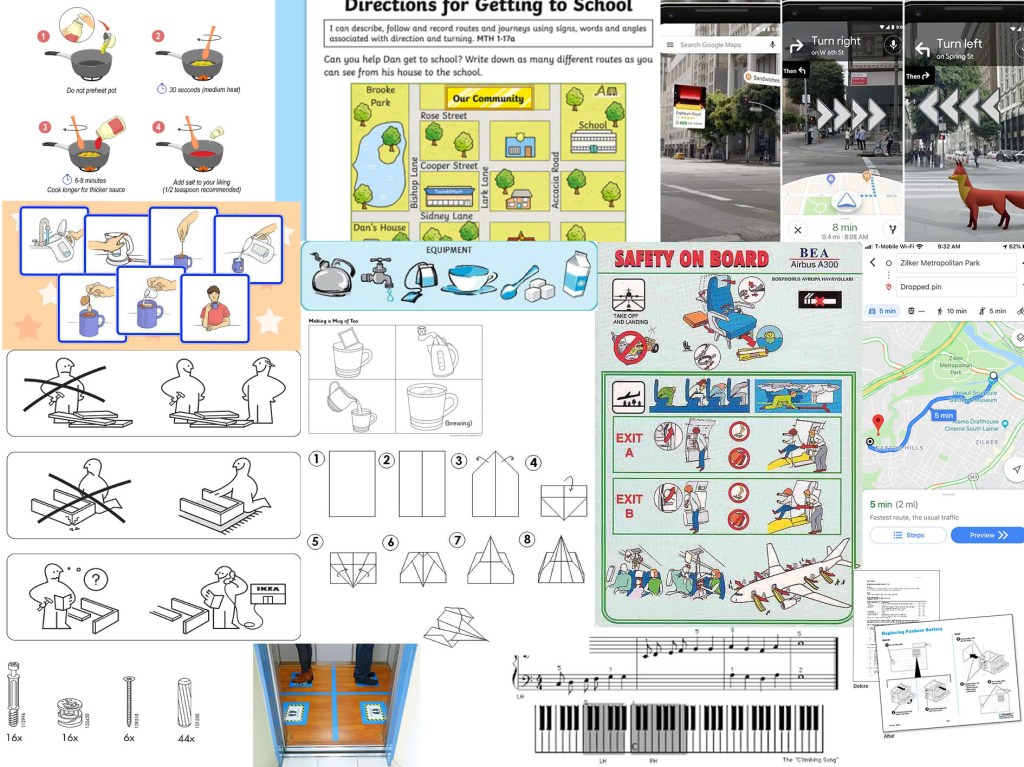
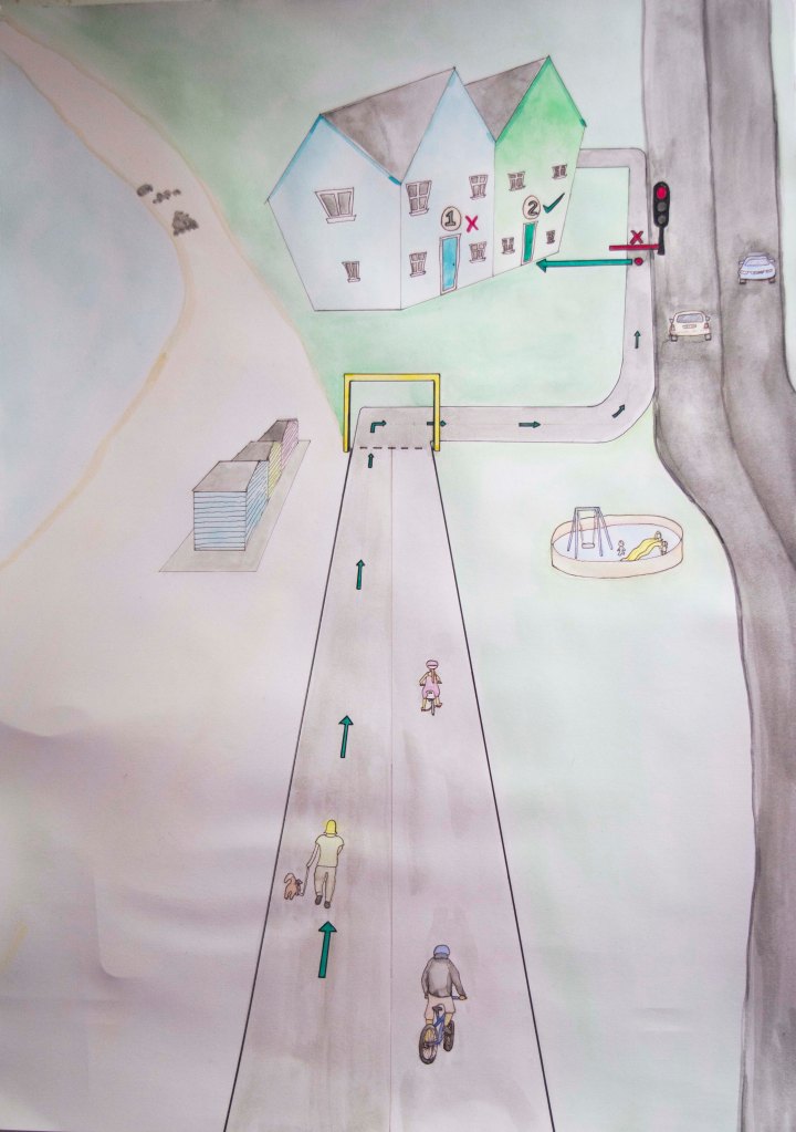
For this exercise I started by collecting reference material of a range examples of instructions. The thing I noticed most about these are that they tend to be in block colours or line drawings and tend to be clear and have images on a plain or solid colour background.
Collection of examples and reference materials
I chose ‘getting to my house’ as I liked the idea of doing something more personable to me. I started by doing loose sketches and seeing what bits I could cut out and identifying which were the important features or landmarks to be left in.
The design, I decided to go with was the more simplified version leaving in key landmarks that would be easily identifiable and therefore help direct the user.
I worked on an A3 format, which gave me just enough room to be able to draw the characters with enough detail. Once I had completed my initial painting, I decided that I wanted the colours to be bolder and more solid. I was trying to do a pastel colour palette. However, it did not work as intended, most likely due to the use of watercolour. I did want to achieve a hand drawn/hand-painted look. Once I started to re-colour in Photoshop, although I really like the colours I realised that I was not going to be able to achieve what I wanted that way either and decided not to proceed. I therefore have stuck with my initial hand-painted illustration. I think I could have improved this if I knew how to use a software such as illustrator, as then I could have kept the hand drawn feel, but change the colours. I also would have needed to have just a black and white outline drawing in order to digitally colour, this effectively as then the trace tool would have worked on Illustrator. However, as I hadn’t planned it this way from the beginning it was not going to work.
Final Painting
A as well as using a pastoral colour palette, I decided to use a traffic light system as a means of directing the map user. Green for the correct path and read for the incorrect path or stop points. I tried to make these brighter so that they stood out and made sure that everything else was more subtle. I showed this to a few of my close family members and asked them if they knew what it was. Each of them said that it was a map to our house, but recognised that I had removed many elements, which I had done to simplify the image so that it was not too busy and distracting.
I found this to be a useful exercise and with that I have recognised some limitations that I have. I also am starting to realise that I do not like to do commercial illustrations such as these, and that they do not fit my style or current skill set. However, I do hope to expand my skills so that I can find a task like this much more simple in future. In order to do this I need to set aside dedicated study time just for learning new programs and features that are not in conjunction with the assignment or exercise. At the moment I am struggling to schedule this in with working full-time and also trying to complete this module in such a short time frame. Once I have caught up. I intend on doing classes to improve my knowledge of digital art techniques.