For this exercise I was asked to draw an item from the following list: Shoe, Umbrella, Pair of trousers, Pair of glasses, Hat.
Take an item from the list provided, and explore it visually to become aware of its textures, physical qualities and function. What is item for – what does it do?
Using a pencil or fine liner do an objective drawing of your subject and an A4 sheet. You are trying to achieve a drawing that has a high degree of visual accuracy and is technically controlled. Be analytical and use drawing to clearly convey this visual information.
You are trying to record what you see in this drawing, so be aware of the relative scale of different elements of your object and position of component parts. Use marks that describe the texture of the object and vary line quality to suggest its contours. You may find that if you place your item on white surface. You can observe it more easily. Colour is reflected by white and you will be less distracted by background contrasts.
The Shoe I chose
I chose this vintage shoe that I have as i really like this the design of this shoe and the different textures it has, with the suede, the textured leather and the smooth leather of the shoe.
My drawing
I am very happy with my final drawing, though I do see a slight error with the positioning of the shoe and I think this was because I was too close to it when I was drawing and seem to have changed my view half way through, so the shoe looks like it is slightly twisted to me. This is something that if I was to do it again, I would be aware of and correct. However, overall I am very pleased. This is the first time I have drawn shoe in such detail and also the first time in a long time that I have drawn anything in pencil to this standard, as I have mainly been working on developing cartoon styles and watercolour techniques. Pencil drawings are one of my favourite to do therefore I did feel quite confident doing this exercise. I think I was able to capture the textures quite well and was happy with how they came out, especially as this was the first time I have tried to draw leather and suede. I placed the shoe on a white sheet of paper and lit it with a small spotlight lamp. I started with a contour drawing and then shaded the shoe using a to 2B and H pencil. I did not shade the actual smooth leather of the shoe as dark as I could have to show the colour. This was because I liked the way it looked being lighter and also because of the amount of light hitting the shoe, it did look a lot lighter where the smooth leather was reflecting the light.
For this exercise I was asked to create a sketchbook from a variety of papers, with different textures. I was asked to choose an object to draw using different material for each drawing, exploring new media and techniques that are unfamiliar to me.
For my project I decided to use a kiwifruit as my subject and used a range of different papers, including tracing paper, tissue paper and glossy photo paper. I have not done much experimental work or testing of new mediums, so I was quite looking forward to this exercise, as this would give me the chance to experiment and try new things. I found it difficult to come up with ideas of what to use, especially towards the end as there was lots of ideas. I wanted to try such as food dyes and using dilute bleach. However, due to being in lockdown I was unable to source these materials.
The tracing paper did not lend itself terribly well to any of the mediums I chose. The most successful was probably the acrylic paint, which I stippled. I think that acrylic paint splattered would have worked quite nicely on the tracing paper, which may be something to explore further.The blown ink, I would like to try again on a larger sheet of paper as it was very difficult to control on such a small scale, it also did not lend itself to the particular rounded form that I was creating, but I would be interested to see how this would work with other subject matters.The acrylic ink splattering was my favourite. It was fun to do and I like the effect of the layering of the colours and the texture, whereas the watercolour Kiwi is my least favourite. Although I quite like the way looks the colours soak straight into the paper and caused bubbling and the colours looked very weak.I love the way the marker pens left translucent colour and delicate effect on the tissue paper. Although unfortunately this cannot be seen in the photographs.I was most excited to try working on this glossy photo paper. However, I was quite surprised by the results. And although I knew it would be difficult to find mediums that would work. I had expected that the mediums would go on a lot smoother and have a nicer quality to them. Particularly the gold marker which did not go on smoothly at all and disturbed the surface of the paper, causing discolouration to show through if I was to go over the same area. The alcohol marker also did not go on smoothly and caused streaks. However, it has left a glossy sheen which I do quite like. I do quite like the way the acrylic paint looks, even though it was quite hard to get it to spread on the page. I did use very thick paint that was not watered down too much, as I was conscious of needing it to dry and stick to the surface. I was surprised how fluidly the fine liner went on, although I do not like my end result as I feel like this centre of my Kiwi was not what I was trying to achieve. I do like the marks for the Kiwi skin and that they look like they are part of the paper as if they have been printed on.The black paper also did not work as I had hoped. However, I like the vibrancy of the pastel pencils and really like the way the dry brush came out. Once again, it is hard to see from the photo, but I really like the texture and marks and also the way I could layer colours like the pale greens with the turquoise blue and pink colours I used. This is something that I would quite like to explore on a larger scale where it would be easier to use and more effective.Although the colours do not shop so well. I do like the way the alcohol markers blended on the brown paper. I also really liked the pastel colours I chose for the acrylic painted kiwi in real life. They are more vibrant than they are showing in these photos do quite like that they are not realistic colours.For the pastel paper. I chose less experimental mediums and chose to work with mediums that I thought would be interesting on the textured surface. The watercolour went on really quite smoothly, I chose to use contrasting colours so that they stood out in the green background. I really enjoyed the way the chalk pastels went on so vibrantly and worked well on the textured surface. They were easy to use and I like the effect they gave. Similarly, I liked the texture created by using the graphite stick. I think both the graphite and the pastels would lend themselves to working on a larger scale, as they are less suited to detail work and are both mediums that I would like to experiment with further in the future. I tend to work very detailed and for a while have been wanting to try working on a larger scale, with a medium that would lend itself to looser work where I would not get so hung up on the details and would have a chance to try my hand at new techniques.
For this exercise I was asked to collect as much reference as I could find the 1950s. And to catalogue the information according to these categories: People and costume Architecture and interiors Art – painting, drawing, sculpture Graphic design – posters, books, typography Advertising Transport Film and TV Surface pattern and decoration.
The brief was to be eclectic in my sources identify the visual qualities that are universal within the categories – shapes, textures, colours, style and other features.
For my research I chose to concentrate just on 1950s Britain. In Britain, the 1950s was an era where the economy was recovering from the effects of world War one and two. Because Britain was badly damaged by bombing there was a housing shortage which led to many temporary and fabricated houses being built. These were designed in a way that would be quick and easy to build and were pretty simple in design. As the economy grew, people were able to start purchasing items again which led to an booming industry of furniture, appliances and other household items. The 1950s style is quite distinctive from the hairstyles of the men and women, to the outfits that they wore which includes the nipped in waist and A-line skirts of the women and the rounded shapes of household furniture and appliances. Interestingly, one of the popular patterns on fabric that was used to make dresses and curtains etc. was that of the symbol of the atomic bomb.
The 1950s style once again become quite popular in recent years. This includes the rounded style of kitchen appliances and vintage furniture from the 1950s that would be repainted in pastel colours. There is a tendency to relate pastel colours to the 1950s however, from my research I found that this was not actually the case. The colour palette was actually more similar to that of the 1970s with the majority of the furniture including sofas and fabrics being in muted dark colours like Forest Green, dark red and dark blues with brown wooden flooring seeming quite common. In the 1950s they did however seem to like using bright colours, particularly in the kitchen with an example being where a bright blue would be used as the main colour for the work surface, with a matching table top and even matching tiles on the walls.
To go with my research I was asked to make an illustration of someone sitting in a chair surrounded by typical artefacts to give a teenager an idea of the 1950s. For my illustration I chose to draw a man sitting in a chair reading a newspaper, with a cup of tea and a cigarette besides him. Cigarettes were very popular in the 1950s and were even considered to have health benefits. I tried to keep the style of the room in keeping with the 1950s style of furniture and colours used for furniture. Behind the man we can see a doorway in which there is a woman (his wife) who is busy in the kitchen. Although women did work during the war due to necessity, once the war ended so did their careers and they went back to their wifely duties as before. Men were considered the providers and worked and provided income for the household and family. Women on the other hand were expected to care for their husband and the children and take care of the home, this included all cooking and cleaning. My aim was to reflect these gender roles within my illustration as this is a big contrast to how things are in the present day with gender roles.
In order to file my research I created folders on my computer for each of the topic headings and searched on the internet and on various online libraries, including the OCA library and the bridgemen library. Unfortunately my laptop broke a few days after I finished my research so although I had luckily backed up my documents before hand, I am missing the last few days of my research. I did however have the research to hand whilst I was planing out my illustration and drawing the initial pencil drawing. I also had my sketchbook to hand where I had already drawn and been experimenting with the colours I wished to use. At this time, I am writing from my new laptop and am presenting what I have of my research.
My research
Someting I learned from this project is that I need to find a new way or software to keep my research that I am able to label individual images and keep those images on seperate files. For this project, I used a word document for each heading. But I realised that this is not going to be easy to find individual images when I need to go back and use this reference libray I was trying to create. I would also like to keep building on this library to create a vast reference base for all future work.
Work in Progress…
My finished Piece
I am quite pleased with how this turned out. I have not had a lot of practice drawing rooms and using perspective in this way, so it started with a bit of trial and error. I used watercolour and gouache to paint this. Paiting is a new medium to me and is one that I am gradually learning. I chose not to use ink on this piece as I wanted to tey to emphasise objects by using more contrast in my painting. I realised that I would like to start to learn how to deplict lighting in my work, be that from lamps or natural light and shadows and also how to paint faces and clothing. This is something that I would like to develop further with my study.
For the words into pictures exercise I was tasked to pick a word from the following list;
childhood
exotic
destruction
kitchen
wild
fashion
travel
Just reading this back to type this blog, I’ve realised that it actually said choose a word from the list And I actually read this wrong and did all of the list. However, I did find that doing all of the list was quite valuable as that was quite a big difference in the quality of the drawings from word to word. For the word childhood, I struggled to know what to draw. On reflection, I think that this is because a lot of the things in childhood are not necessarily objects but feelings and experiences. In contrast, when I did the drawings for the word kitchen I was able to create quite accurate drawings and fill the whole page easily. For other words that I do not have many personal associations with I also struggled to come up with ideas for images.
Childhood
Destruction
Exotic
Fashion
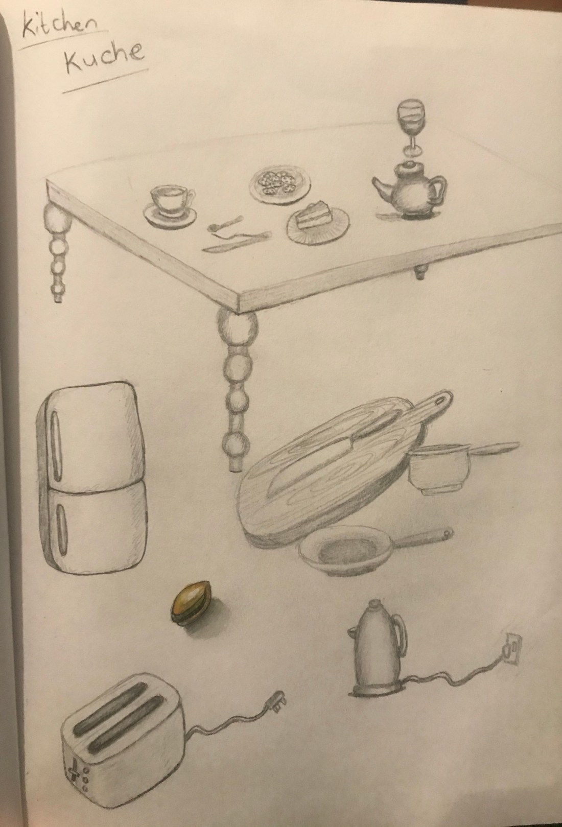
Kitchen
Travel
Wild 1
Wild 2
I found this task quite challenging but also quite fun and think that this is something I would like to do more of however I also see that drawing from observation would be valuable first to build my visual memory so that I can more accurately draw and recall objects.
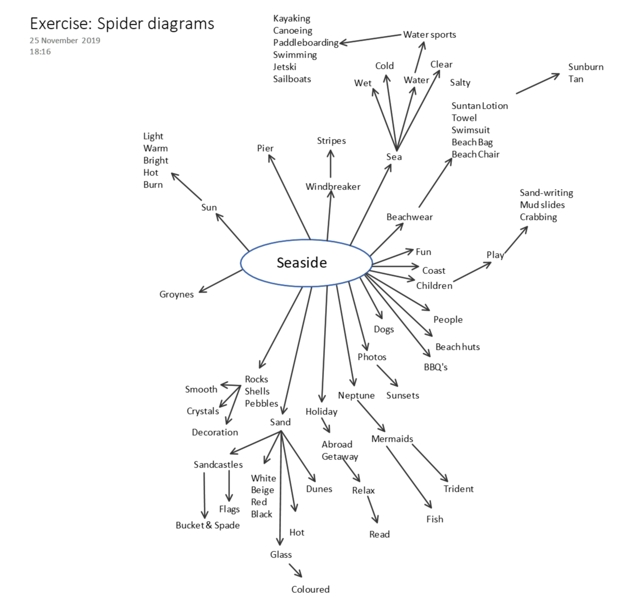
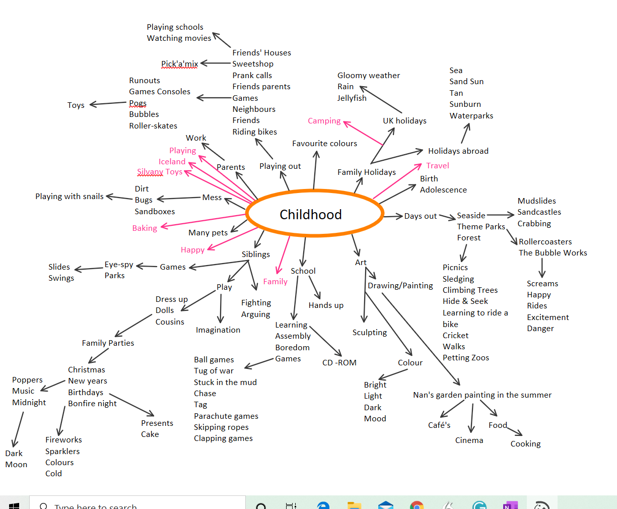
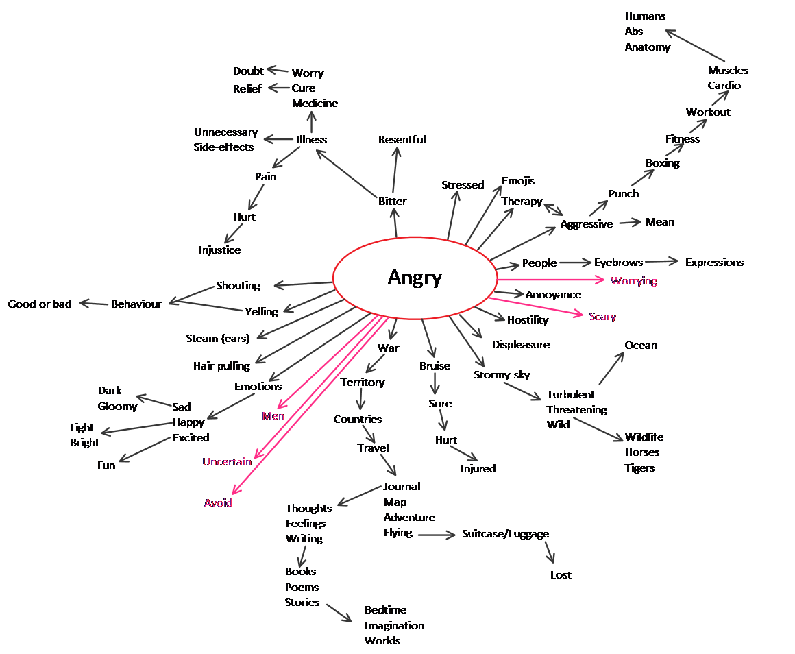
For this exercise I was asked to create four separate spider diagrams. One for each of the following words;
seaside, childhood, angry and festival.
I found the spider diagram for childhood the easiest to produce I guess because this covers quite a wide range of subjects, activities and memories. The word I found the most difficult to produce a spider diagram for was festival. I have limited experience of festivals therefore I was having to imagine the scenario. I also searched the Internet and dictionary for associated words.
I managed to get a couple of people to also do spider diagrams for these words. I found that a lot of the words they chose were quite similar. However, everyone has different experiences which meant that they also had words that I had not thought of, or different connotations of what these four words meant to them.
In order to complete my spider diagrams, I first started with words that I could think of for each subject. When I ran out of ideas, I then looked at the dictionary and thesaurus. To finish I used the internet to search the word, to see if anything different to what I had already come up with showed up in an image search. The thesaurus was probably the most helpful in order to come up with extra words and expand on the meaning of the words I already had.
My words are all written in black And I have selected a separate colour for each different person that contributed their spider diagrams.
I recently attended the OCA Lisbon study visit. The trip was three days of Gallery visits lots of walking and sketching on location. Our tutors were Michelle Whiting and Diana Ali. This is the first study visit I have attended and the first time that I have met any OCA tutors and students. We arrived on the Monday and met with the other students at the hotel for dinner where we introduced ourselves before retiring to our rooms to prepare for the next day. We met in the morning and there we met our tutors and the rest of our fellow students. After our introduction we left for our first outing.
Roof top restaurant – The House of Wonders
These three days were packed with visits to various places. We visited the Museo Berardo where we had an interesting guided tour of a contemporary gallery, my knowledge of contemporary art is very limited, so it was very helpful to have the guide explain the pieces in the gallery. I left with a very different view of these types of artwork than when I went in. We also visited the Paula Rego exhibition at the Casa das Historias which showed a vast collection of her sketchbook work as well as some of her final pieces. I found this exhibition to be extremely inspirational and relative to my studies. I like that she used her art to get a message across, mostly political and quite controversial. It was great seeing her sketches the line style she used the mediums and her experimentation.
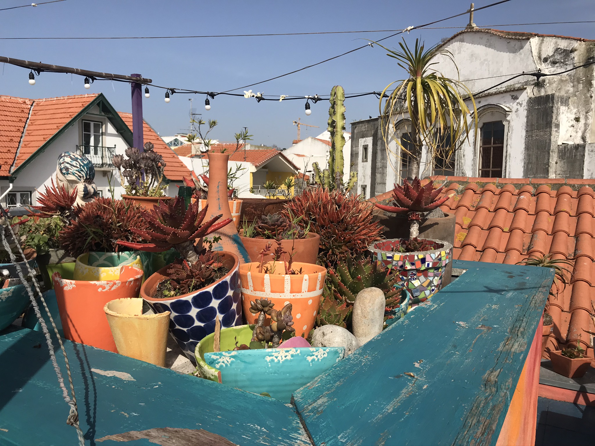
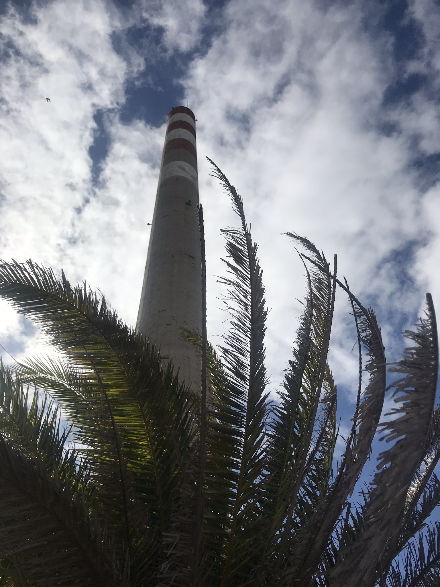
We got to see some beautiful sites including the botanical Gardens which hosted an array of cockerel’s and hens, Peacocks, ducks and terrapins, the castle on the sea which was like something out of a fairy-tale with its little beach cove, a harbour and PADA artist in residence in Barreiro, who gave us access to restricted industrial estate that had incredible views across the water of the whole city of Lisbon and a great many thing to draw.
My sketch at PADA
I really enjoyed meeting my fellow students and tutors. We ate amazing food, had a great time with plenty of laughs and I learned a lot from them all and from our visits as well as the guides from the museums. I got to push myself out of my comfort zone a little bit and try new things and it was very interesting seeing my fellow students work and the ways that they approached this. I came back very excited to get back in my studio and am looking forward to incorporating the things that I learnt on the study visit into my future work. I hope to stay in touch with the other students that I met and will hopefully see them again at other study visits. The tutors did an amazing job of organising the trip, giving us a great experience that I will treasure. I had such a great time and am so glad that I went, I really hope that OCA runs more of these types of study trips.
I went to visit the David Hockney exhibition at the Light Box gallery in Woking, Surrey today. He’s not an artist who’s work I knew of, although I’m sure I’ve heard the name before.
I was impressed by how varied his work was. He had oil pairings, inkjet painting that he’s done when inkjet was first released. He had ink line drawing work and he had even experimented with pressed pulp drawings where he made his own papers, incorporating the image he wanted to make into the process, so that the pressed paper itself was the piece of art.
They exhibited a letter he had written to a friend, where he sounded extremely happy and excited about his work and what he had been learning during his experimentation. This was a nice glimpse into his thoughts about how he felt about his work. I really liked his experimental style. But the one thing I told away from the visit was that although some of his works were perfected to a high level, most were not. Most of them had brush marks, you could see the pencil under-drawings, some looked half finished and if an artist today released his inkjet art I don’t think it would go down so well. But he was incentive with the new materials he had at the time, he was exploring and experimenting and was not afraid to make a ‘bad mark’. I remember seeing the same things when I went to the Comic Museum in London. The work was amazing, but they too had left brush strokes or felt marks and made errors that they the cut out new paper, placed it over the top and repairing the section and used stark white highlights that look like they had been painted in tipex.
After the visit, when I was reflecting on my own work and working practices I realised how hard I am on myself and my work. I am always striving for perfection and spend a lot of time making sure there are no brush marks and lines that aren’t in the wrong place.
I guess what I’m learning is that perfection is overrated and that I really should let go a little and experiment more. Which ties in very nicely with my next exercise which is to create a sketchbook with different materials or types of paper and using different mediums experimenting the different effects I can make. I am quite excited about this exercise as this is something I never do. Although I have been using and learning more and more mediums i.e. watercolour, gouache, pastels, I will always use the appropriate corresponding paper and I have not pushed past that and tried more unconventional materials. I am looking forward to doing more gallery visits to get inspired and see the way others worked.
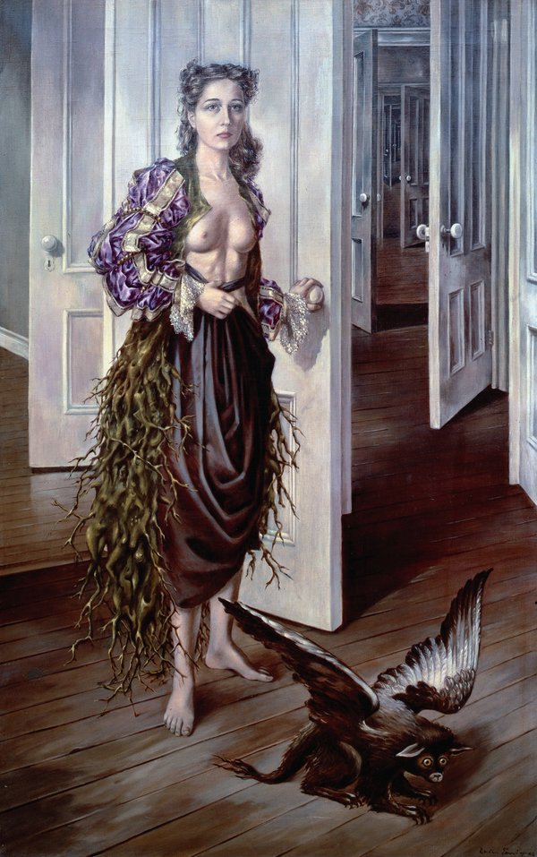
Whilst researching for my 1950’s project I am starting to come across some artists that are new to me and that I like the style of their work, so I thought i’d start this page off. I am quite fussy with art, there’s really not a lot that I like. Perhaps that’s because I like a very specific type, I’m not quite sure. I do like realistic art and very much admire the amazing skin tones and texture I’ve seen at the Tate Modern before. Perhaps creating this section of the blog will help me pinpoint some kind of theme in the ones I do like.
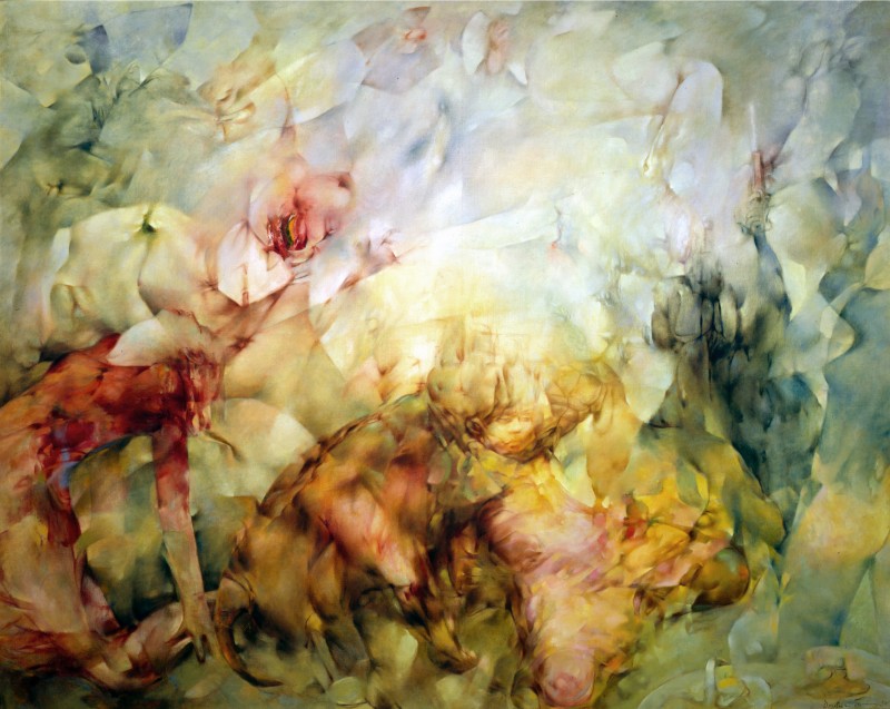
I really like this painting. I find it very interesting and I can spend a long time looking at it, wondering ‘what is going on’. The limited colour palette and effective use of light and shading helps make the image more dynamic and adds depth.
Dorothea Tanning Birthday 1 942 Philadephia Museum of Art. 1 25th Anniversary Acquisition. Purchased with funds contributed by C. K. Williams, Il, 1 999 DACS, London. Source: http://www.tate.org.uk
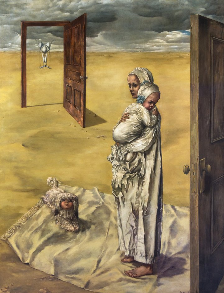
I also love this one, her work is very dynamic and interesting and imaginative.
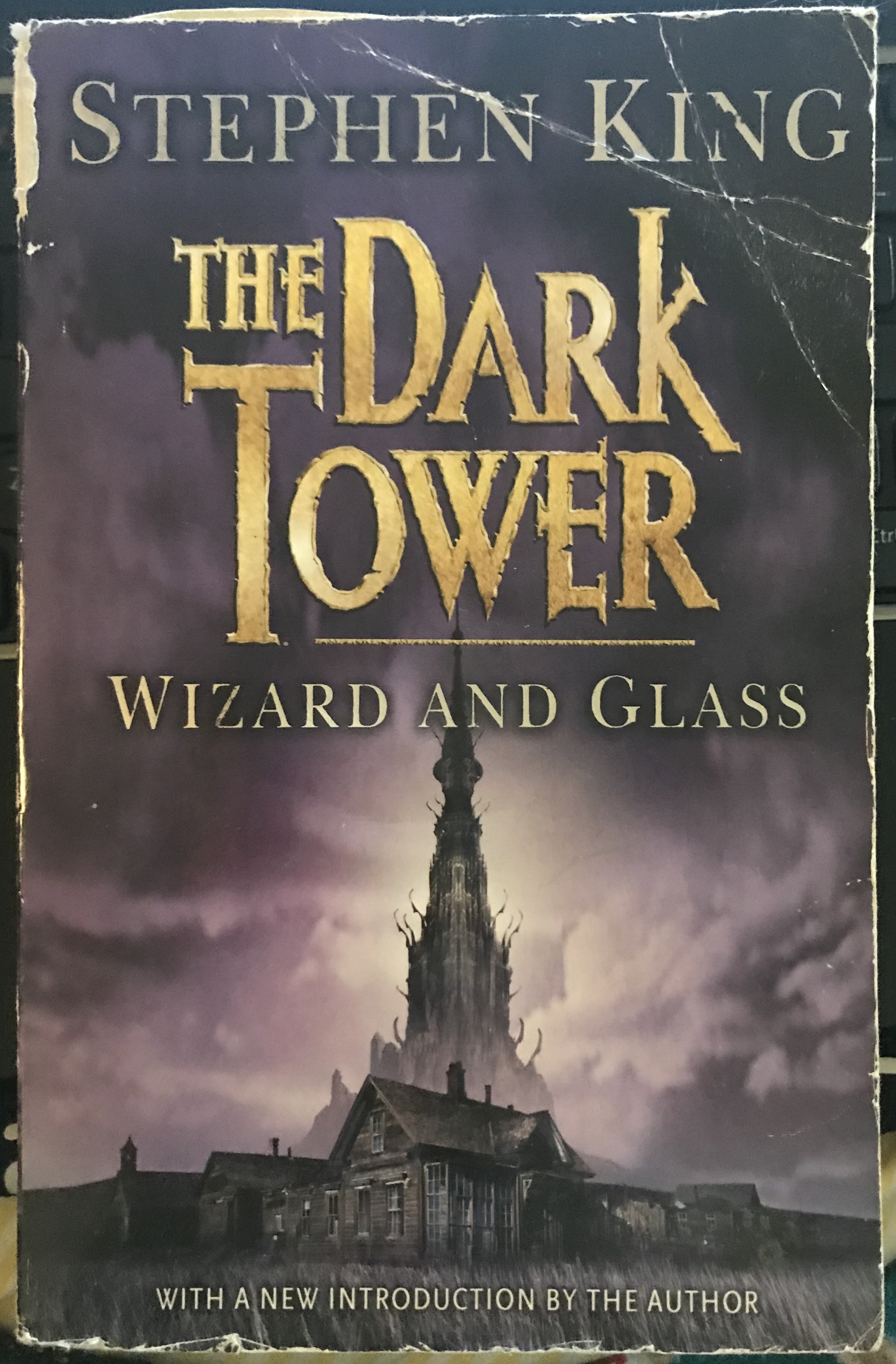
I chose this book as it is one of my favourite series of books I’ve ever read and am currently reading. The image although quite detailed is also a relatively simple one. It accurately sets the world the book is set in and creates the mood for the story, which is dark and intriguing.
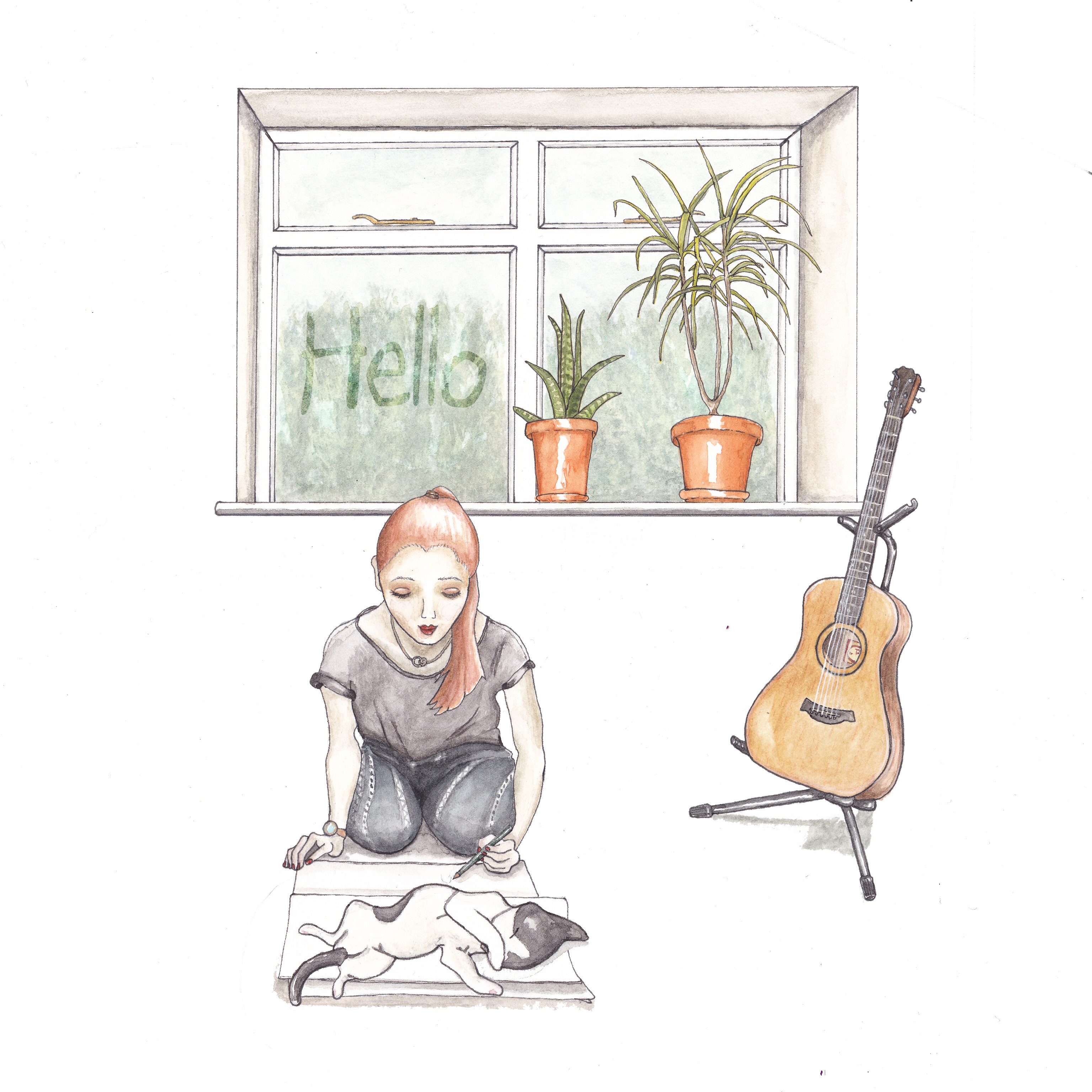
The Brief
The image we need is for a cover for a series of books. The series will all have the same image, but in different colours. The image and colours will be moody and muted. The central part of the image will also be used on the spine and a close up part of the tower will be used on the back of the cover.
The image is to be positioned mainly towards the bottom half of the cover. This is to allow for text in the top half, Which can slightly overlap the image just a little. The whole page will be taken up by the overall illustration i.e. the sky, background of the landscape. The text will be the writers name: Steven King, the book title: The Dark Tower, Wizard and Glass and also the text: With a new introduction by the author, which will be positioned at the bottom of the image in smaller text.
We would like the ‘dark’ tower to be in the image in the background, with an illustration of the old rustic town that is similar to a cowboy town. The town however is not set in any specific time as it is ‘another world’, however there are many elements of this world that coincides with our modern world, which means the reader is never able to place which time period it is set in. The world does have an old world feel. With the houses/town being all made of wood and horses being the main mode of transport. The town itself is full of drunks and unsavoury characters. So although we do not want any characters in the image, this will reflect on the kind of style and darkness in the image. We want the image to draw the audiences eye straight to the text first, then image last. The aim of the image is to relay the mood and create a sense of mystery and wonder about what lies within. Who dwells in those buildings, what is the dark tower.
The intended audience is adults 18-50. This image would be suited to painting/drawing by hand with the background added separately so that the main image is easily transferred to each cover, with the background colour being easily changeable with computer software.
It took me along time to complete this assignment. One reason for that is I painted the scene as individual objects so that I was less likely to make mistakes and have to redo the whole thing. I did redo the guitar once and the girl a few times before I was happy with it. The second reason being that I am only just learning how to use photoshop, which is quite a challenge as I can never remember what tool does what. To fix this problem, today I started writing down what tools do what and what different short cut commands do. The laptop I’m using is very out of date so unfortunately it can’t run illustrator, which I’m told is the on I should be using.
Because of these technicality’s I ended up not adding as much as originally intended in my original sketches. I also wasn’t able to colour the background which I think would have looked better. However I am still happy with my effort. I am keen to move on now and start afresh as I was spending far too much time on this one, getting stuck too many times along the way.
I used watercolour for these drawings, I first drew each item and when I was happy with it traced it on to the A3 watercolour paper. I placed all of the items in the same sheet and then cut them out after. This way I could be sure the colour palette and paint style matched.
I then scanned them and used photoshop cc to resize and layer the images. The words in the window was born from a happy my mistakes and experiments in photoshop. I’d had an error where the background was not working correctly and was not layering in the correct order, therefore partially concealing the things in front. I thought I’d try duplicating the effect but layering in an order that meant that the words remained hazy and by changing the opacity and having the right font, looked like the words were written on the window like condensation. After I was finished editing I sent it to Moonpig the online card retailer and got my image printed out as a card which I will be posting to my tutor. I do like the colour palette in this one. I tried to keep to just a few colours and to keep it simple.
After I did this however I realised I forgot to talk about what mediums I like to use etc. My fault for rushing though the final part. But I was keen to move on, as I have spent far too long stuck in my first module.