For this exercise I looked at a range of books that I had most of which were adult book covers. Then I found a Roald Dahl book that I bought that has three of his stories and it. From this I chose my favourite Roald Dahl tale, which is the twits. This is a childhood favourite of mine and made this a very fun exercise to do.
I did a line drawing on A3 paper at 2.5 times the size of the original. Quentin Blake’s style is very simple. Therefore, it made this task easy. After I traced the image I’d made and redrew it on a new sheet of paper, adding back in only the most important lines in an attempt to simplify it even more so.
I love Quentin Blake’s style and from doing this line drawing, I see that his line-style combined with his beautiful watercolour work is what gives his work, its individual style and makes it stand out from his competitors work.
I then moved on to an illustration of the front cover of ‘Life of Pi’ by Yann Martel. This image was a little more complicated than the last. Due to the many number of characters in illustration. I did this in A3 in pencil at 2.5 times the original size and then inked over the top.
Pencil sketch
Final Image
This image ended up being a very simplified version of the cover. However, I wonder on reflection, if I should have added more details as it would have helped the image be clearer. Such as by adding the trails from the water to show that the fish were in fact swimming in the sea. My image is very one-dimensional and I think with this particular image. The colour is important to make this work, so that the sea animals are muted and the boat with the main characters are the focus of the image.
When reflecting the first image of Quentine Blake’s, I think that apart from the line work needing to be more interesting. The image works as a visual and shows what needs to be shown.
I have read most of the Dark Tower series. The story line could have presented with many different options for cover of this book. However ‘the dark tower’ is a focus point for the story, being a destination that the main characters are trying to reach. Each cover is the same image, but a different Hue. I think that the brief would have been to capture an otherworldly feel and the moody skies that are described in the book. I think this image effectively creates a sense of mystery about the tower, which is a good reflection of the storyline.
I found it difficult to find adult books with illustrations and found that most are photographs instead. I believe this illustration is trying to show a woman that is free, confident, happy and at her best. The book is a woman’s story interlaced with facts and figures and discusses biases and stigmas attached to women that are not in a relationship. I think that the illustration fits the purpose and gives the viewer a sense of freedom and calm from the image. Unless you are scared of diving like me, then it could also represent something risky and scary and be reflecting that side of being single.
I have not read this book, but was really attracted to its cover. The almost collage feel to the line drawings or perhaps Lino cut illustration is very striking and the limited colour palette is very clever. There is so much going on that you can spend quite some time looking at the image. I wondered what this image has to do with the title and now feel compelled to read it to find out what the salt path is. From reading the blurb I wonder if the cover is perhaps trying to represent freedom and a beautiful sight, but at the same time reflecting turmoil with the busy line work and almost overwhelmingly busy illustration. I assume that this scene is one of a place that is visited during the character’s journey.
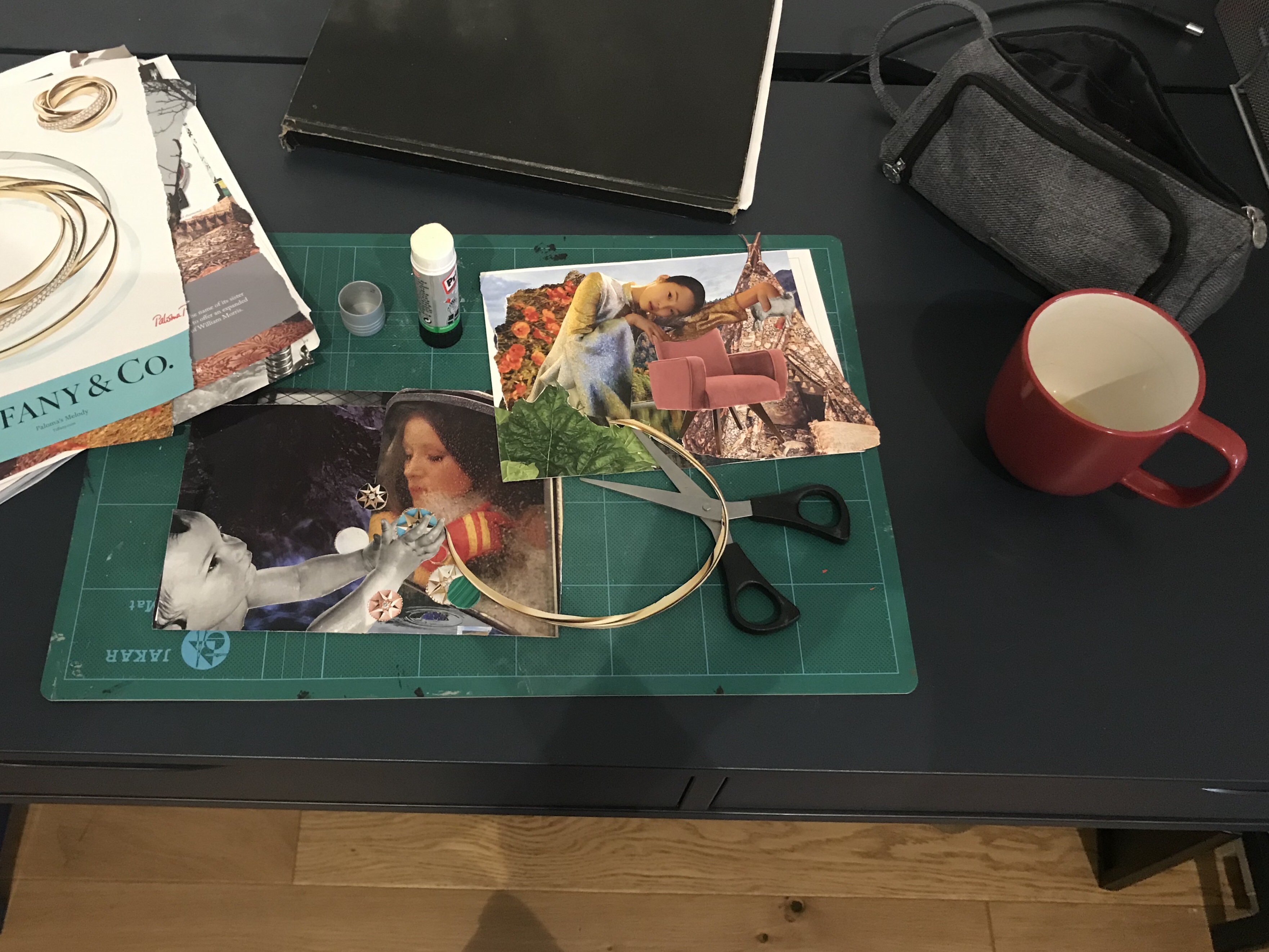
For this exercise I chose ‘workshop’. It was, not the most exciting theme from the selection. However, as I was staying at a friend’s house at the time I had very limited resources to create a collection of objects. I did have a desk that I was working at with my art equipment, which is why I chose this theme.
A selection of my shots with a digital camera
I tried to be unusual with the positioning of the camera in order to make the scene more interesting. I found that I quite liked the shots where the camera was lower and gave more of an interesting perspective of the objects. I did some sketches from my photos by cropping them into different frames.
My thumbnails
My final image
I chose the above as my final composition and frame and drew it in my A4 sketchbook. I tried to keep the lines clean and added a little shading to emphasise shapes. I felt that this frame was the most successful as it showed a range of objects where as some of the others, although more interesting, it was harder to see what the scene was meant to be. I felt that this one clearly showed that it was a ‘workshop’ or working desk.
I found this exercise valuable to teach me to find and experiment with new perspectives rather than settling for the first one I think of and to use this technique to find another more suitable one. I will bear this in mind as I go forward with my course to try to think more about the best perspective and layout for my illustrations.
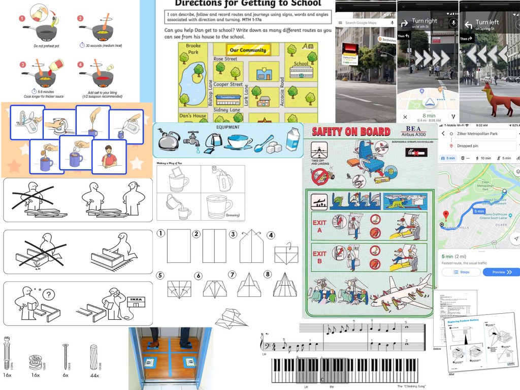
For this exercise I started by collecting reference material of a range examples of instructions. The thing I noticed most about these are that they tend to be in block colours or line drawings and tend to be clear and have images on a plain or solid colour background.
Collection of examples and reference materials
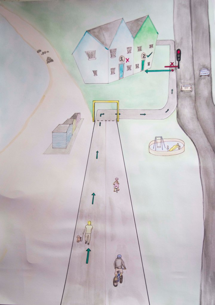
I chose ‘getting to my house’ as I liked the idea of doing something more personable to me. I started by doing loose sketches and seeing what bits I could cut out and identifying which were the important features or landmarks to be left in.
The design, I decided to go with was the more simplified version leaving in key landmarks that would be easily identifiable and therefore help direct the user.
I worked on an A3 format, which gave me just enough room to be able to draw the characters with enough detail. Once I had completed my initial painting, I decided that I wanted the colours to be bolder and more solid. I was trying to do a pastel colour palette. However, it did not work as intended, most likely due to the use of watercolour. I did want to achieve a hand drawn/hand-painted look. Once I started to re-colour in Photoshop, although I really like the colours I realised that I was not going to be able to achieve what I wanted that way either and decided not to proceed. I therefore have stuck with my initial hand-painted illustration. I think I could have improved this if I knew how to use a software such as illustrator, as then I could have kept the hand drawn feel, but change the colours. I also would have needed to have just a black and white outline drawing in order to digitally colour, this effectively as then the trace tool would have worked on Illustrator. However, as I hadn’t planned it this way from the beginning it was not going to work.
Final Painting
A as well as using a pastoral colour palette, I decided to use a traffic light system as a means of directing the map user. Green for the correct path and read for the incorrect path or stop points. I tried to make these brighter so that they stood out and made sure that everything else was more subtle. I showed this to a few of my close family members and asked them if they knew what it was. Each of them said that it was a map to our house, but recognised that I had removed many elements, which I had done to simplify the image so that it was not too busy and distracting.
I found this to be a useful exercise and with that I have recognised some limitations that I have. I also am starting to realise that I do not like to do commercial illustrations such as these, and that they do not fit my style or current skill set. However, I do hope to expand my skills so that I can find a task like this much more simple in future. In order to do this I need to set aside dedicated study time just for learning new programs and features that are not in conjunction with the assignment or exercise. At the moment I am struggling to schedule this in with working full-time and also trying to complete this module in such a short time frame. Once I have caught up. I intend on doing classes to improve my knowledge of digital art techniques.
On my feedback from our my second assignment from my tutor. She suggested that I start a few smaller sketchbooks for each medium so that I can explore painting techniques. Painting is something I am new to and I am learning through doing as I go along. However, I have no technical knowledge of how to paint. This is something that I have been meaning to learn more formally and I thought that my tutor’s suggestion would be really great for me.
Gouache
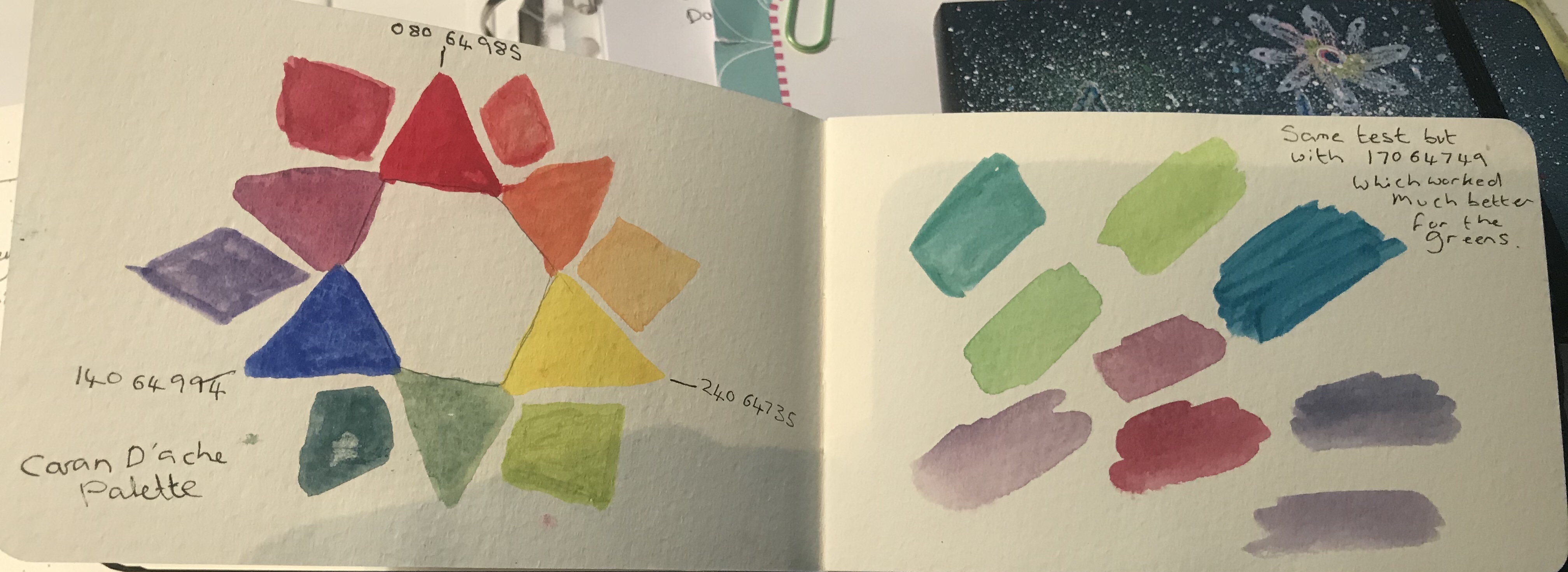
I purchased three A6 sketchbooks, one for gouache, one for acrylics and one for watercolour. I started by using the paints that I have, to paint colour wheels. I found a reference colour wheel online and used that to compare the colours that I was mixing. I tried to match the colour of the reference colour wheel each time, with each different set of paints. The reason for this was so that I could test the difference in the paints and see what happens when I try to mix same colours. I found that although some of the colours mixed as expected, when I mixed the secondary colours, the Greens did not always seem to come out as I had hoped. As the image below shows on the second page, I used the different blues and yellows that I had, to see how they mixed and whether I could match my reference colour will with those paints. Quite often these did mixed better.
Gouache
Acrylic
Acrylic
With the above image. I was testing the consistency of acrylic paint. I have successfully used acrylic inks. The however, I have not used acrylic paint before on paper. Acrylic paint is not something I’m used to and I was unsure as to what the consistency should be as I tend to see people painting rather heavily with this paint and not adding much or any water. Here I tested the acrylic paint neat and then gradually added a little more water until I got to a nice light wash. I really like the wash as the colour is very vibrant still and I like the way it looks on the textured paper.
With the image below. I was actually inspired by the paint marks on my kitchen-towel left from when I was doing my colour wheel. I liked the combination of colours together and also the overlapping lines. Therefore, I decided to use the leftover paint from my palate to experiment with, rather than wasting them. This was very therapeutic and pleasing to do. I like the way the colours overlap each other, but you can still see through them, almost as if this is glass or transparent plastic. This blue mark in the centre reminded me of a stained glass window.
Acrylic
Acrylic
Watercolour
Watercolour
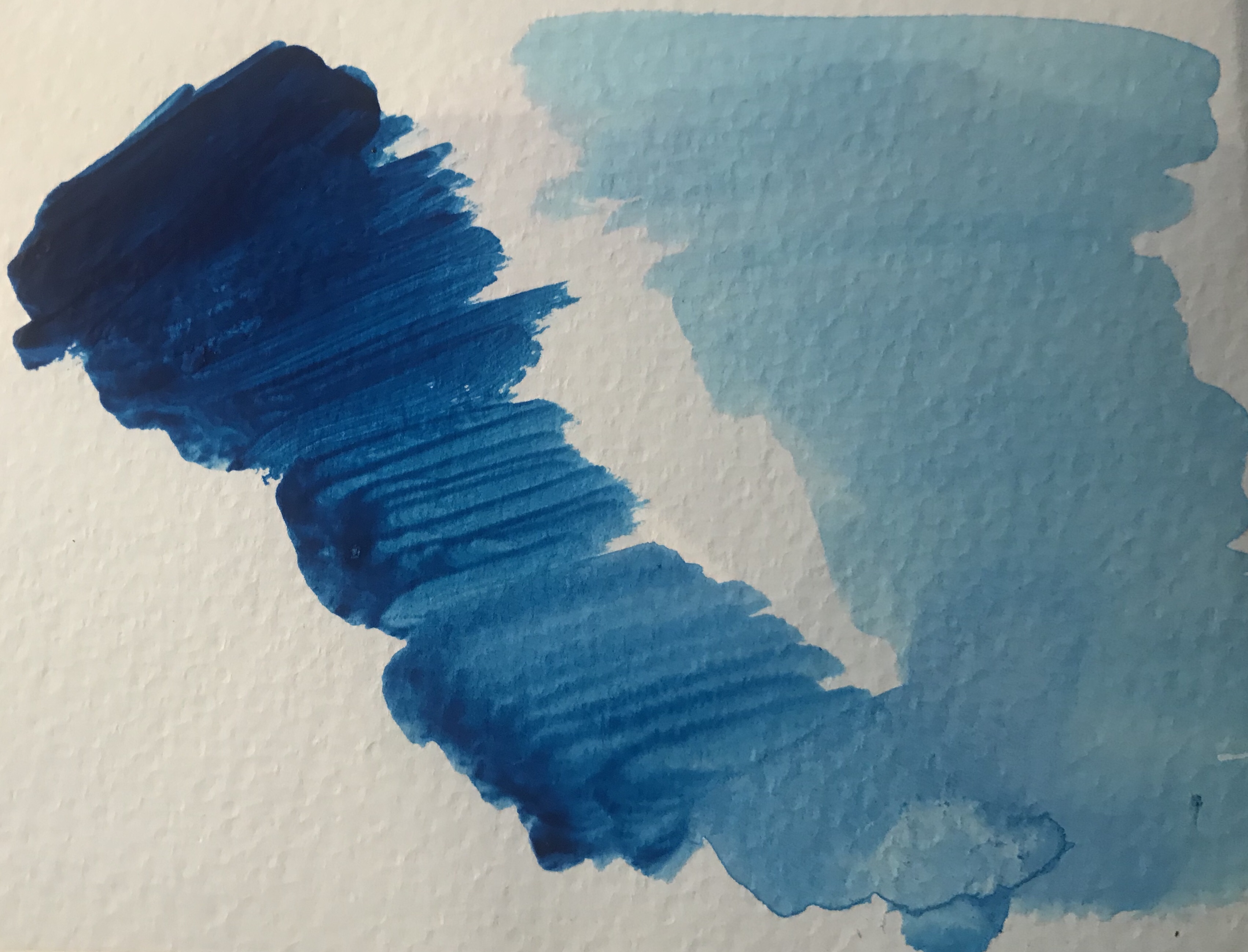
After a recommendation from a friend. I got the book ‘If you’re bored with watercolour, read this book’ by Veronica Ballart Lilja. In this book. The author shares techniques on how to create textured paper. I had heard before that you can use salt on your watercolours and it soaks up some of the paint, leaving patterns underneath. It was also suggested in this book, so I thought I would give it a go. For this one I used table salt because at the time it was all I had. I thought that perhaps this would not work as well, as it would give me just small particles of salt. Therefore, I assumed a very even pattern would be left behind. However, as you can see, this is not the case. On some parts of the painting, it did just stick to the page and did not create much paint lift. On other parts of the page, it created striking patterns, as in the top right red. I really loved this section and feel like I can see an ostrich in that splodge. I was quite struck by how different every patch came out. There seemed to be no repeating pattern happening and I wonder what conditions each patch of paint was in at the time I added the salt, and whether I could replicate the effect easily. I imagine that this is affected by how wet the paint is at the time of adding the salt, how thick the paint is and perhaps even some colours may react differently to the salt. These are things that I intend to explore further, as well as trying this again using rock salt both whole and partially crushed to see what effect that has.
I have enjoyed my experimentation so far and endeavour to keep adding and experimenting in these sketchbooks.
A painting I did in gouache – I really love this painting, but i didn’t plan how I was going to do the floor very well and I realised after starting, that I couldn’t draw every stone. The floor also seems to slope down towards the right, which was not intentional. The floor was meant to veer around to the right and continue up hill evenly on both sides.Another gouache painting of a Lizard that I rescued from the cat in the garden. I took a few photos before releasing him. Detail drawn with ink. It was very tiring drawing all the scales, and I realise that next time I should do the scales slowly over a number of days or use a technique where I am not drawing every scale, as my scales do not graduate into each other well. I also discovered an easier way half way through, which made it much quicker, but then the scales did not match up with my first batch. I am going to finish painting this one regardless for practice and also because this is in my sketch journal.
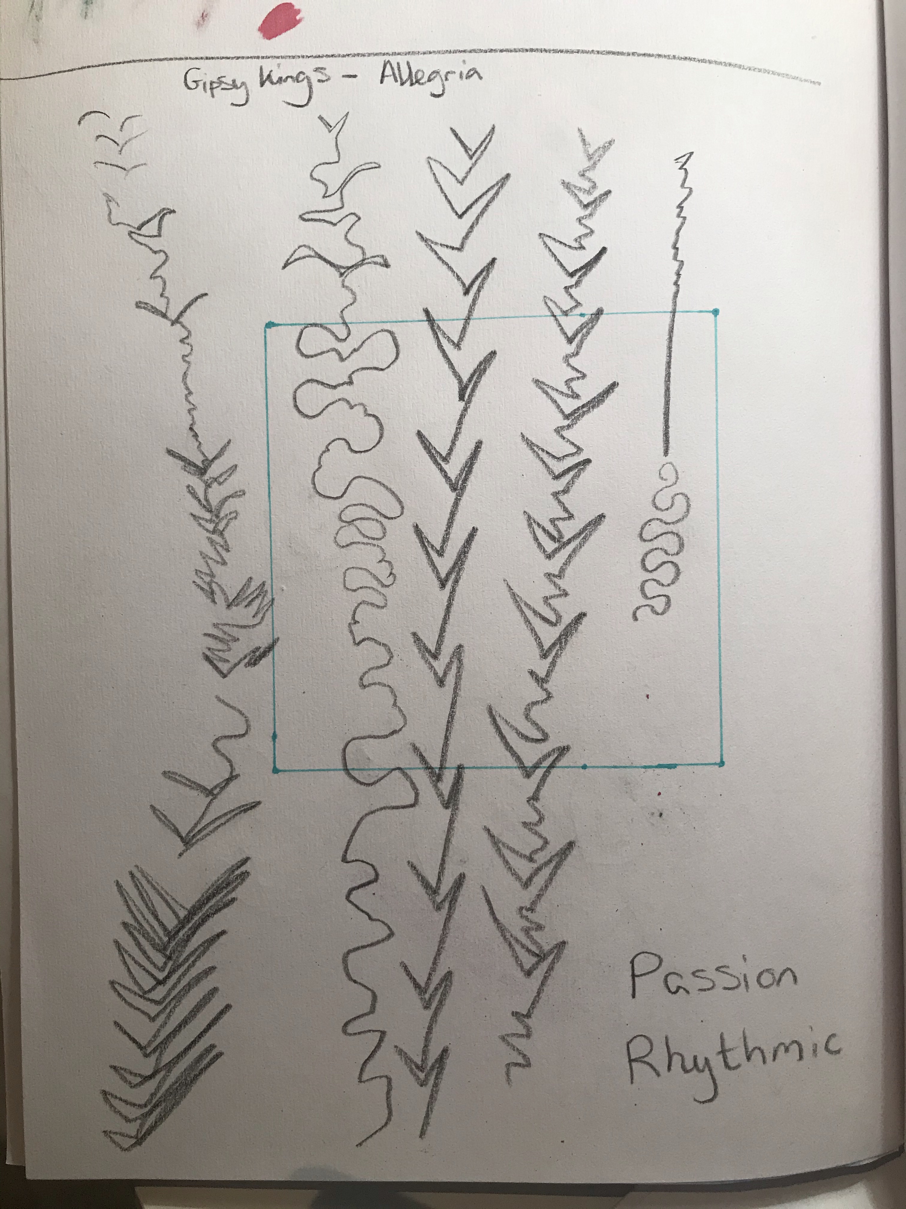
For this exercise was asked to listen to a piece of instrumental music by musicians such as George Gershwin, the Gypsy Kings, Beethoven, Miles Davis. We were asked to listen to the music and create marks which convey out interpretation of the essence of the mood of the piece.
I listened to songs from each of the musicians to see what appealed most to me as from this list, only Beethoven was I familiar with. The song I chose was called Allegria from the Gypsy Kings. The music is from a group from the south of France that have a flamenco, salsa and pop style. The piece Allegra reminded me of salsa dancing and is a happy, upbeat song, full of energy.
Marks made during song.
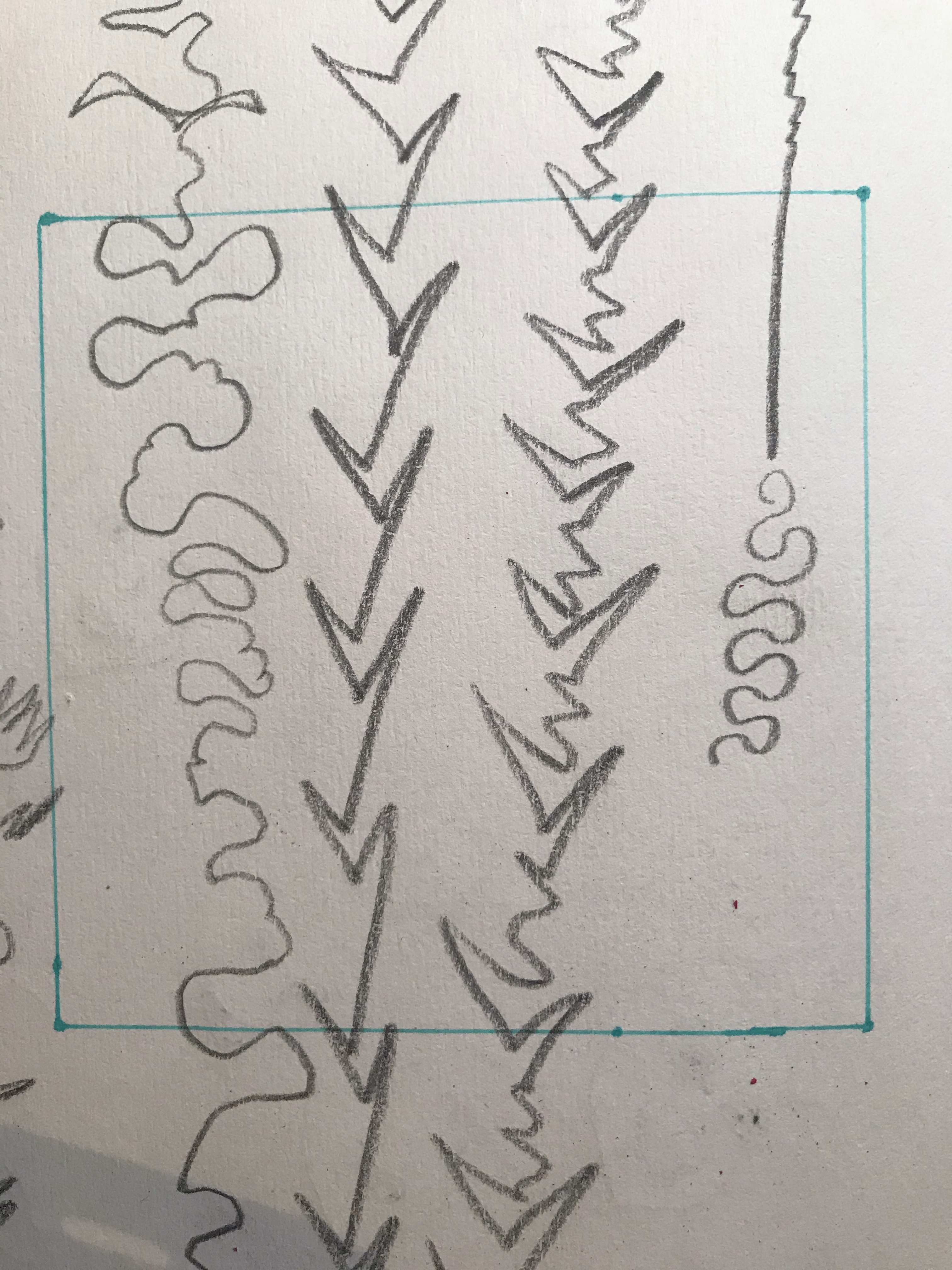
I made marks on my paper whilst listening to the music. I did not look at the paper for most of it and instead made marks based on the rhythm of the music. I carried on until the song finished and then took a step back and looked at what I had on my page. I chose the word ‘passionate’ as an adjective to describe the tone of the piece. I then selected a square of my mark’s to create my abstract illustration with.
My selection
My Final Piece
Using my selection as the starting point I started to transfer elements of my marks over to a fresh square sheet of paper. I used a combination of pastel pencils, Inktense sticks and watercolour marker to add colour to my illustration. The colours I chose all represent an energetic, bright, happy, passionate tone and to me felt like they represented the Latin vibe I was going for. I tried to keep the colours bright and using various shades, whilst not using more than three colours, so that I did not overload or over work piece.
I enjoyed this exercise as it allowed me to be free and create shapes and an illustration just through listening and feeling as opposed to having a plan beforehand. This allowed me to not over think what I was doing and not worry about the outcome. This was also a quick exercise, which meant that I was not precious about what I was doing as I could easily start again if it did not go right. I am not sure if this would work as the album cover for the chosen artist. Although perhaps with dark text overlaid this would work well. Alternatively, this could be the background with an image in front of it, i.e. a Spanish guitar or a photograph or illustration of the band.
For this exercise, I was asked to cut to L shapes of card or stiff paper and use them to explore formats to zoom in and out of compositions.
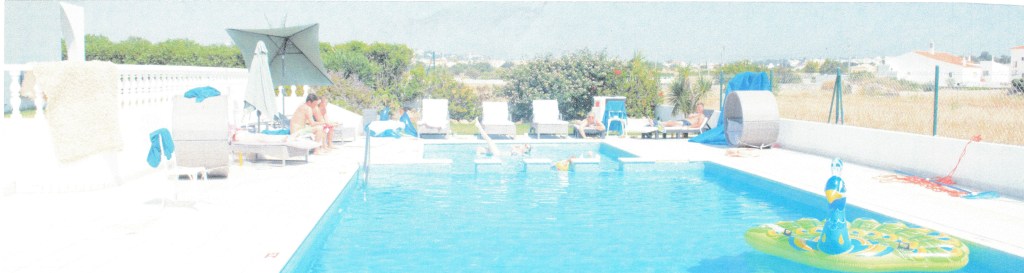
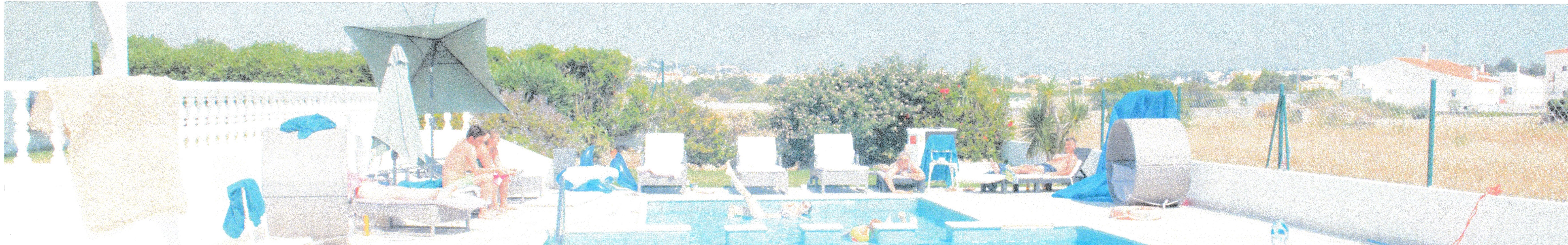
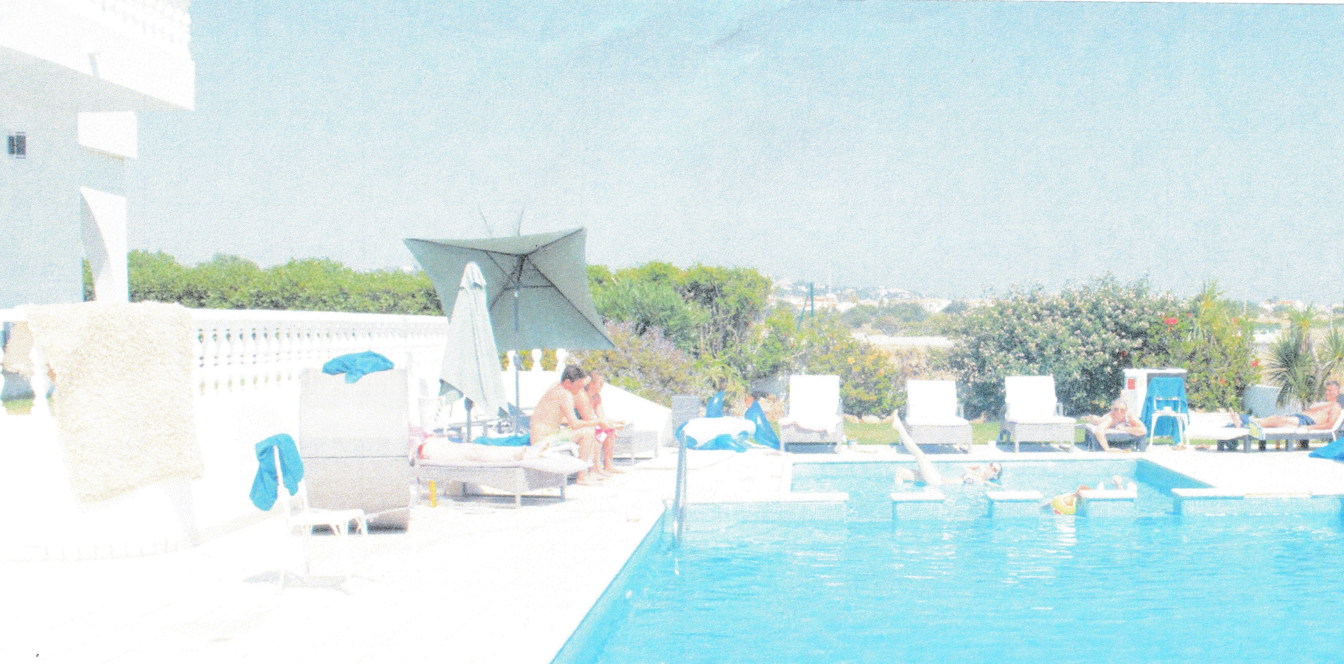
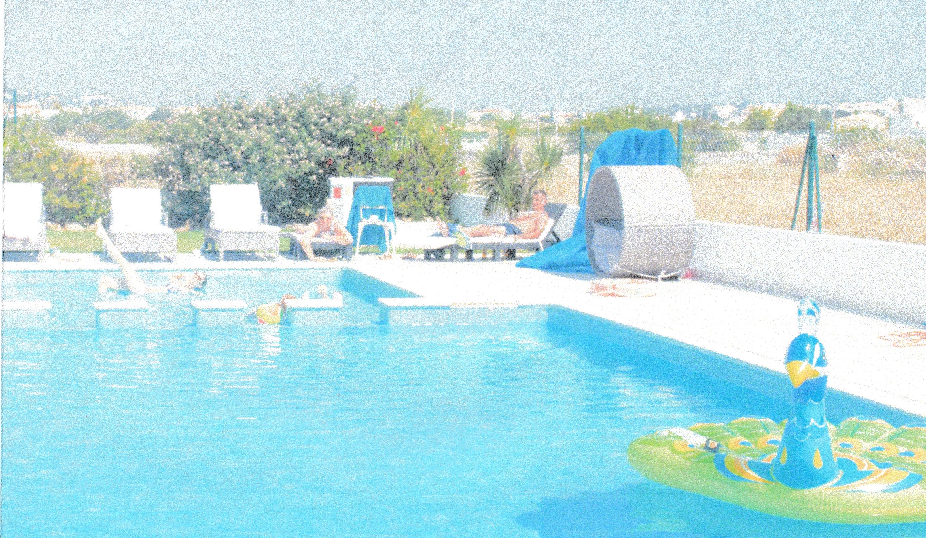
The image I chose was a family photo from a holiday a few years ago. I spent a long time trying to find an image as I am very into photography and most of my photographs were already zoomed in and framed so a lot of these were not going to give me enough room to play with. I really wanted to use one of my own photographs however as I thought this would make the subject fun when it came time to draw it.
I created 10 edited versions of my image trying to retain the content, but presenting it in different ways and in different formats.
Composition 1
Composition 2
Composition 3
Composition 4
Composition 5
Composition 6
Composition 7
Composition 8
Composition 9
Composition 10
Although I found it quite easy to create different compositions with this image I found it difficult to find a way to create much interest within the composition. Although I had my main subject matter, which is the girl posing in the pool, it was hard to compose the image in a way that created much interest or focus within the image, without cutting out my main characters of interest. I found that the compositions that had the other people in I liked more, as it created more interest and with the way the framing is, it tends to lead the eye down the image to the main focus and helps set the scene. I feel like some of the compositions become more interesting due to the way they are cropped, particularly composition 9 which is a panoramic view, which creates more drama.
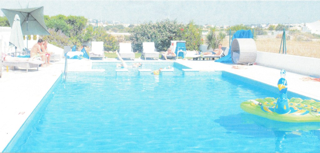
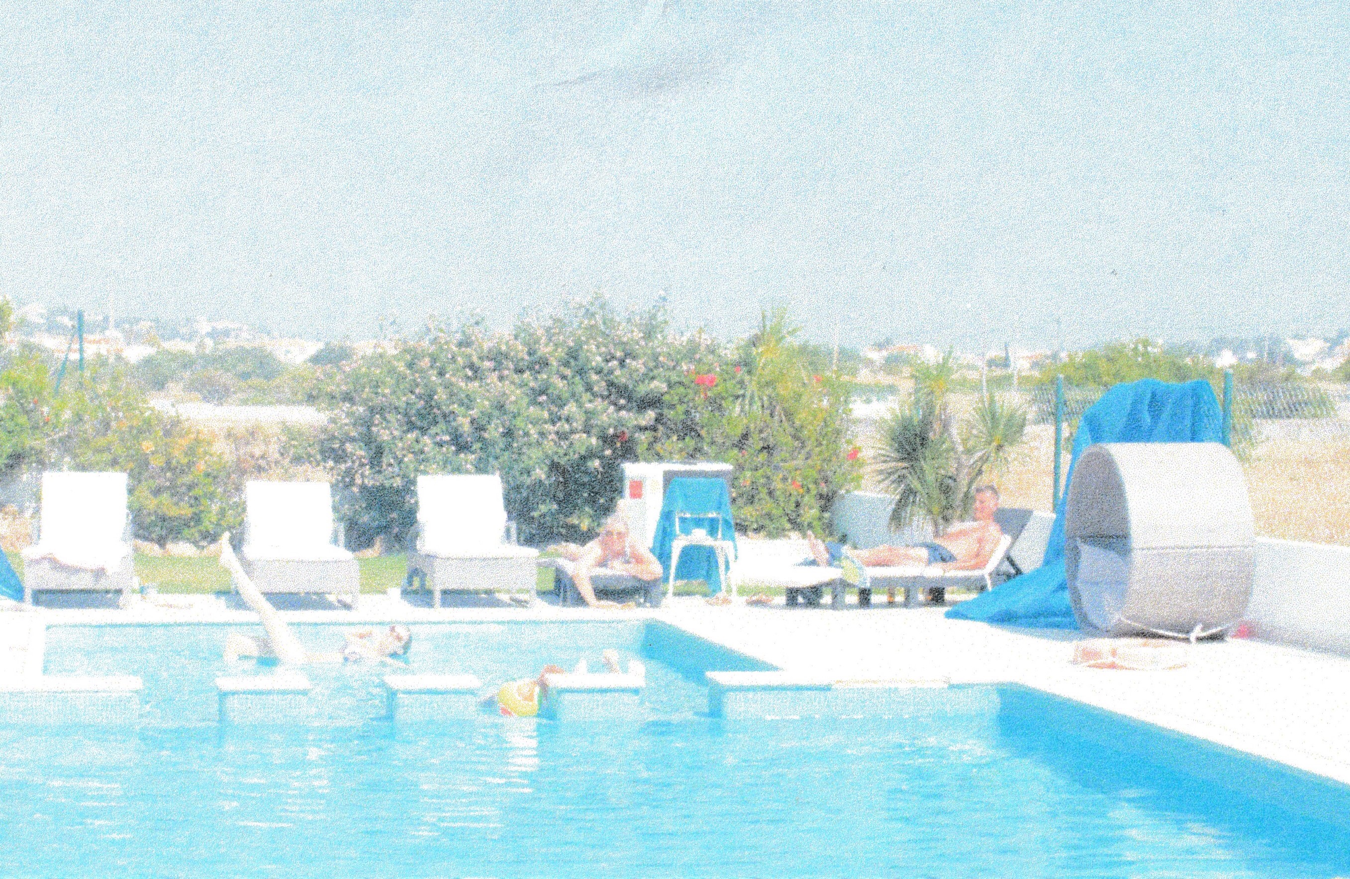
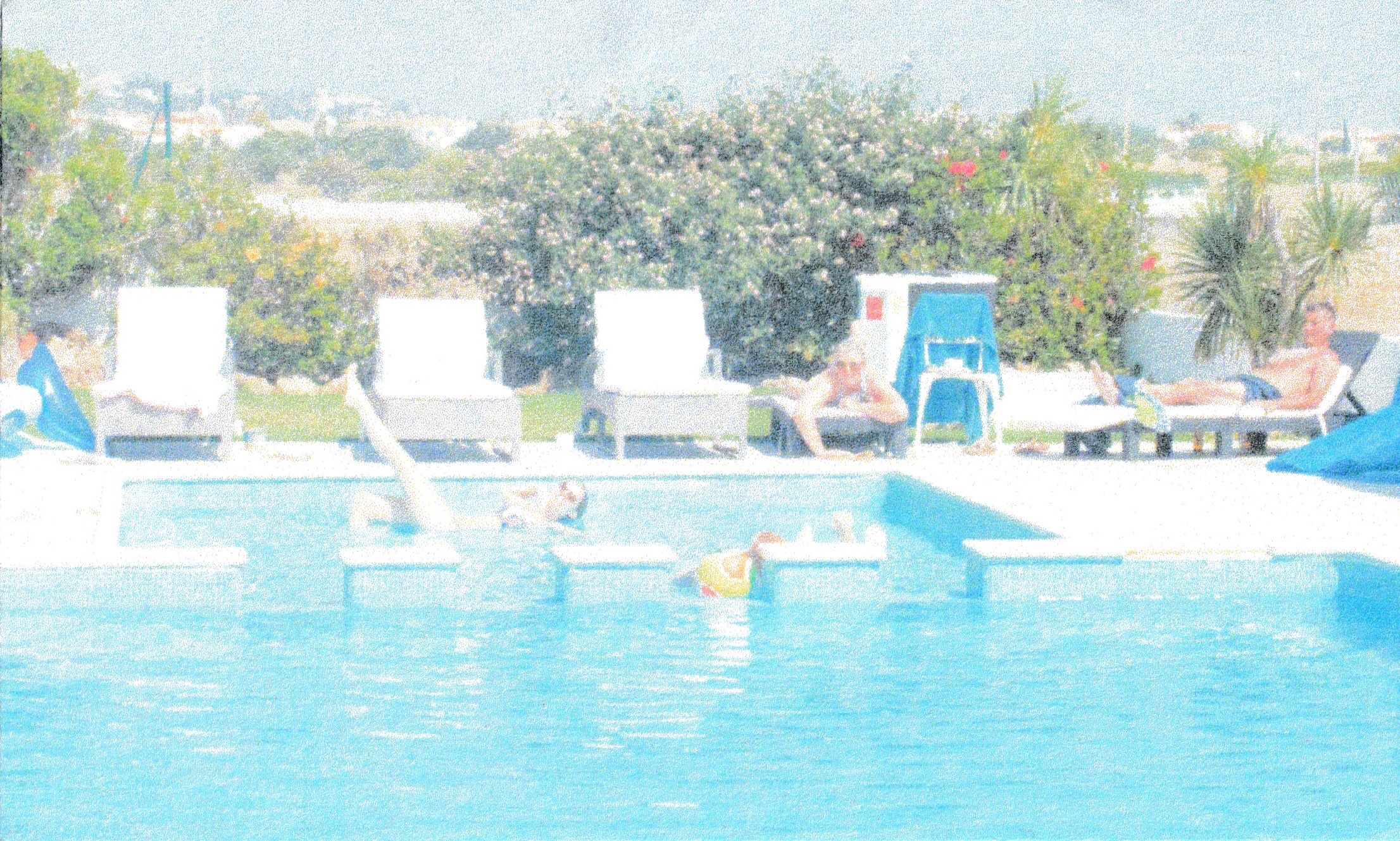
The image I have chosen to draw, is composition 10, where some of the characters are cropped out. Although I like the image better with the other characters and more scenery in the image. I think that in order to convey this as an illustration, I needed to use an image which was zoomed in more, otherwise my main character will be too small to stand out as the focus. Especially as the characters to the left are closer to the camera and therefore appear a lot bigger.
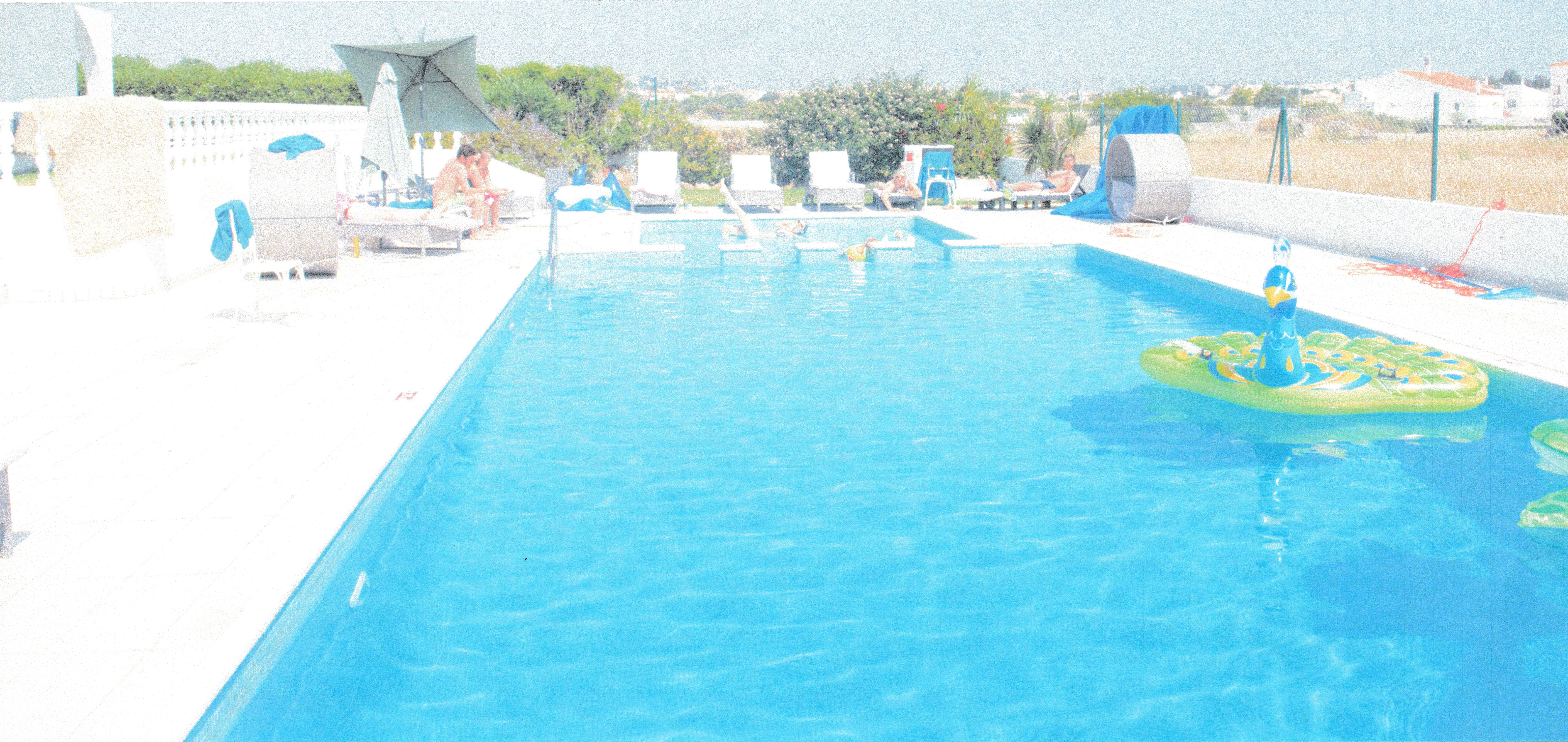
Once I had started to gather my materials and look at the composition more closely, I realised that it would not be very appealing, as an illustration, as the main character still looked too far away. I therefore decided to crop this photo even more to create a new composition.
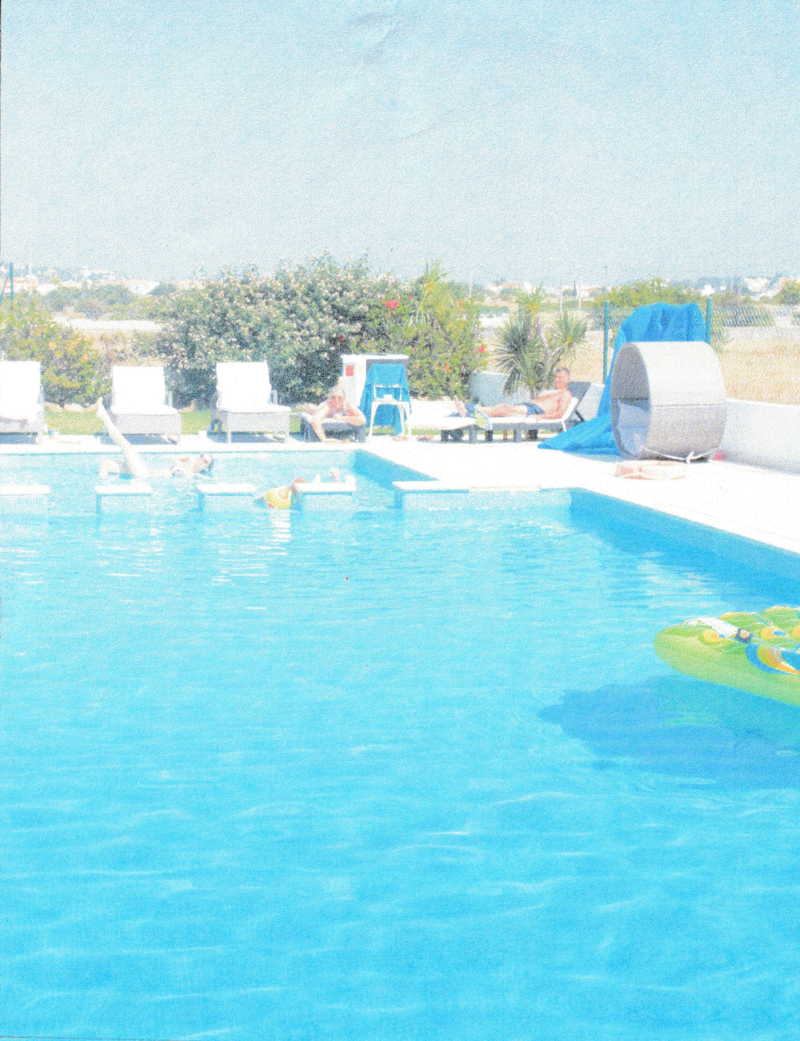
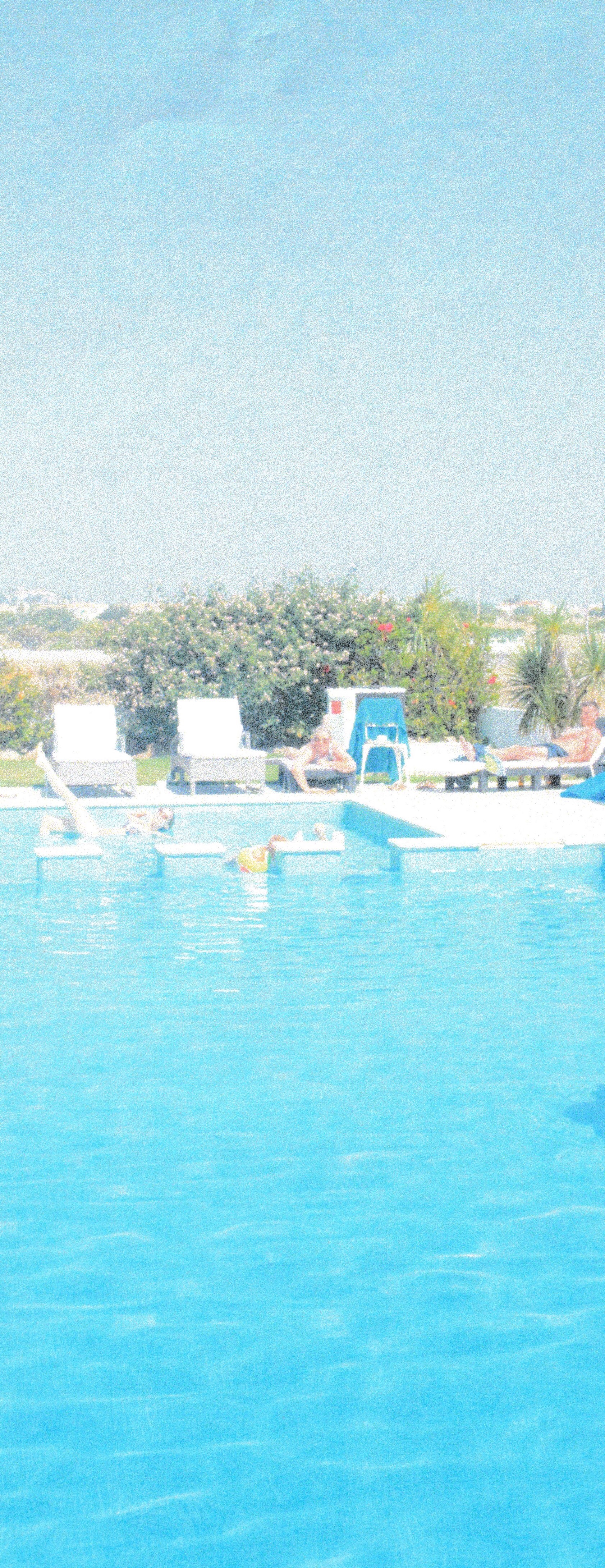
Final composition crop – No. 11My illustration
For my final image, I decided to move the characters closer together as they felt a bit too far apart and separate before. I also left out certain elements in the background as it was quite busy and did not add much to the scene. Some of the things in the composition like the third character and the ball. I also removed, as the third character can barely be seen and I felt like they were doing nothing for the scene and would also perhaps look awkward in the frame.
For this image. I researched cartoon women, including Disney characters to see how they drew facial features and hair. I wanted to keep this image quite simple and this is not a finished piece. My goal was to focus was on learning about composition rather than doing a technical drawing. Therefore, I chose to draw in a cartoon style as this was something fun to try and is not something I have done much of. Although I struggled to get a composition that I liked out of these photos, I enjoyed doing the illustration and the exercise has been useful for understanding composition and understanding what does and does not work. I also feel that it showed me the importance of moving things in different places in the image and trying different layouts as then I could improve the composition by moving the focus to elements of my illustration that I wish to bring to the forefront.
When I got to the end of this exercise and started to add to my learning log I read through the instructions again to check I hadn’t missed anything, and I realised that I had misinterpreted the brief. I remembered that I needed to make an illustration of my composition, but I had missed the part that had said a poster with text. I realise that my illustration does not lend itself to well to a poster, as that is not the purpose I had intended for it. I added a border and thought about the word and what text would work for this and decided on the word ‘stressed’ with a question mark. The word is contradictory to the scene as the characters look very happy and relaxed. Therefore, ‘stressed?’ Is intended as a question to the viewer, suggesting that perhaps if they are feeling stressed that this is what they need, i.e. a holiday.
I feel like overall this image works with the text as it does convey a meaning and this scene is eye-catching. I think if this was to be worked as a poster I would need to do lots of different sketches and mockups and play around with the colours and text a lot more. If I was to develop this image further. I would redraw the image as it is not technically sound and look at other colour options and mediums.
The image here by Mark Oliver, is of a dragon in a cave surrounded by treasure, armour and weapons, in the room with him are two characters. I am unclear about the gender of the lead character.I believe it may possibly be female due to the long hair, but the scene makes me initially assume that it is a male character. This could be simply due to the quality and size of the print as it is difficult to see. However, I do not feel that the gender of this character would explain nor take away anything from this narrative.
The scene seems to be about two characters that have either found or have intentionally been looking for a Dragon, in a cave that is guarding a pile of treasure. There are weapons and suits of armour in the cave in piles, which could suggest that they are there from the failed attempts of men that have come to take the treasure from the Dragon. In the scene, the Dragon is asleep and there is one character in the lead with a torch, that is pointing towards the Dragon and a second character that looks like he is hiding behind the first character and is pointing back in the other direction away from the Dragon, suggesting that they should go back and not wake the Dragon.
This image uses both a hot and cold pallete, the hot areas are used for the main subjects, i.e. the dragon and the fire which is lighting up the cave in hot tones. It is also used on the faces and hair of the characters which makes them stand out. Although the second character is cooler than the first, leading him to recede slightly. The core colours are used mainly for the actual cave e.g. the walls and the floor. A lot of texture is used in this image, particularly on the floor, which helps identify the scene as a cave and also on the cave walls. This is more subtle in the cool areas of the cave and quite dominant in the area of the cave that is lit by the torchlight. This makes this area stand out as a focal point. There is a lot of detail used on the Dragon himself and the most detail is in the foreground of the image with the background being slightly out of focus. There is a definite contrast and a stronger contrast with the hot elements that helps bring them into focus and pushes the cool colours that use less contrast into the background.
I believe there is significance in the colours used for the story. The hot colours bringing certain parts of the story into focus as a main element. In contrast the cool colours are used to push those areas back with less focus on them. The Dragon being a hot colour could imply the significance of Dragon’s breathing fire and the characters having a fire torch with them ties those two elements and ideas together. The torchlight is creating a warmer, brighter glow on the Dragon, whereas in the shaded parts of the Dragon, his colours are cooler.
The most significant part of this image that the artist seems to want you to focus on are all in warm colours, including the faces and hands of the two characters. The other elements in the image are cooler, which takes the focus off of them. There are a couple of the other elements standing out that are warm to medium tones in the throne that the Dragon is guarding and also the green of the character’s outfit. Perhaps this implies that that throne belongs to this character as the two are matching in colour and both highlighted in this bright green.
I believe that the Dragon is a significant part of this image. However, I think that perhaps the character in the bright green and the throne on the right that is in a matching green is the leading element to this story, as they are paired and different in colour to all of the other elements in the image. The Dragon and the fire, I believe, are secondary elements, with the armour and the second character being the third elements. This is because as although these do stand out amongst the background, they are both slightly duller and therefore do not appear to be leading element. I think that the coolest colours being the surrounding caves, sets the scene, but is the least dominant element.
I like the way the bright colours have been used to focus the viewer on certain elements within the image. I think that this image is successful in creating a story and leading the viewer through a journey, very well in just this one image. It gives a lot of information and I found I could easily create a big section of narrative around just this one image. The textured areas in this image seem to not necessarily be the most important areas and therefore the areas are not as in focus and the smooth, clean cut textures, used on the Dragon specifically help him to stand out as the main focus point. My eye on this image tends to lead from right to left, focusing first on the large Dragon and his treasure, that is bright and taking up the main portion of the image. My eye, then works its way across to the left up to the ceiling with the fire and down to the lead character. This then leads me to notice the armour either side and finally the second character. When I first looked at the image I did notice the green throne, but I did not instantly put any value on this. It made me wonder what significance it had, but it took me a while to see what the possible connection between the character and the throne could be. This created interest as the story unfolded gradually.
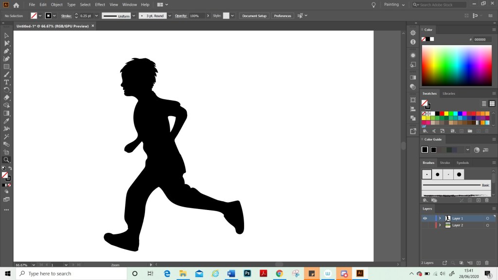
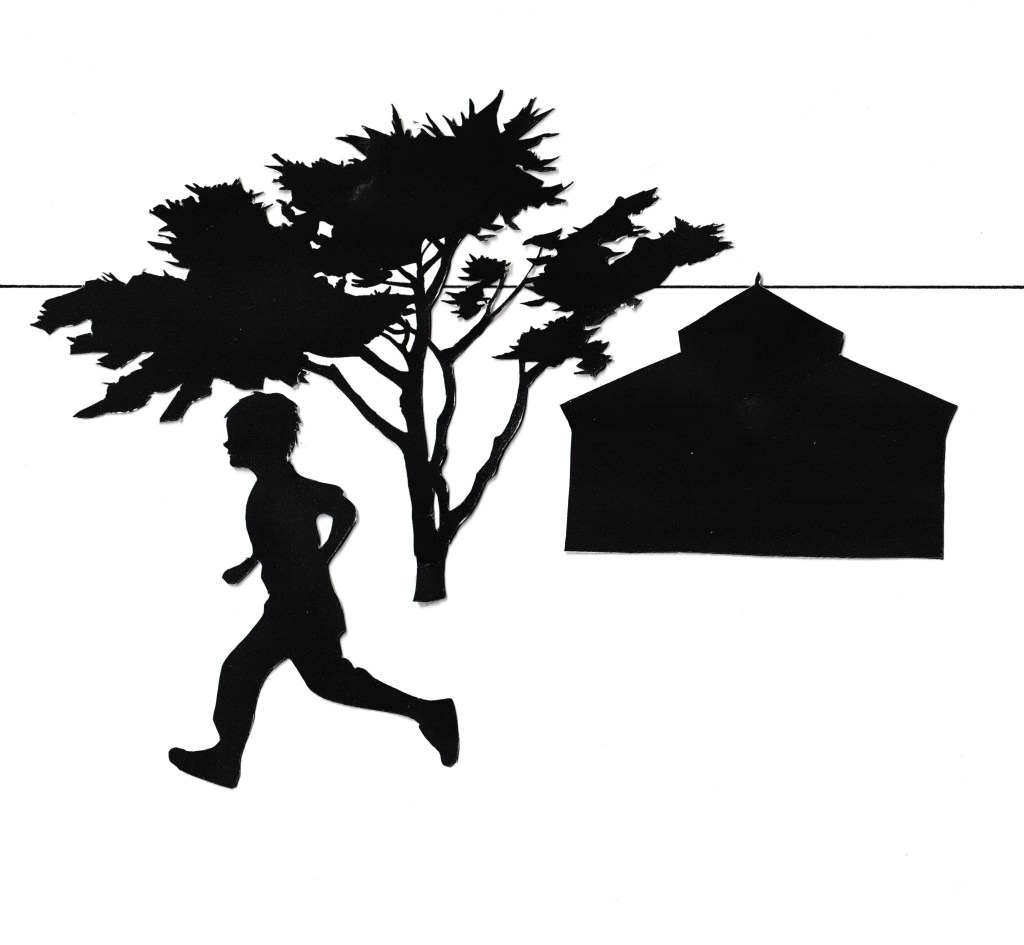
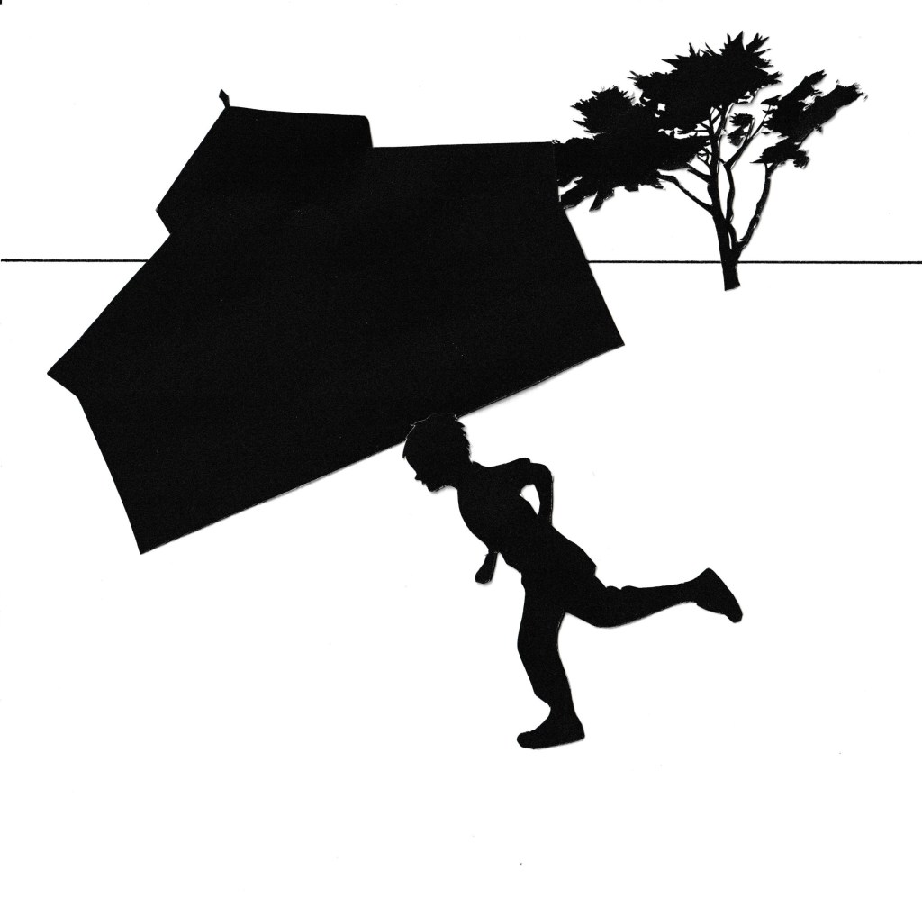
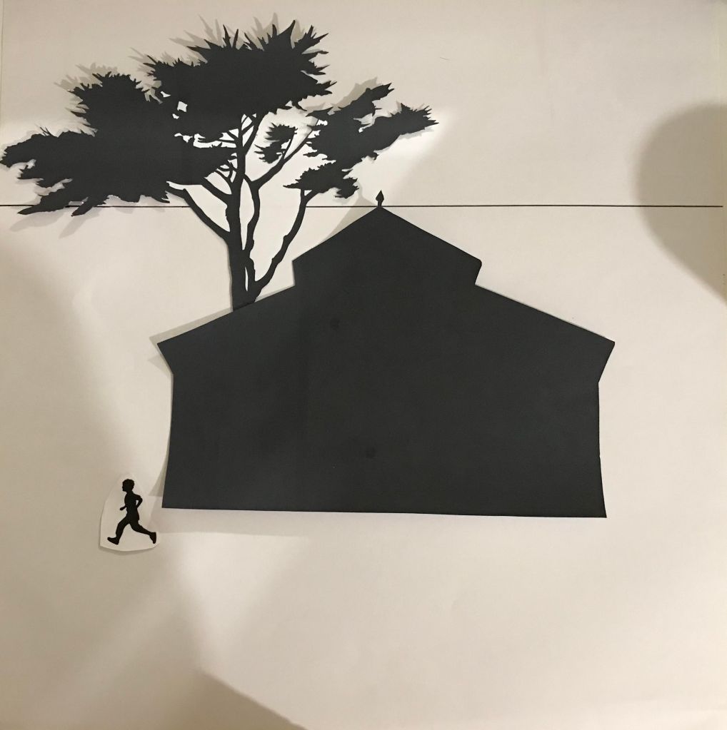
For this exercise we were asked to; use Internet searches or our own visual references for each of the following: a tree, a child running or walking, a building.
We were then asked to photocopy them in black and white in different scales and sizes, so that we have several versions of each image. Cut them into individual items with which to work.
Working the square format, arrange some of the cutouts to create a representational image. We may use the distortion of scale of one element compared to another to create an image which is interesting visually.
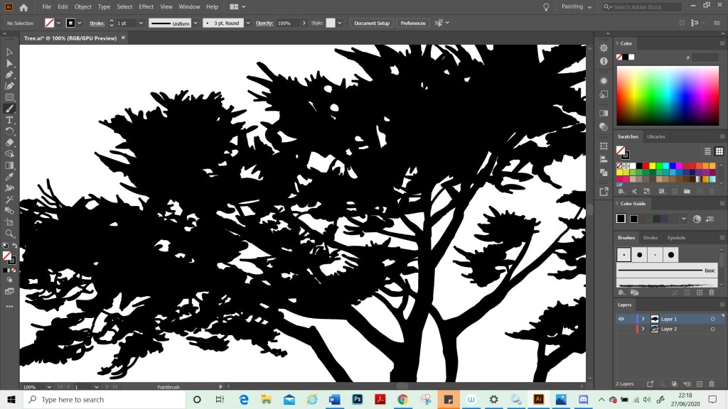
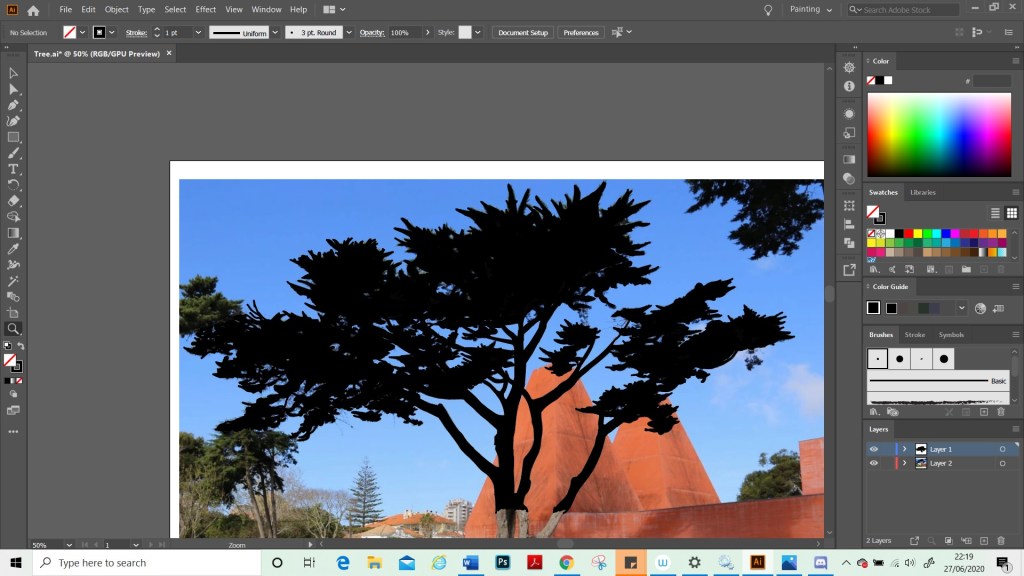
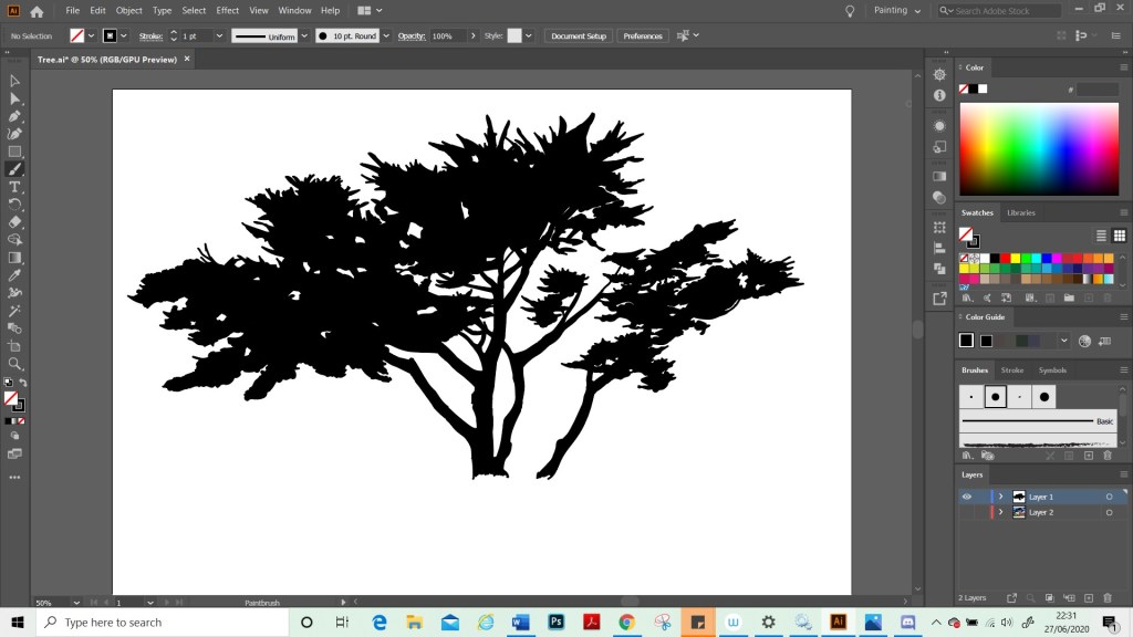
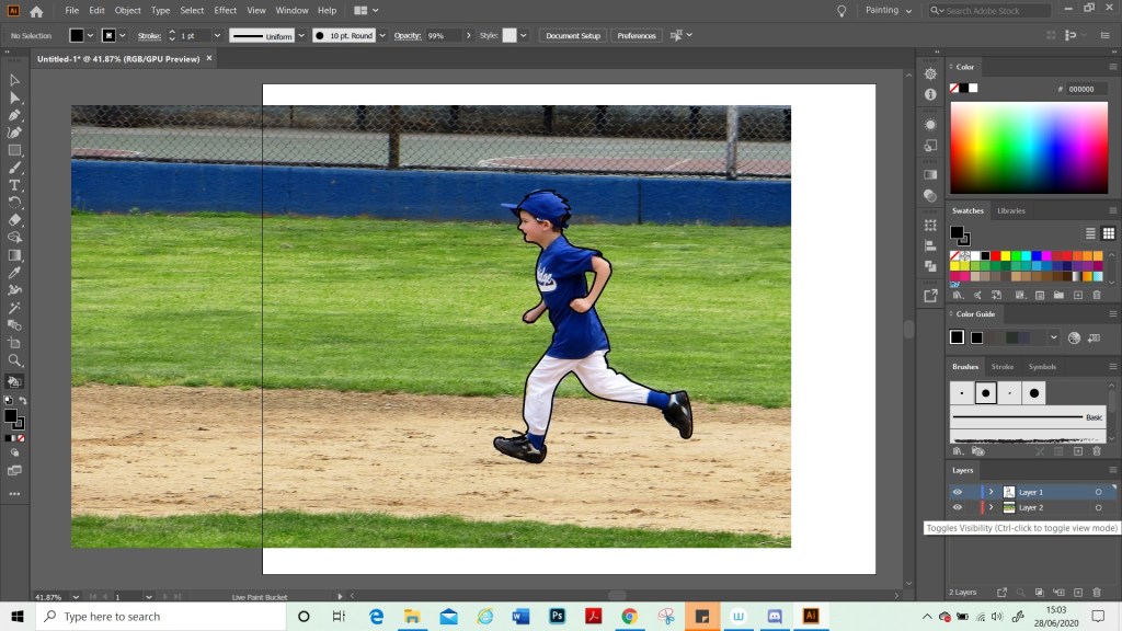
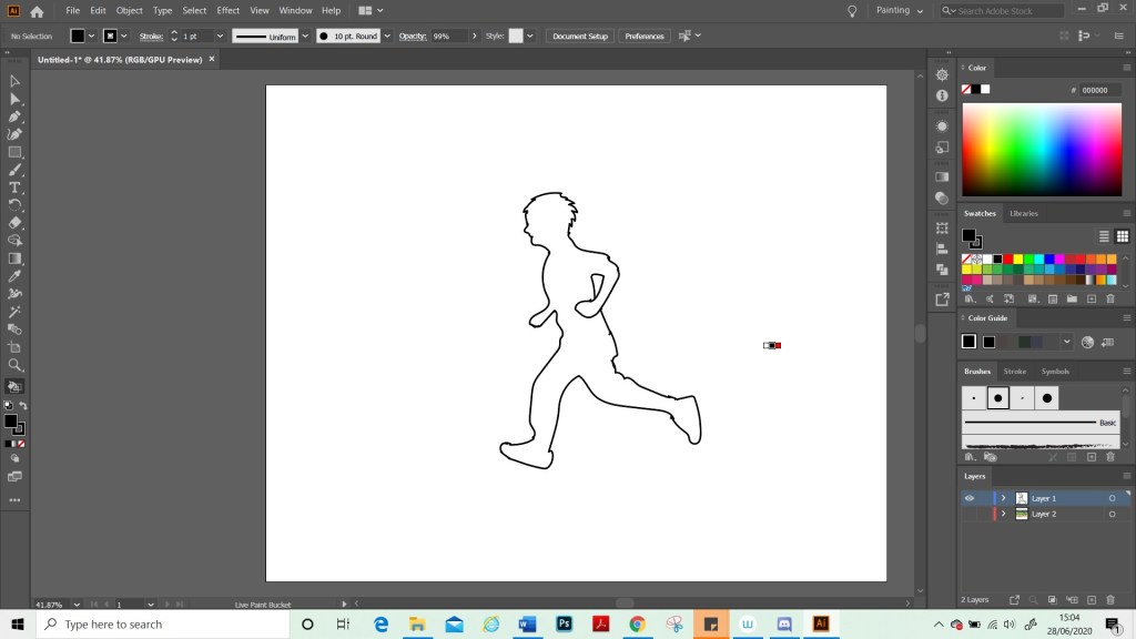
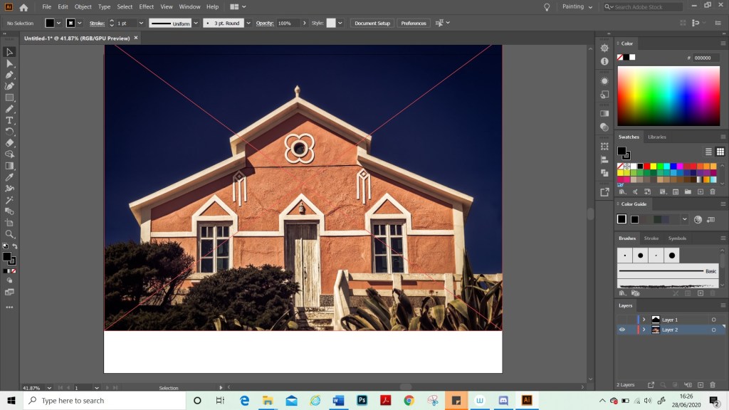
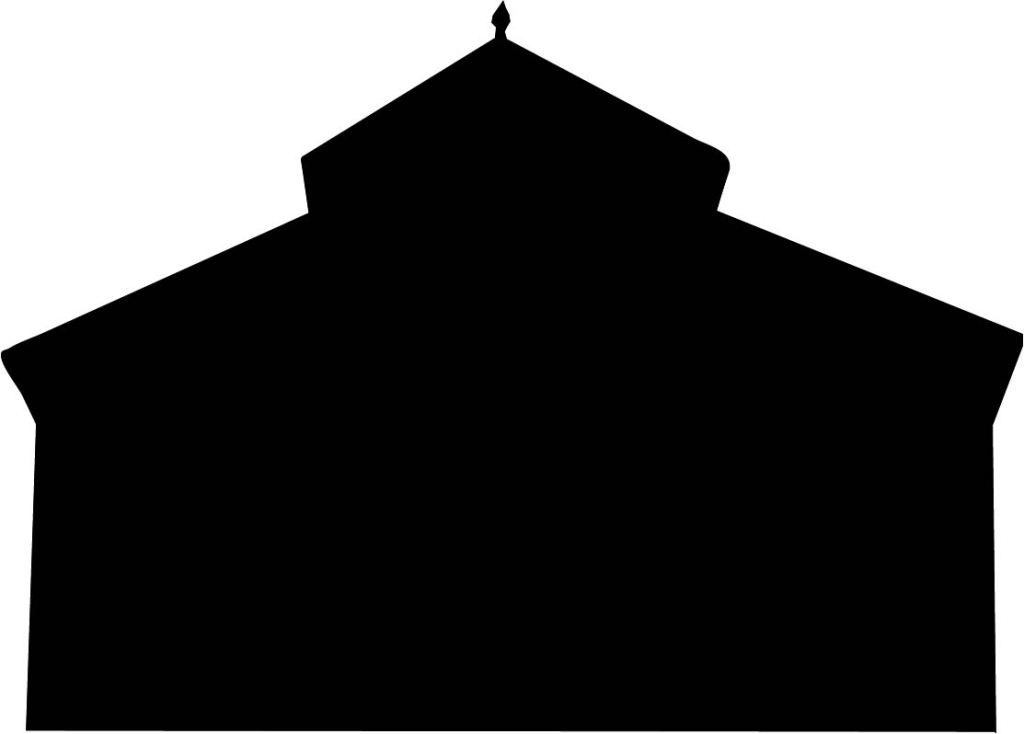
For this exercise I decided to try using Illustrator for the first time with my tablet as this is software that I would like to learn. I used a photograph that I have from my Lisbon trip and used it as a template and traced the tree. I really liked how the tree was coming out. However, I realised for this exercise that, as I have to cut out the tree I needed less detail. I saved a copy of what I had done and then on a new file, I filled in the gaps on the tree. Once I was done, I printed this out in different sizes. I then did the same with the boy and the house. However, these images I found on Pixabay.
I originally started working on a large format, but then realised I would not be able to scan these into my computer so I changed to a smaller format. I also realised that I had not fully understood the brief and that the images were meant to be black and white, not black on white. However, this still seemed to work okay for this exercise.
Test 1
Test 2
Test 3
Test 4
Test 5
Test 6
Test 7
Test 8
Test 9
Test 10
Test 11
Test 12
Test 13
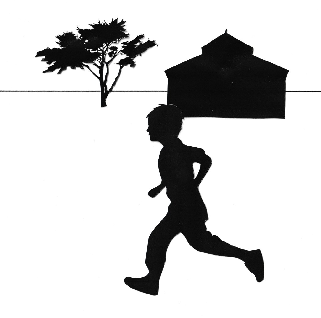
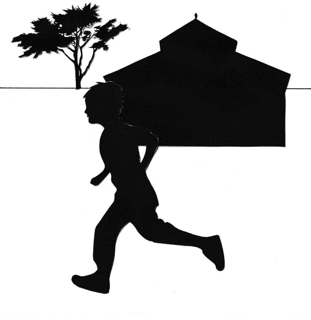
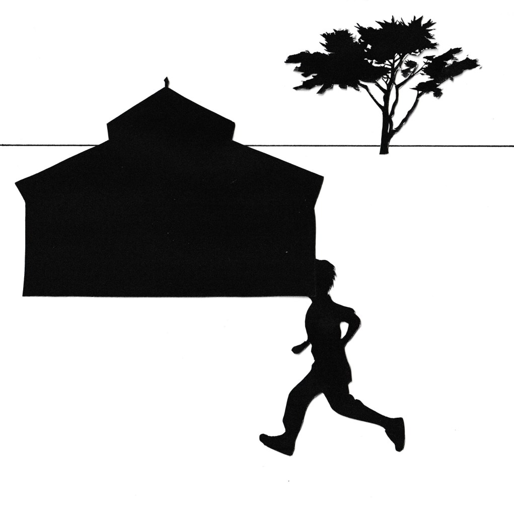
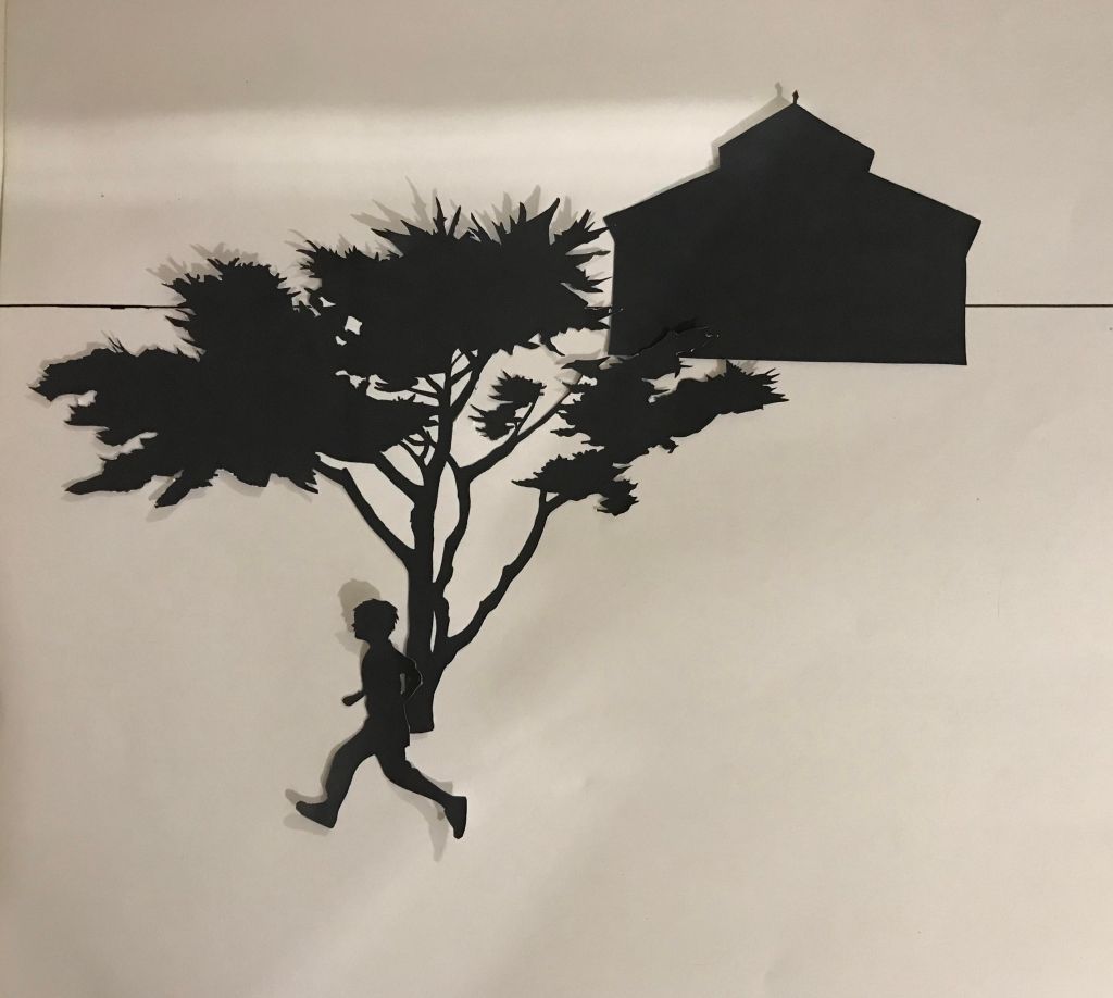
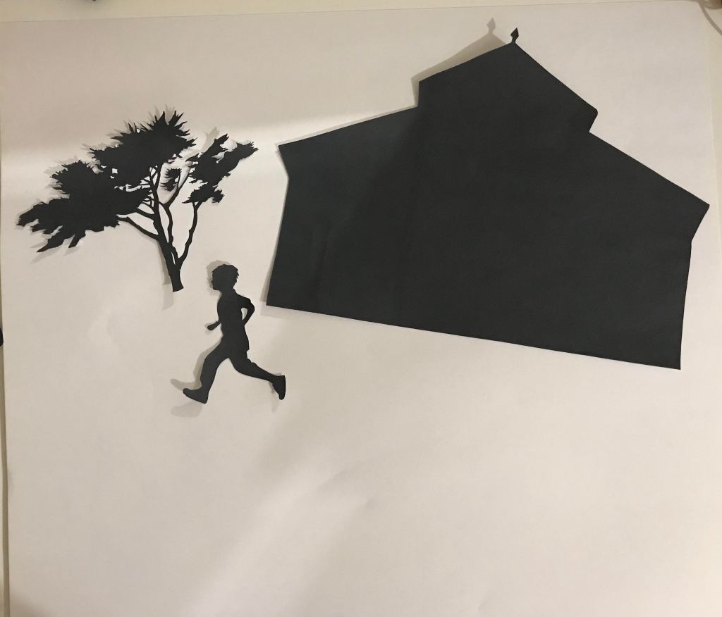
When the figure is smaller than the other elements. It makes me wonder what he is doing. It makes my eye travel across the page with him and adds a sense of intrigue. The figure may seem less significant and this gives the building and the tree more of an impression of grandeur and therefore they become overpowering in the image. In some instances, such as test 12, the figure would need to be a lot smaller, so that he would appear to be very far in the distance on the horizon. It was difficult, however, to print him so small, perhaps a tiny drawn figure would have worked better in this instance. When the figure is smaller, it looks as though he is perhaps just jogging or playing through the land around and pass the house. In contrast, when the figure is large as in ‘test 4’, he almost looks like he is running away from something. The large size of him seems almost to create a sense of urgency. Although, of course, he could simply be running for fun as well.
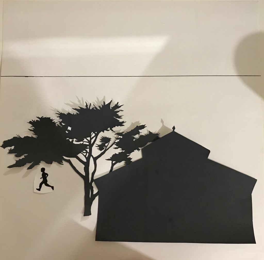
When the elements are right differing angles to each other and at an angle to the frame. This changes the dynamic. I struggled with this as I could not find a way to place my images that made sense. As in ‘test 6’, where it could perhaps suggest that the house and the boy are on a hill. However, I found that in this particular image, it just looked very odd and did not particularly give that impression. I imagine that with different elements such as a tall building that perhaps this would be more effective. However, I believe in test nine that giving the element a slight incline did work better and created the sense of the house being on a hill. Having elements at differing angles could also incite a sense of chaos or perhaps a different world.
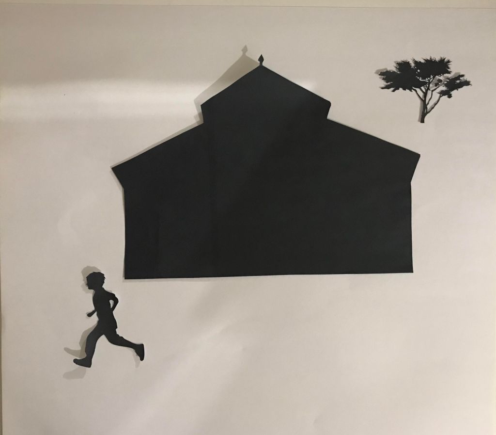
When all the elements are completely horizontal and vertical in relation to the frame, the dynamic is one of being grounded and realistic. This makes sense to me and feels familiar to the and therefore does not suggest a different world to our own. Nothing seems out of the ordinary and a sense of realism is suggested. A sense of calm and order.
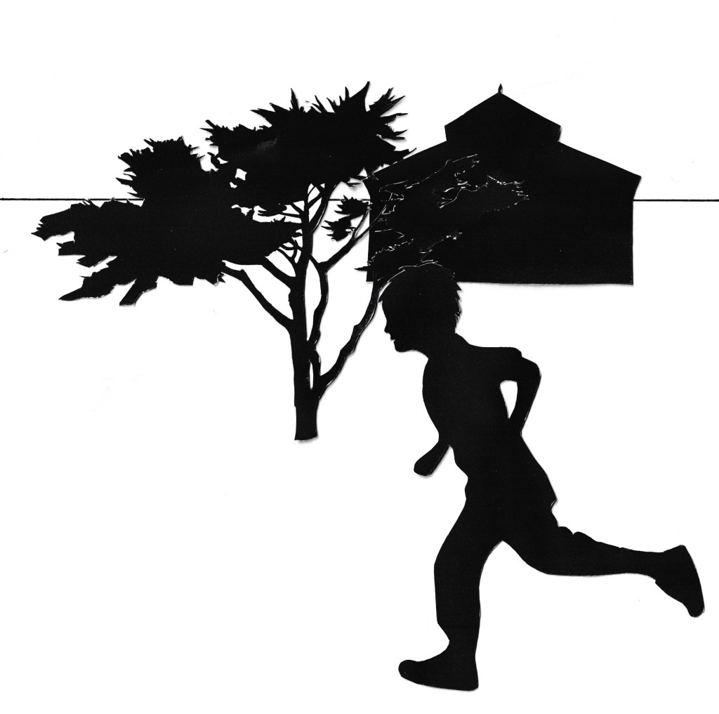
My favourite composition is ‘test 1’. I like the spacing in between the elements as I feel that this creates a sense of depth to the composition. I also feel like it adds to the story as it makes me wonder where the boy is going and if there is significance to the house and the tree in the background in relation to the boy’s story or if they are just passing elements. I like that the boy is the focus of the frame and I really like the way the tree is overlapped in front of the building to create a sense of dimension and interest. The tree and the building that I chose for this exercise are references from Portugal. I chose these as I already had the image of the tree that I thought was a very appealing shape so I wanted to match the building to the place to set the scene. I do not think that you can tell where this image is based on these elements, however, I do feel that it creates a more interesting composition when the elements are more varied in their shapes and this made it more fun for me to work with. The are a few other compositions that I like to, such as test 2, 4, 7, 10 and 13. I feel that these layouts are also interesting or at least work, whereas the others I am not particularly keen on as I feel they are a bit bland and uninteresting.
Reflection
By doing this exercise, It has made me realise that there are a lot more options that I can and should be exploring when I am coming up with compositions. And that by trying out different compositions, I may find one that works better than my original idea. It may also be that by exploring my options, I may find the composition that I was going to go with, reads in a different way than I had intended. Therefore, by experimenting more, I may find a better composition that presents my story in a more effective manner.
I think that I understood the brief. However, I feel like I was missing an opportunity to explore interesting compositions as I was not quite sure how to go about this with just my free elements and the particular shape of the building. I had, I do feel perhaps if I had had a different element will shape building, or perhaps a much smaller size of building that maybe then I could have created more compositions with the elements being at differing angles to each other and to the frame. I am glad that I got to use this exercise is a chance to start to learn Adobe Illustrator and I am feeling like I am learning a lot of different things at the moment, which is very exciting and I look forward to being able to incorporate the things I am learning into my future work.
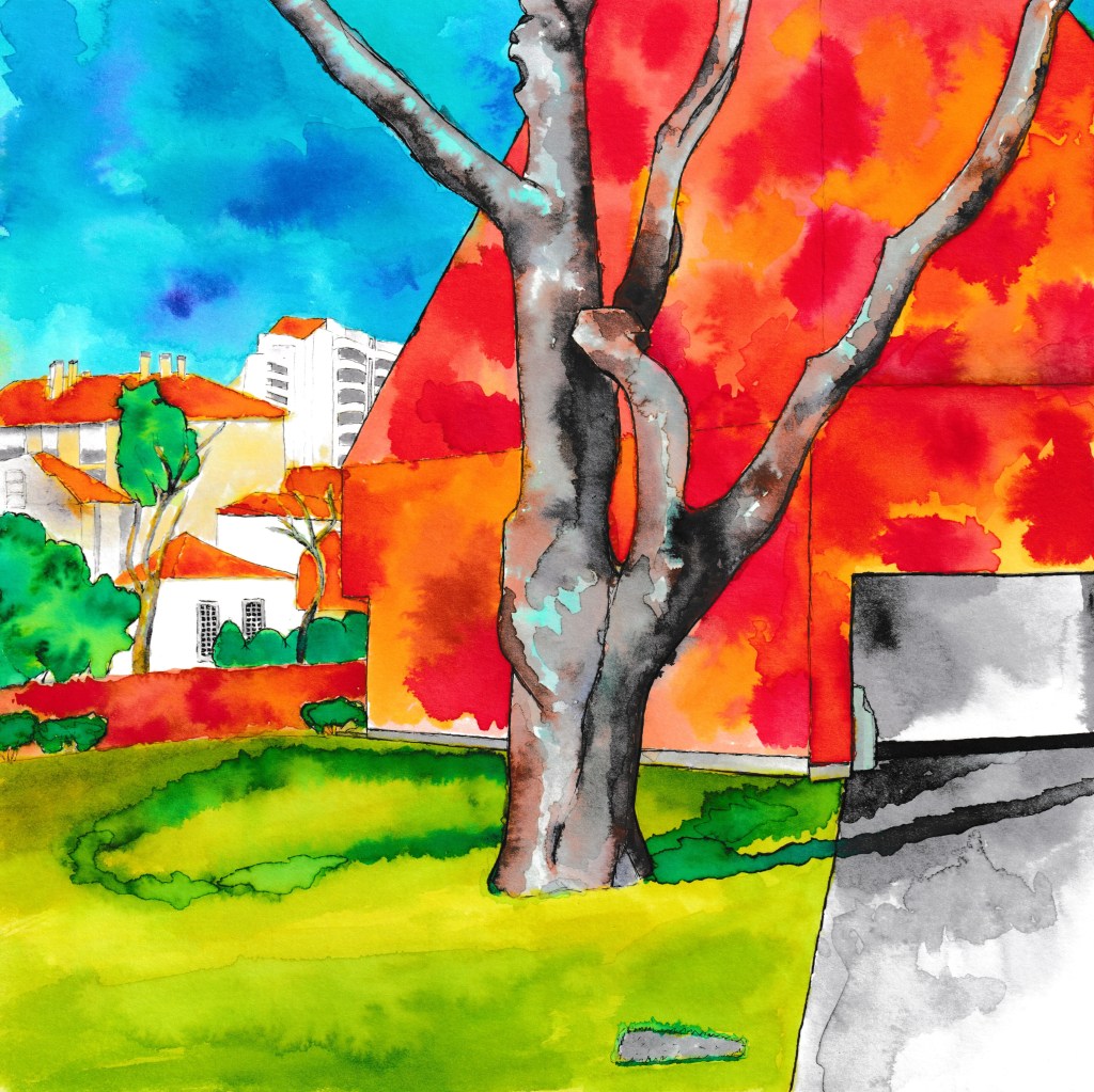
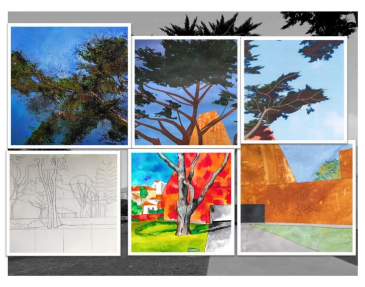
I recently participated in a group collaboration project with 6 of my fellow students from the Lisbon trip. This was led by one of the students, Martine Elliott by one of the students. For this group project. We took a photo that was taken during a Lisbon trip of the Paula Rego Museum and divided this into six sections. We each picked a section with the idea that we each used whichever mediums we wanted to recreate the tile that we were given. Once we had all completed our sections. These were then handed back to the student leading the project, who then pieced them together to create one piece of work.
My Final Piece
I really enjoyed doing this collaborative project, partly due to not feeling any pressure for it to be good, as it was not going to be marked and was purely for fun. I therefore decided to take what I had learnt in Lisbon from my tutors and fellow students and apply that to this painting. One of the things I mentioned in Lisbon, is that I have not been very explorative in my artwork. I wanted to set myself the task of pushing my boundaries and pushing myself out of my comfort zone. Whilst in Lisbon, we experimented as a group with India ink and made a big old mess! This was really fun and made me realise that sometimes I need to experiment and to do artwork that I do not need to take so seriously.
My arrival back from Lisbon was timed perfectly with my mark making project for key steps, part two. Inspired by Lisbon, I completed my mark making project and then did this group collaboration. For this painting. I used ‘Viviva Colorsheets’ to paint with which are described as super vivid, transparent watercolours. They come in a paper pad rather than paint in pots which is very handy for carrying around when on location. I found these colours to be extremely bold and bright and was inspired by these to create the colour palette that I did.
Once I had finished my painting. I was not so sure about the building and wondered if I should have painted it all one shade, so that the sky and the tree stood out more. However, now that I look back at this painting. I do not feel so overwhelmed by the brightness of the building and I do see the other elements in the painting as competing. This was very enjoyable to make and these are definitely techniques, I would also like to try again, perhaps on other assignments. I particularly liked the technique for the sky and I really liked the tree which was my main focus, with my plan being to incorporate blues into the highlights, as opposed to using more realistic colours. This did not take me much time to complete, I think this is partly due to me not being so precious with it.
I choose this part of the grid as it was the most interesting to me, due to it having varied subjects i.e. buildings, tree, hedges.
My grid selection
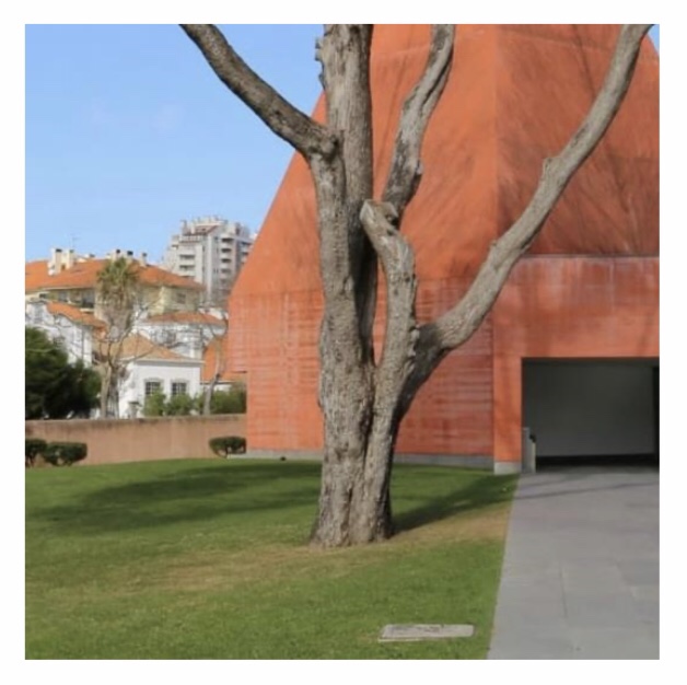
The original photo of the Paula Rego Museum
The Finished Grid
Due to the success of the grid collaboration. We are now embarking on a second collaboration project led by one of the other students in the group. I am looking forward to participating in this next collaboration project.
The brief for this assignment was to create images which will be used within a campaign for a supermarket to package and promote a range of seasonal foods.
We had to create an illustration of fruit or vegetables. One illustration for each of the ranges; summer and autumn.
These images were to be objective and based upon direct observation. The brief asked us to consider putting ourselves in the place of the customer and asking, ‘does this look edible?’, ‘Would I like to eat it?’ They asked us to be especially conscious of the way we use colour to describe tone, shadow and surface marks as poor colour choices can result in good-looking, mouldy, battered or ultimately unappetising.
I considered these questions and remember reading or hearing about this topic before with making sure that colour and texture are considered in food illustration to make sure look appetising.
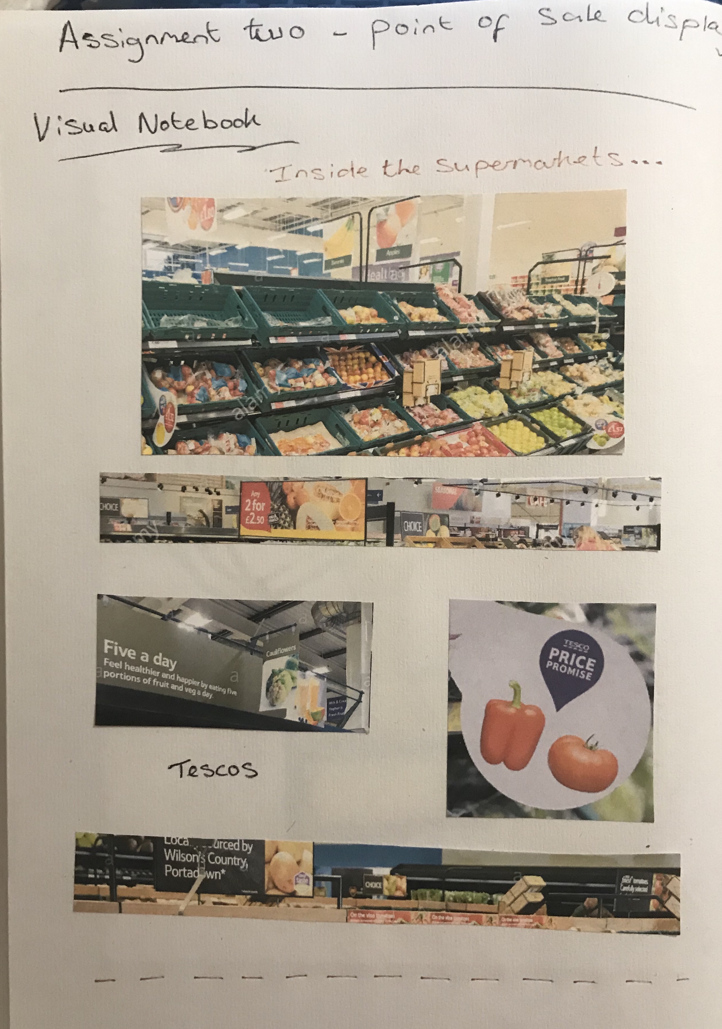
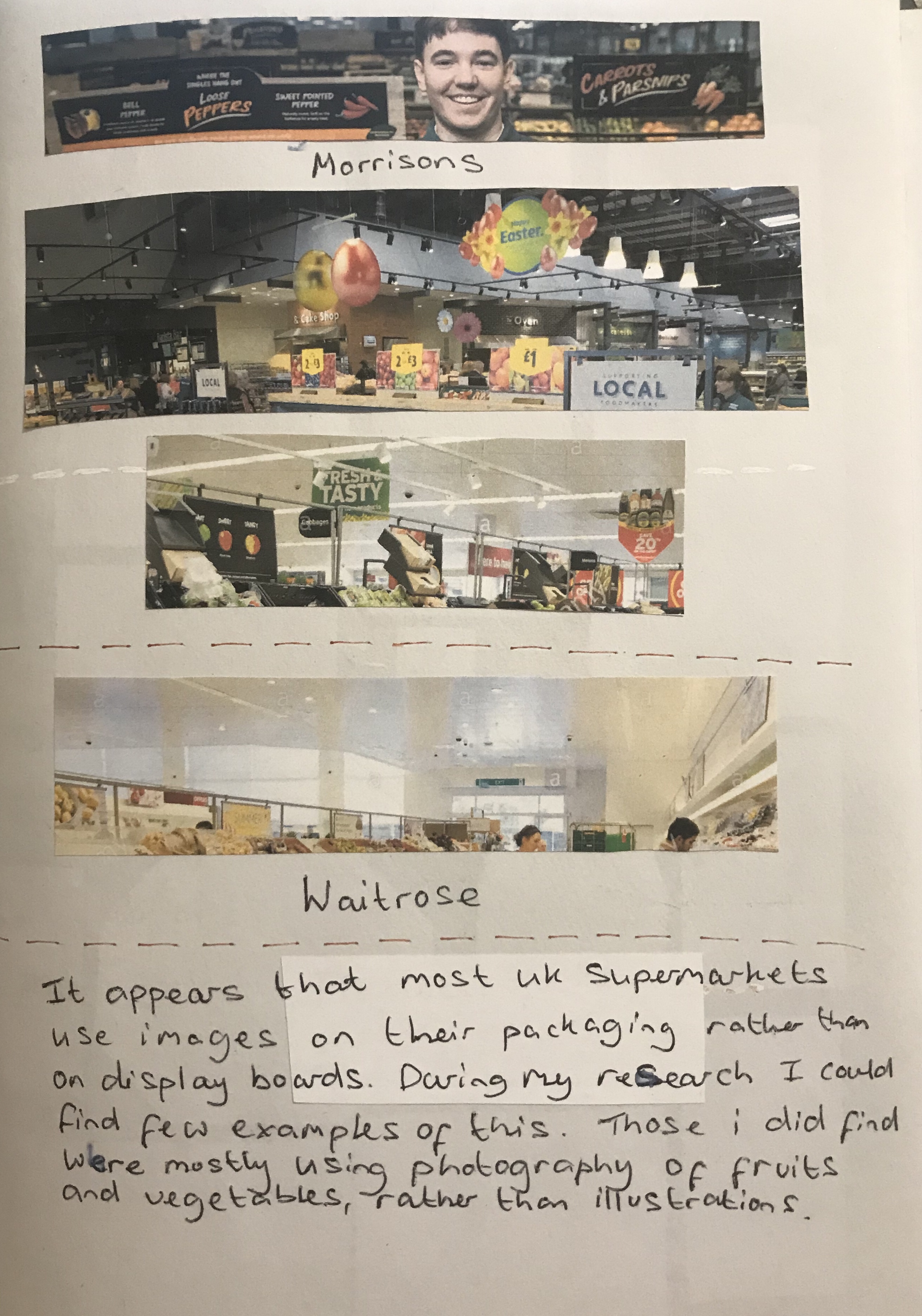
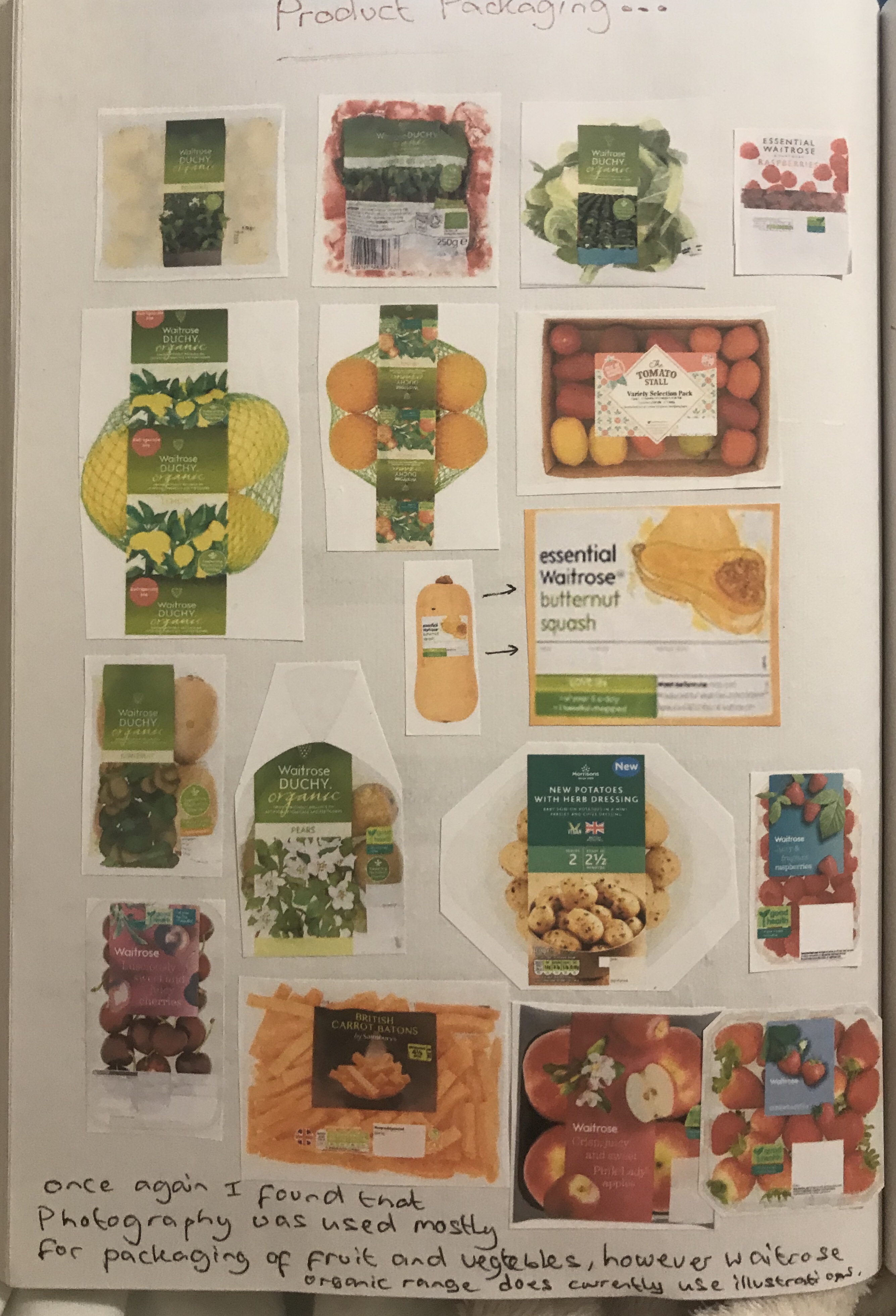
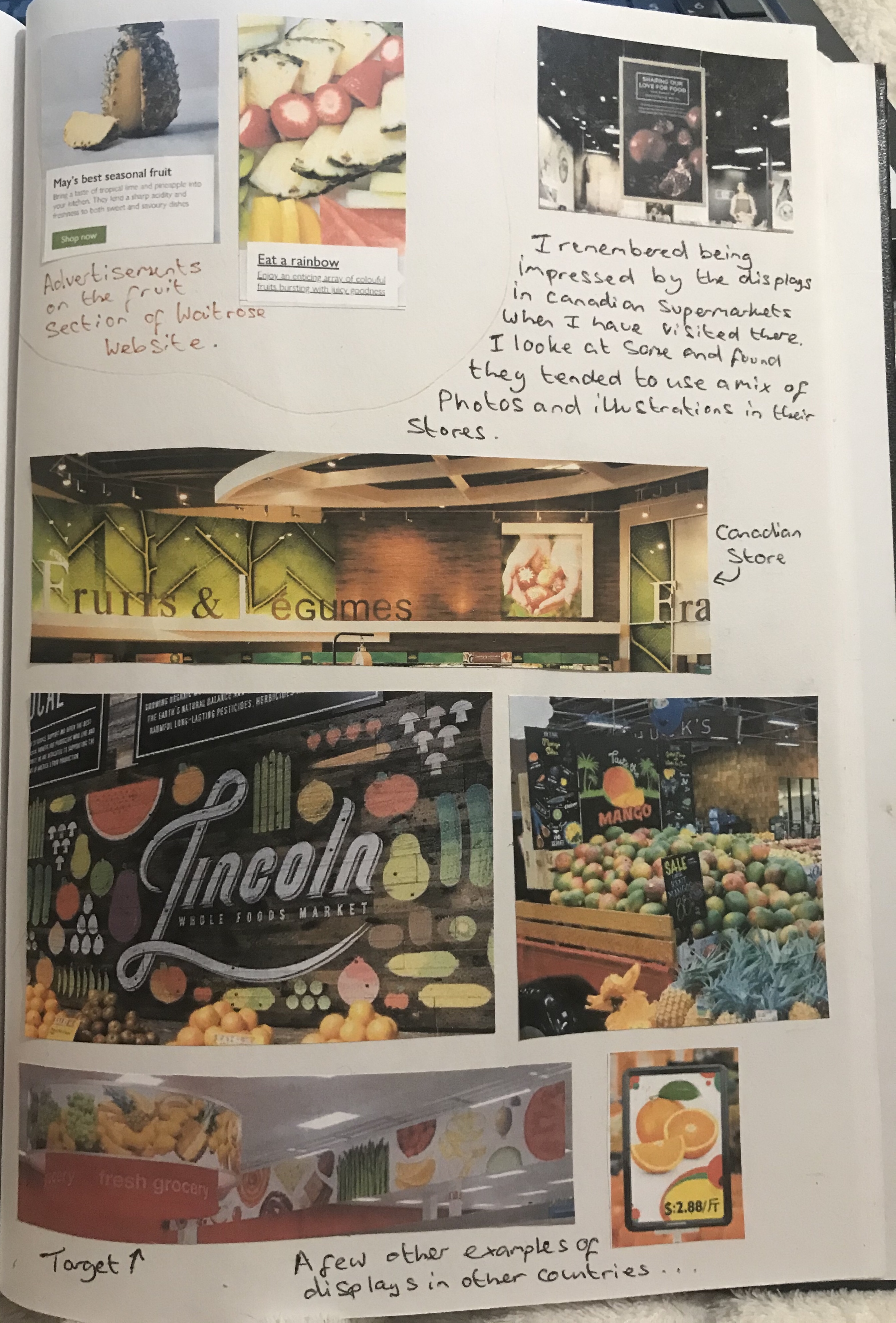
With a visual notebook and used the Internet to find photographs from inside supermarkets. I would have gone to visit some stores, but due to Covid this was not going to be practical and I was definitely not able to take photographs in store. I did struggle to find examples of display boards and illustrations on fruit and veg packaging in the supermarkets. Partly this was due to the fact that most of the supermarkets actually use photographs rather than illustrations for their display boards and illustrations in hand display boards are generally used for other items in store and other sections more than the fruit and veg aisles.
I did however find a few examples and found that Waitrose in particular does use illustrations on the packaging and I looked at the artist’s work on her agents website which showed these illustrations. The majority of examples of more elaborate display boards using illustration, I actually found in other countries such as Canada and America.
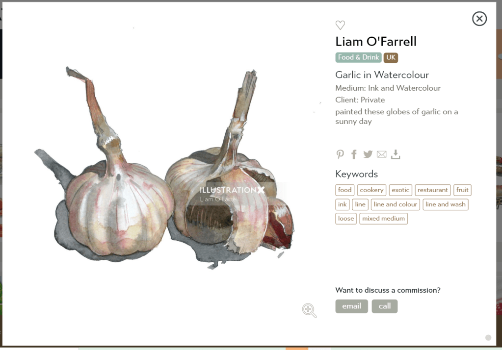
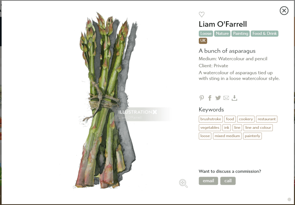
I looked at food illustrators work and found varying styles, some of which I did not like so much and some of which I really loved such as Liz Pepperell. Her colour palette is really rich and I love the way she makes food look tasty, particularly the one she did with the orange pieces that look really juicy. Another artist’s work that I loved is Liam O’Farrell. I really love the colour palette uses and the style of his illustrations. They remind me of another artist named Holly Exley that I have seen do food illustration, amongst other types of illustration. She tends to use lots of blues and purples in her shading, so her images are not realistic, but the colour palette is very beautiful and interesting.
I had a go at copying a couple of the artists illustrations or illustration style. However, this did not go well. I found it extremely difficult to decipher what it was they were doing with their paint and realised it was better that I did not try this and just tried my own being inspired by their colour pallets rather than trying to use too much of their styles.
My failed attempt at studies of the artists work.
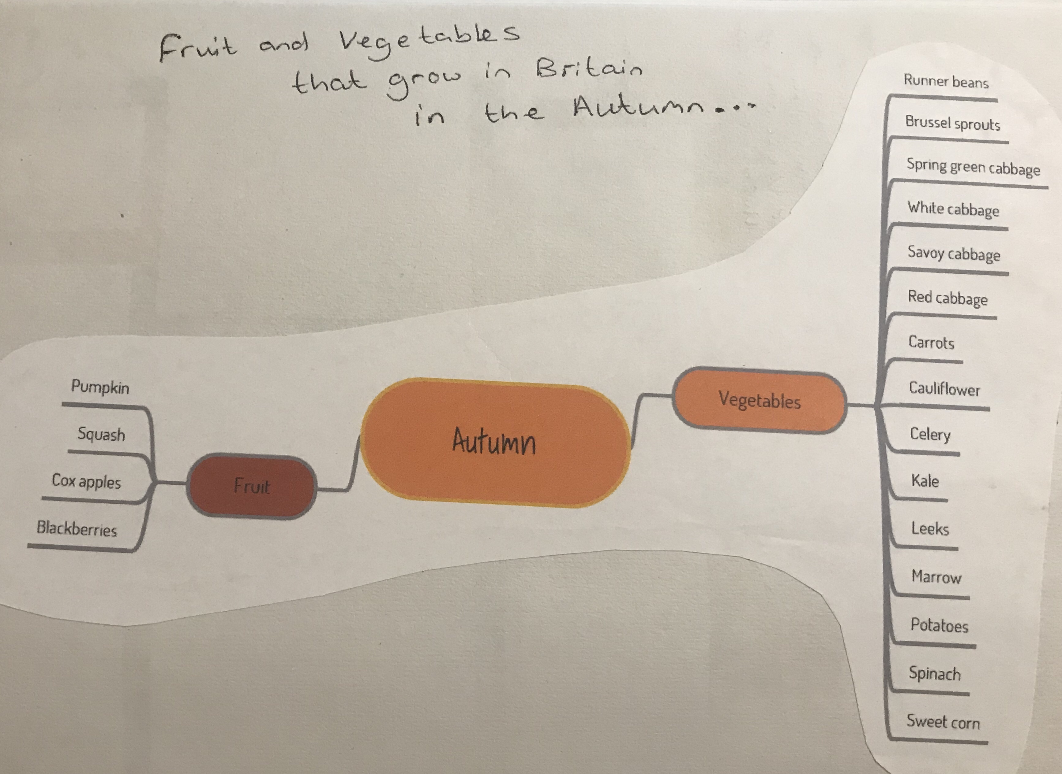
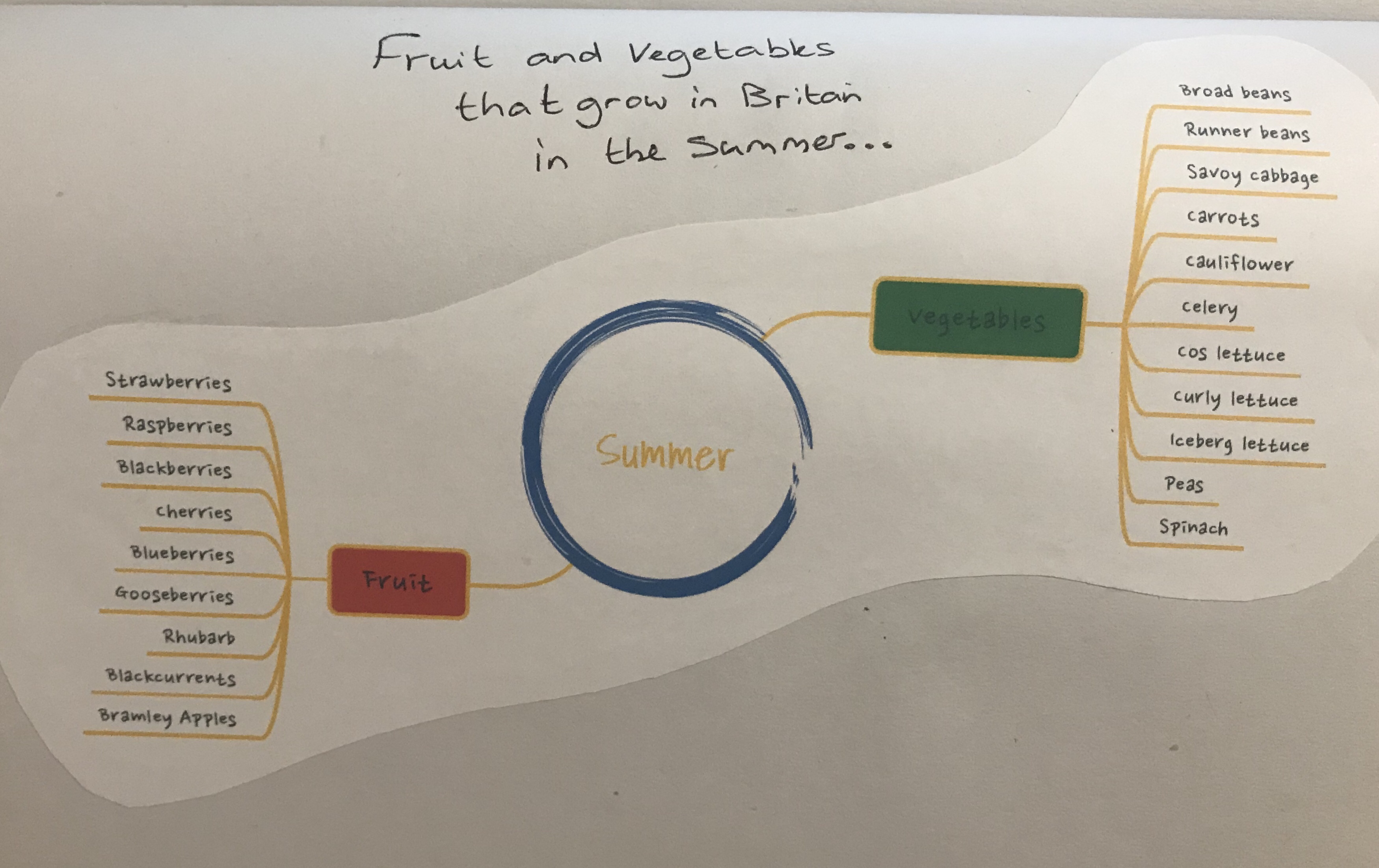
I did some mind maps of both autumn and summer fruits and vegetables to find out what grows in Britain during each season. From this I selected the fruits and vegetables to include in my mood board. I decided to go with summer fruits and autumn vegetables. This is because the autumn fruits list is a little sparse, whereas the autumn vegetable list is very long and therefore it made more sense to do it that way round. I was also quite keen to do fruit for my summer illustration.
Moodboard for Summer Fruit
Moodboard for Autumn Vegetables
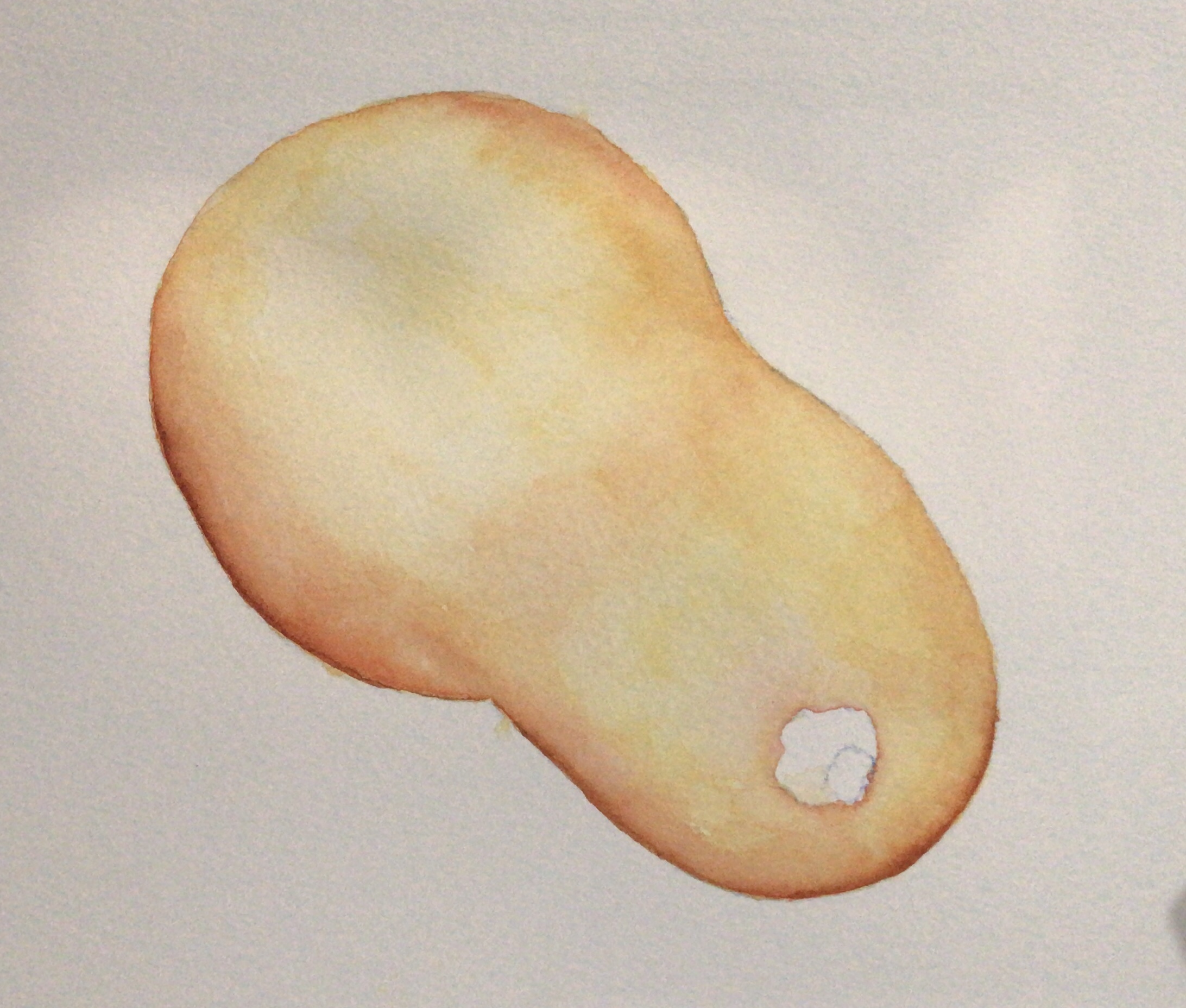
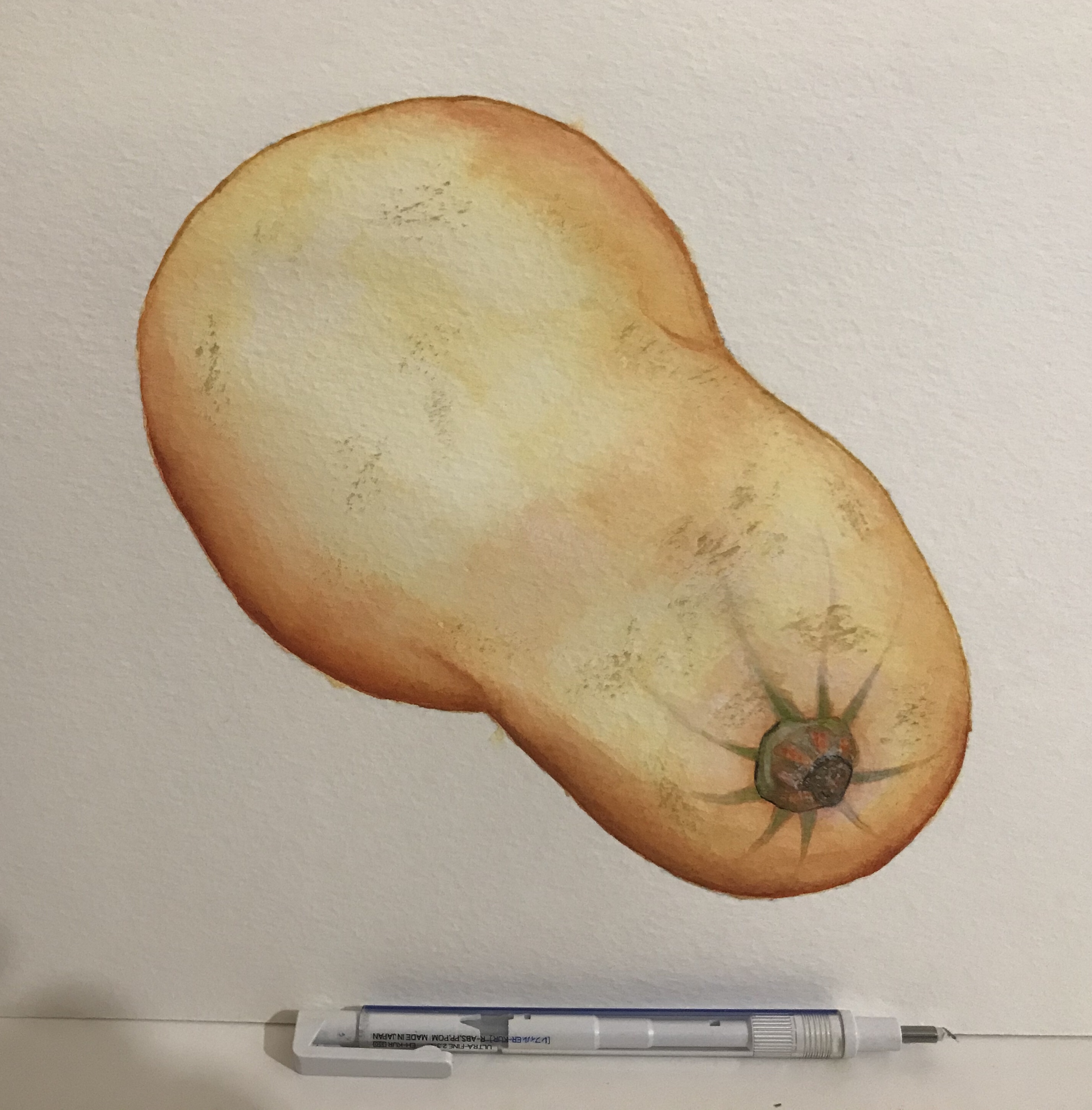
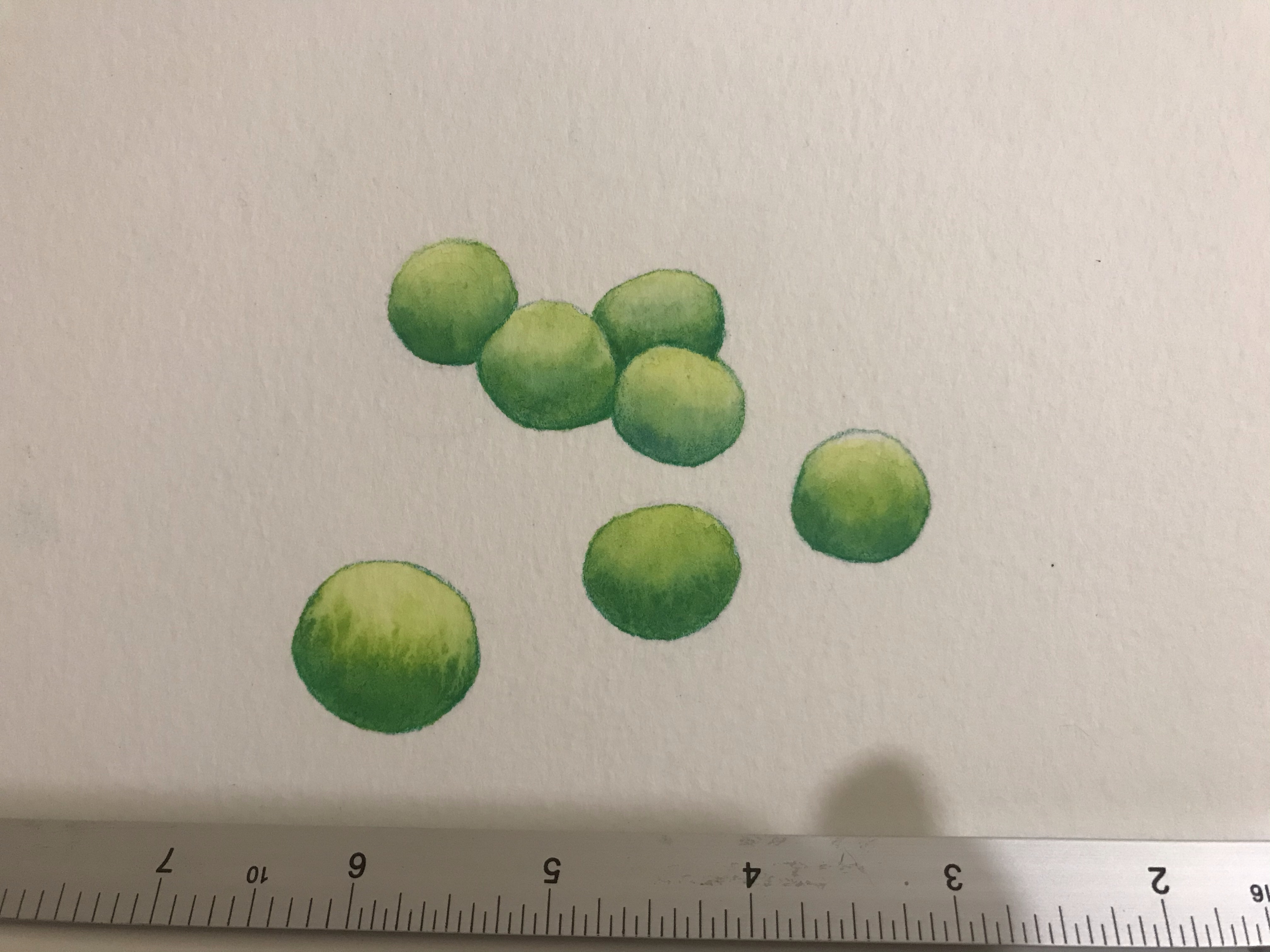
My tests of painting autumn vegetables – Watercolour and Gouache.
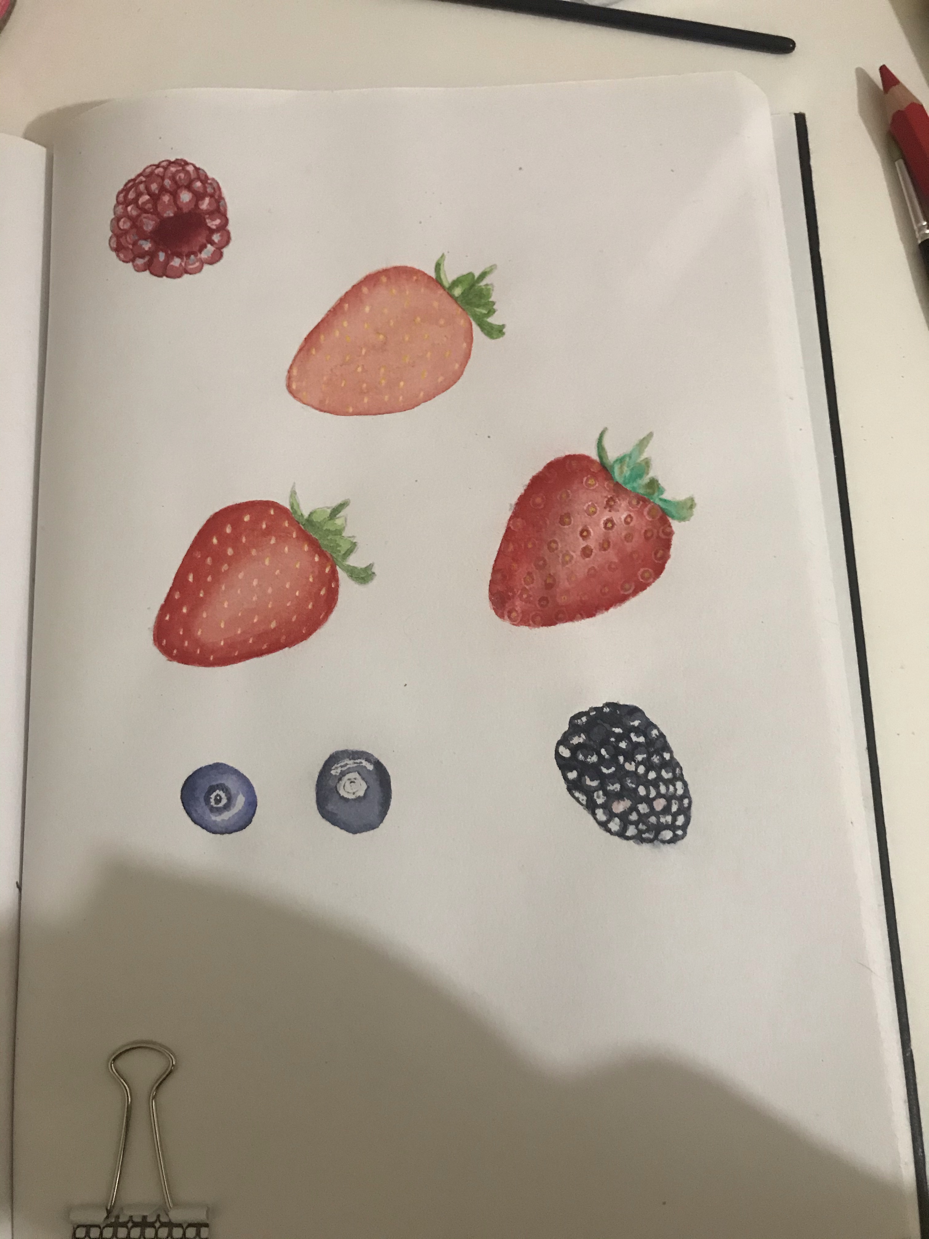
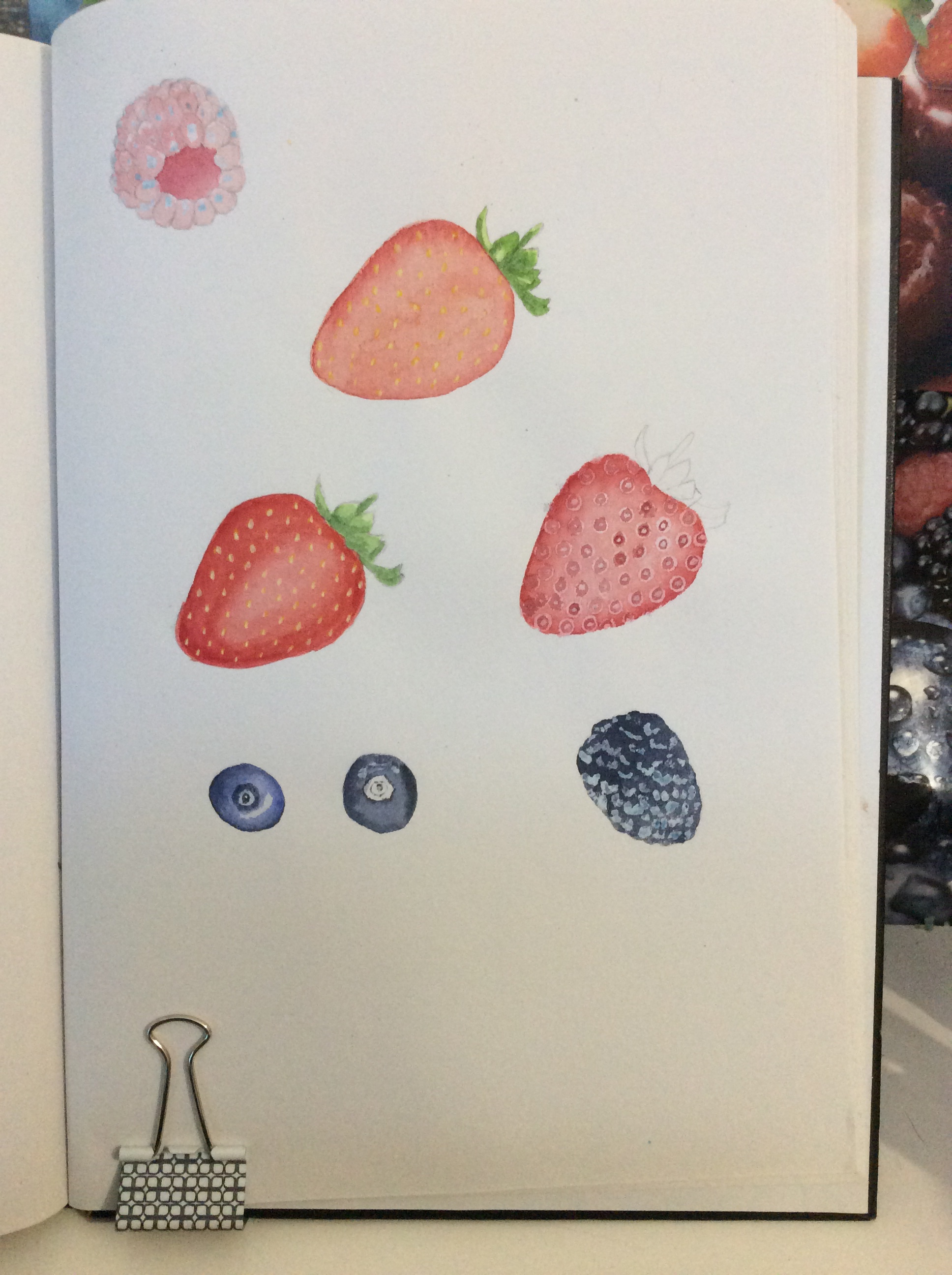
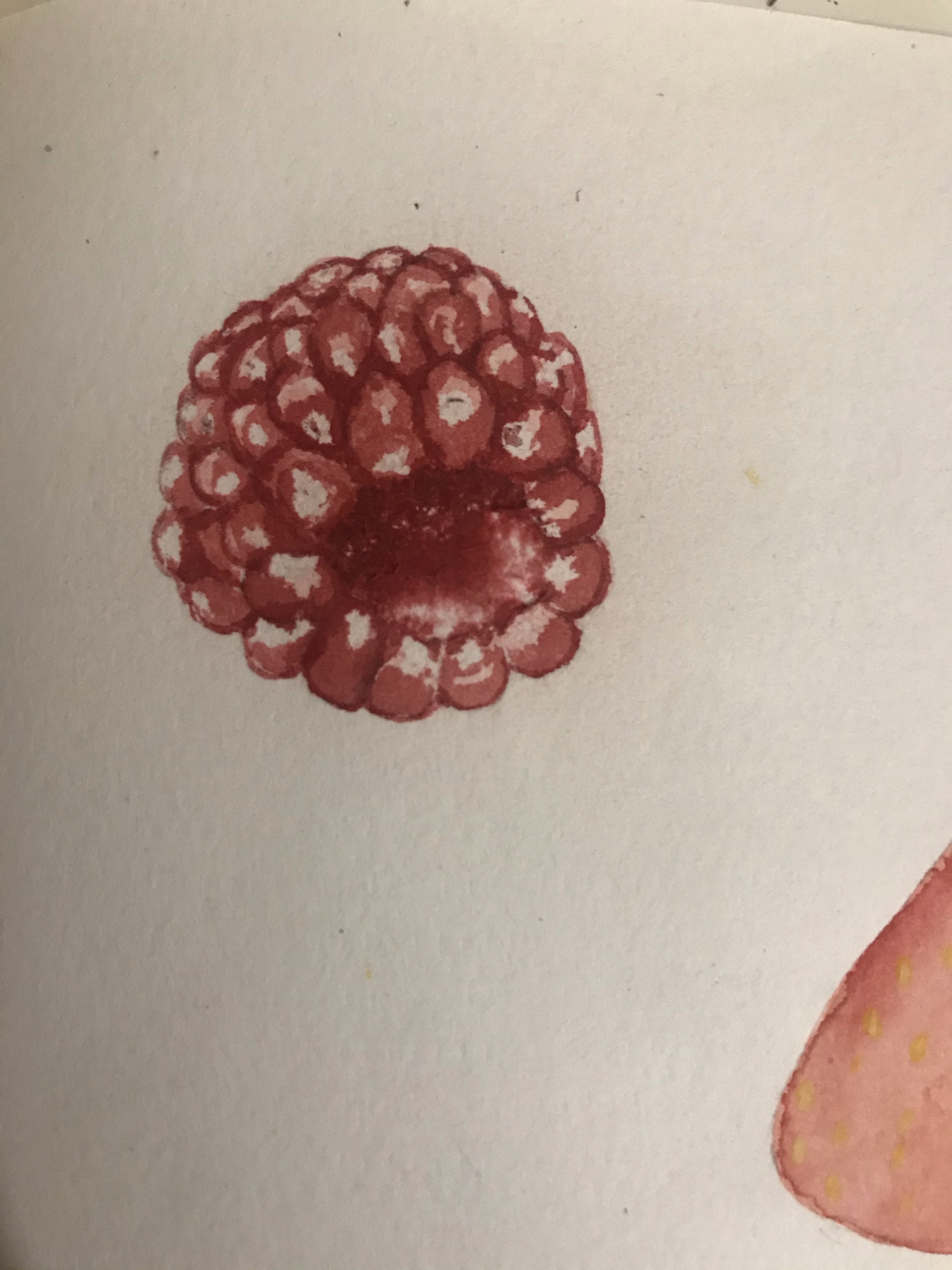
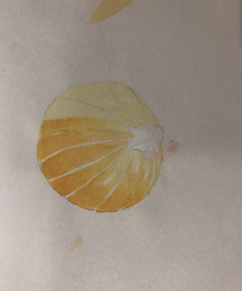
My test paintings of the autumn vegetables went quite well. I was happy with how they came out. I participated in a group session with OCA tutor Bee Willey and after showing her these images and discussing with her. She suggested that I work a lot larger so that I am able to create fine details easier and also to try acrylic inks to paint as I mentioned that I was concerned with watercolour and gouache that it will sometimes struggle to get the paint colours as bright as I want them to be. I said that I do have a tendency to work very small and that this is a habit that I would like to get out of, but also that I really would like to experiment with working on a bigger scale to see how that affects my work. For my test paintings. I used masking fluid on some of them to keep the highlights and then painted over the top. I did a few different versions of the strawberries until I found one I liked the look of. However, I did quite like my Rasberry, but I wasn’t sure about how strong the highlights were. I decided that I would work on a large scale for my final piece, so I would not use masking fluid. I would just leave out the highlights.
My tests of painting summer fruits – Watercolour and Gouache.
Small test painting with FW acrylic inks.
I have acrylic inks in my supplies, but I have only used them to paint on a very small scale. I hadn’t considered them as an option for this project until it was mentioned by Bee. I therefore did a small test with them before I started painting my final piece, and I found them to paint very smoothly and will easily blendable. After my test I was very happy with how it looked and was now confident that acrylic inks would work for my painting.
To show the scale
Failed attempt
2nd attempt
2nd attempt
Testing the composition
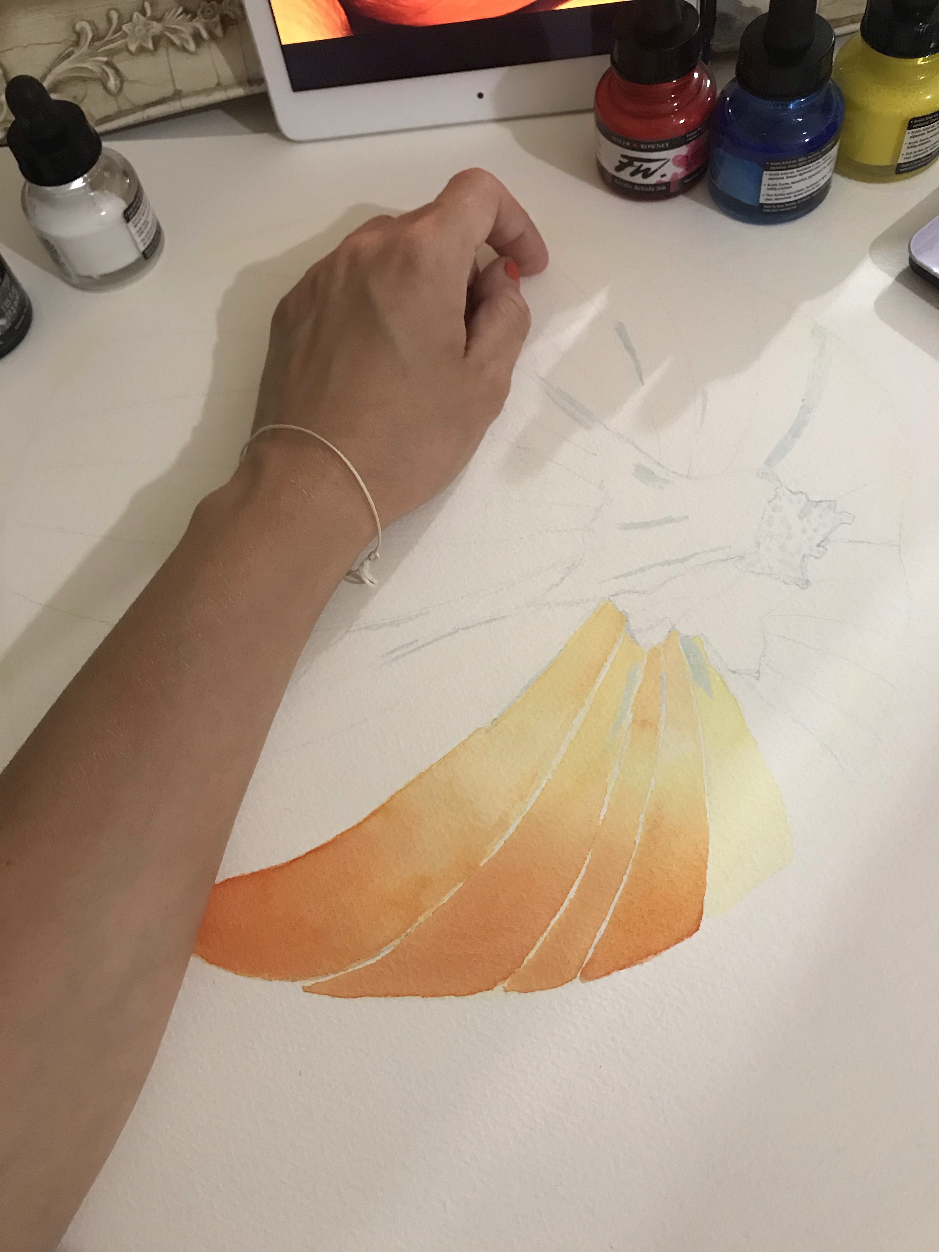
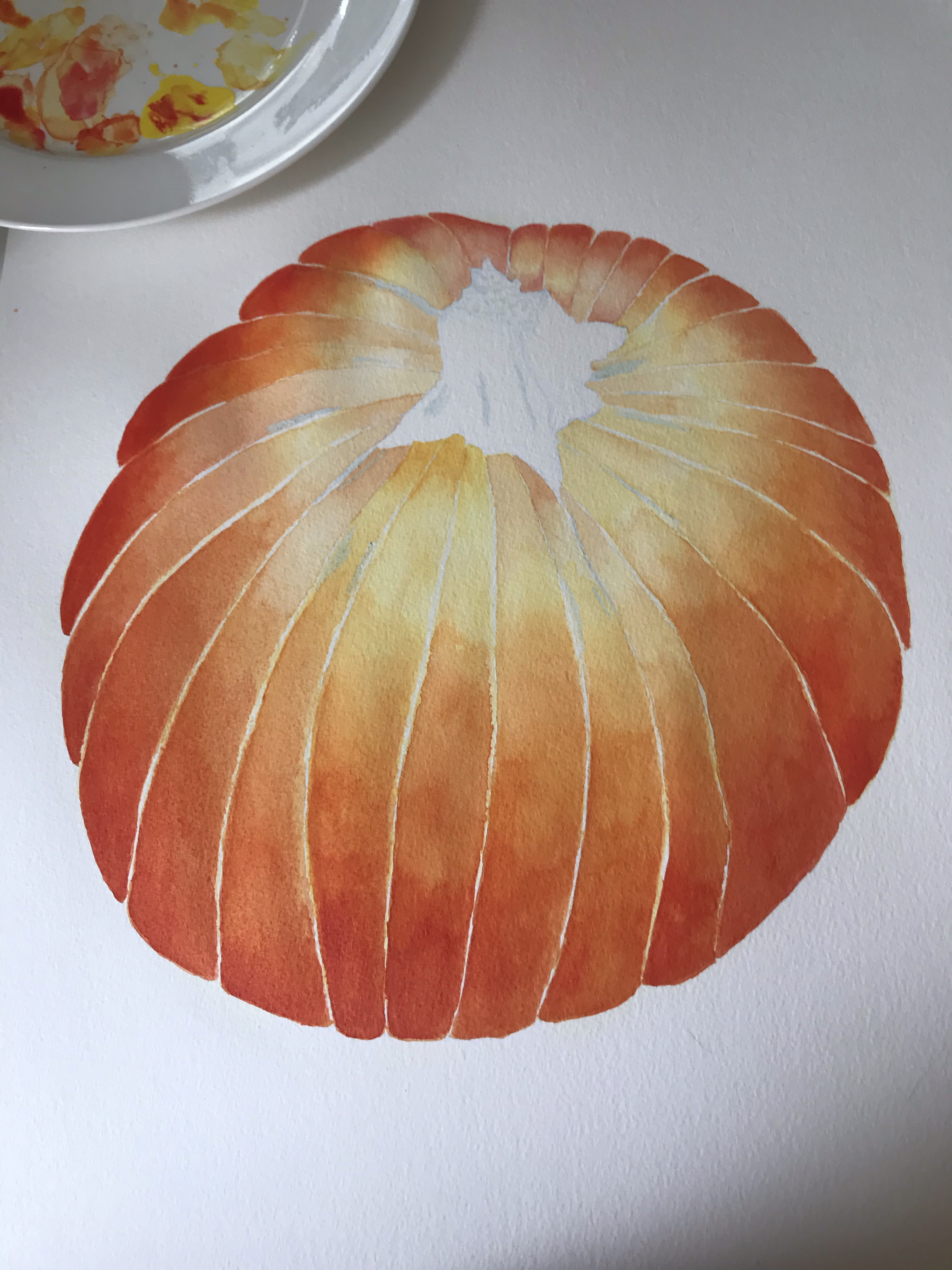
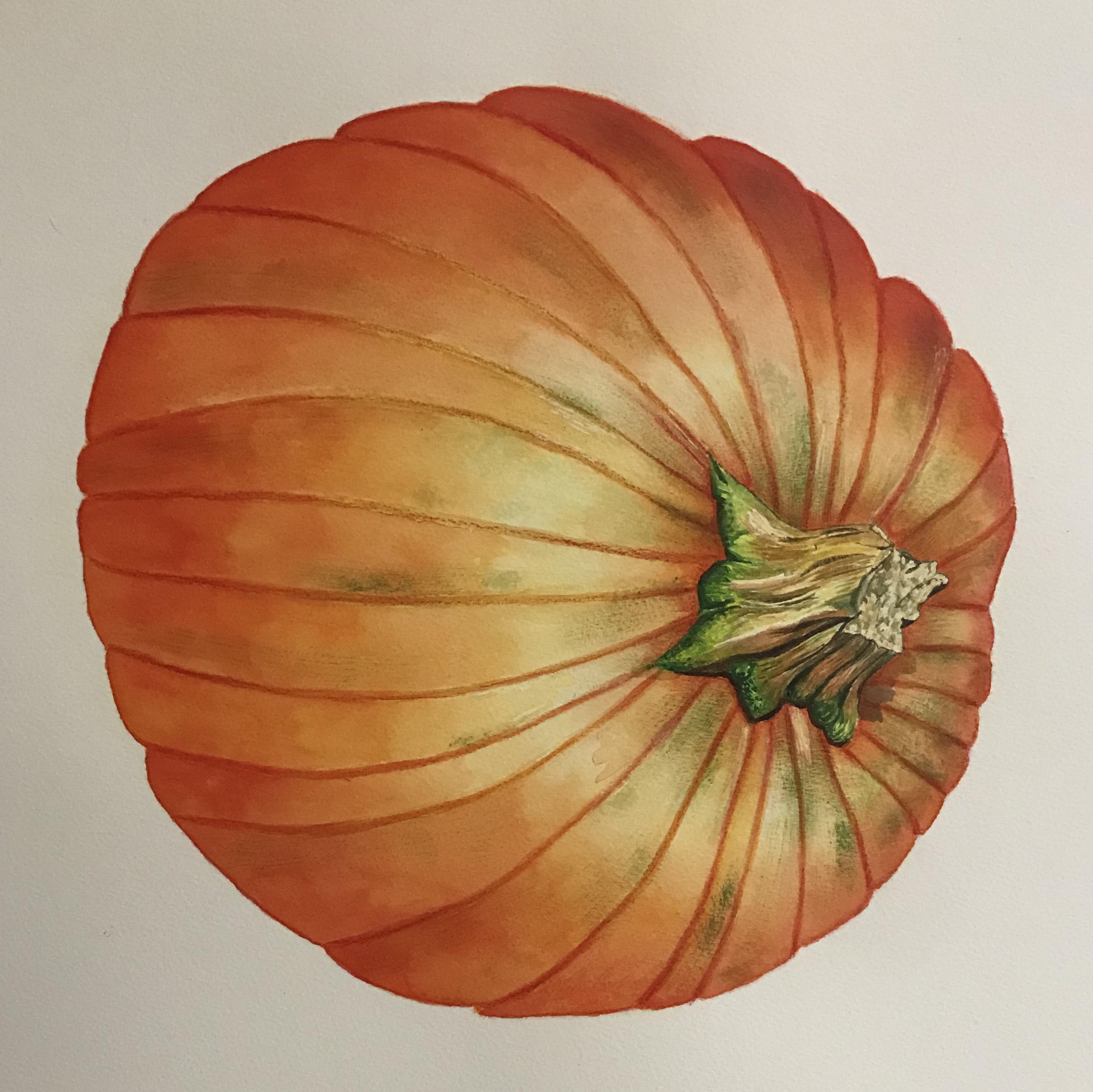
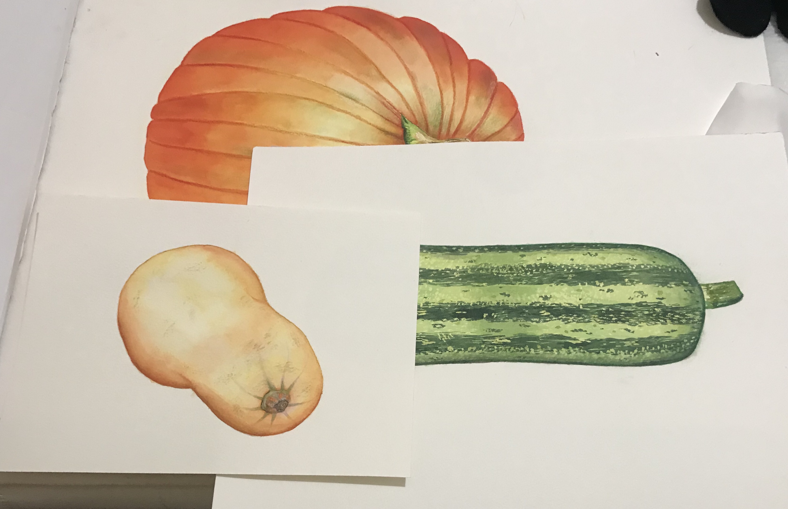
I decided to work on each vegetable as an individual painting rather than altogether, so that I could work on a larger scale and because if I was to make a mistake on one of them. I would be able to redo them without having to redo all of them. I only had to redo one of them, which was the butternut squash that was because I was not happy with how it was coming out and messed up with the shading. This resulted in the image looking muddy and the shading harsh and not blended well. This took quite a long time to paint, but I did enjoy painting them. I was happy with how they turned out, especially as apart from my practice pieces. This was the first time I’ve ever painted vegetables and I was using acrylic inks, which are not particularly familiar with. I do really like the vibrant colours and was sure to not use black unless I really had to, to darken the colour so that they did not become muddy and caused the food to look mouldy or unappetising.
Once I had painted each of the vegetables. I then layered them to test roughly how they would look to see if it was going to work. I then started to photograph them and put them into photoshop as raw files. At this point I was mainly just removing the backgrounds and correcting the colours so that they matched the original colours. I edited each of the paintings individually 1st to remove the backgrounds and then I compiled them onto a 12 x 12 image and move them around to find a composition that I liked. I did struggle with this a little bit as I realise that perhaps I should have done the marrow on a slight angle as it looks a bit flat just being on the side. However, I found a composition that was not too bad and that is what you see below.
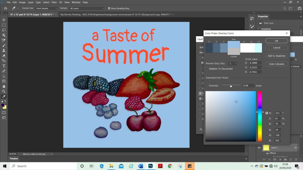
I then started to play around with background colour to try to find one that would not overpower my paintings. It took a little while as the colours I would associate with autumn that I would ordinarily have used were already in my painting. When I used a green or an orange, for instance, it did not enhance the image and I could not seem to find a contrasting colour that worked for this image. I eventually settled on the light peachy colour as this did not overwhelm the image.
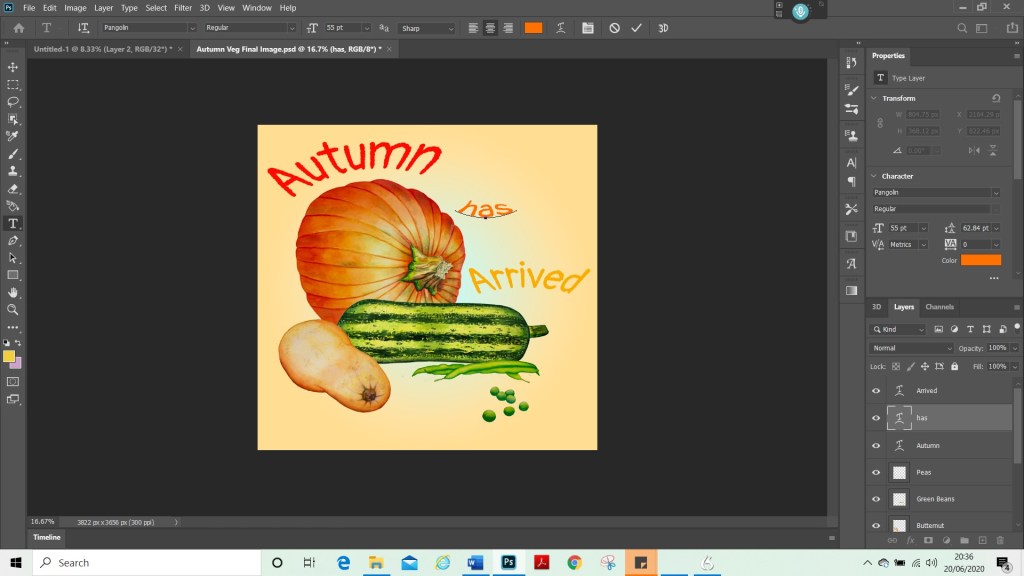
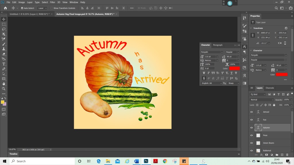
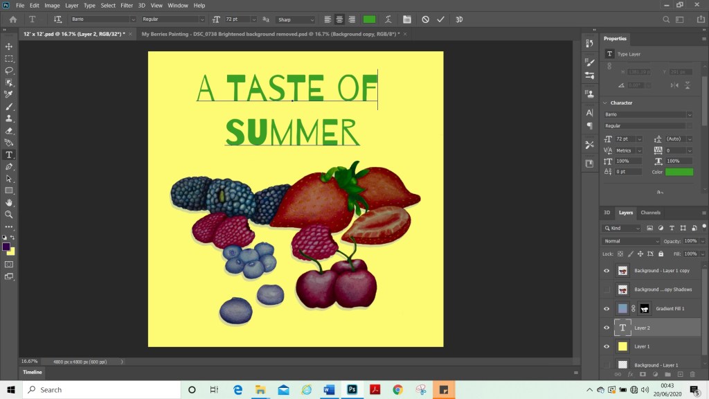
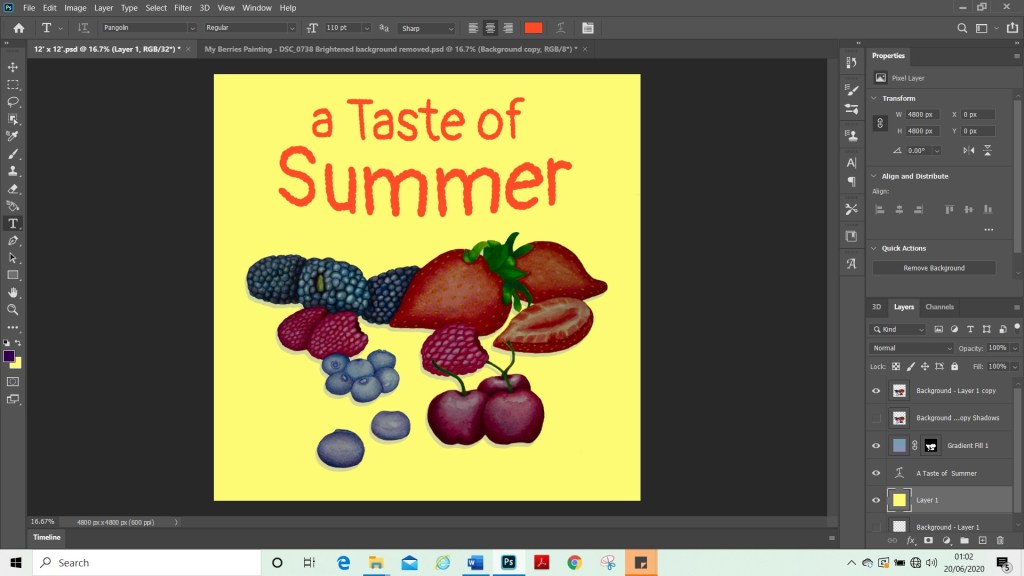
I needed to find a way to fit some text into the empty space. There wasn’t quite enough space to have the text horizontally as this would have resulted in it being quite small. Therefore, I decided to try carving the text so that it fit with the shapes of the vegetables. I also wanted it to be clear and readable, so I did not want to go too elaborate.
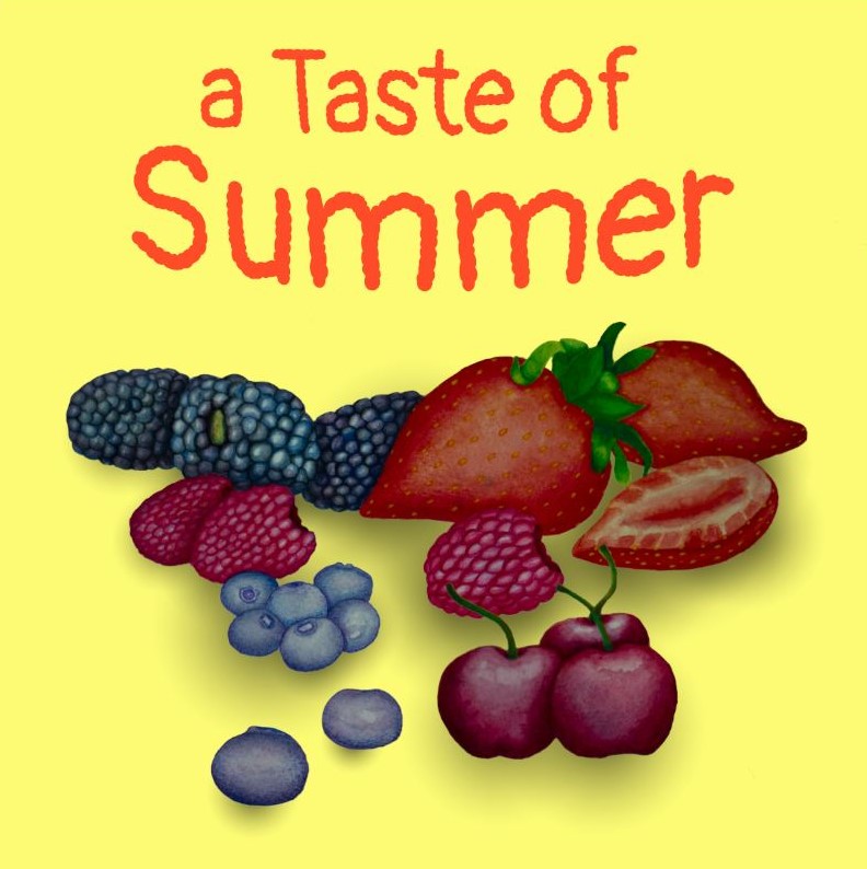
My Final Image
For my final image above. I learned how to add shading on Photoshop, although I’m not entirely sure how successful that was, for this particular image, it is now a new technique that I have in my skill set that I can use for later projects.
Composition Sketch for my fruit painting
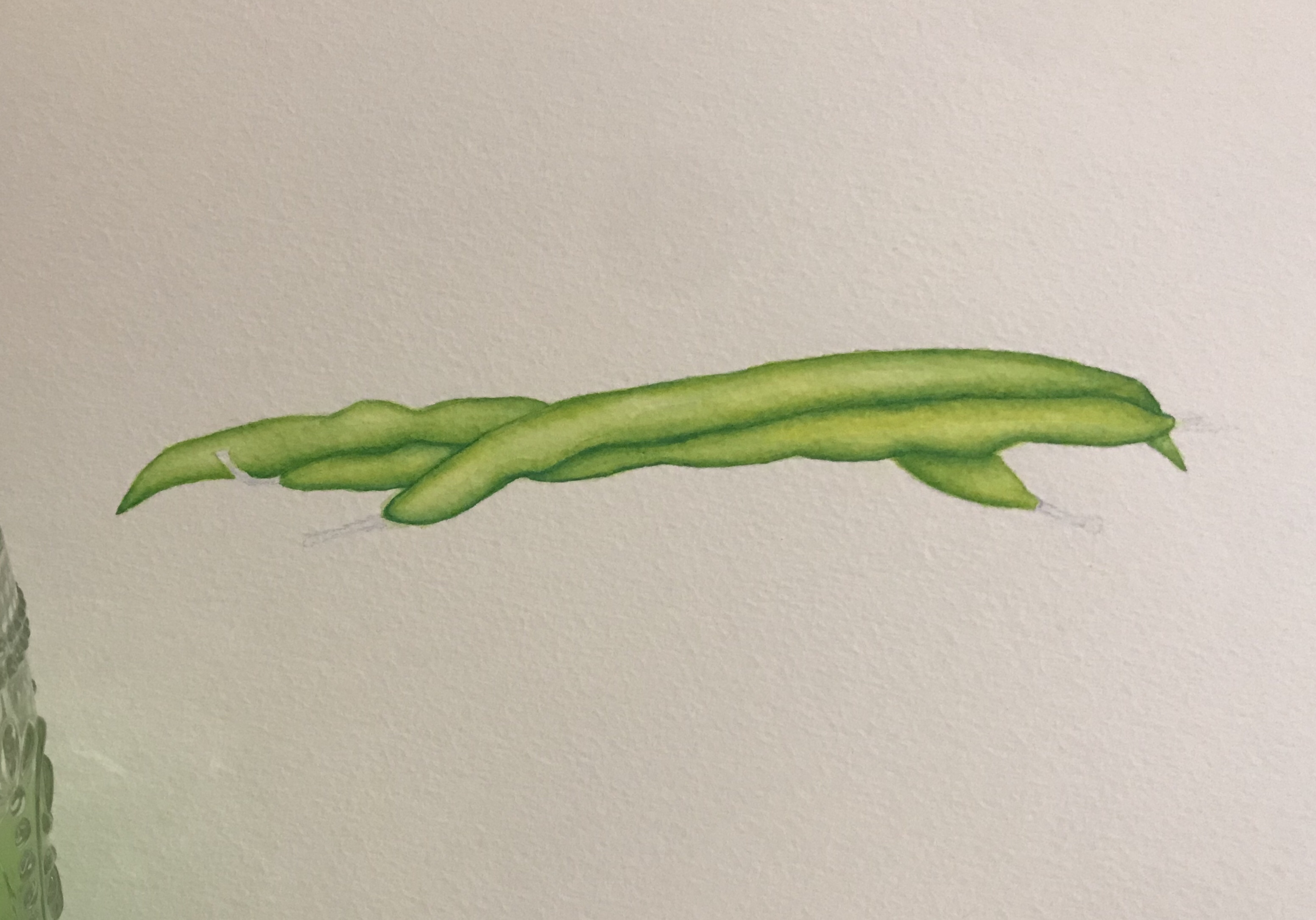
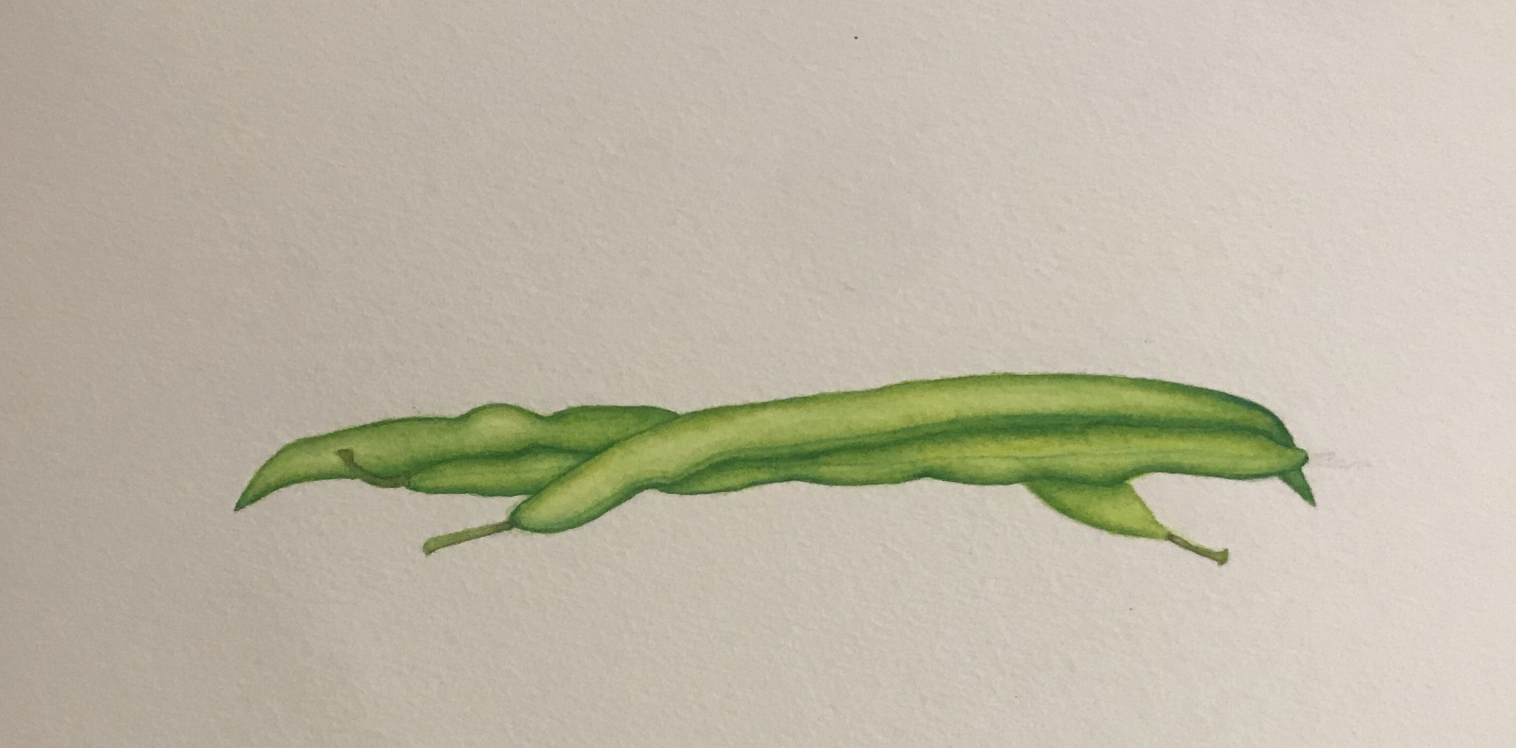
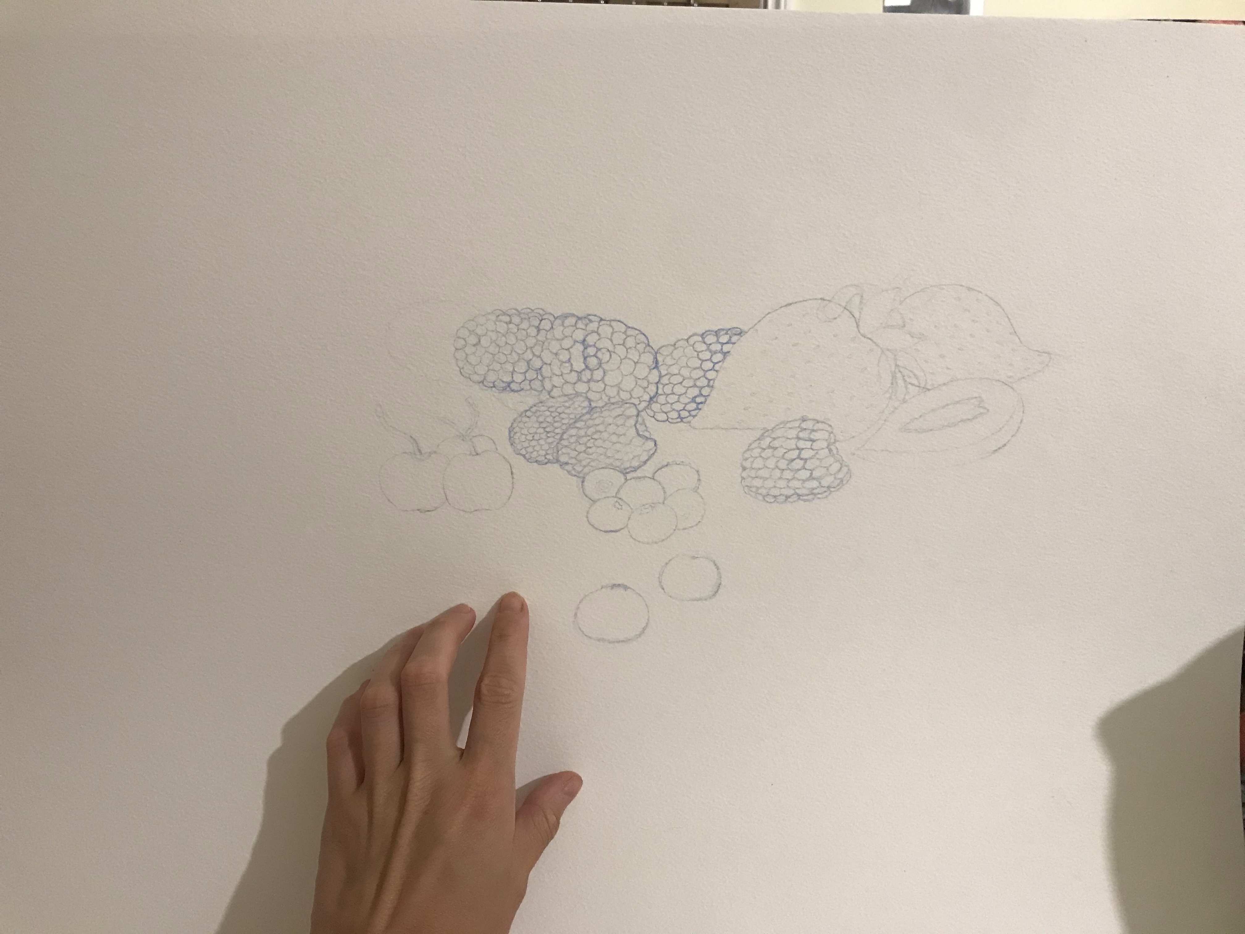
To get started on my Summer Fruits project, once I had collected all my research and did some tests, I started to sketch out a loose composition sketch to try to plan how my painting should look. Once I had done this, I used the reference material and moodboard. I had collected and begun a fresh sketch on A3 watercolour paper. For this I used a watercolour pencil, so that my colours did not become grey or muddy. Once this was done, I started to paint with acrylic inks as I had done with my vegetable paintings.
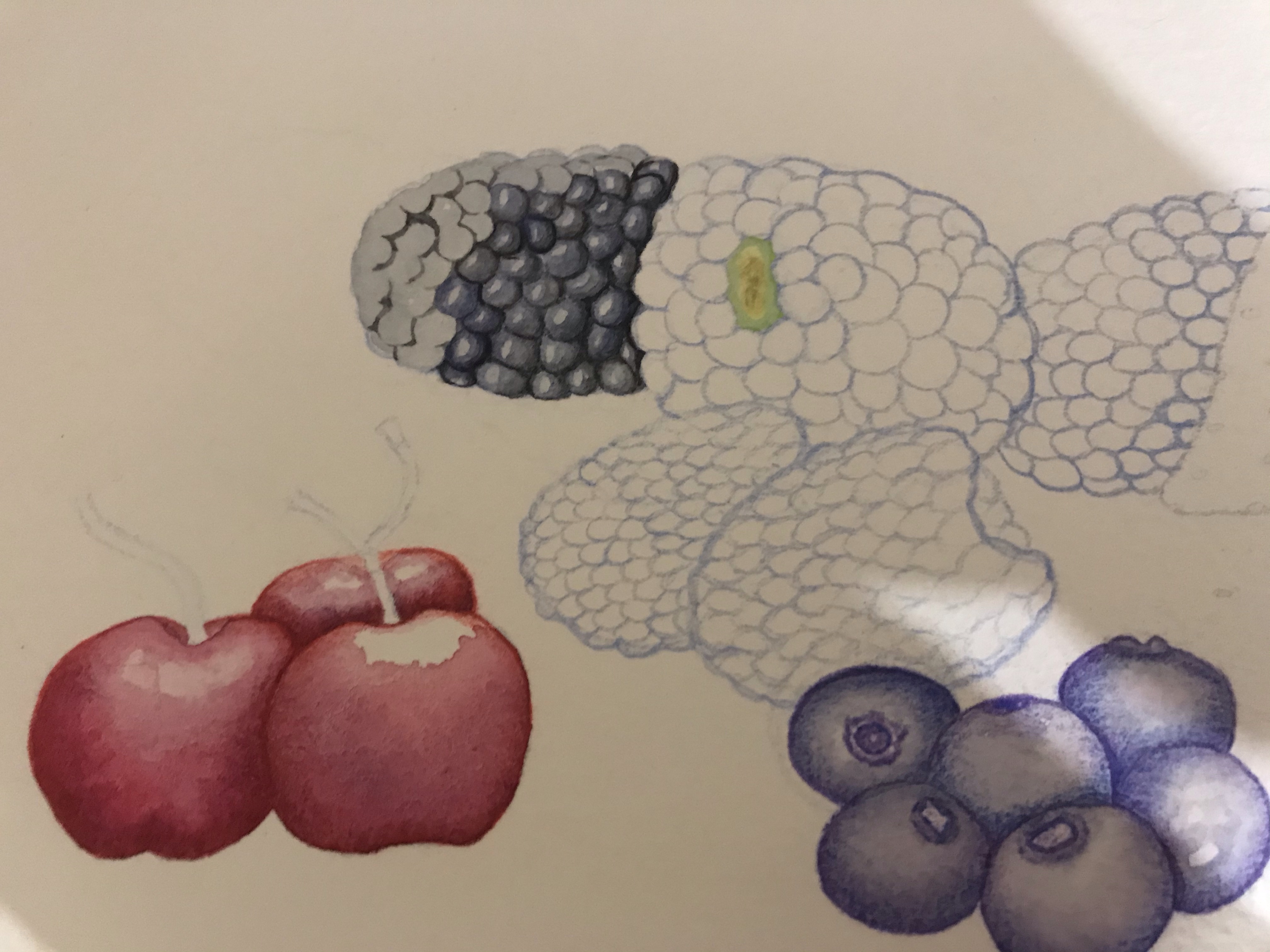
I decided to paint the fruit as one piece, rather than individually. I had hoped that this would save time, however, in the end, I think it took just as long as the vegetables did. Maybe even longer due to the fact that the objects were smaller, so the details were trickier to paint. The berries were generally much more time-consuming and difficult to paint and the vegetables, as it took some time to paint the blackberries, for instance, due to the nature of their make-up. I was trying to give them a 3D effect, however, I was not aiming for them to be realistic and was trying to strike a nice balance.
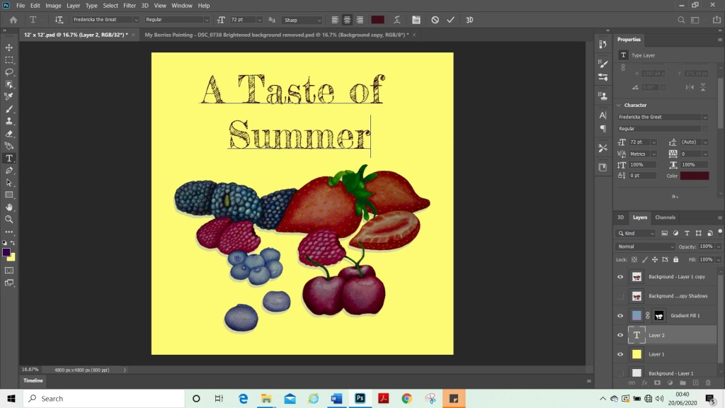
I had to change my composition a little bit once I had put it onto Photoshop because it was not going to work with the square, 12 x 12 format. I therefore moved the cherries so that they were in a different place. This also gave me the chance to resize them as I felt that they were a little small on my original painting.
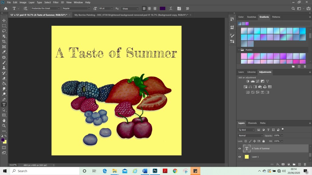
Once I was happy with my composition and had adjusted the colours to how I wanted them. I started to add a background layer and try out colours. I added the text and tried different fonts and sizes to see what would work alongside my image. I tried various colours and fonts until I found one that I was happy with. Above are some examples of these.
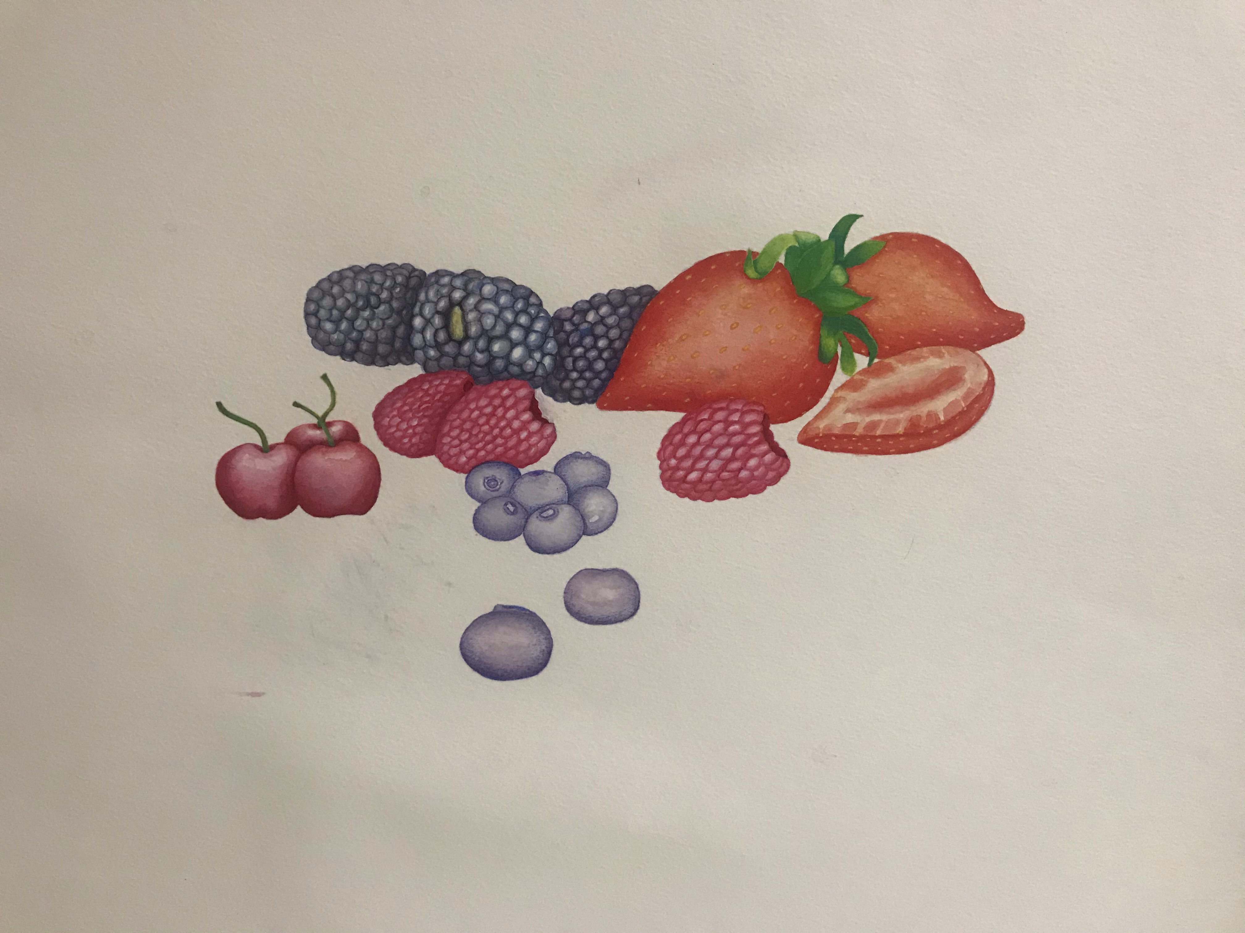
Final Image
Final Image with lighter shadows
Reflection
For my final image. I added shadows in the same way I had with vegetables. This was to try to ground my painting so the berries did not like they were floating. I wonder if they would have looked better if they were a blue or purple colour rather than black shadows. I would have done this if I was painting them, but as I was following instructions and learning how to do them for the first time, I did not change the colour. I realised during this assignment that my computer does not have a good screen as I really struggled to see the shadows as I was adding them. And yet when I viewed them from another angle, they looked very heavy. Also, once I had transported my final image into another format and viewed it on my phone, the image background was a lot brighter than it had shown in Photoshop.
Overall, I am happy with my images and I feel that I met the brief. I did find this assignment challenging, as I am still new to Photoshop. Therefore, once I had put my images into Photoshop, I found that my skills limited my possibilities for what could be done with the final pieces. I am happy that I learnt some new techniques. I also learned my current limits (or some of them) for using Photoshop. I did try to use the 3D tool to create more interesting text. However, I was unable to do so as my computer could not run it and unfortunately just froze. On looking at my paintings. I am happy with how they look, in particular with the fruit. I really liked the biggest strawberry and I liked the way the blackberries came out. I did not manage to capture the juiciness of the berries which is something, perhaps, that is lacking in my image and could have improved it. This is something I could explore further with my painting and perhaps do some tutorials to learn how to do this.
Key Steps Part Two – In Summary
Key steps part two has been quite a challenge and I have enjoyed the exercises and doing this assignment. I have learnt many new skills and techniques, that I can now take on to other projects. I finally feel like I have found a pace for my course and feel like I am progressing. When I look back over the past two months I have done a lot of work in a short space of time and feel quite a sense of achievement about this. This makes me excited to continue on to part three and I am looking forward to the next set of challenges and opportunities for growth in my learning.
Key steps part two has been quite a challenge and I have enjoyed the exercises and doing this assignment. I have learned many new skills and techniques, that I can now take on to other projects. I finally feel like I have found a pace for my course and feel like I am progressing. When I look back over the past two months I have done a lot of work in a short space of time and feel quite a sense of achievement about this. This makes me excited to continue on to part three and I am looking forward to the next set of challenges and opportunities for growth in my learning.
This year and especially since my study trip to Lisbon. I have really immersed myself in my course and in OCA life. I have really enjoyed having a group of peers that I can talk to. This gives me a sense of community and support, and I do not feel isolated in my studies anymore. We keep in contact via a WhatsApp group and have a second Lisbon catch up session coming up with the tutors in August, which I’m looking forward to. The Lisbon students are from a mixed range of disciplines and I am the only illustration student amongst the group. I have been very inspired by their work and they have helped me to view art from different perspectives and not be scared to try new techniques and make a mess. I have also been participating in group sessions with OCA tutors, which have been very helpful and once again build a sense of community and help me connect with fellow students. I have been connecting with my fellow illustration students a lot more, this past month, which is very helpful and nice to feel like part of the OCA community and no longer just an impostor. (Now that I am actively studying.) I do struggle a lot with self-motivation and communicating with my fellow students and tutors has really helped me find motivation and purpose.
I do tend to struggle at first understanding the briefs and have to re-read some of them over and over and ask others how they interpret them, to see if I am understanding them correctly. This does cause me to hesitate on starting a project and I really have to push past my fear of failure and perfectionist tendencies. Although helpful in some instances, it does tend to hold me back. I am finding, however, that now that I have processes in place. I find it easier to start projects, as I have steps that I can follow i.e. Research, moodboards and mind maps. These steps, stop me getting stuck procrastinating and mean that I know what I need to do to get started. Once I have started, I have no trouble continuing. It is just the initial starting of a project. I am happy that I am finding a way around this and I hope that this will continue to improve as time goes on.