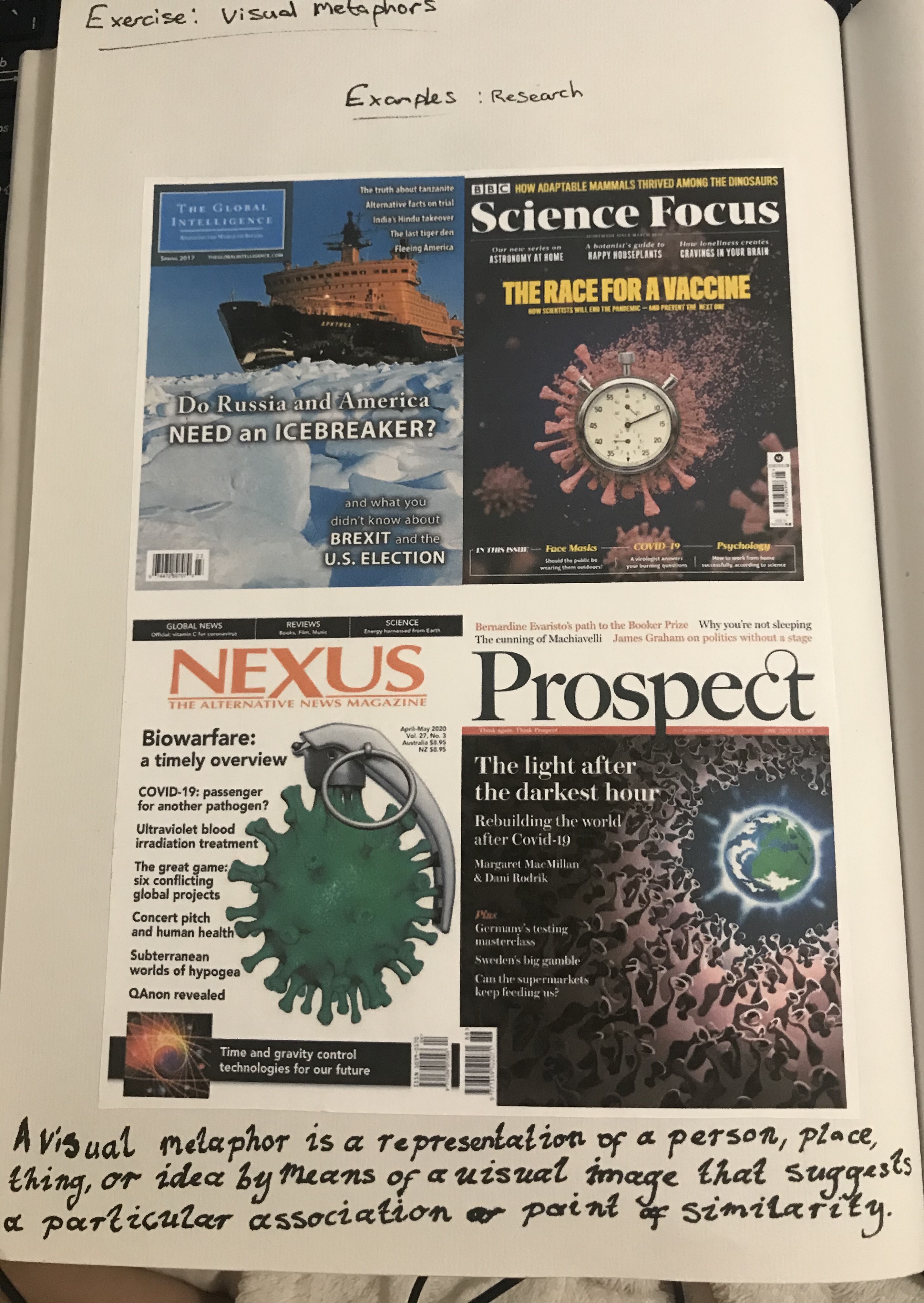
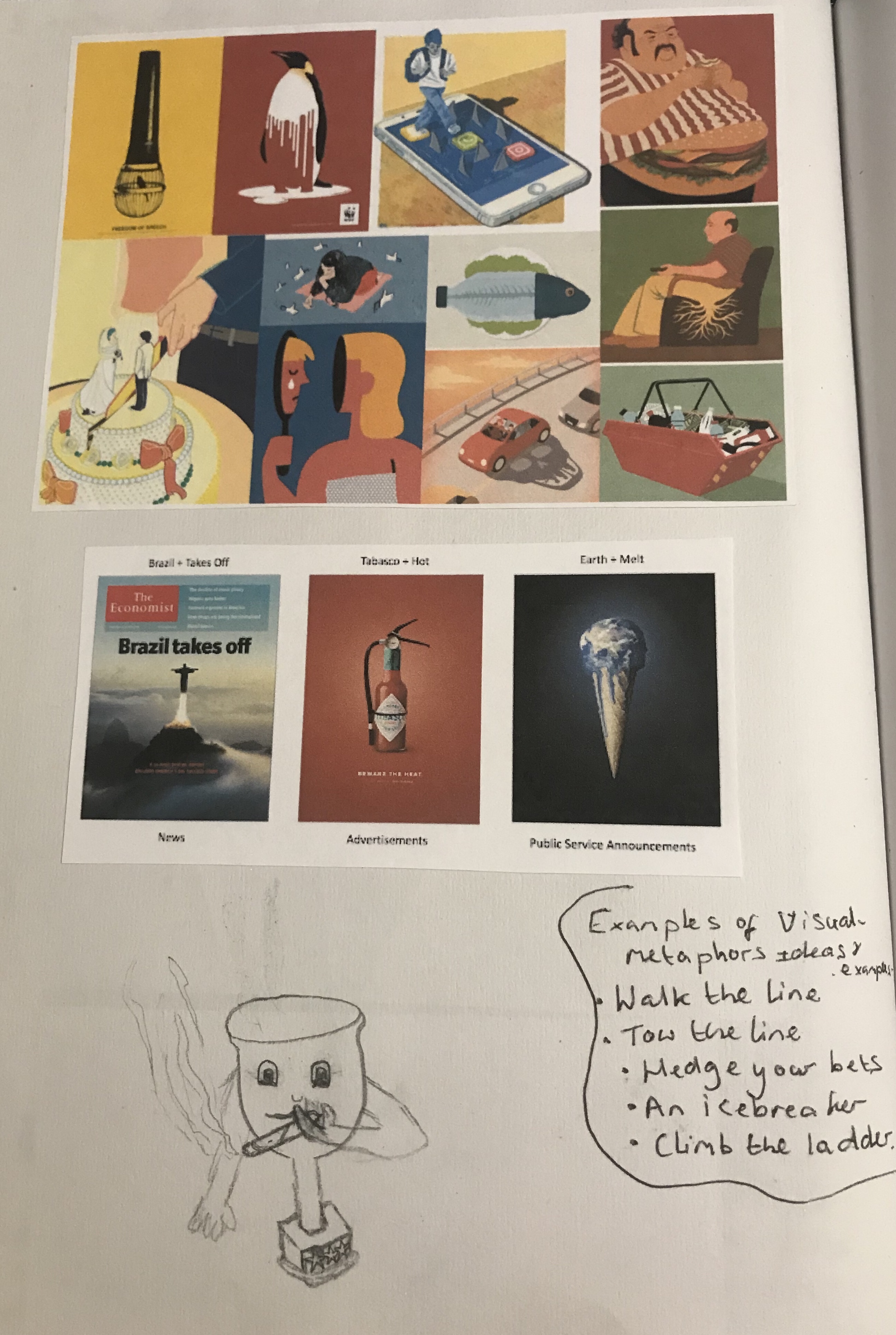
For this exercise, we were asked to collect as many examples of visual metaphor as we can find. I used a thesaurus to look up the meaning of a visual metaphor. I then started to collect images I found on the Internet. My research was a little limited due to co-feared and as I have no magazines in the house other than travel magazines and no newspapers, and I feel that these would have been good sources of visual metaphors. However, I did find a variety online from different magazines and advertisements. As well as some examples of some illustrations from an unknown source.
We was asked to choose from one of the following phrases; reaching retirement, dreams of romance, broken relationship, censorship of the press, high achievement, economic catastrophe.
After trying to think of ideas for each of the six I decided to go with high achievement as this is the only one I could think of any ideas for. It was asked to create a drawn visual list of objects and subjects which could be used to symbolise them. The brief does say not to be overly concerned with the aesthetic quality or technical accuracy in the drawing, and to see this is the an extension of your visual shorthand.
I found this exercise extremely difficult, as I just could not come up with many ideas, even though I had looked at examples. I feel like this is something I am not particularly skilled at, and my mind would just go blank. I wonder if this is possibly due to my dyslexia. Even now as I write this in my learning log no new ideas or understanding of this exercise comes to me. I asked my family if they could tell what my drawings were meant to be. They were aware that they were meant to be visual metaphors. I received mixed feedback on these. They tried to help give me ideas of what I could do, so I tried these out too. In the end, I ended up going for the word high achievement and created the image below.
Reflection
I was very frustrated with how much I struggled with this exercise, especially as I understand its importance in illustration. However, I hope that as my skills develop during my course that perhaps this is something that I can try to improve or that will improve naturally as I progress. I’m not completely dissatisfied with my image as I feel like he could be developed into an interesting image or at least a fun image. But I feel like so much more could have been achieved and explored with this exercise had I been able to grasp the concept better.
For this exercise with asked to read an extract of a book by Michael Innes adapted from the Daffodil Affair. We were then asked to make notes on the following questions:
If this were to be made into a film. What would the main character be like?
Firstly, I decided that my character was going to be based in the 1940s as the text said during wartime London. However, it did not specify which war. I answered this question based on the facts from the extract and then imagined my own character traits. The facts were that he is a middle-aged man, described as having a fixed contraction on his brow. My ideas without he had his hair neatly gelled back into the side parting is clean-shaven, stern -looking and serious with lines on his face showing years of seriousness and worry. He is clean and neat with a London accent and is a family man. The character is a man that works in Scotland Yard, it does not specify as to whether he is a detective or not. But it says that he controls ‘the file of police papers which dealt with the abduction and subsequent history of feeble minded girls.’ It was quite easy for me to imagine his style due to my extensive knowledge on this period due to my background as a make-up artist. Details like having a man’s side parting on the left is considered to be a defining feature of hairstyles of the period. This meant I had quite a clear image of my character in my head just from reading the story and by deciding what decade he was from.
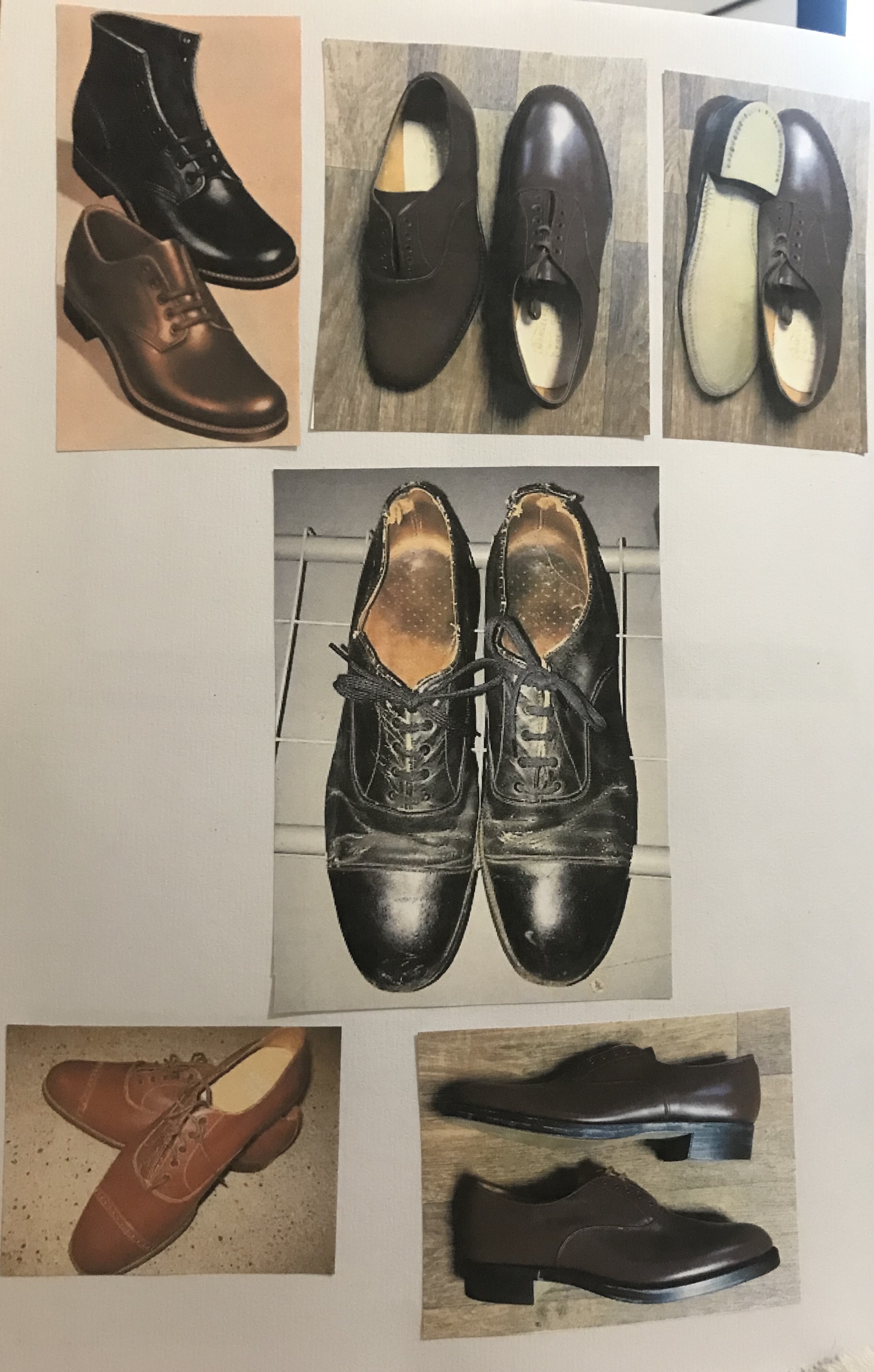
What clothes with the character be wearing?
Brown suit, tie, polished shoes. Briefcase (on his desk). Smart/office worker.
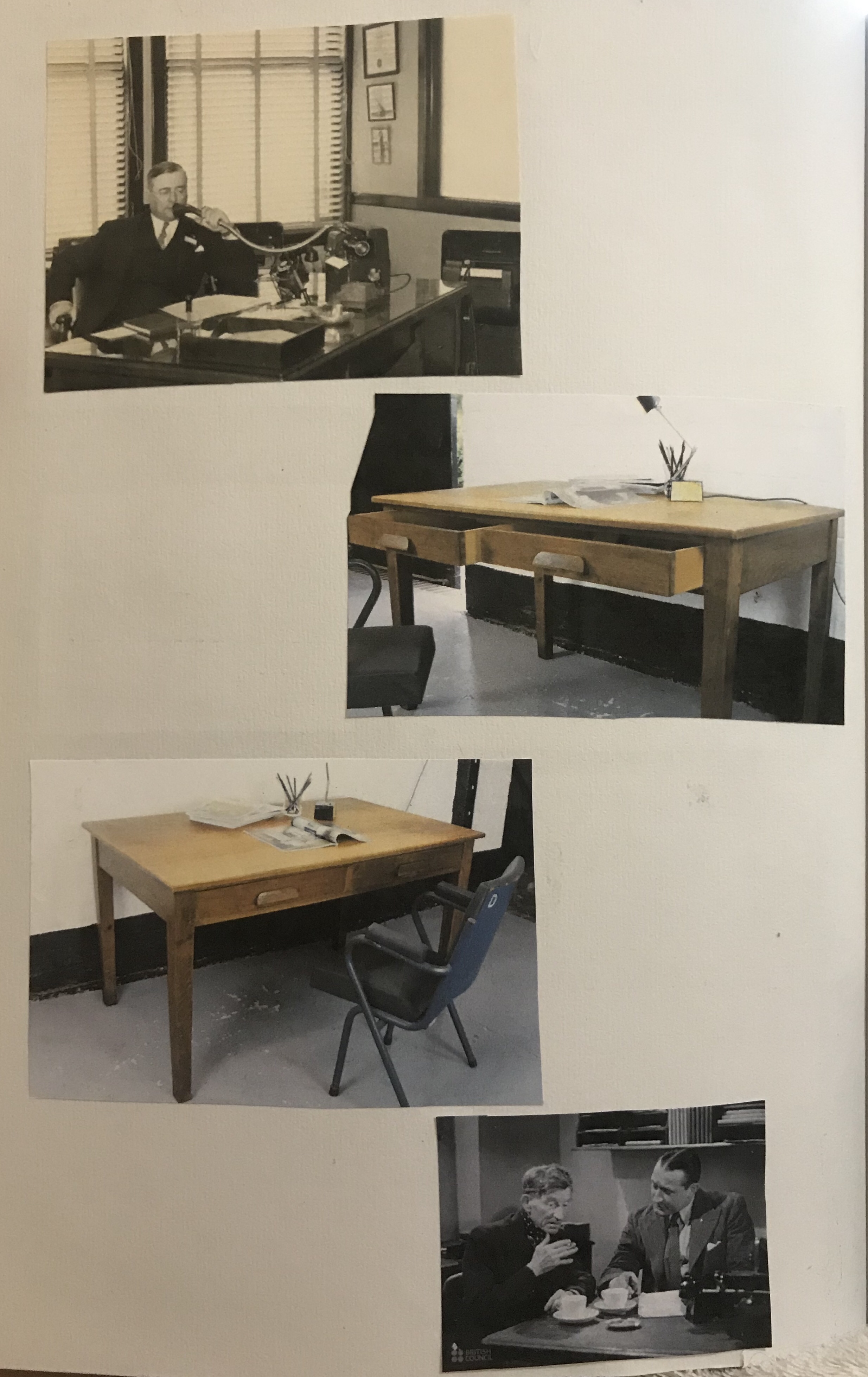
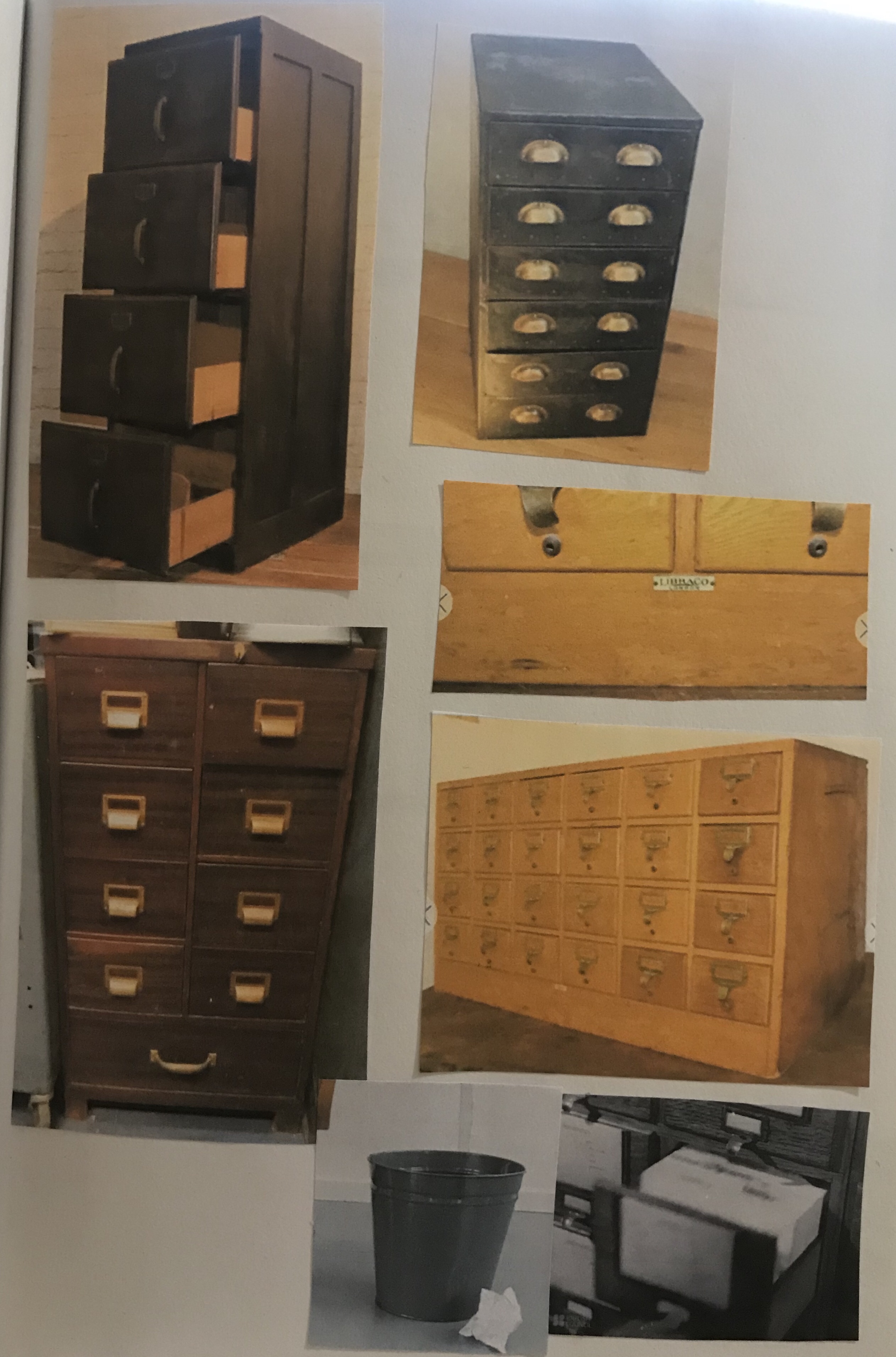
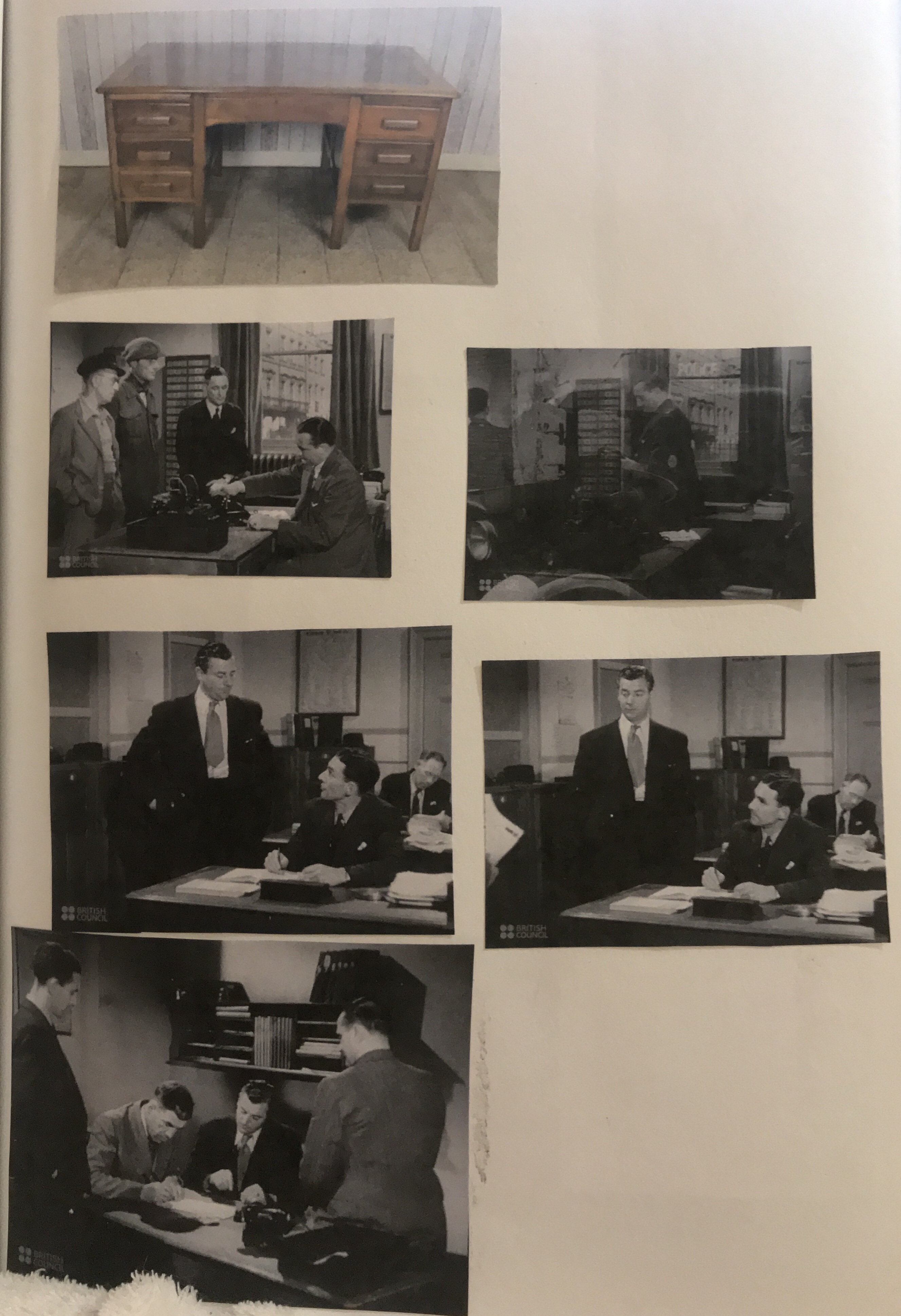
What furniture is in the main area in which the action takes place?
In the excerpt, a big desk is mentioned. I also imagined some filing cabinets and file boxes as the man keeps files as part of his job. However, I did not imagine there to be anything else in the room as the description does say that the room is empty except a big desk.
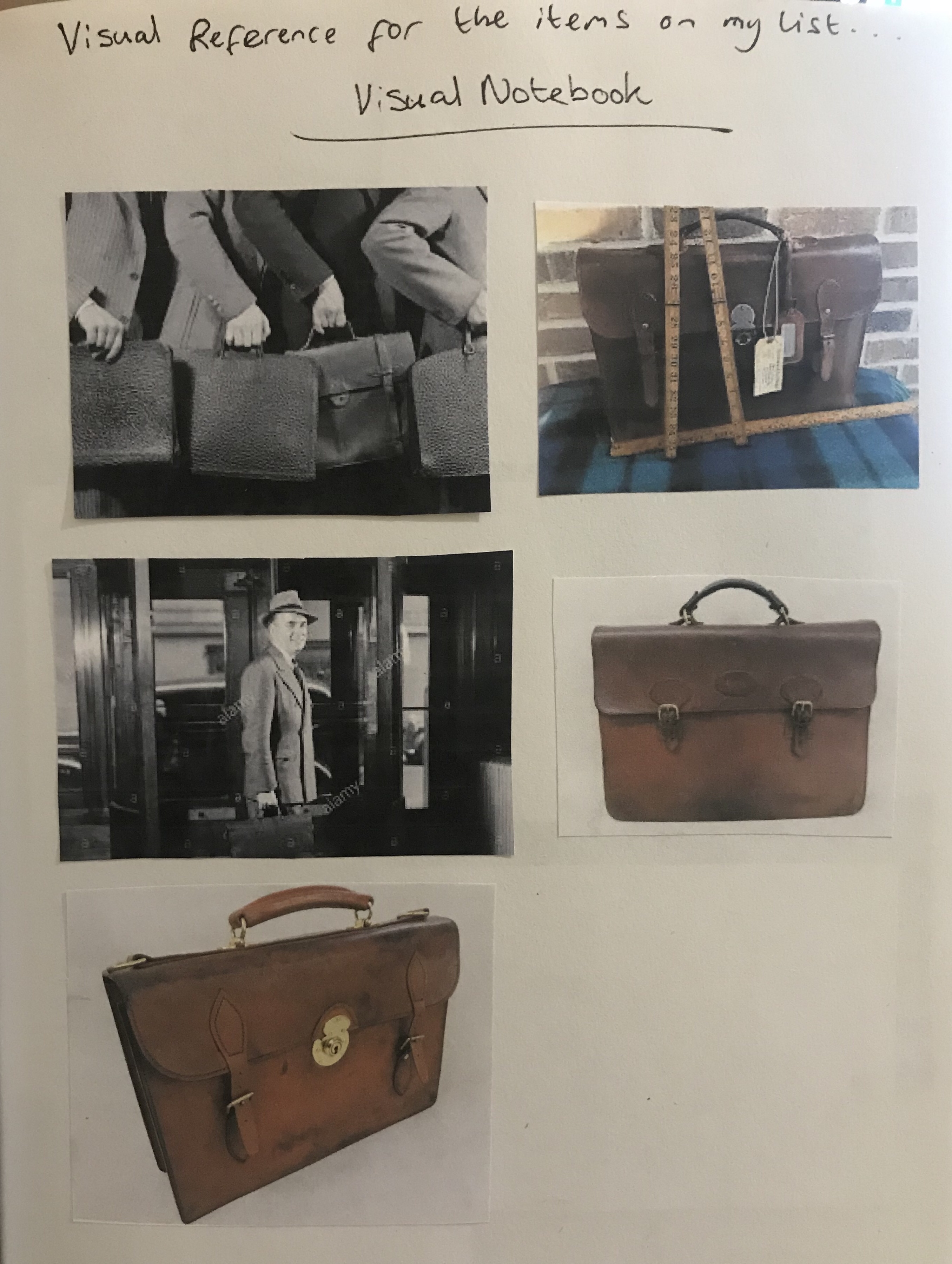
For the next part of the exercise was asked to: Collect a visual reference for the items on our list. Find a reference book or website for this era. Use the Internet to do an image search. Be selective. Don’t go for the first image and counter try to remember your own vision of the story and reflect this in your choices. Stick these images onto a large sheet of paper or individual notebook. I did my visual notebook in my sketchbook and started finding images for the items I had on my list for the character either to be wearing or items of furniture in the room.
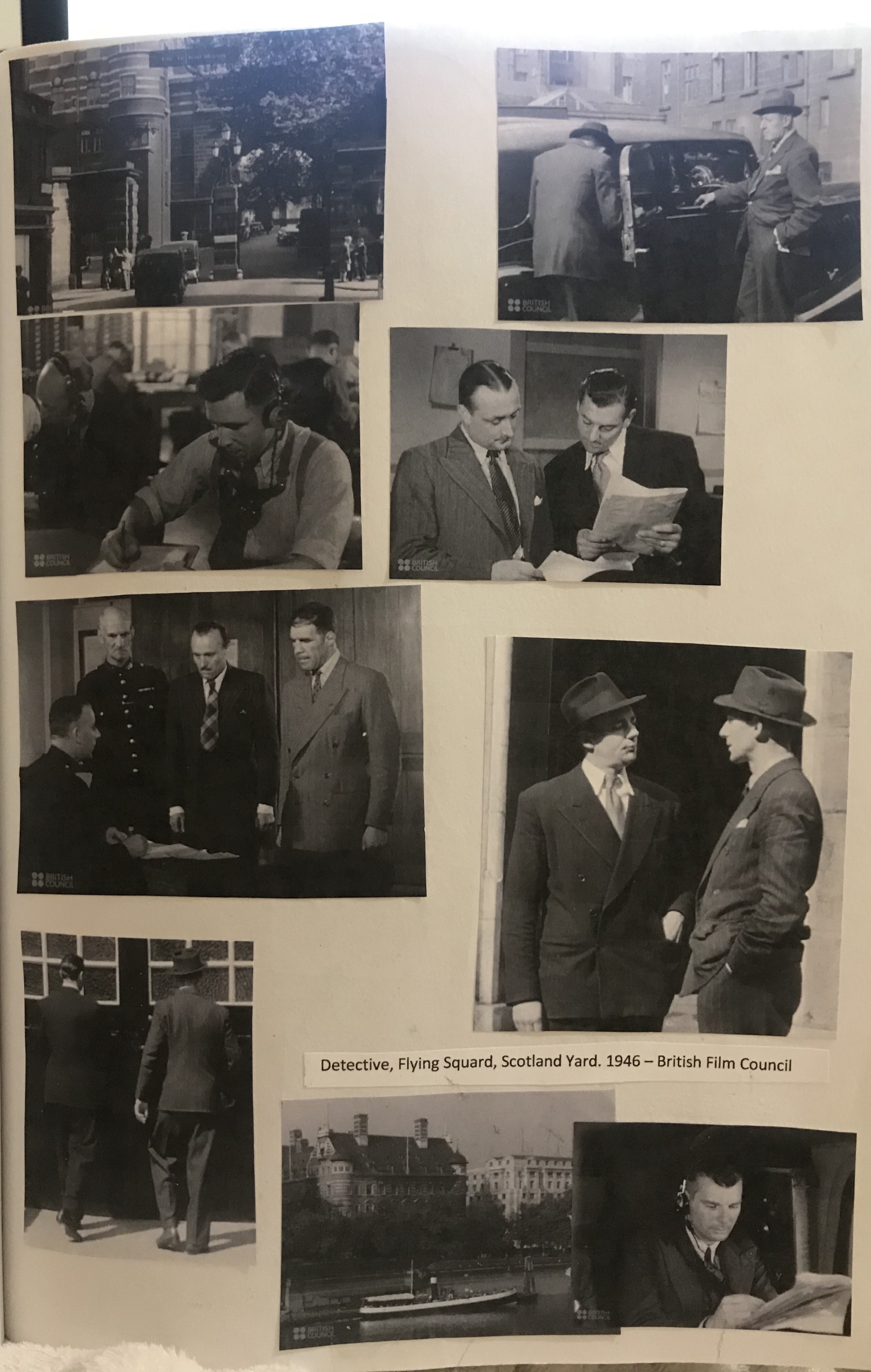
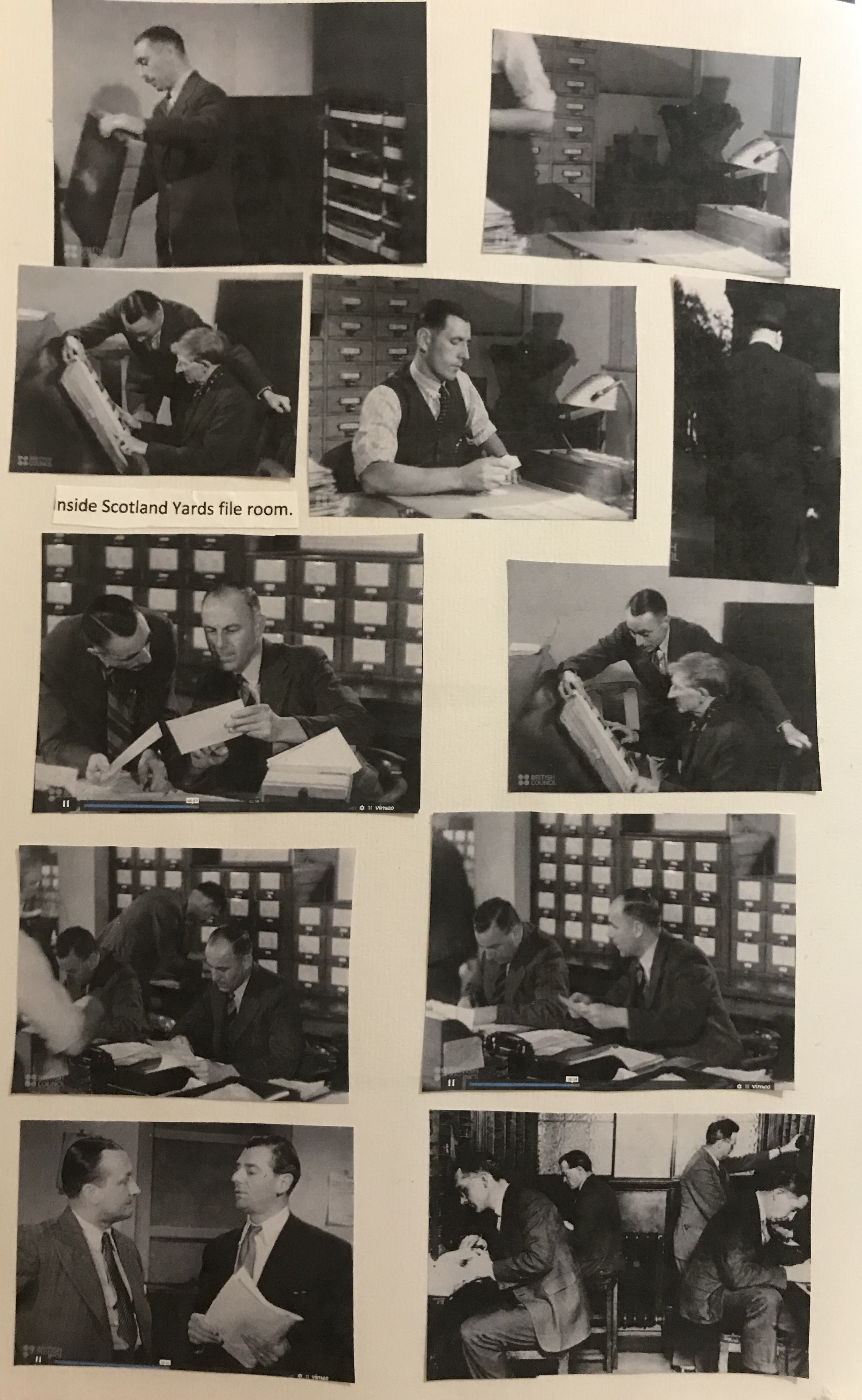
I then found some great films from wartime Britain on the ITV website, one of which was called; ‘Routine Job’. It was about detectives in the Flying Squad, Scotland Yard.1946. I am unsure if any of the characters in this film are real or just based on real characters, as I was unable to find any details on this. However, the locations are real and the costumes or clothes that the characters are wearing our typical of the 1940s, and therefore fit very well with how I imagined my character. This film is very interesting and shows a typical day of a detective from the flying squad. During the film, the file room at Scotland Yard is shown. This was very interesting to me as it is probably where the character in our excerpt would work. However, from the description given this is not at all how I imagined his office, nor how it is described. The rooms I saw in the film are occupied by multiple workers and are not in any way empty. I also included some pictures of Scotland Yard’s buildings as when I read the excerpt and imagined the scene, I imagined more modern windows than they actually were, due to the description given by the writer.
The next task was to explore textual and colouristic visual brainstorming and idea generation.
We were asked to ‘choose a word which we feel captures the mood we would like to convey. Collect and create textures and colours we associate with this word to make a mood board. Start with a broad vision to describe the overall colour or tone of the image, not specific elements of it. Be minimal and selective, and gradually add textures and colours that complement the general impression. ‘
I really enjoyed doing this mood board and had quite a different approach with it, from the ones I have done for previous exercises. My chosen word for my mood board was ‘stark’. I started my mood board by adding colours and textures with gouache paint. I also used patches of colour with metallic pencils and markers, then I went around the house and did some texture rubbings. I had seen my fellow students do these on my Lisbon trip and thought that it would be good to try that in order to add textures to my board. I did rubbings of an Artex wall, the steps of a metal ladder, wooden floorboards, the bottom of a saucepan, a woven basket and a couple of other items I found around the house. I really loved the one of the floorboards, but the one that interested me the most was the one of the metal ladder treads as it reminded me of pinstripe material.
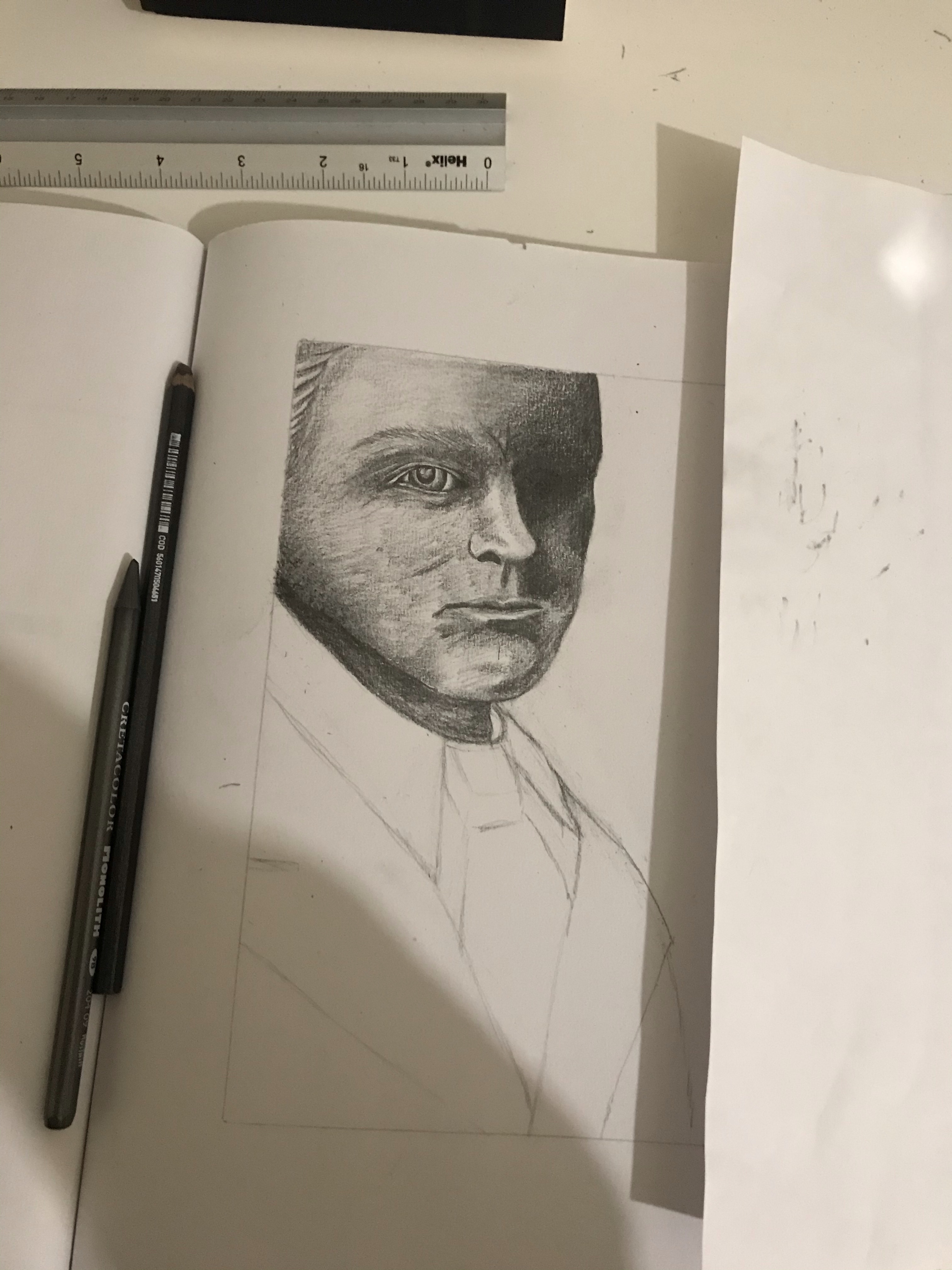
My next task was to ‘create a simple portrait (figure, or head and shoulders) of the character, using the reference you have gathered.‘
‘Use sketchbooks to help you to select and edit from your reference materials and explore where to position your figure within the frame format of the picture make the shape based on any book you have to hand.
Use the colours, textures and qualities you assembled for your mood board to render the portrait. You may literally collage these textures into a drawing, or convey the tonal qualities of the mood bored through the way that use materials and mark making.’
A book I had to hand was this one called Mr Darcy, Vampyr by Amanda Grange. I liked the composition of this book cover and wanted to use this for the composition of my drawing. I did some test sketches of the composition and also some quick sketches to try to put on paper the image of my characters features that I had in my head. This was however quite hard to do.
It was at this point that I realised that it may be interesting to incorporate some of my rubbings directly into my drawing. As you can see from the top thumbnail I tested this out and really liked the result. I went and did some more rubbings of a couple of the textures I liked from before, with varying shades of pressure so that I had some dark for shaded areas and lighter for highlighted areas. I used the steps of the ladder again to create some rubbings for the tie and again for the blazer, but this time by moving the paper in small increments and re-rubbing I created a different looking texture and second type of pinstripe.
Work in progress…
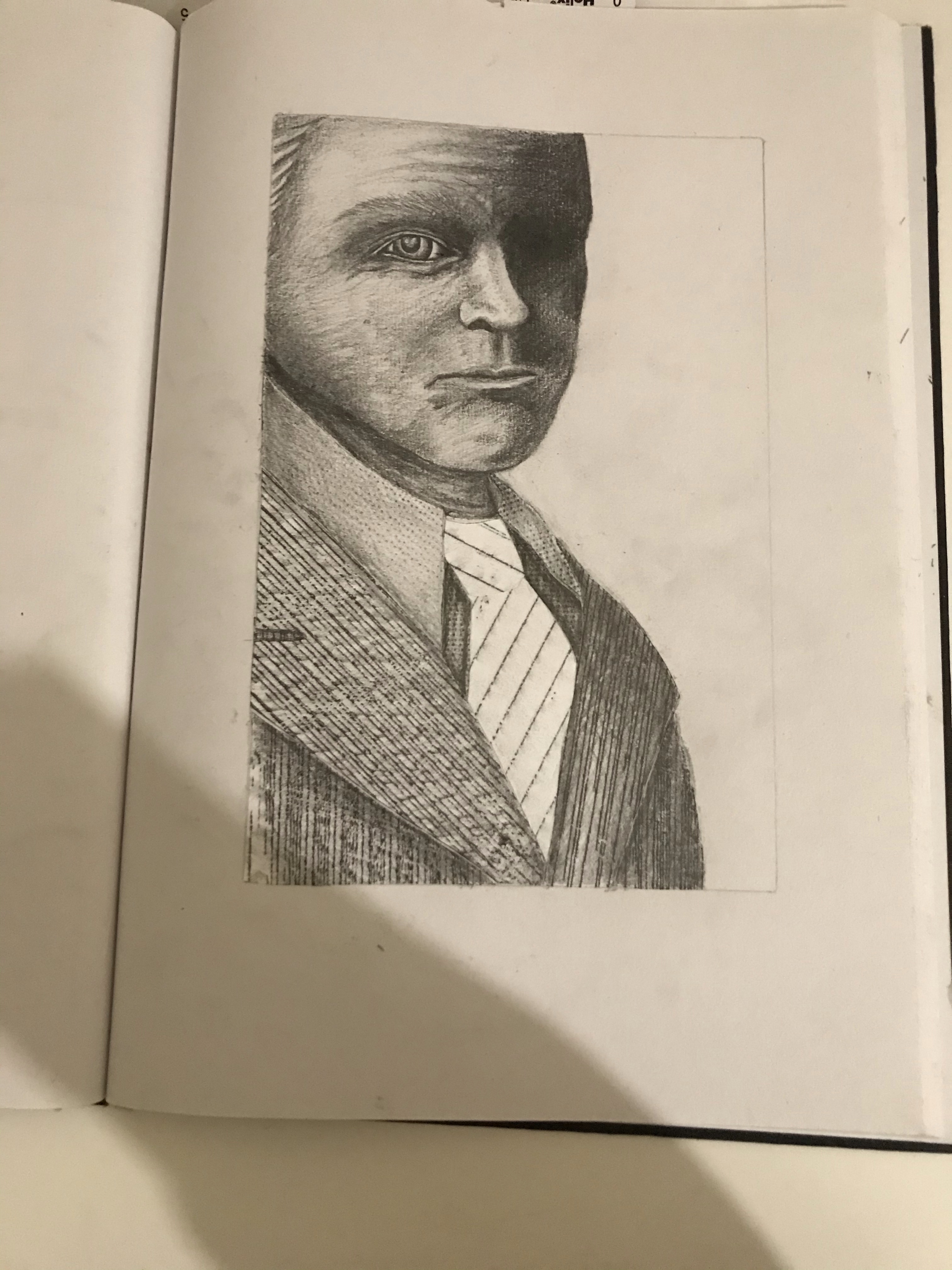
For my final image, I cut out sections of my rubbings and placed them on to my drawing. To create my characters suit. Once I had done this, I added shading with graphite to add a further dimension to the drawing.
My Final Image
Reflection
I am overall very happy with how my final image turned out. With each new exercise and assignment that I do. I am learning something new and this to me is very exciting, as most of the things I am doing, I would never have thought to try or bothered to try without these kind of briefs. Therefore, I am finding that my course is opening my mind up to new techniques and possibilities. Even if some of them I do and I then decide it is something that I would not like to do again, it is still good to try and each time there is something that I learn that I can take on to my next piece of work.
The reference material. I gathered was essential in making this piece seem realistic and fit with the era. Even though I did not need to use most of my references for my final image. It helped me to develop the character, and if I was to go on to draw this character in a room or in a story, I now have all of the visual information that I would need to start this process. I had sufficient reference material to create my image in terms of context. I kept it quite simple and the main focus was the suit in which I used my reference images to make sure that it was of the right cut and style as well as pattern and tone.
I would really like to further explore using rubbings in my illustrations in the way that I did here. I started the drawing of the face before I did the suit and then after thought that actually, I would have really liked to have found a way of perhaps using rubbings to create his face as well. I was quite impressed with how I managed to draw his face so well from memory as I did not use reference for his features, I just tried to picture my character in my mind. He did change and develop quite some bit in my head, as I considered the brief more. The biggest change being that I had originally envisioned him much younger, but later realised he would be a much more interesting character to draw if he was older. I realise that his eye is a little big and the other one I messed up and ended up having to shade out completely, when I had intended on shading it, but leaving some kind of pronunciation to suggest an eye.
This was the most enjoyable exercise so far, as I got to be creative and inventive. Had time permitted, I would have liked to have tried more versions of this character using the same techniques for his suit and seeing what else I could do with his face and also redrawing him in the way that I had intended, as well as experimenting with what rubbing textures I could use to create a human face. I do intend on trying this out again soon.
For this exercise we had to produce a line visual around one of the following words: Sea, Extraordinary, Building or Journey. Before I started. I had a look through some of my books to find examples of black and white or high contrast illustrations. I have included a few of these here. These are from the book: Masters of Sketching by 3Dtotal Publishing.
Kristjana S. Williams Victoria & Albert Museum interactive print journey.
Daniel Pudles Nuclear Power and the Greenseditor
Victor Ambrus The Battle of Hastings
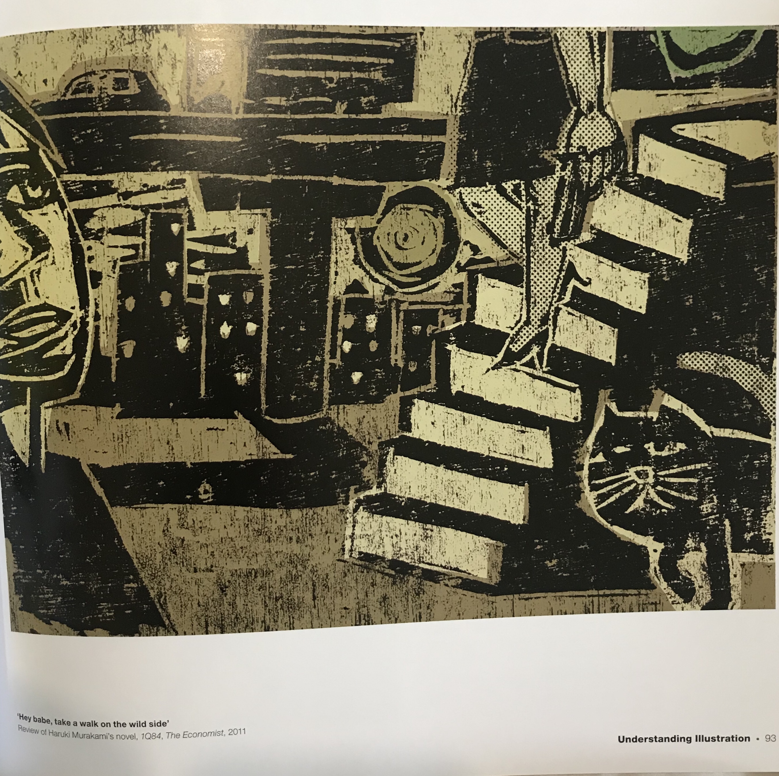
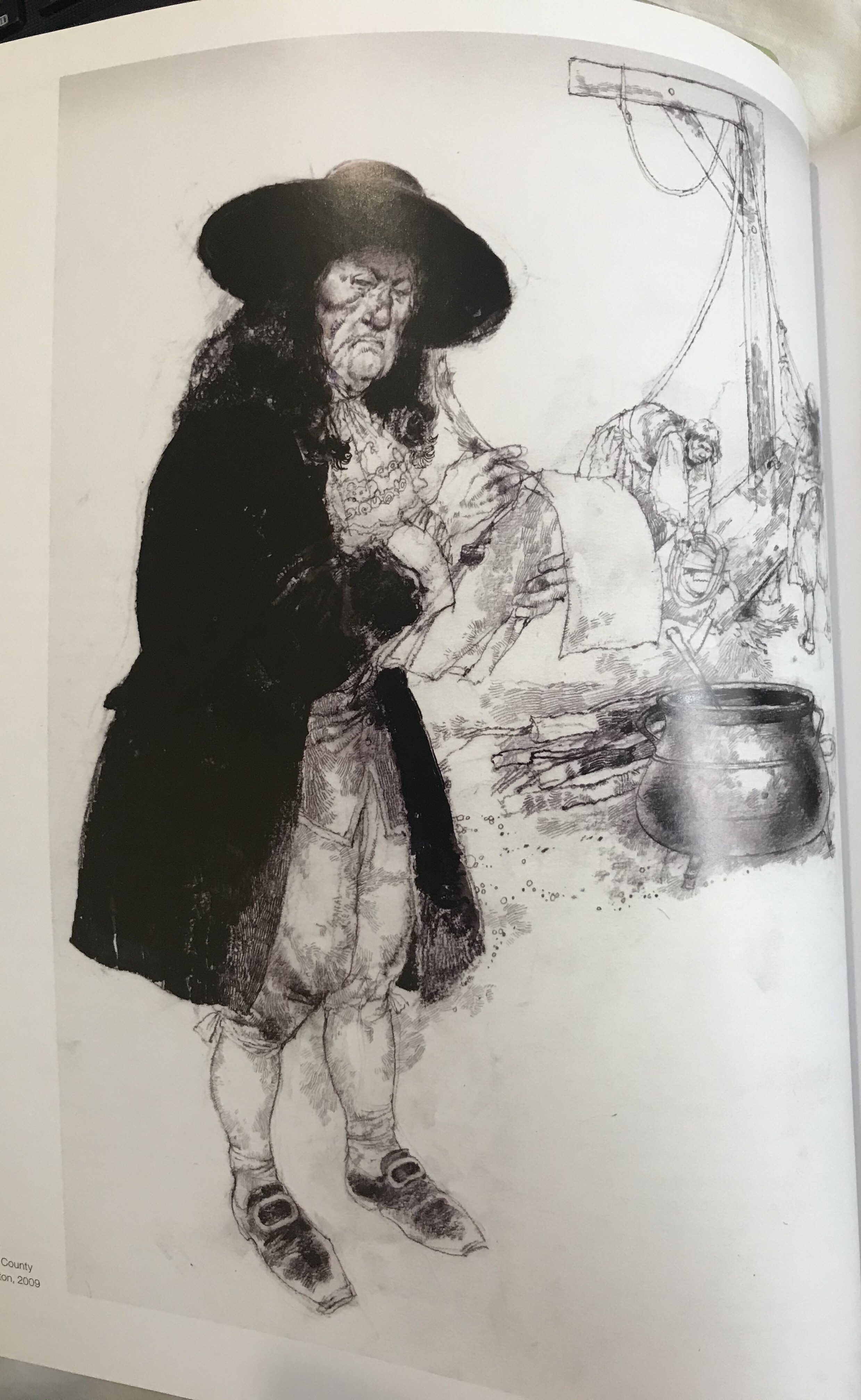
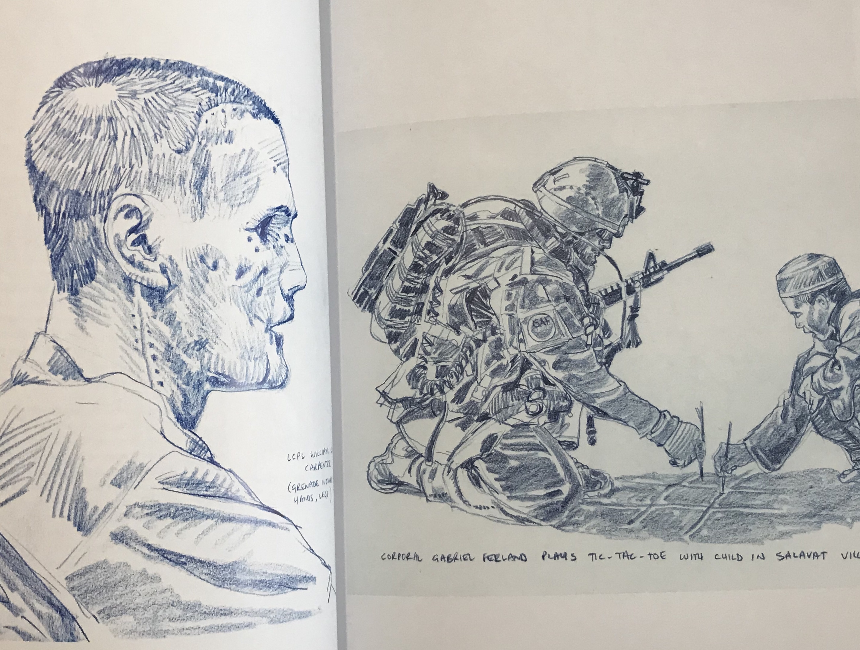
Richard Johnson Afghanistan reportage
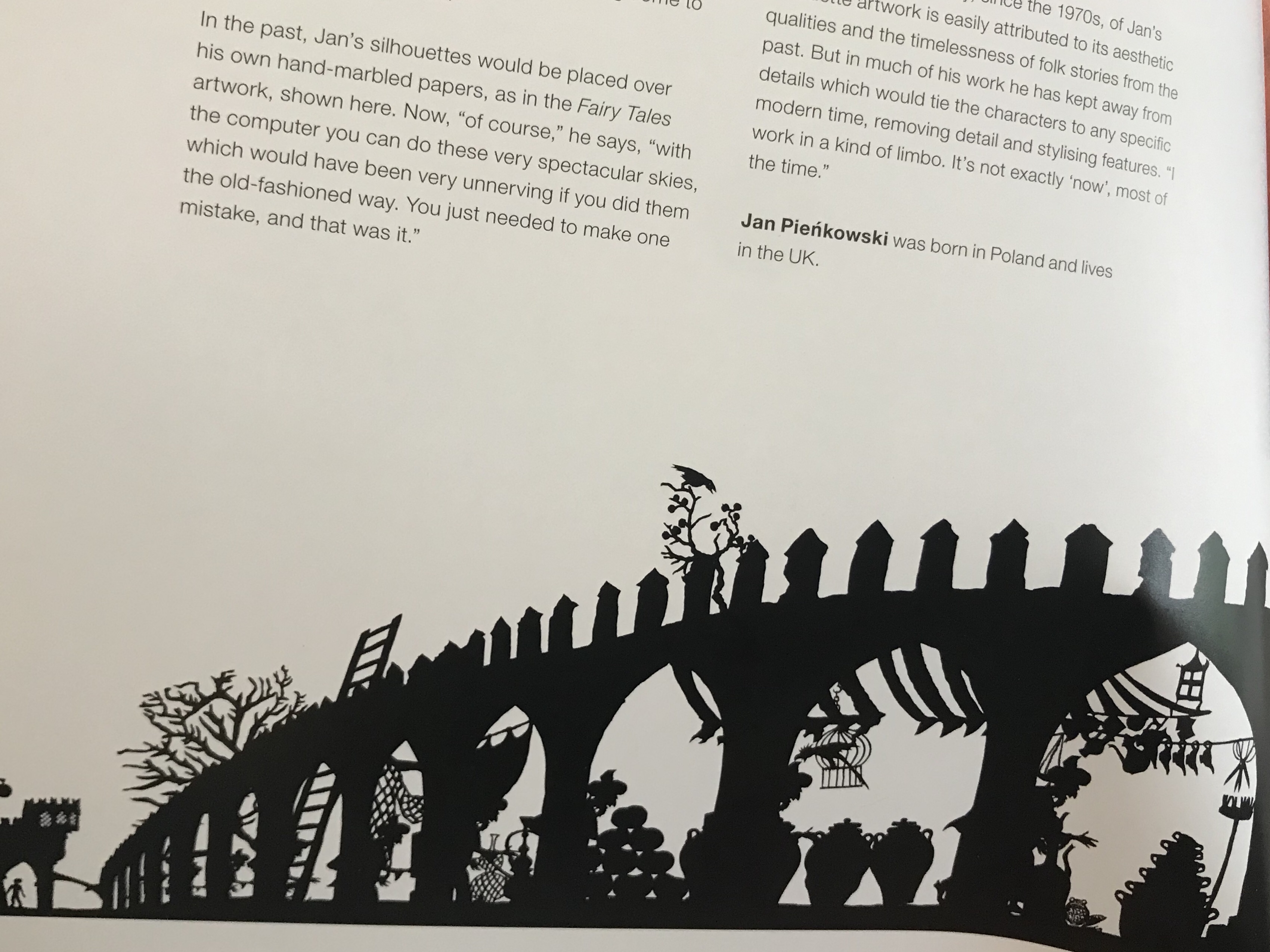
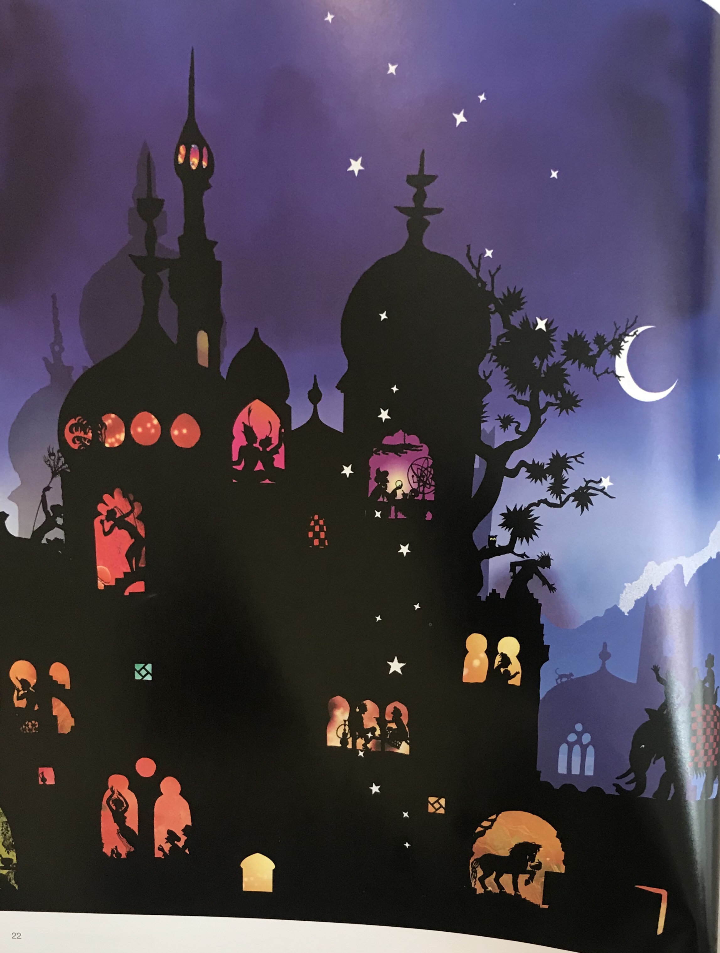
Jan Pienkowski The Thousand Nights and One Night
Jan Pienkowski The Thousand Nights and One Night
I chose images that I liked and that were all quite different. The ones that stood out in reference to this assignment were the images by Daniel pudles and Jan Pienkowski. Daniel pudles work because it is a lino print and therefore lends itself very well to a two colour palette. I really love Jan Pienkowski’s illustrations and although one of them has colour. The main portion of the image would work also in just black and white and uses very interesting silhouettes and lots of varied shapes, that created a piece that really captures your attention. I really took my time looking at it thoroughly, to see all of the different elements and characters within the image. I did also look at some other lesser know artists on Instagram and on a general google search to find other examples until I felt more confident about what I was trying to acheive.
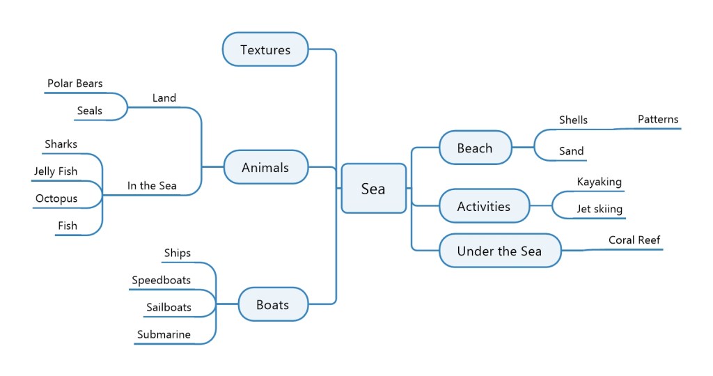
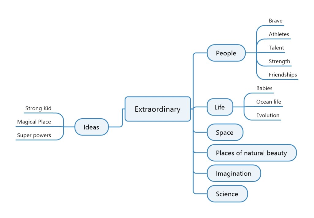
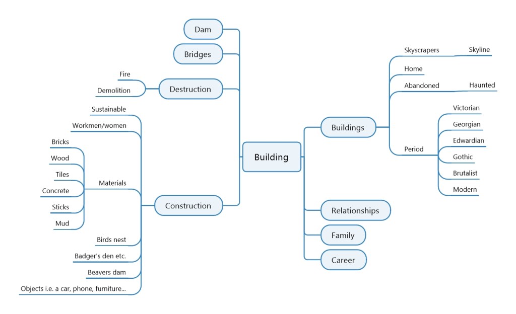
I then started by brainstorming each of the words so that I could come up with some ideas and choose the word I wanted to use for my image.
Once I had done my mind maps I chose a few of the ideas and did some quick sketches to see what would work and which ones I liked that I would want to develop more.
I liked the idea of under the sea, however, I could not think of an idea that would work with this style. The idea I had of the man walking down the street would have worked very well with the style, yet I did not want to create a piece that looked dated. I wanted to try creating something with the old style, but with subject matter that could represent the current day. I therefore settled on the scene with the toddler on a tricycle.
I took my initial sketch and did a perspective drawing. Once I was happy with how it was looking. I then inked over the pencil markings to create the final line drawing and rubbed out the pencil markings. After this I scanned it onto my computer and put it into Photoshop, where I removed the background so that only the line drawing was left and saved the file and printed a copy. I then changed the colours so that they were inverted, I saved this as a new file and then printed two copies.
Once I had both my original and my inverted copy, I then started to cut out shapes from my inverted copy and place them onto my original copy. I used white tack to keep the pieces in place. Whilst I experimented with the placement.
I really struggled with choosing the colours for the toddler and his tricycle as it was hard to see what balanced him well. I therefore spent a lot of time changing his clothes and hair around to see which would work best. The tricycle tyres dictated to some level, what colour I could use for the boys clothing, as I felt it important to keep the tyres black as this made more sense. I would have liked to have the car tyres black also, but then they would have been invisible against the road and the road was more important to have black. This was so that the grass surrounding it and the pavement stood out in contrast.
Final Image
Reflection
I spent a lot of time trying different layouts with the cutouts and found this to be quite challenging to get it to look right. I think that now I have tried the exercise I would perhaps have used a simpler design or designed it in a way that it was easier to colour. However, I would not have understood how to do this until I had tried the exercise myself and learnt from the problems I encountered. I am not entirely sure if I met the brief as it said that there should be no lines left by the end of the cutting and pasting. However, I found this impossible to do and do not think that I could achieve this or know how to achieve this on this particular drawing. In doing so, I would have lost a lot of the important elements like the curb and some of the details on the boy and his tricycle. I found this brief very difficult to and do not feel that the instructions were clear. It would have been helpful to have a simple example of the technique.
In conclusion, I can see how important it is to think more about the design process for each image I am producing. Overall, I am happy with my image, especially as it is the first time I have tried something like this and it is very different to my usual style and type of work that I do.
References: 3dtotal Publishing (2017) Masters of Sketching. (s.l.): 3DTotal.com.
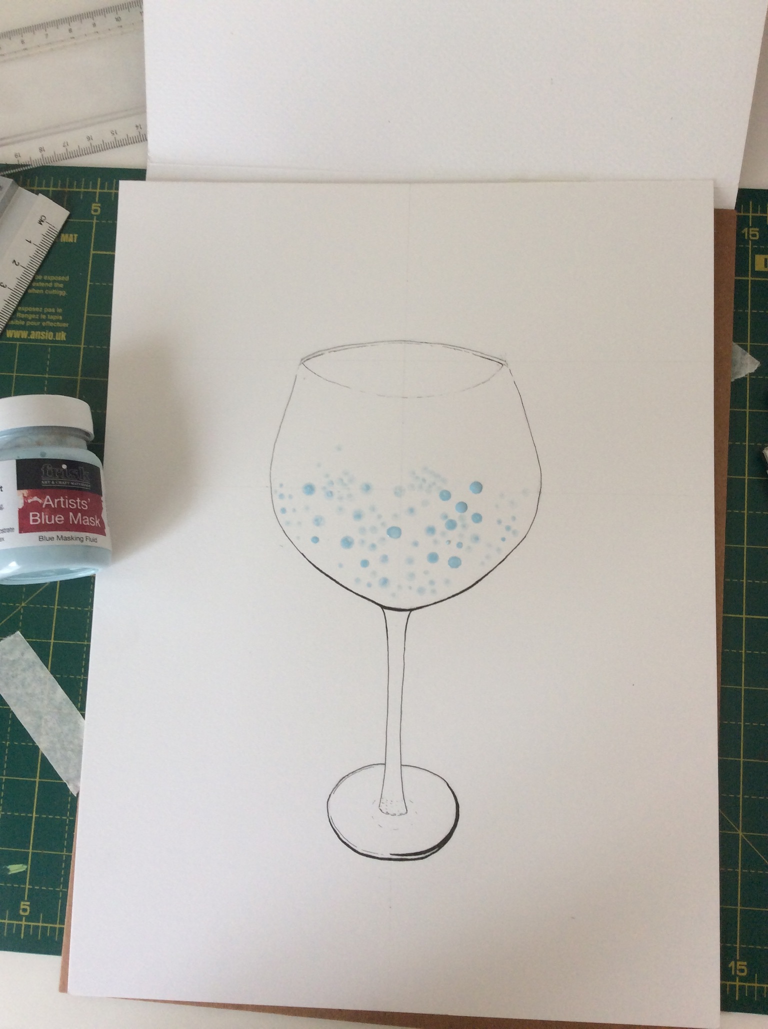
For this exercise I had to take an object and write a down a series of words to describe it. These words would need to describe its particular qualities. The object I chose was a glass of gin and tonic with fruit in it. The words I chose to describe it are; refreshing, fruity, bubbly, cold, wet, delicious.
We were then asked to choose one word from our list as the basis of our idea and explore the idea visually by making a mood board. Due to the Covid 19 lockdown. I have limited materials with which to make a mood board. However, I do have some travel magazines and National Geographic magazines left over from my last mood board. Therefore from these and also from searching the Internet, I managed to find the images I wanted for my board.
My chosen object
The word I chose to use for my moodboard was ‘refreshing’. I looked through magazines to find images that represented this word. Once I had finished with the magazines, I did a web search to find other images that I wanted for my board, such as the cucumber and mint leaves.
Working on my moodboard
My finished moodboard
Once I had finished my moodboard I started adding the colours, textures and materials identified during my exploration to my line drawing.
My line drawing
I used artists, masking fluid to keep the area where the bubbles were going to be clear and started to paint. I used Viviva Colorsheets to paint with as I love how vivid the watercolours are.
My Final Drawing
I am pleased with my final piece. There were many elements to this drawing that were new and experimental for me, such as drawing bubbles and painting in less realistic style’s. This was the also the first time I have used masking fluid. I liked the freedom that this exercise gave me to experiment, as the drawing was subjective rather than objective. Therefore, this was a fun exercise. The only thing I would have liked to incorporate which I did not, is to have the effect of condensation on the glass. I feel like this would have reinforced the idea of a cold, refreshing beverage. I think this would have been quite difficult to draw on a technical level, but is something that I would quite like to experiment with, to see if I can find a way of effectively communicating that.
For this exercise I was asked to draw an item from the following list: Shoe, Umbrella, Pair of trousers, Pair of glasses, Hat.
Take an item from the list provided, and explore it visually to become aware of its textures, physical qualities and function. What is item for – what does it do?
Using a pencil or fine liner do an objective drawing of your subject and an A4 sheet. You are trying to achieve a drawing that has a high degree of visual accuracy and is technically controlled. Be analytical and use drawing to clearly convey this visual information.
You are trying to record what you see in this drawing, so be aware of the relative scale of different elements of your object and position of component parts. Use marks that describe the texture of the object and vary line quality to suggest its contours. You may find that if you place your item on white surface. You can observe it more easily. Colour is reflected by white and you will be less distracted by background contrasts.
The Shoe I chose
I chose this vintage shoe that I have as i really like this the design of this shoe and the different textures it has, with the suede, the textured leather and the smooth leather of the shoe.
My drawing
I am very happy with my final drawing, though I do see a slight error with the positioning of the shoe and I think this was because I was too close to it when I was drawing and seem to have changed my view half way through, so the shoe looks like it is slightly twisted to me. This is something that if I was to do it again, I would be aware of and correct. However, overall I am very pleased. This is the first time I have drawn shoe in such detail and also the first time in a long time that I have drawn anything in pencil to this standard, as I have mainly been working on developing cartoon styles and watercolour techniques. Pencil drawings are one of my favourite to do therefore I did feel quite confident doing this exercise. I think I was able to capture the textures quite well and was happy with how they came out, especially as this was the first time I have tried to draw leather and suede. I placed the shoe on a white sheet of paper and lit it with a small spotlight lamp. I started with a contour drawing and then shaded the shoe using a to 2B and H pencil. I did not shade the actual smooth leather of the shoe as dark as I could have to show the colour. This was because I liked the way it looked being lighter and also because of the amount of light hitting the shoe, it did look a lot lighter where the smooth leather was reflecting the light.
For this exercise I was asked to create a sketchbook from a variety of papers, with different textures. I was asked to choose an object to draw using different material for each drawing, exploring new media and techniques that are unfamiliar to me.
For my project I decided to use a kiwifruit as my subject and used a range of different papers, including tracing paper, tissue paper and glossy photo paper. I have not done much experimental work or testing of new mediums, so I was quite looking forward to this exercise, as this would give me the chance to experiment and try new things. I found it difficult to come up with ideas of what to use, especially towards the end as there was lots of ideas. I wanted to try such as food dyes and using dilute bleach. However, due to being in lockdown I was unable to source these materials.
The tracing paper did not lend itself terribly well to any of the mediums I chose. The most successful was probably the acrylic paint, which I stippled. I think that acrylic paint splattered would have worked quite nicely on the tracing paper, which may be something to explore further.The blown ink, I would like to try again on a larger sheet of paper as it was very difficult to control on such a small scale, it also did not lend itself to the particular rounded form that I was creating, but I would be interested to see how this would work with other subject matters.The acrylic ink splattering was my favourite. It was fun to do and I like the effect of the layering of the colours and the texture, whereas the watercolour Kiwi is my least favourite. Although I quite like the way looks the colours soak straight into the paper and caused bubbling and the colours looked very weak.I love the way the marker pens left translucent colour and delicate effect on the tissue paper. Although unfortunately this cannot be seen in the photographs.I was most excited to try working on this glossy photo paper. However, I was quite surprised by the results. And although I knew it would be difficult to find mediums that would work. I had expected that the mediums would go on a lot smoother and have a nicer quality to them. Particularly the gold marker which did not go on smoothly at all and disturbed the surface of the paper, causing discolouration to show through if I was to go over the same area. The alcohol marker also did not go on smoothly and caused streaks. However, it has left a glossy sheen which I do quite like. I do quite like the way the acrylic paint looks, even though it was quite hard to get it to spread on the page. I did use very thick paint that was not watered down too much, as I was conscious of needing it to dry and stick to the surface. I was surprised how fluidly the fine liner went on, although I do not like my end result as I feel like this centre of my Kiwi was not what I was trying to achieve. I do like the marks for the Kiwi skin and that they look like they are part of the paper as if they have been printed on.The black paper also did not work as I had hoped. However, I like the vibrancy of the pastel pencils and really like the way the dry brush came out. Once again, it is hard to see from the photo, but I really like the texture and marks and also the way I could layer colours like the pale greens with the turquoise blue and pink colours I used. This is something that I would quite like to explore on a larger scale where it would be easier to use and more effective.Although the colours do not shop so well. I do like the way the alcohol markers blended on the brown paper. I also really liked the pastel colours I chose for the acrylic painted kiwi in real life. They are more vibrant than they are showing in these photos do quite like that they are not realistic colours.For the pastel paper. I chose less experimental mediums and chose to work with mediums that I thought would be interesting on the textured surface. The watercolour went on really quite smoothly, I chose to use contrasting colours so that they stood out in the green background. I really enjoyed the way the chalk pastels went on so vibrantly and worked well on the textured surface. They were easy to use and I like the effect they gave. Similarly, I liked the texture created by using the graphite stick. I think both the graphite and the pastels would lend themselves to working on a larger scale, as they are less suited to detail work and are both mediums that I would like to experiment with further in the future. I tend to work very detailed and for a while have been wanting to try working on a larger scale, with a medium that would lend itself to looser work where I would not get so hung up on the details and would have a chance to try my hand at new techniques.
For this exercise I was asked to collect as much reference as I could find the 1950s. And to catalogue the information according to these categories: People and costume Architecture and interiors Art – painting, drawing, sculpture Graphic design – posters, books, typography Advertising Transport Film and TV Surface pattern and decoration.
The brief was to be eclectic in my sources identify the visual qualities that are universal within the categories – shapes, textures, colours, style and other features.
For my research I chose to concentrate just on 1950s Britain. In Britain, the 1950s was an era where the economy was recovering from the effects of world War one and two. Because Britain was badly damaged by bombing there was a housing shortage which led to many temporary and fabricated houses being built. These were designed in a way that would be quick and easy to build and were pretty simple in design. As the economy grew, people were able to start purchasing items again which led to an booming industry of furniture, appliances and other household items. The 1950s style is quite distinctive from the hairstyles of the men and women, to the outfits that they wore which includes the nipped in waist and A-line skirts of the women and the rounded shapes of household furniture and appliances. Interestingly, one of the popular patterns on fabric that was used to make dresses and curtains etc. was that of the symbol of the atomic bomb.
The 1950s style once again become quite popular in recent years. This includes the rounded style of kitchen appliances and vintage furniture from the 1950s that would be repainted in pastel colours. There is a tendency to relate pastel colours to the 1950s however, from my research I found that this was not actually the case. The colour palette was actually more similar to that of the 1970s with the majority of the furniture including sofas and fabrics being in muted dark colours like Forest Green, dark red and dark blues with brown wooden flooring seeming quite common. In the 1950s they did however seem to like using bright colours, particularly in the kitchen with an example being where a bright blue would be used as the main colour for the work surface, with a matching table top and even matching tiles on the walls.
To go with my research I was asked to make an illustration of someone sitting in a chair surrounded by typical artefacts to give a teenager an idea of the 1950s. For my illustration I chose to draw a man sitting in a chair reading a newspaper, with a cup of tea and a cigarette besides him. Cigarettes were very popular in the 1950s and were even considered to have health benefits. I tried to keep the style of the room in keeping with the 1950s style of furniture and colours used for furniture. Behind the man we can see a doorway in which there is a woman (his wife) who is busy in the kitchen. Although women did work during the war due to necessity, once the war ended so did their careers and they went back to their wifely duties as before. Men were considered the providers and worked and provided income for the household and family. Women on the other hand were expected to care for their husband and the children and take care of the home, this included all cooking and cleaning. My aim was to reflect these gender roles within my illustration as this is a big contrast to how things are in the present day with gender roles.
In order to file my research I created folders on my computer for each of the topic headings and searched on the internet and on various online libraries, including the OCA library and the bridgemen library. Unfortunately my laptop broke a few days after I finished my research so although I had luckily backed up my documents before hand, I am missing the last few days of my research. I did however have the research to hand whilst I was planing out my illustration and drawing the initial pencil drawing. I also had my sketchbook to hand where I had already drawn and been experimenting with the colours I wished to use. At this time, I am writing from my new laptop and am presenting what I have of my research.
My research
Someting I learned from this project is that I need to find a new way or software to keep my research that I am able to label individual images and keep those images on seperate files. For this project, I used a word document for each heading. But I realised that this is not going to be easy to find individual images when I need to go back and use this reference libray I was trying to create. I would also like to keep building on this library to create a vast reference base for all future work.
Work in Progress…
My finished Piece
I am quite pleased with how this turned out. I have not had a lot of practice drawing rooms and using perspective in this way, so it started with a bit of trial and error. I used watercolour and gouache to paint this. Paiting is a new medium to me and is one that I am gradually learning. I chose not to use ink on this piece as I wanted to tey to emphasise objects by using more contrast in my painting. I realised that I would like to start to learn how to deplict lighting in my work, be that from lamps or natural light and shadows and also how to paint faces and clothing. This is something that I would like to develop further with my study.
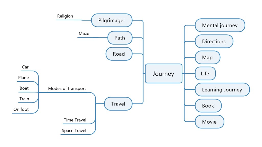
For this exercise, I was asked to create a mood board for one of the words from my previous exercise; ‘.Turning words into pictures’. I chose the word travel as this is something that I am very passionate about and would therefore be quite interesting for me to create a mood board for. I tried to create seasons within the move mood board trying to blend seamlessly from winter to summer as best as I could.
For the words into pictures exercise I was tasked to pick a word from the following list;
childhood
exotic
destruction
kitchen
wild
fashion
travel
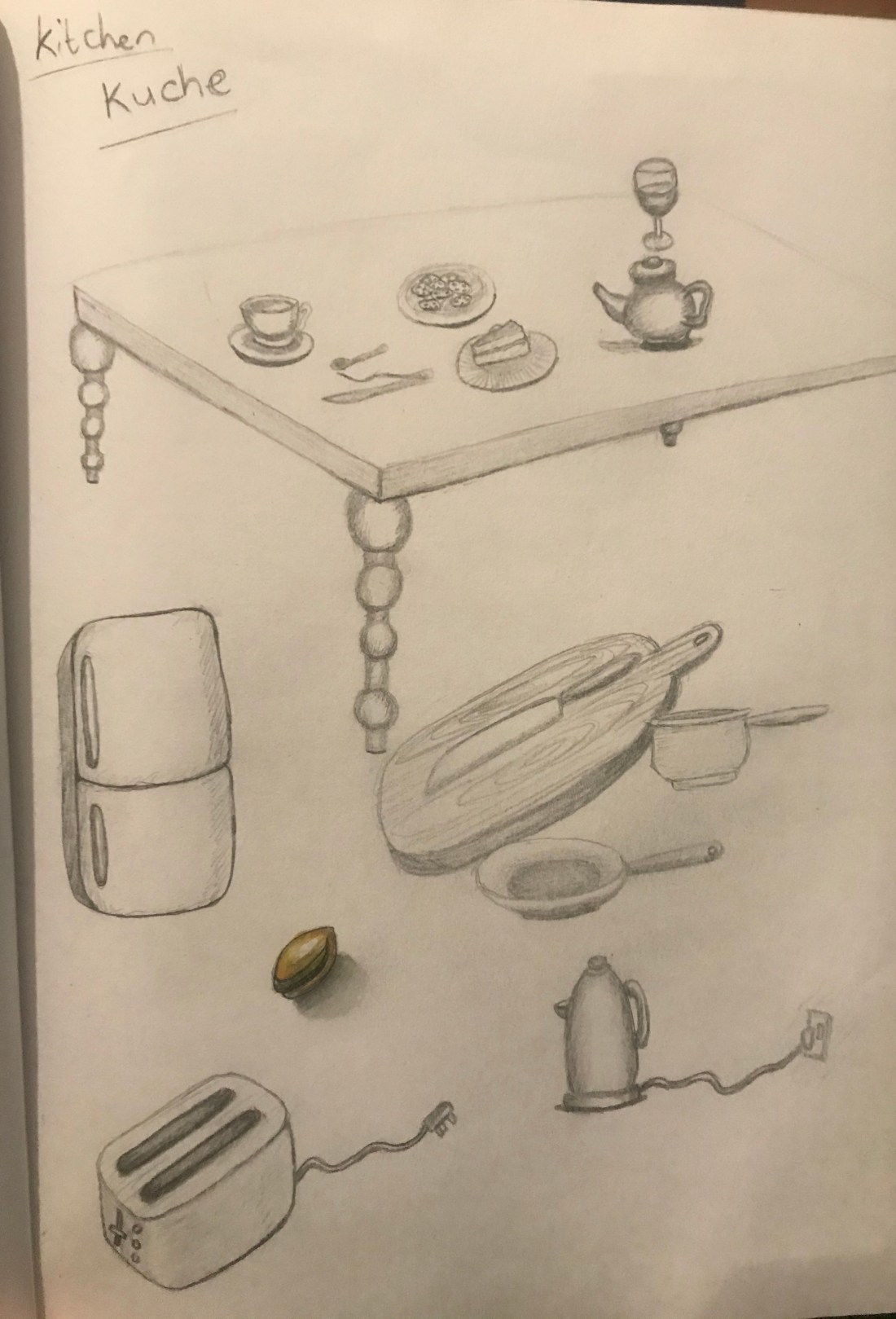
Just reading this back to type this blog, I’ve realised that it actually said choose a word from the list And I actually read this wrong and did all of the list. However, I did find that doing all of the list was quite valuable as that was quite a big difference in the quality of the drawings from word to word. For the word childhood, I struggled to know what to draw. On reflection, I think that this is because a lot of the things in childhood are not necessarily objects but feelings and experiences. In contrast, when I did the drawings for the word kitchen I was able to create quite accurate drawings and fill the whole page easily. For other words that I do not have many personal associations with I also struggled to come up with ideas for images.
Childhood
Destruction
Exotic
Fashion
Kitchen
Travel
Wild 1
Wild 2
I found this task quite challenging but also quite fun and think that this is something I would like to do more of however I also see that drawing from observation would be valuable first to build my visual memory so that I can more accurately draw and recall objects.
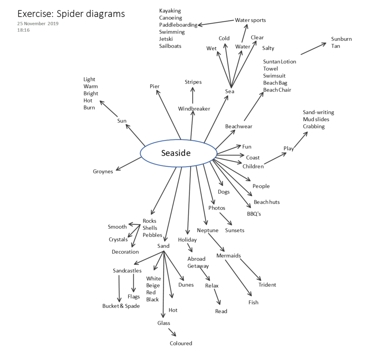
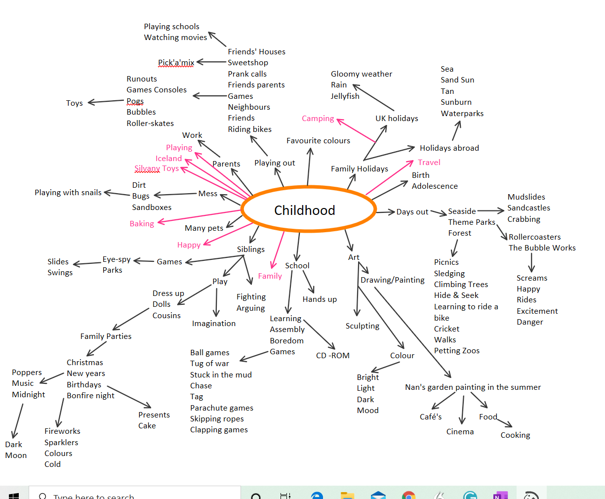
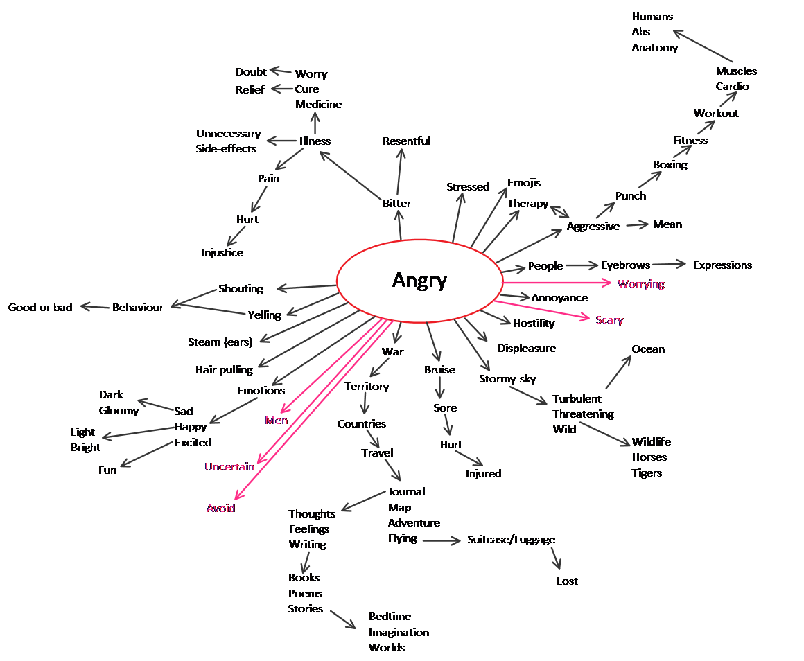
For this exercise I was asked to create four separate spider diagrams. One for each of the following words;
seaside, childhood, angry and festival.
I found the spider diagram for childhood the easiest to produce I guess because this covers quite a wide range of subjects, activities and memories. The word I found the most difficult to produce a spider diagram for was festival. I have limited experience of festivals therefore I was having to imagine the scenario. I also searched the Internet and dictionary for associated words.
I managed to get a couple of people to also do spider diagrams for these words. I found that a lot of the words they chose were quite similar. However, everyone has different experiences which meant that they also had words that I had not thought of, or different connotations of what these four words meant to them.
In order to complete my spider diagrams, I first started with words that I could think of for each subject. When I ran out of ideas, I then looked at the dictionary and thesaurus. To finish I used the internet to search the word, to see if anything different to what I had already come up with showed up in an image search. The thesaurus was probably the most helpful in order to come up with extra words and expand on the meaning of the words I already had.
My words are all written in black And I have selected a separate colour for each different person that contributed their spider diagrams.