Lisbon Study Trip

I recently attended the OCA Lisbon study visit. The trip was three days of Gallery visits lots of walking and sketching on location. Our tutors were Michelle Whiting and Diana Ali. This is the first study visit I have attended and the first time that I have met any OCA tutors and students. We arrived on the Monday and met with the other students at the hotel for dinner where we introduced ourselves before retiring to our rooms to prepare for the next day. We met in the morning and there we met our tutors and the rest of our fellow students. After our introduction we left for our first outing.

IMG_9307
Roof top restaurant – The House of Wonders 

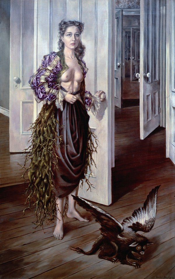
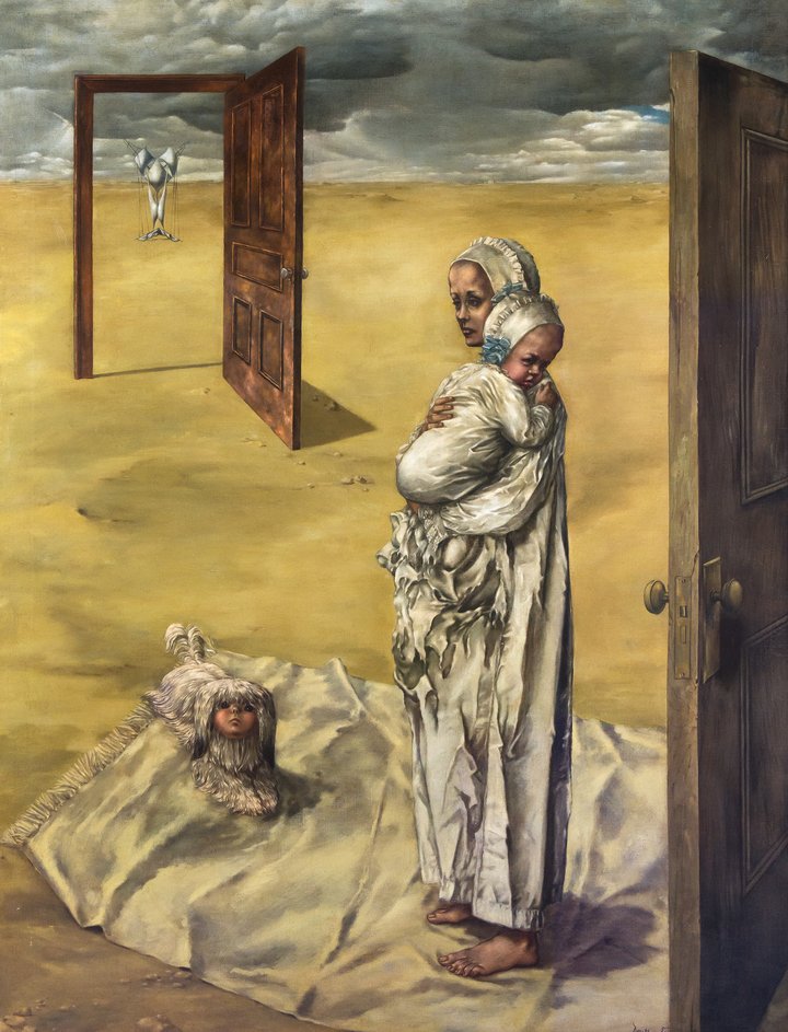
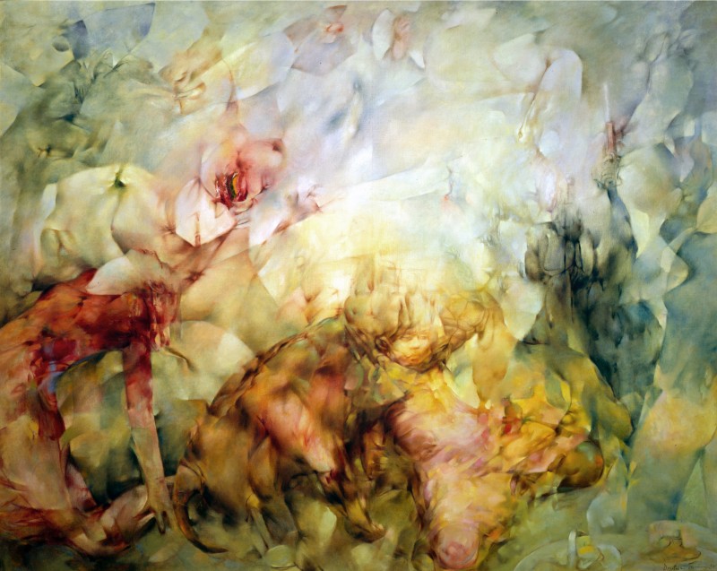
These three days were packed with visits to various places. We visited the Museo Berardo where we had an interesting guided tour of a contemporary gallery, my knowledge of contemporary art is very limited, so it was very helpful to have the guide explain the pieces in the gallery. I left with a very different view of these types of artwork than when I went in. We also visited the Paula Rego exhibition at the Casa das Historias which showed a vast collection of her sketchbook work as well as some of her final pieces. I found this exhibition to be extremely inspirational and relative to my studies. I like that she used her art to get a message across, mostly political and quite controversial. It was great seeing her sketches the line style she used the mediums and her experimentation.


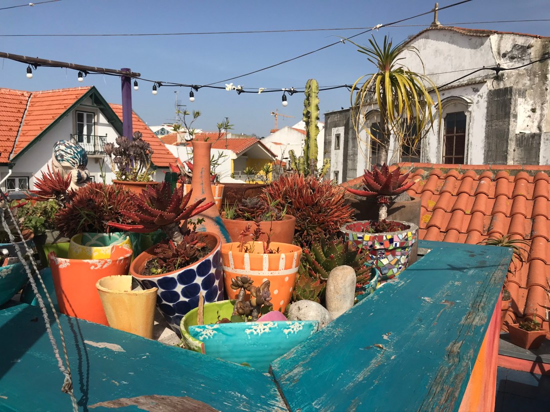
We got to see some beautiful sites including the botanical Gardens which hosted an array of cockerel’s and hens, Peacocks, ducks and terrapins, the castle on the sea which was like something out of a fairy-tale with its little beach cove, a harbour and PADA artist in residence in Barreiro, who gave us access to restricted industrial estate that had incredible views across the water of the whole city of Lisbon and a great many thing to draw.

My PADA sketch
My sketch at PADA

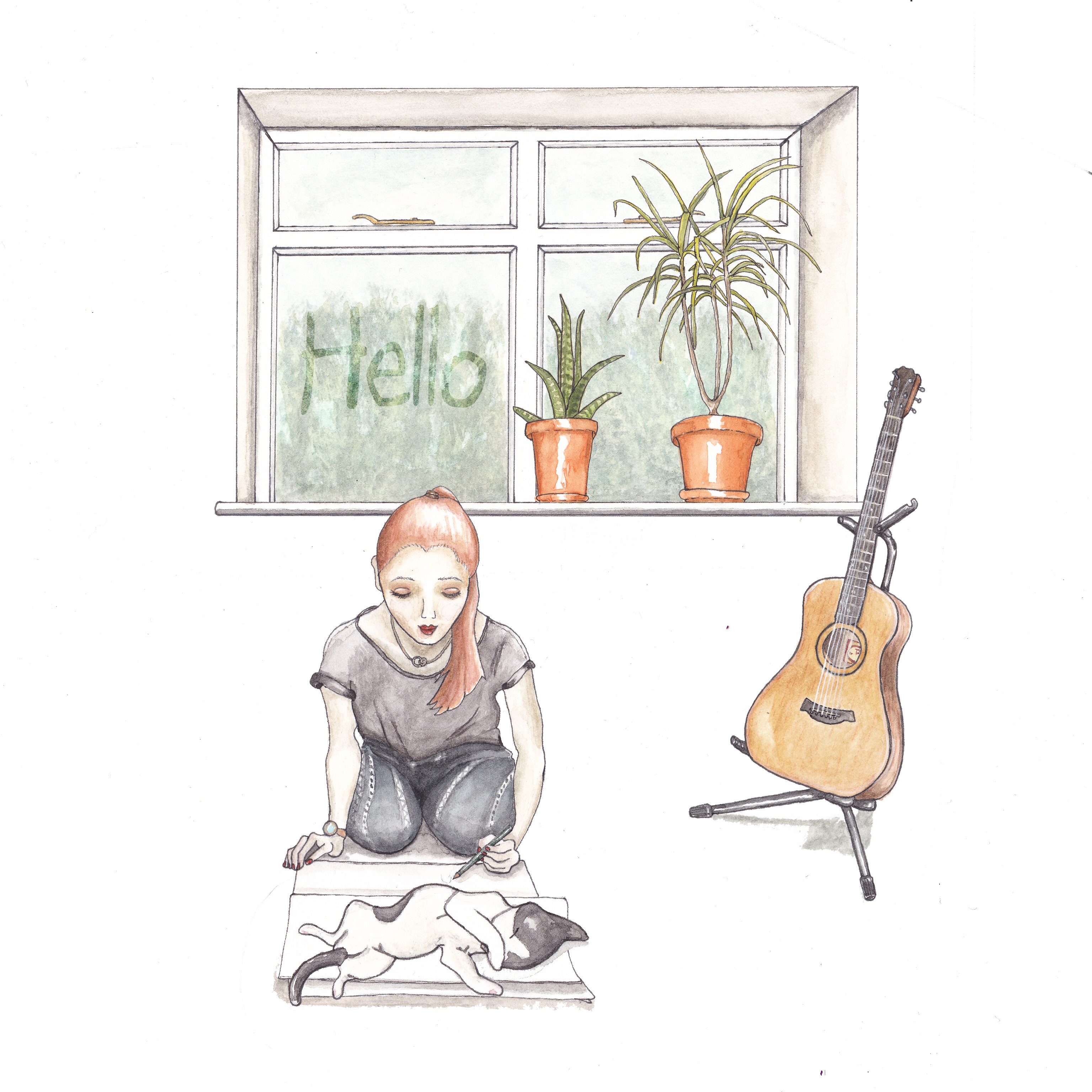
I really enjoyed meeting my fellow students and tutors. We ate amazing food, had a great time with plenty of laughs and I learned a lot from them all and from our visits as well as the guides from the museums. I got to push myself out of my comfort zone a little bit and try new things and it was very interesting seeing my fellow students work and the ways that they approached this. I came back very excited to get back in my studio and am looking forward to incorporating the things that I learnt on the study visit into my future work. I hope to stay in touch with the other students that I met and will hopefully see them again at other study visits. The tutors did an amazing job of organising the trip, giving us a great experience that I will treasure.  I had such a great time and am so glad that I went, I really hope that OCA runs more of these types of study trips.

IMG_8808
Photo at PADA – Property of Ashley Mclaughlin

Gallery visit – David Hockney Exhibition

I went to visit the David Hockney exhibition at the Light Box gallery in Woking, Surrey today. He’s not an artist who’s work I knew of, although I’m sure I’ve heard the name before.

I was impressed by how varied his work was. He had oil pairings, inkjet painting that he’s done when inkjet was first released. He had ink line drawing work and he had even experimented with pressed pulp drawings where he made his own papers, incorporating the image he wanted to make into the process, so that the pressed paper itself was the piece of art.

They exhibited a letter he had written to a friend, where he sounded extremely happy and excited about his work and what he had been learning during his experimentation. This was a nice glimpse into his thoughts about how he felt about his work. I really liked his experimental style. But the one thing I told away from the visit was that although some of his works were perfected to a high level, most were not. Most of them had brush marks, you could see the pencil under-drawings, some looked half finished and if an artist today released his inkjet art I don’t think it would go down so well. But he was incentive with the new materials he had at the time, he was exploring and experimenting and was not afraid to make a ‘bad mark’. I remember seeing the same things when I went to the Comic Museum in London. The work was amazing, but they too had left brush strokes or felt marks and made errors that they the cut out new paper, placed it over the top and repairing the section and used stark white highlights that look like they had been painted in tipex.

After the visit, when I was reflecting on my own work and working practices I realised how hard I am on myself and my work. I am always striving for perfection and spend a lot of time making sure there are no brush marks and lines that aren’t in the wrong place.

I guess what I’m learning is that perfection is overrated and that I really should let go a little and experiment more. Which ties in very nicely with my next exercise which is to create a sketchbook with different materials or types of paper and using different mediums experimenting the different effects I can make. I am quite excited about this exercise as this is something I never do. Although I have been using and learning more and more mediums i.e. watercolour, gouache, pastels, I will always use the appropriate corresponding paper and I have not pushed past that and tried more unconventional materials. I am looking forward to doing more gallery visits to get inspired and see the way others worked.

Artists I Love: Dorothea Tanning

Whilst researching for my 1950’s project I am starting to come across some artists that are new to me and that I like the style of their work, so I thought i’d start this page off. I am quite fussy with art, there’s really not a lot that I like. Perhaps that’s because I like a very specific type, I’m not quite sure. I do like realistic art and very much admire the amazing skin tones and texture I’ve seen at the Tate Modern before. Perhaps creating this section of the blog will help me pinpoint some kind of theme in the ones I do like.

Dorothea Tanning, ‘Eine Kleine Nachtmusik’ 1943

Dorothea Tanning, Eine Kleine Nachtmusik 1943. Tate. © DACS, 2019. Source: http://www.tate.org.uk

I really like this painting. I find it very interesting and I can spend a long time looking at it, wondering ‘what is going on’. The limited colour palette and effective use of light and shading helps make the image more dynamic and adds depth.


Dorothea Tanning Birthday 1942 Philadephia Museum of Art. 125th Anniversary Acquisition

Dorothea Tanning Birthday 1 942 Philadephia Museum of Art. 1 25th Anniversary Acquisition.
Purchased with funds contributed by C. K. Williams, Il, 1 999 DACS, London. Source: http://www.tate.org.uk

I also love this one, her work is very dynamic and interesting and imaginative.


Dorothea Tanning Maternity 1946-1947 Private Collection

Dorothea Tanning Maternity 1946-1947 Private Collection ©DACS, London. Source: http://www.tate.org.uk

This one reminds me of how I envisaged the doors when I read the Stephen King Books, ‘The Dark Tower’.

<i>Midi et demi (Half Past Noon)</i>

Midi et demi (Half Past Noon)1957 Source: http://www.dorotheatanning.org

This one is so different from the previous three. I just love the colours and that the

re seems to be something going on there, I can see bodies and faces, it’s very difficult to work out, but that makes it all the more interesting.

Exercise: Writing a brief

I chose this book as it is one of my favourite series of books I’ve ever read and am currently reading. The image although quite detailed is also a relatively simple one. It accurately sets the world the book is set in and creates the mood for the story, which is dark and intriguing.


The Brief

The image we need is for a cover for a series of books. The series will all have the same image, but in different colours. The image and colours will be moody and muted. The central part of the image will also be used on the spine and a close up part of the tower will be used on the back of the cover.

The image is to be positioned mainly towards the bottom half of the cover. This is to allow for text in the top half, Which can slightly overlap the image just a little. The whole page will be taken up by the overall illustration i.e. the sky, background of the landscape. The text will be the writers name: Steven King, the book title: The Dark Tower, Wizard and Glass and also the text: With a new introduction by the author, which will be positioned at the bottom of the image in smaller text.

We would like the ‘dark’ tower to be in the image in the background, with an illustration of the old rustic town that is similar to a cowboy town. The town however is not set in any specific time as it is ‘another world’, however there are many elements of this world that coincides with our modern world, which means the reader is never able to place which time period it is set in. The world does have an old world feel. With the houses/town being all made of wood and horses being the main mode of transport. The town itself is full of drunks and unsavoury characters. So although we do not want any characters in the image, this will reflect on the kind of style and darkness in the image. We want the image to draw the audiences eye straight to the text first, then image last. The aim of the image is to relay the mood and create a sense of mystery and wonder about what lies within. Who dwells in those buildings, what is the dark tower.

The intended audience is adults 18-50. This image would be suited to painting/drawing by hand with the background added separately so that the main image is easily transferred to each cover, with the background colour being easily changeable with computer software.

Assignment one: Say hello

It took me along time to complete this assignment. One reason for that is I painted the scene as individual objects so that I was less likely to make mistakes and have to redo the whole thing. I did redo the guitar once and the girl a few times before I was happy with it. The second reason being that I am only just learning how to use photoshop, which is quite a challenge as I can never remember what tool does what. To fix this problem, today I started writing down what tools do what and what different short cut commands do. The laptop I’m using is very out of date so unfortunately it can’t run illustrator, which I’m told is the on I should be using.

Because of these technicality’s I ended up not adding as much as originally intended in my original sketches. I also wasn’t able to colour the background which I think would have looked better. However I am still happy with my effort. I am keen to move on now and start afresh as I was spending far too much time on this one, getting stuck too many times along the way.

I used watercolour for these drawings, I first drew each item and when I was happy with it traced it on to the A3 watercolour paper. I placed all of the items in the same sheet and then cut them out after. This way I could be sure the colour palette and paint style matched.

I then scanned them and used photoshop cc to resize and layer the images. The words in the window was born from a happy my mistakes and experiments in photoshop. I’d had an error where the background was not working correctly and was not layering in the correct order, therefore partially concealing the things in front. I thought I’d try duplicating the effect but layering in an order that meant that the words remained hazy and by changing the opacity and having the right font, looked like the words were written on the window like condensation. After I was finished editing I sent it to Moonpig the online card retailer and got my image printed out as a card which I will be posting to my tutor. I do like the colour palette in this one. I tried to keep to just a few colours and to keep it simple.

After I did this however I realised I forgot to talk about what mediums I like to use etc. My fault for rushing though the final part. But I was keen to move on, as I have spent far too long stuck in my first module.

Exercise: Getting the gist

‘Solo brides’ – For this exercise I chose an article from Cosmopolitan magazine. The article was about strong business women in Japan that were opting to have a wedding ‘experience’ without a groom. They would have a photo shoot in a wedding dress, a cake and a dinner where they can have provided a dinner guest if they feel too lonely dining alone.

I used watercolour to create this image in which I was trying to capture a slightly crazy story.

First I drew the image in pencil and reworked until I was happy with it. Then I traced the image and transferred it to watercolour paper. This way it was a cleaner image. I then proceeded to paint with watercolour. I did use very light colours, which maybe I should have been bolder with my colours. I naturally tend to be very reserved with colour and this is something I have to push past, to not be scared to use bold colours. I used I my watercolour for this image, I also used it to outline.

I’m still getting used to painting as a medium so faces I find challenging to paint, as well as fine details in general. I did enjoy creating this image though as the article was very interesting.

Exercise: The History of Illustration

Winnie StyleAbove: Ink drawing the the style of E.H. Shephard.

Below: Drawing inn the style of Laura Vaccaro Seeger. Drawn using  a twig dipped in India Ink, then background added and coloured on Photoshop.

Fox and chickensfinished image

Earnest Howard Shepard who was born on December 1, 1879, most significant works were his Winnie the Pooh illustrations which we originated from ‘The Tales of Christopher Robin’ books by author A.A. Milne published between 1924-1928. E H Shepard continued to draw ‘Winnie the Pooh’ for the rest of his life.

The characters and scenes in ‘The tales of Christopher Robin’ were inspired by A.A. Milne’s home in Sussex which is where I grew up. He was inspired by the woodlands that were his surroundings at his country home and by his son’s toys, which he based his characters for the Winnie the Pooh books on.

I choose this artist as I also love to draw animals and I really like the style of Earnest Howard Shepard work.


  • There are elements of E H Shepard’s work, mostly it does not look dated as the backgrounds are forests which do not change from decade to decade and the toys are also not dated. However the characters he draws are dated by their hairstyles and clothing. He also drew a lot of illustrations of the wartime. His style is more detailed than a lot of artist use today and his colours more subtle. Whereas current artists tend to use more bold and block colours to illustrate children’s books, with a lot less detail. Perhaps due to needing to produce illustrations faster for tighter deadlines. He uses a lot of pen work with many small lines and hatching to shade his work.


  • For my contemporary artist, I chose Laura Vaccaro Seeger. She also illustrates children’s books with animals as her subject matter. I chose her for this reason, but also because her illustrations are vastly different from that of E H Shepard. Her illustrations are very bold, and almost harsh when compared to E H Shepard’s work. Laura uses block colour and little detailing to create her characters. I admire the way that she creates such powerful characters with such a simplistic style. Whereas E H Shepard uses words to drive the narrative and tell you what is happening in the illustration, Laura uses speech bubbles and clear facial expressions to show what is happening in the story rather than using many words.

Tools

The materials E H Shepard used was mainly pencil, which when finalised he would then ink over to create is final image. In later years he started to colour his drawings with watercolour paint.

Laura Vaccaro Seeger uses a variety of mediums such as oil paints and watercolour, however the book that I liked the style of the most happened to be hand drawn using a twig dipped in Indian Ink to give a rough finish, then painted on computer software. In an interview she said that she had a background in television and animation so tends to think of the story and map it out in the same way she would for a story board for tv. And this shows through in the types of line drawings and block colours she uses, which is visually very strong, however is not at all like the whimsical drawings of E H Shepard.

Conclusion: It was fun trying the styles of two very different artists for this exercise. It pushed me to add more elements in to the drawings than I usually would in order to try tell a story as this is something I have not done before. I am very proud of the results and my first attempts of colouring on Photoshop.

I find it quite difficult using ink as I am not always so accurate as I don’t have the steadiest of hands, so it did take me a couple of attempts to get each drawing outlined. Photoshop was a new experience as I have only briefly used it to change the colours and remove backgrounds of my drawings before. I do not have a tablet so I had to do it all with the trackpad on my laptop, which was very difficult and time consuming and meant it was very hard to get neat line on my shading. I decided just to embrace it as perfection was not the goal and I am pleased with the results.

Using a twig to ink with had it’s own challenges, I experimented with many different twigs to try to get one that was small enough, yet sturdy enough to draw with. The ink did not last for more that a centimetre and a half at a time so I had to repeatedly re-dip in ink, luckily the lines were not supposed to be neat and rather more organic so it still worked okay.


And so I begin…

I have been a little delayed in starting my degree as I had an Illustration job come in. This is ongoing; designing backgrounds, obstacles and characters for a phone app computer game. I am really enjoying doing this  as the subject matter it is all entirely new for me. This makes it challenging, however I am learning a lot from doing it. It is a very time consuming project and is very hard to balance with working 6 days per week and uni work. I am struggling for time, but am keen to make a start now on my first assignment.

I have just finished the Introductory course which I found very useful. It has hopefully prepared me for what is ahead and has given me the tools and methods I need to employ going forward. I feel that I would have been quite lost without this, so I am grateful that this course is available and I did not want to start my degree until I had completed this. Although I chose not to do the final assignment as I am starting my first degree assignment instead. I now feel that I am ready to move on to my degree, although I must admit I am a little nervous as I have never done one before and really want to do well.