After receiving my tutor feedback for this assignment I wanted to implement some of the changes she had mentioned and push my illustrations a little further. I really enjoyed working on this assignment am quite keen to keep developing these characters and see how they evolve over time, as I learn more and more during the duration of my course.
Reflecting on my research
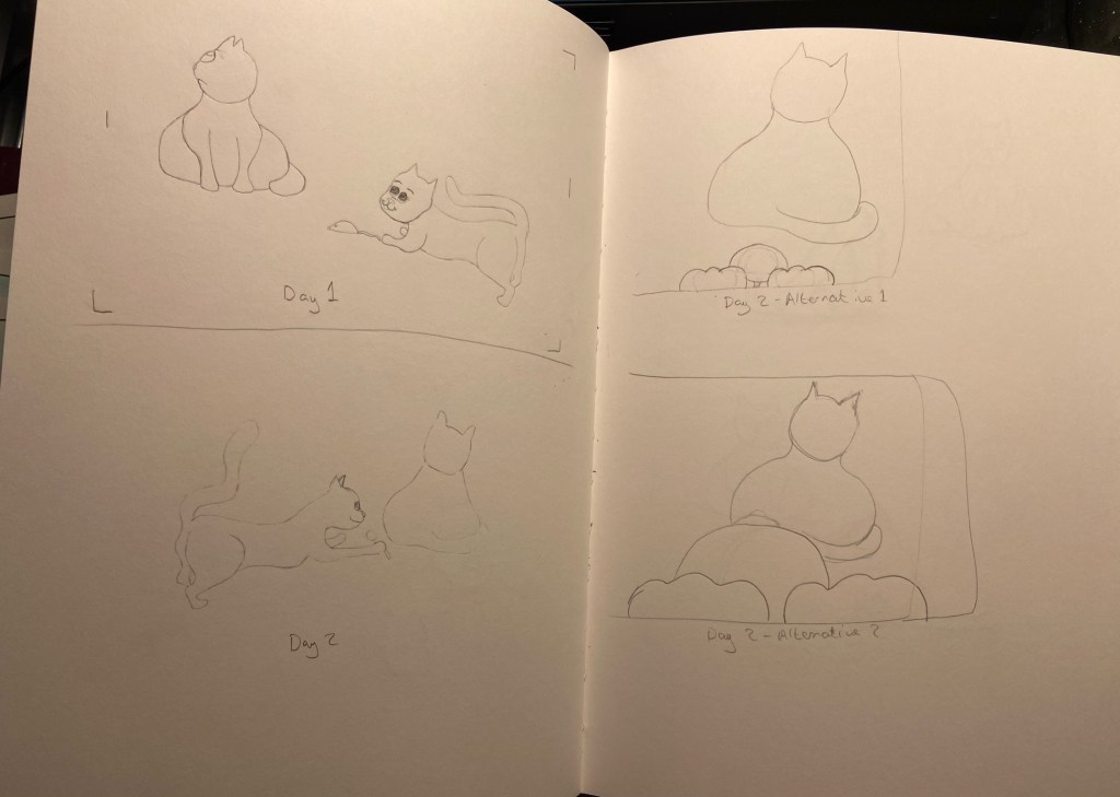
My tutor had asked me to take time to consider my research on comic strips and discuss what I had learned about this area. When I used to get the train in London, I would read the comic strips in the Metro Paper, my original layout idea was inspired by this. I was thinking of displaying my images in one continuous strip so that they could be intended for a space at the bottom of a page in a newspaper. However, when I tried this I realised I had too many images to work this way, as the images would end up too small in order to fit across the page. Therefore, I decided to place them in two rows instead, after looking at reference of comic layout.
My research lead me to look at and consider different types of layouts and think about how I could explore this further in my next modules. The comics I looked at, such as newspaper strips, Garfield and Beano tended to have evenly spaced lined boxes or could have no spacing at all. Some of the characters were drawn extending outside of the boxes. Boxes tend to be uniform or various sizes. However, they were always clearly defined and neat. This makes them easy to read. As this is the first comic strip I have done, I decided to keep mine to a simple, clean layout. This was a challenge in itself to get everything evenly spaced and lined up.
The comic strips I looked at, tended to have a simplicity in the visual information contained. They tend to be line drawings, some black and white and some with colour. Most contained backgrounds. My original images did not contain a background so I added this to see how it would look. My tutor had also mentioned this is something I should consider. I much prefer the versions with the background. It gives the strip more substance and context and adds more life and colour into the images. It also shows the cats being inside a house which helps give context, for example, if my comic strip was called, ‘Toby gets a new friend’ etc., which is the idea behind my narrative, it should be clear what is happening in the comic. I could have shown this within the illustrations by perhaps adding a bow to the neck on the first image to give the impression of the female cat being a present. When I showed my DSA study tutor, she had said that because they didn’t have a background, she pictured a background for herself and imagined the cats were in her home. I found this quite intriguing and that got me thinking about the audience and how much of their own imagination they contribute to illustrations they see. Before I re-worked these I did a lot of sketches to learn comic styles using two new books I bought. These are; Sha, B. (2015) Doodle Dogs and Sketchy Cats: fun and easy doodling for everyone. (First Edition) Ash, Ohio: North Light Books. and Hart, C. (2009) Humongous book of cartooning. New York : Lewes: Watson-Guptill Publications ; GMC Distribution [distributor]. From these I learned different head shapes, how to draw different expressions and emotions and I learned to be more confident and bold with my shapes and move away from realism. I did tests to see how different line styles would look, but decided to stick with the line style I had originally used as I liked the soft effect better for this particular set of images.
Another thing my tutor had mentioned was that all my images were from one view point. I looked at the examples she provided as well and revisiting my composition and viewpoint exercise and re-worked some of the drawings so that they included a more varied range of viewpoints. I think this made it harder to create clear context, however, I think as a whole the story can still be read as intended. I am glad I tried this as it has made me think differently and include another dimension to my illustrations.
Sketch book pages showing character development and visuals with new viewpoints
Line style and colour experiments
The stories in comic strips are told effectively without words by exaggerating expressions and keeping the images simple and not too busy to distract from the intended point of each frame. A comic strip is a continuation of an evolving story, that each image builds upon. I did show my images to other students and family to check that the message of my comic was well received and the feedback was positive.
I worked in watercolour and then finished the images in PhotoShop.
My Final Images – Photographed version – Layout variationFinal Version – Closer Spacing
I photographed my images to get them into photoshop, I do not have my camera and lighting set up with me at the moment and therefore had difficulty getting my photos clear enough with just my phone. The paper texture is very clear and the images have a grey hue that is not in the originals. Despite altering the colours in photoshop I could not find an effective way to correct the grey hue nor the texture, without losing the image quality. I therefore also did a second version where I scanned the images, however the scanner bleached the images. Even though this corrected the paper grain issue, like I had expected, it left the images with limited colour. I lowered the brightness, but still preferred the original painted version as I was unable to get the pink colour back in the images.
Final Images – Scanned version originalFinal Images – Scanned version Colour adjusted
Additional colour testsFinal Image with Title
Conclusion
I learned a lot by reworking this project. However, I can still see much room for improvement and space to push this further. Part of doing so would require me to learn and improve, as some of the things I would want to do, I do not know how yet or else cannot quite get my hand to do. I am overall pleased with the outcome and much prefer this version of my comic strip. I am grateful for my tutors advice and direction on how I could improve my work and am excited to take this knowledge onto my next module.
For this exercise I began by researching illustrators that use different mediums. I created folders on my computer for each medium. These were watercolour, digital, collage, ink, pencil and oil paint.
The artists that I researched were the following;
Claire Rollet, Dieter Braun, Tom Bonson, Will Terry, Annie Davidson, Chris Riddell, Chrissie Lau, Jake Parker, Jan Pienkowski, Quentin Blake, Christopher R.W. Nevinson, Kadir Nelson, Raymond Briggs, Richard Johnson, Agnes Ernoult, Beatrix Potter, Carter Goodrich, George Butler, Hannah Davies, Lee White, Lev Kaplan, Peter De Seve, and TS Spookytooth.
To research, I found a good aray of illustrators in Understanding Illustration, (Brazell and Davies, 2014), such as Richard Johnson, who is a reportage artist and travels with the military. His style is very particular and very detailed. He always tends to draw with a Prisma colour blue, indigo pencil and draws his subjects live or within a couple of hours of taking a photo, if that is not possible. He believes this helps him to capture the feeling and a moment in his drawings. He says, however, that he does not distort his images and draws only what he sees.
I browsed agent websites such as, ‘IllustrationX’ (Accessed, 10/10/2020). I found a search option to pick a medium and therefore was able to narrow my search down and find artists of interest, that used specific mediums. I used this to find more watercolour artists as I had collected a few, but none that I was particularly wanting to use for my illustration. The artists I made folders for, I chose because I liked their style or technique. I find Lev Kaplan’s work very striking. He creates images that are very dynamic and that have strong compositions. He tends to use a limited colour palette most of the time, and his subject matter tends to be historical. I do find, however, that his images also look slightly dated as opposed to modern twists on historical subjects. So although these are very beautiful images and extremely well executed technically, I did not select him as my final artist. I feel that my work sometimes can be too stiff and regimented and lacks flow and freedom of marks. Therefore, I was looking for artists that I could use as inspiration that would help me develop a style and move away from this. I catalogued each of the artists in folders with written information on their work and examples of their work, so that I can refer back to these in the future. I categorized them by medium.
I found so many amazing artists that I am feeling very inspired by each of them and eager to explore some of their techniques. I am a big fan of:
Chris Riddell
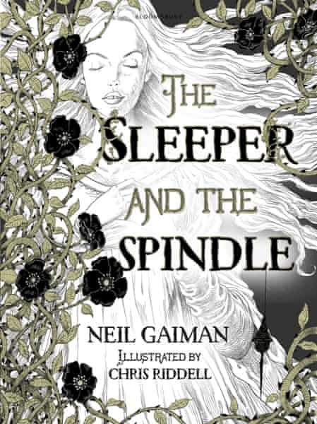
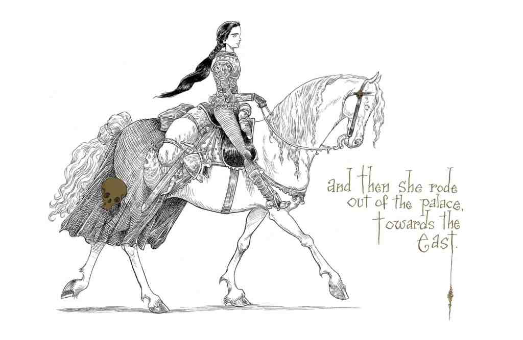
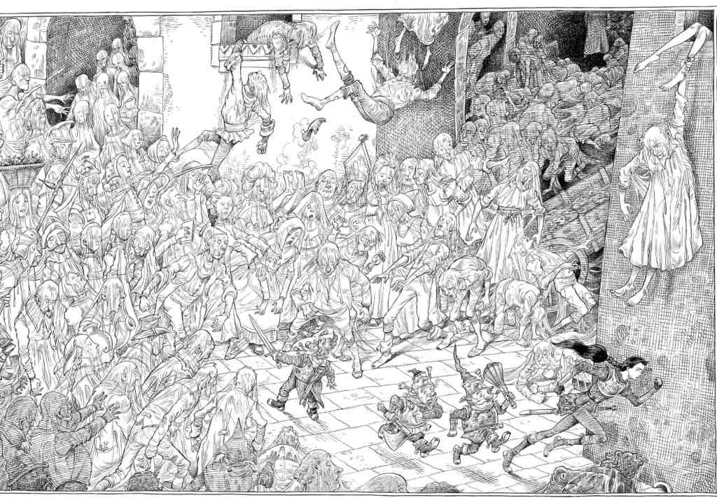
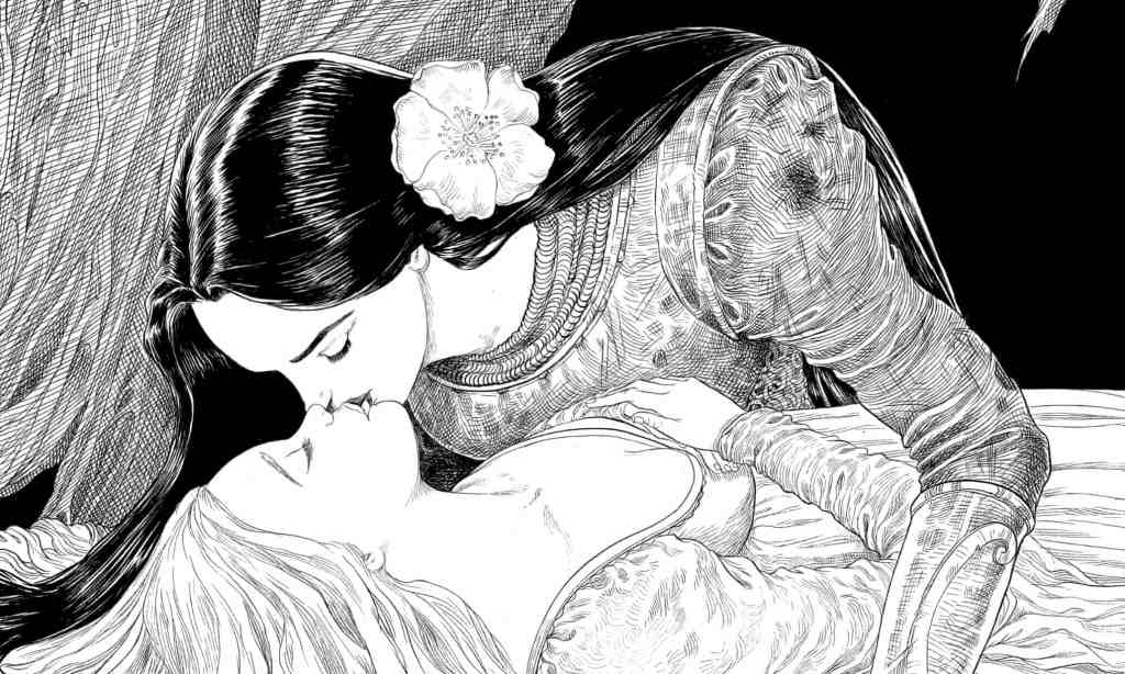
Fig 1.The Sleeper and the Spindle Book Cover (2014)
Fig2. The Sleeper and The Spindle Artwork (2014)-
Fig 3. The Sleeper and the Spindle Text (2014).
Fig 4. The Sleeper and the Spindle Artwork (2014)
Fig 5. The Sleeper and the Spindle Artwork (2014)
Fig 6. The Sleeper and the Spindle Artwork (2014).
Fig 7. The Sleeper and the Spindle Artwork (2014)
Fig. 8 The Sleeper and the Spindle Artwork (2014).
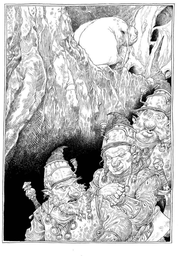
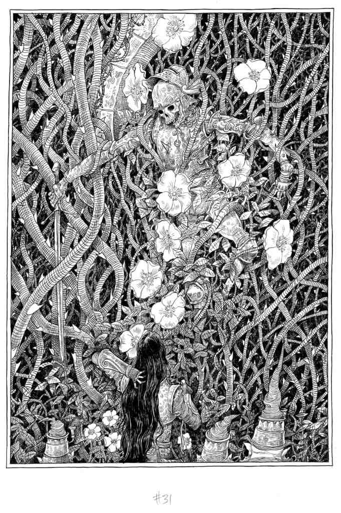
Riddell draws in pencil, inks over the lines with a brush and then adds colour, often blue and yellow, last Rustin, S. (2014) “I’m not a painter by any stretch of the imagination; I’m a dyed-in-the-wool traditional illustrator, and I begin with black and white. If I need colour, I add it over the top. There’s a calligraphic element to it … it’s about the texture of lines on the page.” The hectic schedule for The Pied Piper persuaded him to try a pastel pencil; occasionally he uses an art pen for very fine lines, “though I don’t like using them, because they’ve got a mechanical-looking line; the lovely thing about a paintbrush is its fluidity, it gives a lyrical quality”. The Guardian 19/12/2014. At: https://www.theguardian.com/books/2014/dec/19/chris-riddell-illustrator-neil-gaiman-jk-rowling-russell-brand-books-interview (Accessed 11/09/2020). I really love his graphic style and limited use of colour. He also tends to distort certain elements of his drawings as seen in Fig 7. with the cow that has been drawn with bulky muscles and bowed legs to show that the cow has been worked a lot and is now at the end of its use perhaps and is miserable and fed up. His limited use of colour is also used just where needed to make things stang out or elements to sink back as he has done so in Fig 7. to add depth to the image by placing black towards the back of the image.
Once I had done my research, I chose my artists. I selected two of my previous visuals to work on. The artists I chose were Claire Rollett and TS Spookytooth.
I had started my research with very traditional artists and as my search continued a came across Claire Rollett. Her work stood out from the other artists as it was something quite different that she does. She works with collage by using a photograph of a character and then drawing the background as a line drawing in ink. She uses a loose, sketchy, medium weight line style. From analysing the work I can see that she then adds colour digitally. This results in some really striking images. Sometimes these have colour. Sometimes they are just black and white, however the colour she does use is just in strategic places and never on the whole image, which really helps draw your eye to the characters. After recently doing a collage workshop with the OCA. I am keen to investigate this area further and was another reason for selecting this artist. Roulette seems to place her characters off to one side of her composition, which seems to add interest and create more dynamic images. As seen in Fig 8. She does tend to enlarge her characters slightly in the frame, perhaps to put them into focus and have them as the focal point which would work very well, particularly as these images are intended as part an editorial clothing/style story.
Fig 1. Couple Hotel Reception
Fig 2. Ferris Wheel
Fig 3. Johnny Rocket Jewellery Shop
Fig 4. Lady Bicycle
Fig. 5 Modern City
Figure 6. Portobello Road
Fig 7. Telephone Box
Figure 8. Walking Couple
Work by Claire Rollett.
TS Spookytooth’s style is completely different to Clare Rollett. He is an acrylic artist and creates illustrations for children. His colour palette is very rich and striking and I am in awe of his ability to create striking images that incorporate a lot of texture and contrast. He is also quite unusual and intriguing as I read that no one has ever met him in the flesh. He is also using a pseudo-name. Therefore, he is working as an illustrator with an air of mystery. For this reason however, I could not find any interviews or information on his work other than from his agents page. He is the artist I chose to start with as I really admire his work. He uses a lot of texture in his paintings and shading to create dynamic images that take your eye straight to a focal point in the image. His work is all cartoonish in style and not at all realistic. He distorts his figures quite a lot by using round, large heads and smaller bodies, He also tends to use dots for the eyes and adds very little in the way of realism to the face of his characters. In some of his paintings he does not use shading on the characters and will use block colours, such as their hair and clothing. However, this is not consistent across all of his work.
Fig 9. Dinosaur
Fig 10. Skeleton dog
Fig 11. Beach
Fig 12. Teeth
Fig 13. Moon
Fig 14. Sea
Fig 15. Girl
Fig 16. Crocadile
Fig 17. Statue of liberty
Fig 18. A king
Illustration work by TS Spookytooth
I decided to make a start by doing some tests and experiments in my watercolour sketchbook which I started a while back on the advice of my tutor. I decided to experiment with different techniques to work out how TS Spookytooth created the skies in his illustrations.
My Watercolour experiments.
I then went on to do further tests in watercolour and acrylic paint and ink to see if I could replicate the effects of Spookytooth’s work. I found the tests I did on watercolour paper were much more effective than those done directly in my sketchbook and none of those done in my sketchbook came out well.
Markmaking experiments.A previous watercolour painting I had done this year for my Lisbon group project. I used this as reference when painting as the colours were vibrant and I liked the effects I had achieved with the tree and sky and wanted to try to replicate that, as it was also similar to Spookytooths in subtle ways.
My chosen visuals – (previous work from my course).
I chose to do 2 pieces as I wanted to really see how the artists work would be different with different subject matter.
My first, failed attempts.2nd attempt, this time with watercolour.
I decided to try watercolour as i knew it would be easier to get the type of effects I wanted. However the colours were too weak and the tree blended too well with the background. I do quite like the sky and grass otherwise. But I do not see any of my chosen artists’ styles in it.
Final piece
For my final piece (above) I used acrylic ink and then a brush pen to line in places. I did really struggle to strike a resemblance to Spookytooths work. I tried to use the colour palette from Fig 18. in both of my images to see how they translate. With my first attempt I tried to use the colour palette from Fig 10. however, this did not make sense with my visuals because of the activities of the characters. I feel that I have captured an essence of my chosen artist. I worked simultaneously on my two paintings, working on one part whilst the other was drying. Because of this, I made discoveries along the way and the two are quite different. Also working with more detail and on a smaller scale, such as in my painting below, made the techniques that much a harder to achieve the same results with. I am happier with my painting of the Girl under the tree than I am with the boy on his tricycle.
Once I had completed my first set of paintings I started on my next chosen artist which was Claire Rollett. I love her work as it is very different to what I would usually produce and very different from Spookytooth. I took the same two visuals as before and created artwork using the methods Rollett uses.
Work in progress.
I had already uploaded my visual to my computer as a JPEG, therefore I just needed to remove the background and tidy it up. I then added layers to add colour and I used a stock image which was the closest to what my original drawing was.I could not find anything of a girl in the right pose, as initially I was going to try mesh two photos together to include the fox. In the end, I settled for the photo of the girl and her dog sleeping, which fit quite well into the style of Rollett as she tends to do editorial work and my visual was not editorial in style or design.
My final Image
For my final image i traced over the dog in photoshop so that it was similar to the way Rollett had composed her illustration as in Fig 1. I was quite happy with this work. It is not as polished as Rollet’s work and my access to images were limited, however, it was a quick process and satisfying to work on. I think with more details/props in this scene, this would make a better image and I think the style worked much better with my second visual (below) as there was more going on in the scene. Which interesting was the opposite problem I had with Spookytooth’s style. Too much detail hindered the paintings with recreating his style.
Work in progress.My final Image.
I really liked this image, I think the level of detail works well to create an interesting scene. I could not find an image of a boy on a tricycle from the right angle to fit into my drawing, therefore I opted for this girl on a bike, which was a stock image. On reflection, I think that in order to make the image more interesting and give it more of a story I could add something like a snail to an object to the floor as it looks like the little girl could be looking at something and has stopped in her tracks. This would also make it more like Rollett’s work as she is telling a story with her images.I decided to add this in and am really happy that I did (see below), as it definetely does add a bit of interest and a story element.
I have just this second finished the study event with our Lisbon group and wanted to write up on my learning log whilst everything was still fresh. I have been looking forward to seeing everyone for a while now, and was excited to participate in this event. I was concerned as my internet connection has been playing up, but I was very lucky and it only cut out for a few mins today. Many thanks to Diana Ali and Michelle Whitting once again for a fantastic study event and to Alison Dollery for organising. Our Lisbon trip was the last big event that happened for me before lockdown and I have fond memories from the trip. It came at the right time as I was struggling, feeling isolated with my studies and the Lisbon trip changed that completely. I met some amazing people and am really glad we have all stayed in touch. It made me realise that I am not alone. You just have to reach out and you will find your classmates are all there, also in the same boat. Since then I have also joined the illustration group on discord, which is another great group of people that inspire and support each other. I in no way feel lonely when I’m studying anymore.
Today, after catching up. We were read to by Michelle Whiting, her paper that she has been working on. We were asked to think about how we feel in response to this and were encouraged to move around whilst we drew. I initially found this very difficult and felt a bit lost. So I started just by walking around the room and making marks on my page based on that experience. After that I sat down and concentrated more on the words Michelle was reading and listening more intently. And I started to make marks based on what she was describing and also from the feelings and thoughts I was having. I started to think about movement and dancing in particular, and drew a few lines based on this. I think this exercise is something I should practice more and develop as it would help my illustration work to try to feel more and as Michelle mentioned, feel the time and place of your illustration, ‘feel the sun on the back of your neck’ etc… Which I think is definitely key to creating a believable illustration and something that I need to take on board and explore more as I work. as this would really add dimension to an illustration.
Photo taken by me in Lisbon whilst on our way to Pada studios.
After lunch we each used a photo we had taken in Lisbon and chose five words to describe the feeling we got from it. The words I chose for my image were bright, contrast, surprise, fun and colourful. The word I chose to focus on was colourful as I wanted to have fun playing around with colour. I used oil pastels as I have not used these before and started to create shapes on black paper. I had no plan or idea as to what to do, so I just kept adding colours and as I did this, it started to evolve into more of an idea or form. Therefore, the left side of the drawing is less structured than the right side as I started on the left. From doing this, more ideas were triggered. From which, I made a series of drawings which developed as an idea from the drawing before.
My First drawing
On the right side. I started to see what looked like part of a face emerging so I decided to start on a fresh piece of paper and recreate that face.
Second drawing
I decided not to make this into a full face or character as I really liked the way the eyes and the feathered shapes coming down were looking interesting and I did not want to ruin the shapes by overcrowding the drawing as this was starting to happen at the top (hair). So I decided to stop here. However, if I wanted to develop this into a character I would work on a fresh sheet and develop ideas from this. Looking at him now. He kind of reminds me of a ‘Rayman’ type character, which is a cartoonish computer game that I played as a child.
My third drawing
For this drawing I chose to take the outside shape of the jellyfish in my original photo, which I thought was really beautiful and experiment with that technique and the shapes whilst keeping with my chosen word which was ‘colourful’. Here i used a combination of chalk pencils and Conte sticks.
My fourth drawing – unfinished
With my fourth drawing, I expanded on my previous drawing taking the same shapes but seeing what else I could do with them. This developed organically and initially I did not have a plan to make them 3D like this, but I was experimenting and wondered what would happen if I did x,y,z… and this is what I came up with.
I really enjoyed today and am really happy that I got the chance to experiment and have some ‘free play’ time. This past year with the OCA, from my time in Lisbon, as well as the other study events I have been participating in. I have been trying new things and getting lots of inspiration. However, outside of those events. I haven’t continued to experiment as much as I would like. Part of this is due to time constraints and also because I am working on my exercises for my course which are structured, I tend to forget about experimenting. Today was great because I got to experiment again and this is something that I really must make more time for. As through experimentation, it is possible that some of the techniques or ideas that I have, can be developed into a larger project or else stored to be used for a project at a later date. On reflection, this reminded me of my abstract exercise for part three and thinking back, the process I developed today would have been quite useful for that exercise. I now see how much further I could have pushed that illustration and how I could have worked what I had, into something more or something totally different.
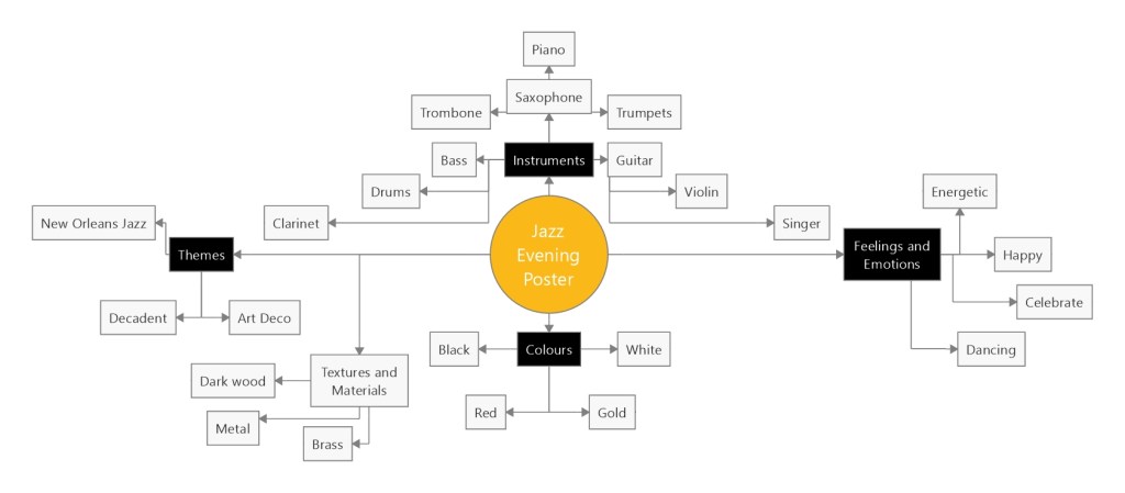
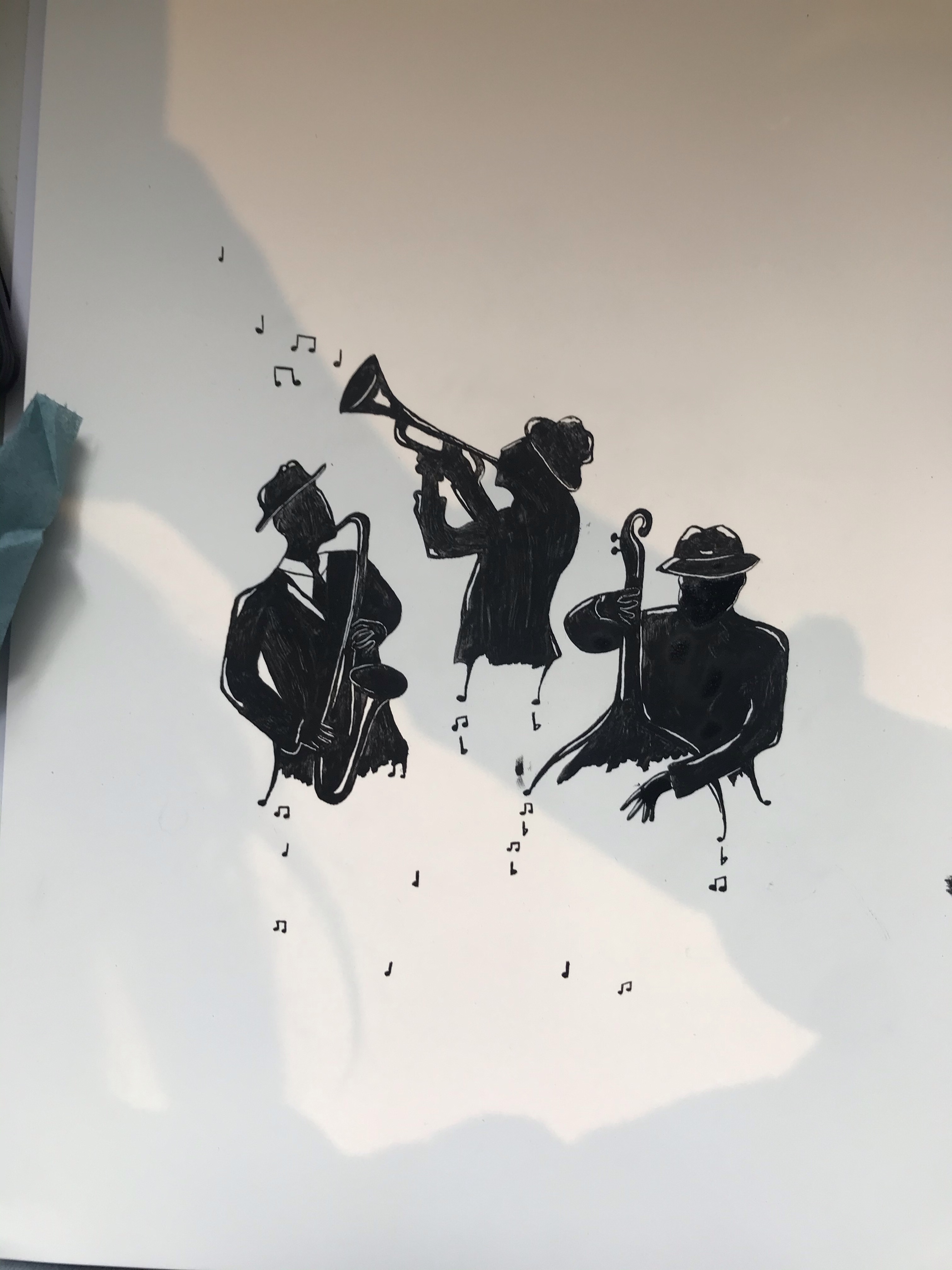
For my third assignment I chose the title ‘Jazz Evening’ for my poster. I started by doing a mind map of the things that I associate with jazz, which helped to give me a basis to start to trigger ideas. I really love the idea of going to new New Orleans and experiencing the culture there; of which music is a big part of. I decided to use New Orleans jazz as my concept and started to collect reference images. One of the first images I came across was a black-and-white image (as below), which had ink drip marks coming from the characters. I was inspired to try my own version of this and see where I could take it.
My moodboard
I collected images for my moodboard and realised that I really liked a simple colour palette. I wanted to have my poster combine old jazz vibes, but have the poster modern and crisp looking. For this reason I decided I would use modern text to make sure that my poster did not look dated. I collected images to use to for the poses of my characters from Adobe stock images. Quite a few of the ones I had found on my Google search were also on there.
Thumbnails
I started working on some thumbnails to develop my ideas. I was drawn to the thumbnails that included a group of individuals the most and selected my two favourites to try out as visuals.
Visual 1
Visual 2
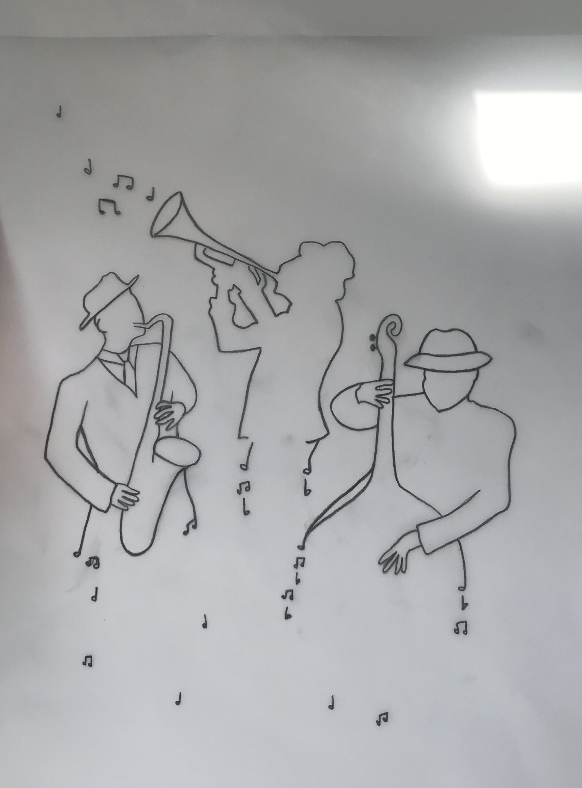
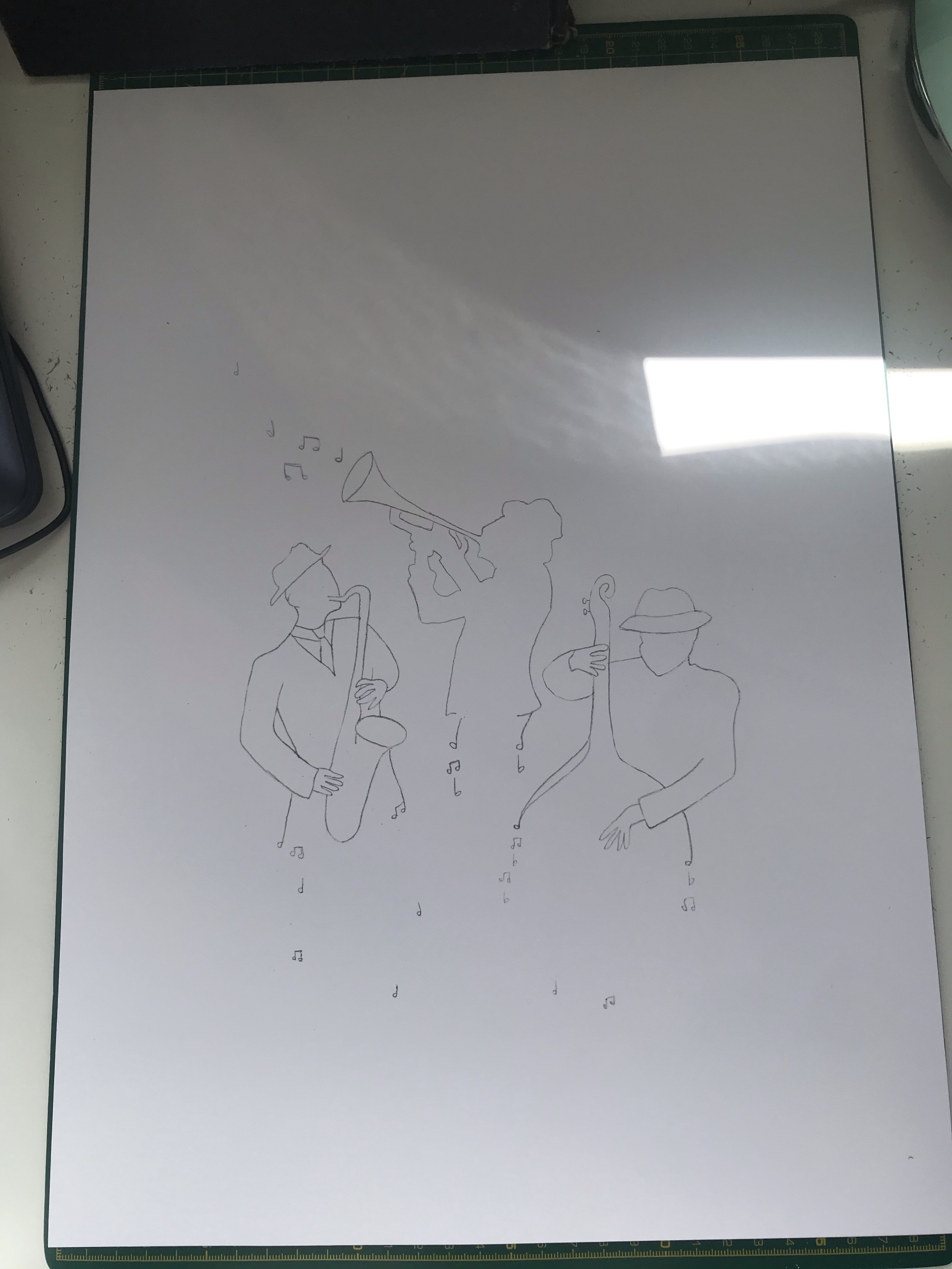
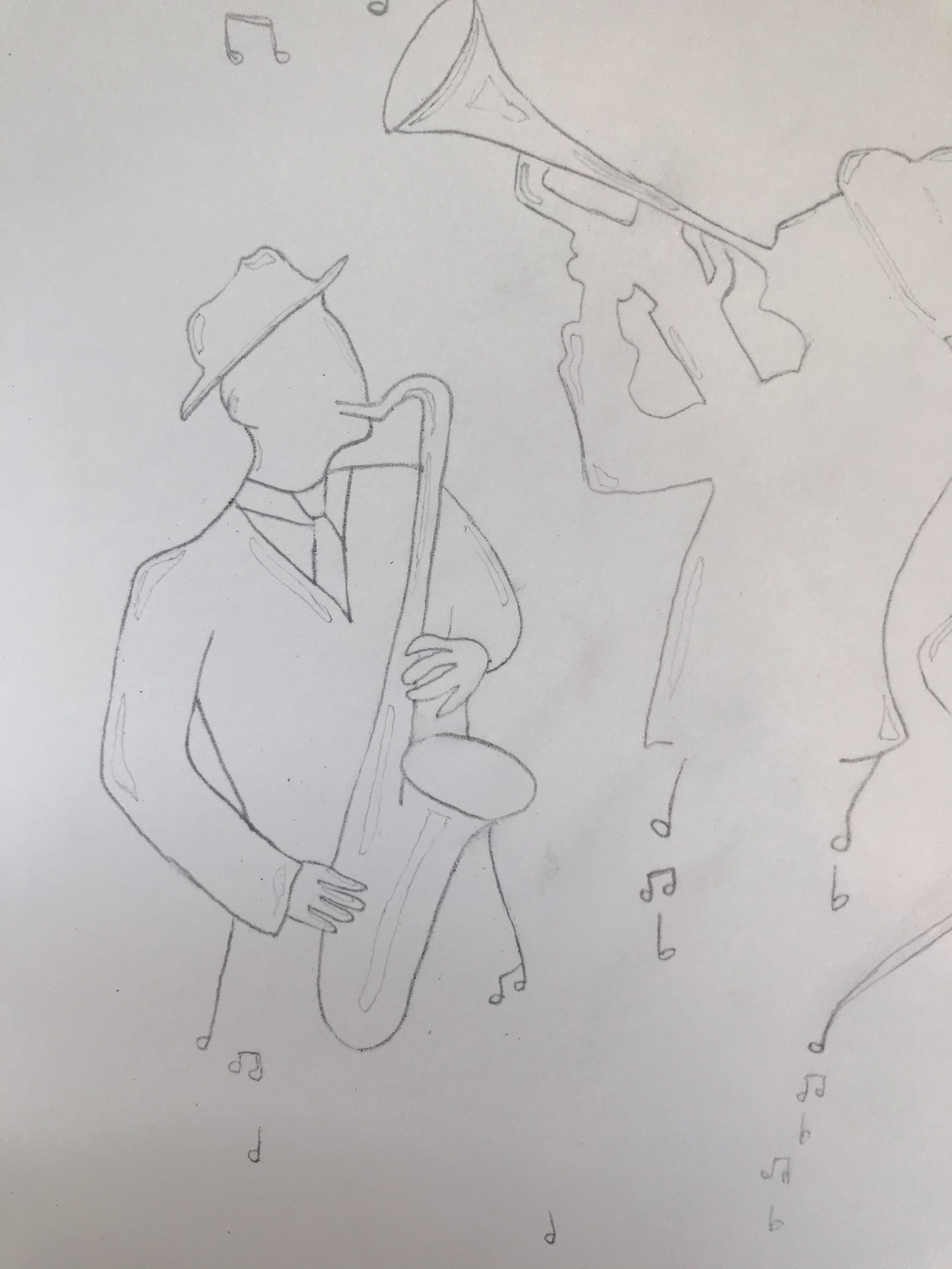
Though I liked the idea of having a pianist in my drawing for visual no.1, I did not feel that this would work for a poster and that the drawing had too much detail and too much going on. However, I really liked visual no.2. The design is more simplistic and stylised. I had done my visuals on A3 paper so was able to do a tracing of my chosen visual and used this to place my image onto fresh paper. I ended up doing three attempts of my final artwork. Originally I was trying to do this in India ink with dip pens on Bristol board, but the paper surface was disturbed when inking. Therefore, it was not working and I did not like the texture. On my second I switched to cotton watercolour paper to see if that worked any better. However, I was still not happy with the results. I ended up using acrylic ink on watercolour paper, using dip pens for smaller details and a paintbrush for the rest. I did ink the outline first in a technical ink pen. Before I got to my third attempt I kept making mistakes and this led me to think about my technique and process and rethink how I was working. I ended up going back and sketching in all of the areas that I needed to leave white so that I was not making decisions as I went and I had a clear guide of where to colour, and when not to. This lead me to think about the black and white exercise I had done previously and how much that also needed planning. I also worked from the left side of the page down and then across to the right so that I did not smudge my work. These were such simple things that I could have done from the beginning, but I guess not having done any illustrations like this before. I was not aware of these rookie mistakes. I have definitely learnt some good lessons from this assignment that have led to a more structured approach and forward planning.
Work in progress
My Final Illustration
I am really happy with my final illustration. Although there are a few things that I would possibly tweak now looking back and did try to tweak once I had put them in photoshop. However, I did not want to spend any more time on the ink drawing as it was a very tricky process and I was going to be putting it into Adobe Illustrator anyway where I could edit it further if need be.
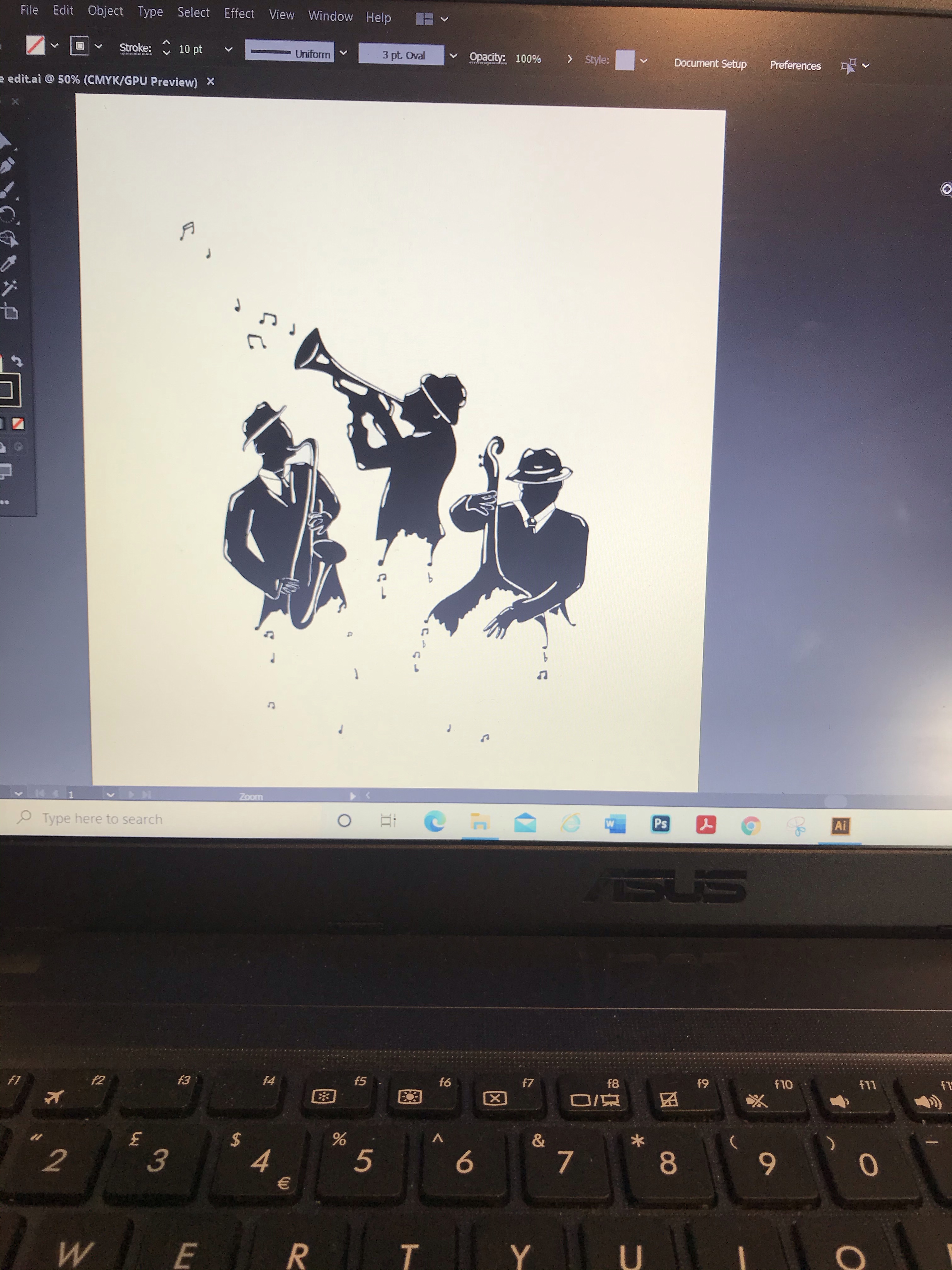
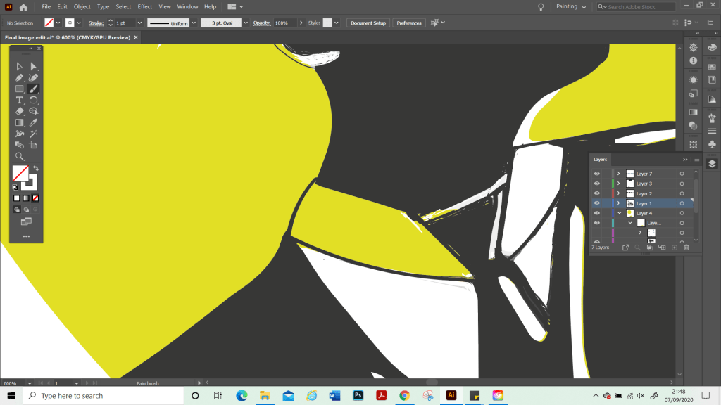
Screenshot from working in Illustrator.
Once on Illustrator. I cleaned up the image as it did not scan very well and I pretty much had to redraw over the top of the whole thing to put some of the details and edges back in and recolour it as I went. At this point, I realise that although I had a strong plan and idea for my main illustration I did not actually have a plan as to how the poster would look as a final piece nor had I included these in my thumbnails. Partly this was due to my limited software knowledge and I wanted to just have a play with Illustrator to see what the possibilities were for me and to go from there. However, as I become more skilled with software programs, I know that this is something I will be able to plan more thoroughly at the beginning. I played around with different shapes such as stars. However, I felt that this made the image too busy and detracted from my illustration which I wanted to be the focus, and to make sure that the notes that are part of the image were clear and visible. Therefore, I decided to keep the poster more simple. Once I had found my final composition, I zoomed in again and did my final edit. Such as cleaning up the black-and-white sections and correcting where the background had come through on my illustration.
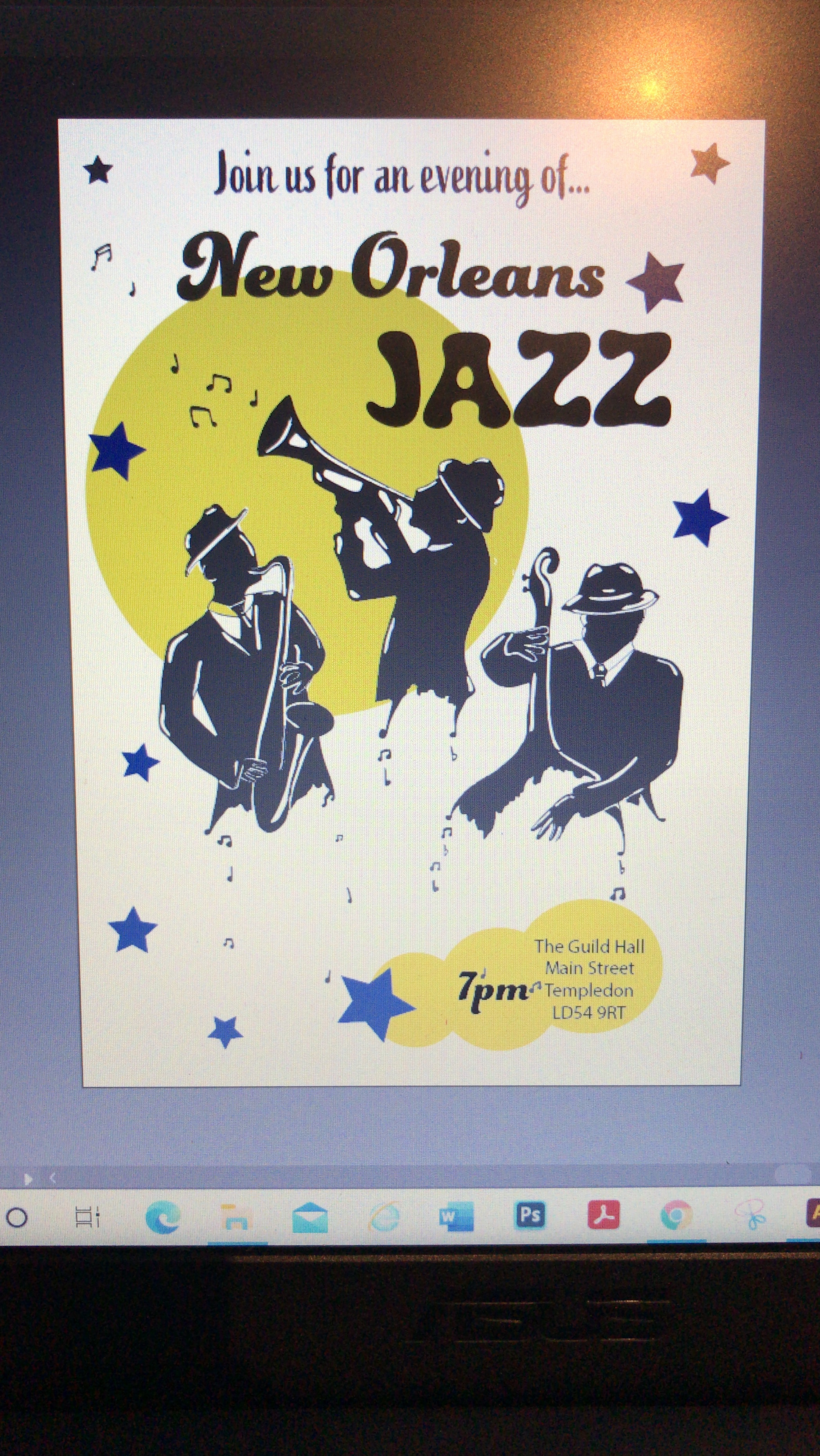
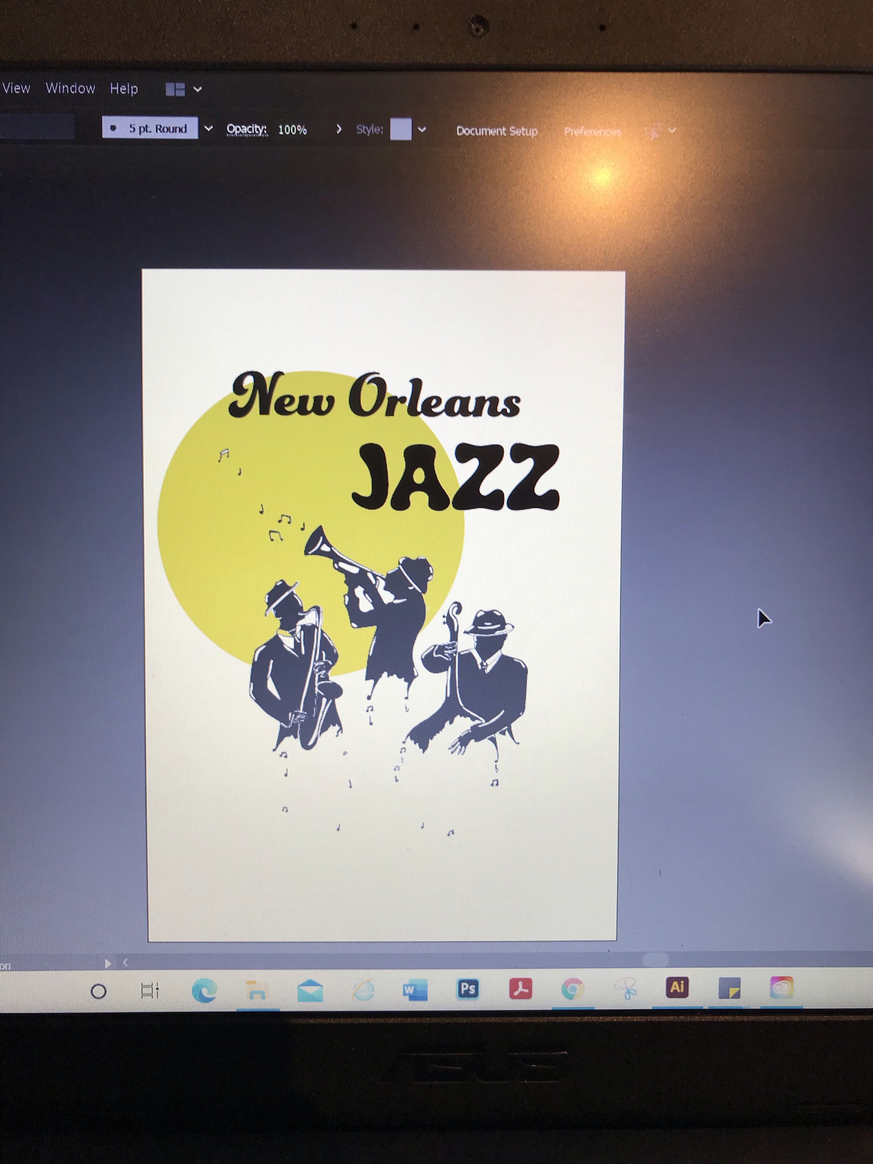
My Final Poster
In Summary
I am really proud of what I achieved with this assignment. A poster is not something I have done before. I also managed to master the basics of Adobe Illustrator, which I’ve been trying to learn. I did this by using short tutorials to learn different techniques and just played around with the different elements and fonts from the online library. I was unsure at first if my poster was too plain, or if a white background was the right way to go, but I had tried using different colour backgrounds also, and it did not look good.
Through doing this assignment, I feel it has given me more confidence. Although illustration part three has given me very valuable skills to carry on with, it did not lead me to produce any work that I was particularly proud of. It was also quite challenging for me as a lot of the exercises were more commercial types of artwork which I did not quite have all the skills to pull off successful illustrations in the style needed. I’m still working on developing a style and recognise that this is still early days. Sometimes this makes me feel a bit lost when it comes to some exercises as I have not developed my ways of ‘working’ yet. I am looking forward to moving on now to part four and continuing to develop my skills. Part three has made me feel more prepared for what is to come and that I am starting to develop processes and a way of working. Therefore, I am excited to see what is next.