Re-work of Assignment 4

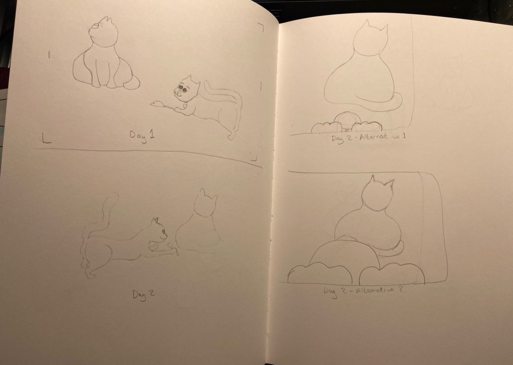
Reflection on Tutor Feedback

I wanted to push assignment 4 a little further after getting my tutor feedback. My tutor suggested that perhaps I do not need to add the magnifying glass to my arrangement. I initially put the mug and magnifying glass there as the brief had asked for, a collection of still life objects from around the home. However, I did feel that I put the objects there as I thought I should add to the skull and headphones, rather than because I really saw a big part for them. I recently had a study day with a student group of OCA students from a wide range of disciplines. This was lead by Diana Ali and Michelle Whiting. I showed a version of my assignment 4 piece to the group and the feedback I receive was that there was a strong enough message that everyone could relate to and that the skull and headphones alone was enough. They suggested I play with the background to see what I could do with this. Originally I had removed the background so that the image would be directly on the magazine page.

Research

I did a bit more research on the types of things I could do with PhotoShop backgrounds and came across a website that has downloadable templates to. I not use them, but had a look through to find out what kind of things were possible and decided to make my own. One I saw was a pattern with a word repeated over and over evenly spaced letters and another was rough vertical lines. This lead me to the idea of using words. I started to write down a list of words that related to Covid-19 and then asked other students and family members what words they associated with covid. This expanded my list to include ‘homeschooling’ amongst various other words, which, although aren’t applicable to my situation, it is something that is very relevant to a lot of people and other OCA students.

My process

I found a wordsearch generator and created a 40 by 40 letter wordsearch with my list of words. Initially I had the words going in all directions, but then realised in order for this to be easily viewable they words needed to be easier to find.

I copied the letters over to photoshop and added them to my background.

Screen shot 1 – Working progress

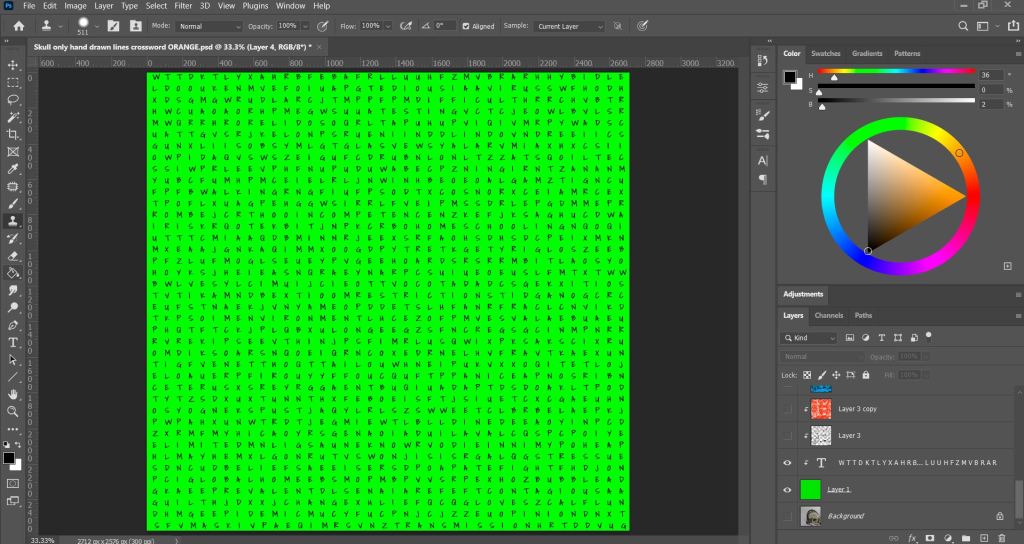
I then marked off words to highlight the context, with the font I chose it was very hard to pick out any words and I was struggling to find them myself, so this took some time. However, I liked that the font become something more asthetic than just a regular wordsearch and helped this blend into overall image more.

Screenshot 2 – Working progress

I used various brushes in photoshop to add crossed out words, ink splatters and marks on the background to give it a grungy and more edgy feel. Taking inspiration from some of my mood boards and mark making practices from earlier in this module.

Finished background

I added more breakdown to the page to create more interest and make it less stark. I did do other colour tests as seen below, but decided after showing it to my fellow students for critique that the green worked the best. My intention was also that the bright green represents a hazardous/virus element. However, I do think that this could be achieved with most colours, providing they are bright, with also luminous, neon colours working best. These are the shades we mostly relate to toxic materials due to the popularity in comic books and film, such as the bright green slime in the original Ghostbusters movie and the bright green toxic chemicals Joker falls into in the DC Comics.

My final Image

Conclusion

I am much happier with my illustration now than my previous attempt. I am grateful to my tutor to keep pushing me to go further. This was really out of my comfort zone, but when I found a source of inspiration and an idea, I really had fun putting this together and just trying things and seeing what worked. This also makes me appreciate how digital software can really enhance my work and give me the tools to try things that are easily undone. I could also do a hand drawn version of this now by using this as my blueprint, which would likely take far less time than if I tried to work this all out on paper and not use PhotoShop at all. I am keen to keep exploring digital software and find ways for this to use it to add to my work and use it more for preliminary sketches and colour tests in the future.

Re-work of Assignment 5

After receiving my tutor feedback for this assignment I wanted to implement some of the changes she had mentioned and push my illustrations a little further. I really enjoyed working on this assignment am quite keen to keep developing these characters and see how they evolve over time, as I learn more and more during the duration of my course.

Reflecting on my research

My tutor had asked me to take time to consider my research on comic strips and discuss what I had learned about this area. When I used to get the train in London, I would read the comic strips in the Metro Paper, my original layout idea was inspired by this. I was thinking of displaying my images in one continuous strip so that they could be intended for a space at the bottom of a page in a newspaper. However, when I tried this I realised I had too many images to work this way, as the images would end up too small in order to fit across the page. Therefore, I decided to place them in two rows instead, after looking at reference of comic layout.

My research lead me to look at and consider different types of layouts and think about how I could explore this further in my next modules. The comics I looked at, such as newspaper strips, Garfield and Beano tended to have evenly spaced lined boxes or could have no spacing at all. Some of the characters were drawn extending outside of the boxes. Boxes tend to be uniform or various sizes. However, they were always clearly defined and neat. This makes them easy to read. As this is the first comic strip I have done, I decided to keep mine to a simple, clean layout. This was a challenge in itself to get everything evenly spaced and lined up.

The comic strips I looked at, tended to have a simplicity in the visual information contained. They tend to be line drawings, some black and white and some with colour. Most contained backgrounds. My original images did not contain a background so I added this to see how it would look. My tutor had also mentioned this is something I should consider. I much prefer the versions with the background. It gives the strip more substance and context and adds more life and colour into the images. It also shows the cats being inside a house which helps give context, for example, if my comic strip was called, ‘Toby gets a new friend’ etc., which is the idea behind my narrative, it should be clear what is happening in the comic. I could have shown this within the illustrations by perhaps adding a bow to the neck on the first image to give the impression of the female cat being a present. When I showed my DSA study tutor, she had said that because they didn’t have a background, she pictured a background for herself and imagined the cats were in her home. I found this quite intriguing and that got me thinking about the audience and how much of their own imagination they contribute to illustrations they see. Before I re-worked these I did a lot of sketches to learn comic styles using two new books I bought. These are; Sha, B. (2015) Doodle Dogs and Sketchy Cats: fun and easy doodling for everyone. (First Edition) Ash, Ohio: North Light Books. and Hart, C. (2009) Humongous book of cartooning. New York : Lewes: Watson-Guptill Publications ; GMC Distribution [distributor]. From these I learned different head shapes, how to draw different expressions and emotions and I learned to be more confident and bold with my shapes and move away from realism. I did tests to see how different line styles would look, but decided to stick with the line style I had originally used as I liked the soft effect better for this particular set of images.

Another thing my tutor had mentioned was that all my images were from one view point. I looked at the examples she provided as well and revisiting my composition and viewpoint exercise and re-worked some of the drawings so that they included a more varied range of viewpoints. I think this made it harder to create clear context, however, I think as a whole the story can still be read as intended. I am glad I tried this as it has made me think differently and include another dimension to my illustrations.

The stories in comic strips are told effectively without words by exaggerating expressions and keeping the images simple and not too busy to distract from the intended point of each frame. A comic strip is a continuation of an evolving story, that each image builds upon. I did show my images to other students and family to check that the message of my comic was well received and the feedback was positive.

I worked in watercolour and then finished the images in PhotoShop.

My Final Images – Photographed version – Layout variation
Final Version – Closer Spacing

I photographed my images to get them into photoshop, I do not have my camera and lighting set up with me at the moment and therefore had difficulty getting my photos clear enough with just my phone. The paper texture is very clear and the images have a grey hue that is not in the originals. Despite altering the colours in photoshop I could not find an effective way to correct the grey hue nor the texture, without losing the image quality. I therefore also did a second version where I scanned the images, however the scanner bleached the images. Even though this corrected the paper grain issue, like I had expected, it left the images with limited colour. I lowered the brightness, but still preferred the original painted version as I was unable to get the pink colour back in the images.

Final Images – Scanned version original
Final Images – Scanned version Colour adjusted
Final Image with Title

Conclusion

I learned a lot by reworking this project. However, I can still see much room for improvement and space to push this further. Part of doing so would require me to learn and improve, as some of the things I would want to do, I do not know how yet or else cannot quite get my hand to do. I am overall pleased with the outcome and much prefer this version of my comic strip. I am grateful for my tutors advice and direction on how I could improve my work and am excited to take this knowledge onto my next module.