Exercise: Making a mockup

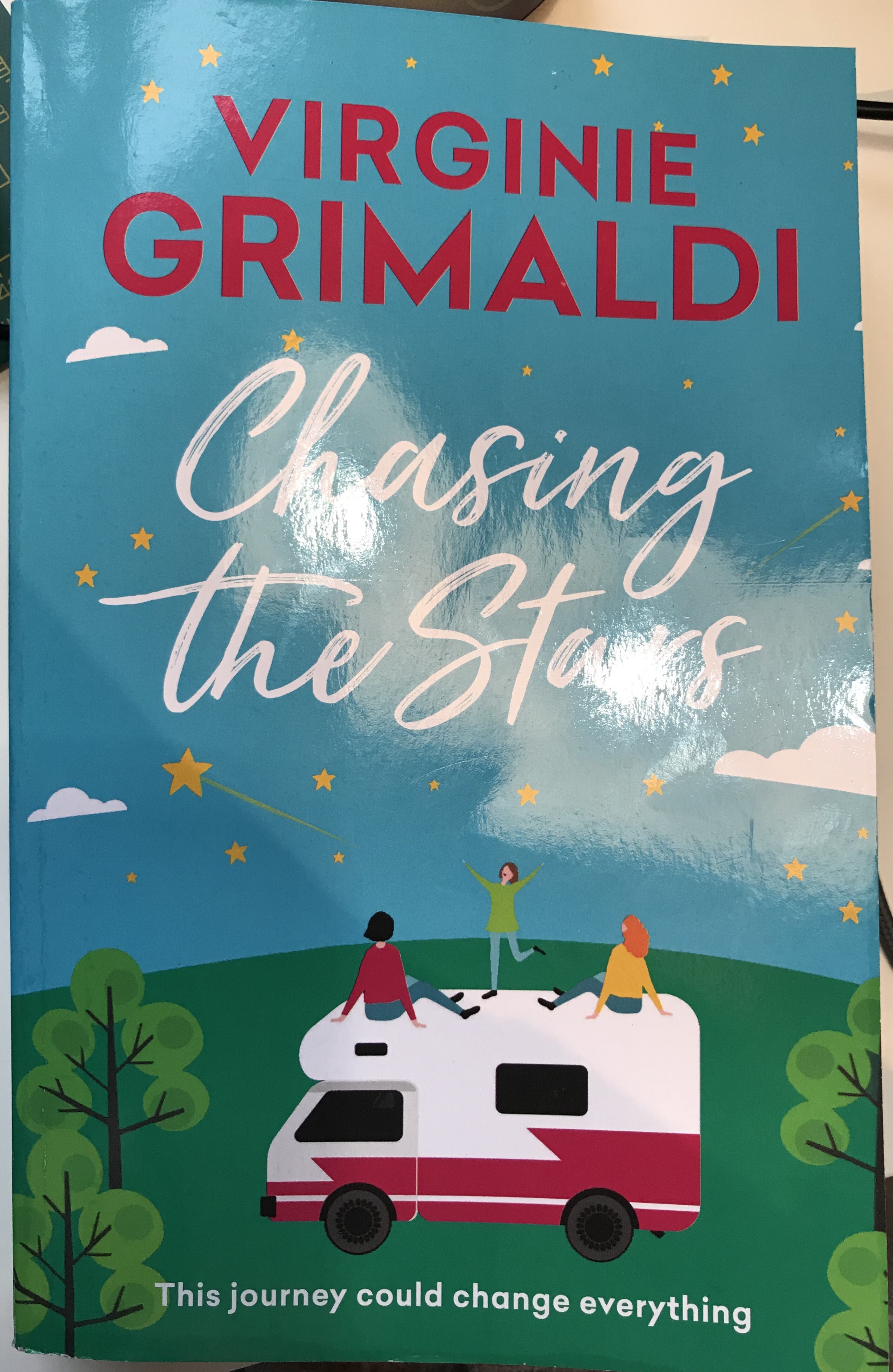
For this exercise I chose a book that I have just finished reading. From reading the book and the back cover. The title of the book does not necessarily reflect the book’s content in a literal way, as what the characters are actually chasing is the Northern lights, as opposed to stars. This is a story of a mum and her two daughters who take a campervan and go travelling in Europe. Because of the title. I felt like stars needed to be incorporated into the cover of the book. However, from the storyline I would have chosen to draw one of the scenes and places travelled in the story, or else the Northern lights had this had not been the case. I imagine that the stars, the characters and the campervan were the brief for the book cover. As well as the age and hair colour of the characters.

Ideas
My final design

I decided to draw my version of the cover based on the characters in the book and the way that I had imagined them as I had read it. Although I was not happy on a technical level with my drawing, once I had placed the text and created the mock-up. I did feel that it made a convincing book cover. I decided to create my mock-up in Adobe Photoshop and used a mockup template from Adobe Stock images. I am not sure how to add the cover so that it works correctly as a mock-up, but did the best I could and positioned it so that it did the job well enough. I decided not to print it as a mock up as my printer would not be capable of making it look realistic enough.

I used darker colours on the cover to show that it was night-time. I had originally planned to paint a soft light from the van over the characters. However, due to redrawing the van, due to a technical issue with the prospective, it did not end up being in the right position for this. However, now that the image is completed. I do wish that I had re-drawn the van in the original position I wanted, as the way the characters were positioned was more interesting and generally worked better overall. I feel like in my final image, the scene is a bit fragmented and there is too much distance and not enough interaction with the characters and the environment.

My finished book cover

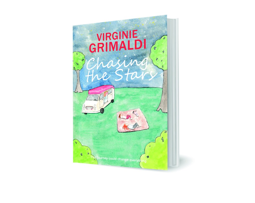
I am quite happy with the outcome of this exercise, as part of the obstacle was to just have this completed and to have made something out of my illustration. Quite often I will critique my work as a simple image, however, now that I have had the experience of using my image for a purpose, I feel slightly less critical. When I critique other artists work. I am not as harsh as I am with myself and although I do not feel that my work is not where I want it to be yet technically, I can see that it is also not as bad as I think or at the very least, it can work.

My finished painting
The original cover

Exercise: Client visuals

For this exercise I looked at a range of books that I had most of which were adult book covers. Then I found a Roald Dahl book that I bought that has three of his stories and it. From this I chose my favourite Roald Dahl tale, which is the twits. This is a childhood favourite of mine and made this a very fun exercise to do.

I did a line drawing on A3 paper at 2.5 times the size of the original. Quentin Blake’s style is very simple. Therefore, it made this task easy. After I traced the image I’d made and redrew it on a new sheet of paper, adding back in only the most important lines in an attempt to simplify it even more so.

I love Quentin Blake’s style and from doing this line drawing, I see that his line-style combined with his beautiful watercolour work is what gives his work, its individual style and makes it stand out from his competitors work.

I then moved on to an illustration of the front cover of ‘Life of Pi’ by Yann Martel. This image was a little more complicated than the last. Due to the many number of characters in illustration. I did this in A3 in pencil at 2.5 times the original size and then inked over the top.

Pencil sketch
Final Image

This image ended up being a very simplified version of the cover. However, I wonder on reflection, if I should have added more details as it would have helped the image be clearer. Such as by adding the trails from the water to show that the fish were in fact swimming in the sea. My image is very one-dimensional and I think with this particular image. The colour is important to make this work, so that the sea animals are muted and the boat with the main characters are the focus of the image.

When reflecting the first image of Quentine Blake’s, I think that apart from the line work needing to be more interesting. The image works as a visual and shows what needs to be shown.

I have read most of the Dark Tower series. The story line could have presented with many different options for cover of this book. However ‘the dark tower’ is a focus point for the story, being a destination that the main characters are trying to reach. Each cover is the same image, but a different Hue. I think that the brief would have been to capture an otherworldly feel and the moody skies that are described in the book. I think this image effectively creates a sense of mystery about the tower, which is a good reflection of the storyline.

I found it difficult to find adult books with illustrations and found that most are photographs instead. I believe this illustration is trying to show a woman that is free, confident, happy and at her best. The book is a woman’s story interlaced with facts and figures and discusses biases and stigmas attached to women that are not in a relationship. I think that the illustration fits the purpose and gives the viewer a sense of freedom and calm from the image. Unless you are scared of diving like me, then it could also represent something risky and scary and be reflecting that side of being single.

I have not read this book, but was really attracted to its cover. The almost collage feel to the line drawings or perhaps Lino cut illustration is very striking and the limited colour palette is very clever. There is so much going on that you can spend quite some time looking at the image. I wondered what this image has to do with the title and now feel compelled to read it to find out what the salt path is. From reading the blurb I wonder if the cover is perhaps trying to represent freedom and a beautiful sight, but at the same time reflecting turmoil with the busy line work and almost overwhelmingly busy illustration. I assume that this scene is one of a place that is visited during the character’s journey.