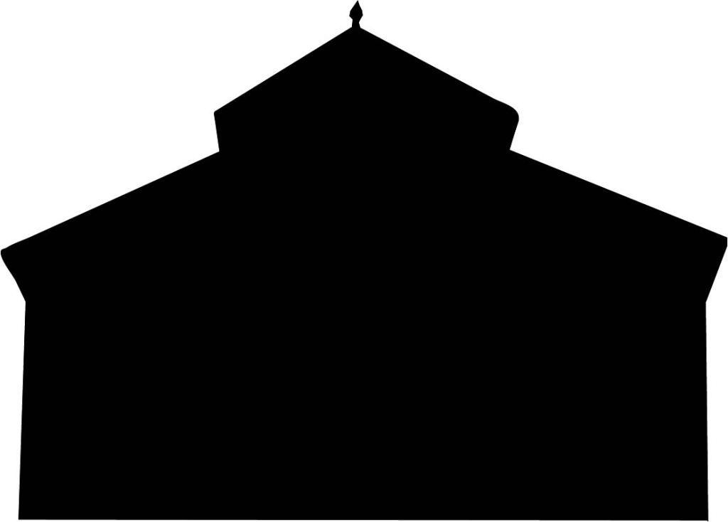
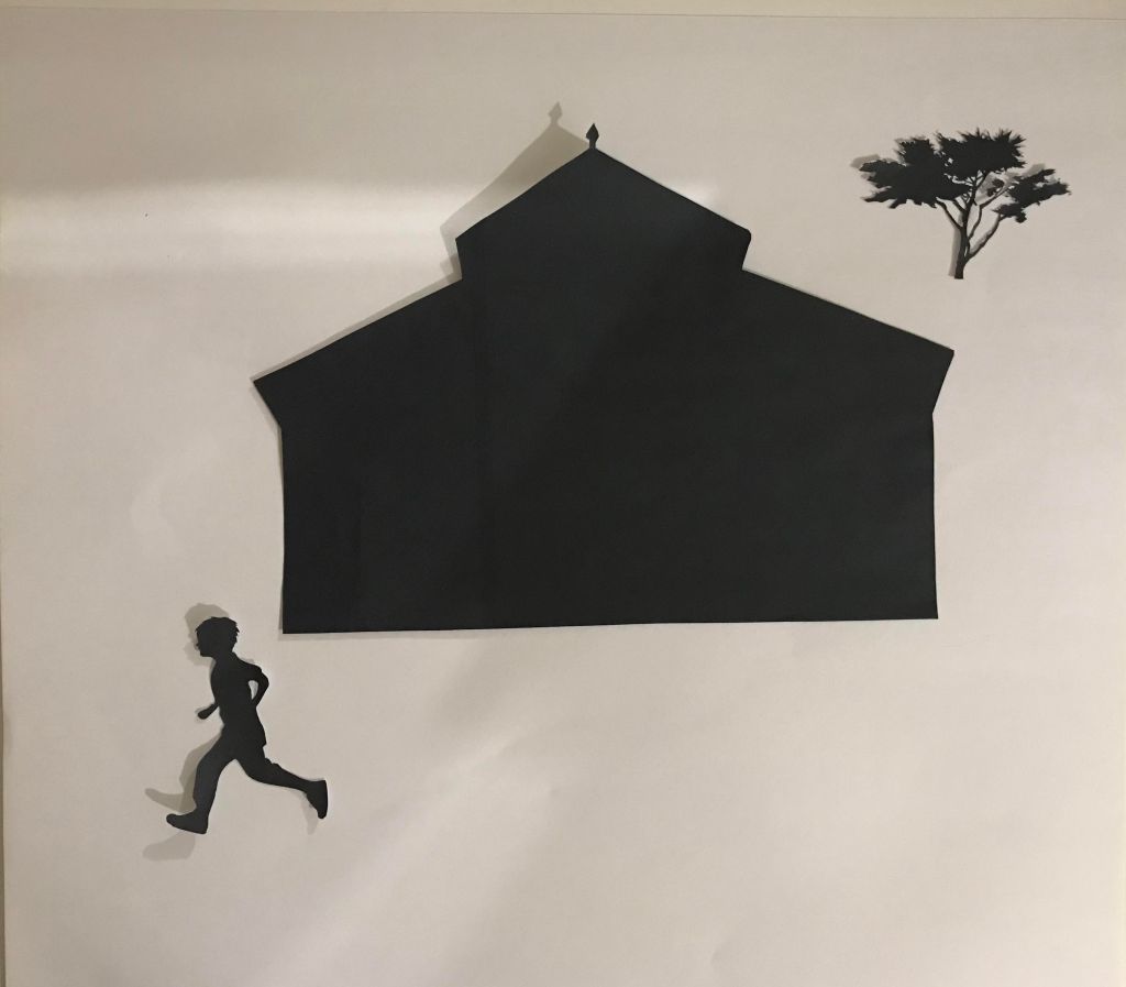
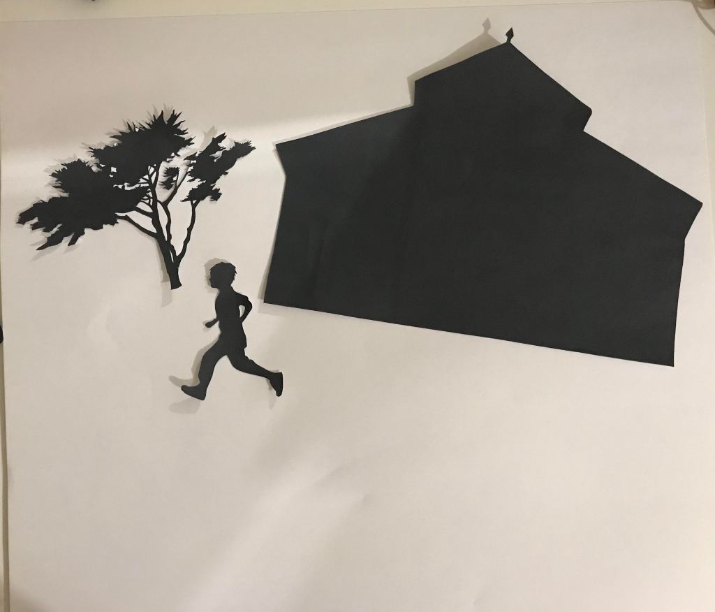
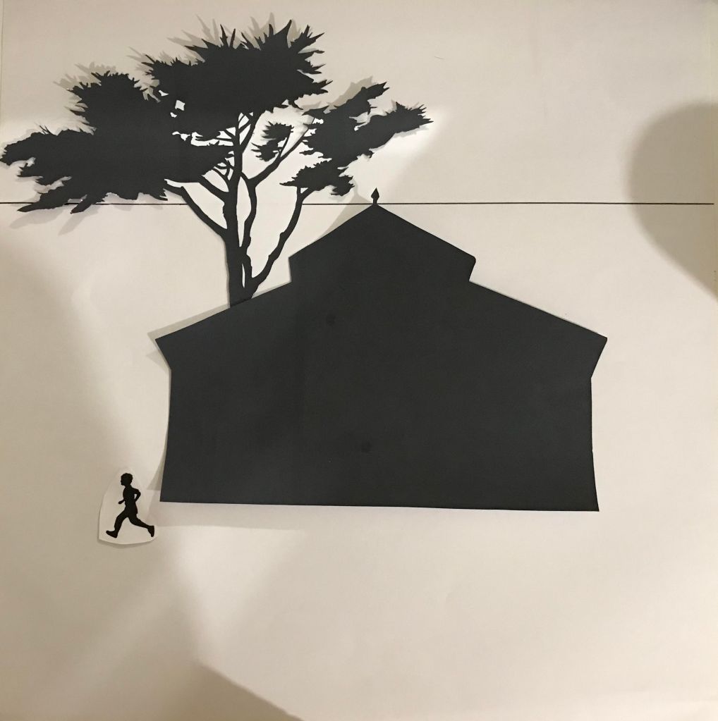
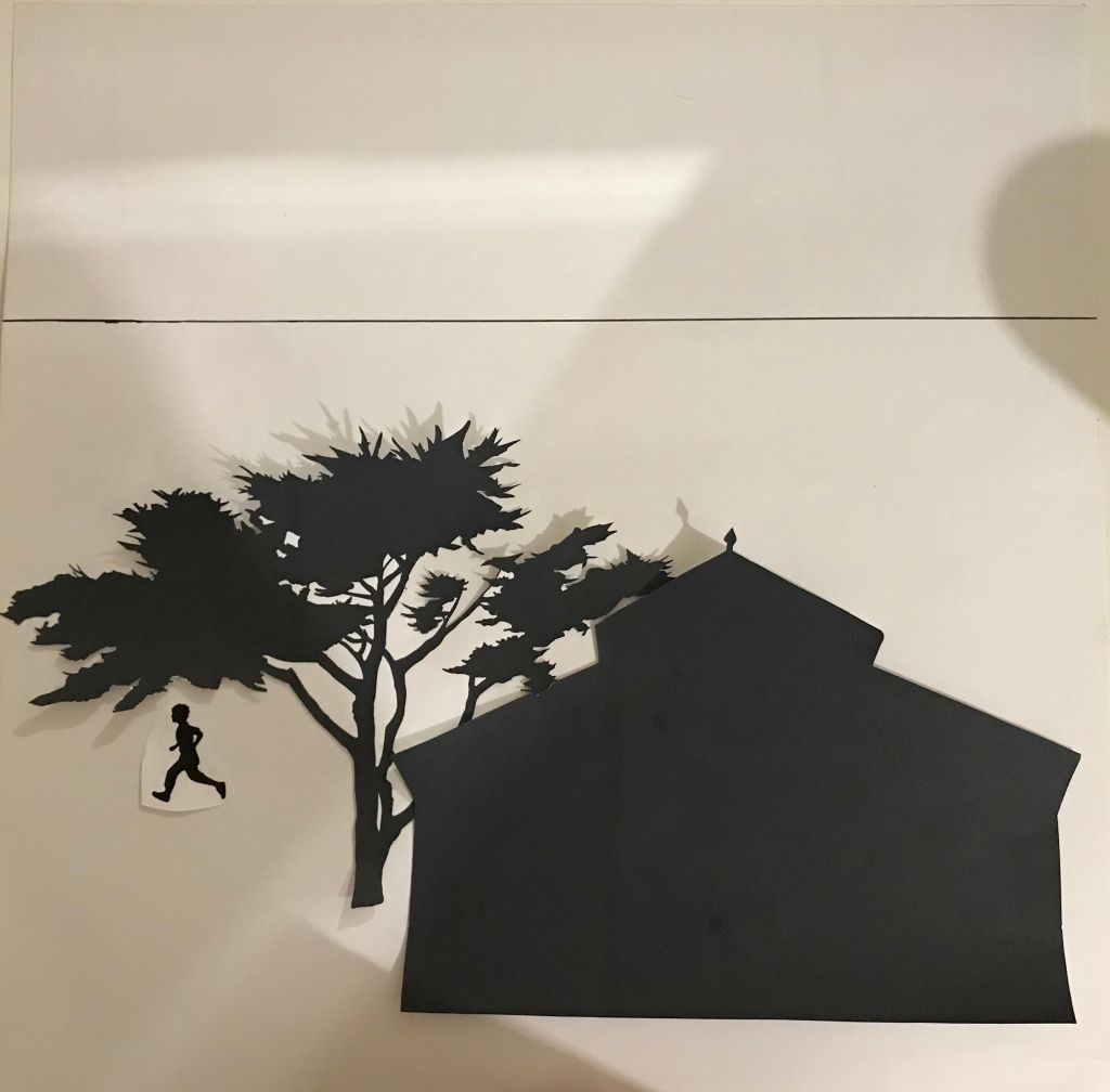
For this exercise, I was asked to cut to L shapes of card or stiff paper and use them to explore formats to zoom in and out of compositions.
The image I chose was a family photo from a holiday a few years ago. I spent a long time trying to find an image as I am very into photography and most of my photographs were already zoomed in and framed so a lot of these were not going to give me enough room to play with. I really wanted to use one of my own photographs however as I thought this would make the subject fun when it came time to draw it.
I created 10 edited versions of my image trying to retain the content, but presenting it in different ways and in different formats.
Composition 1 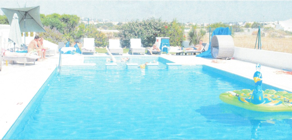
Composition 2 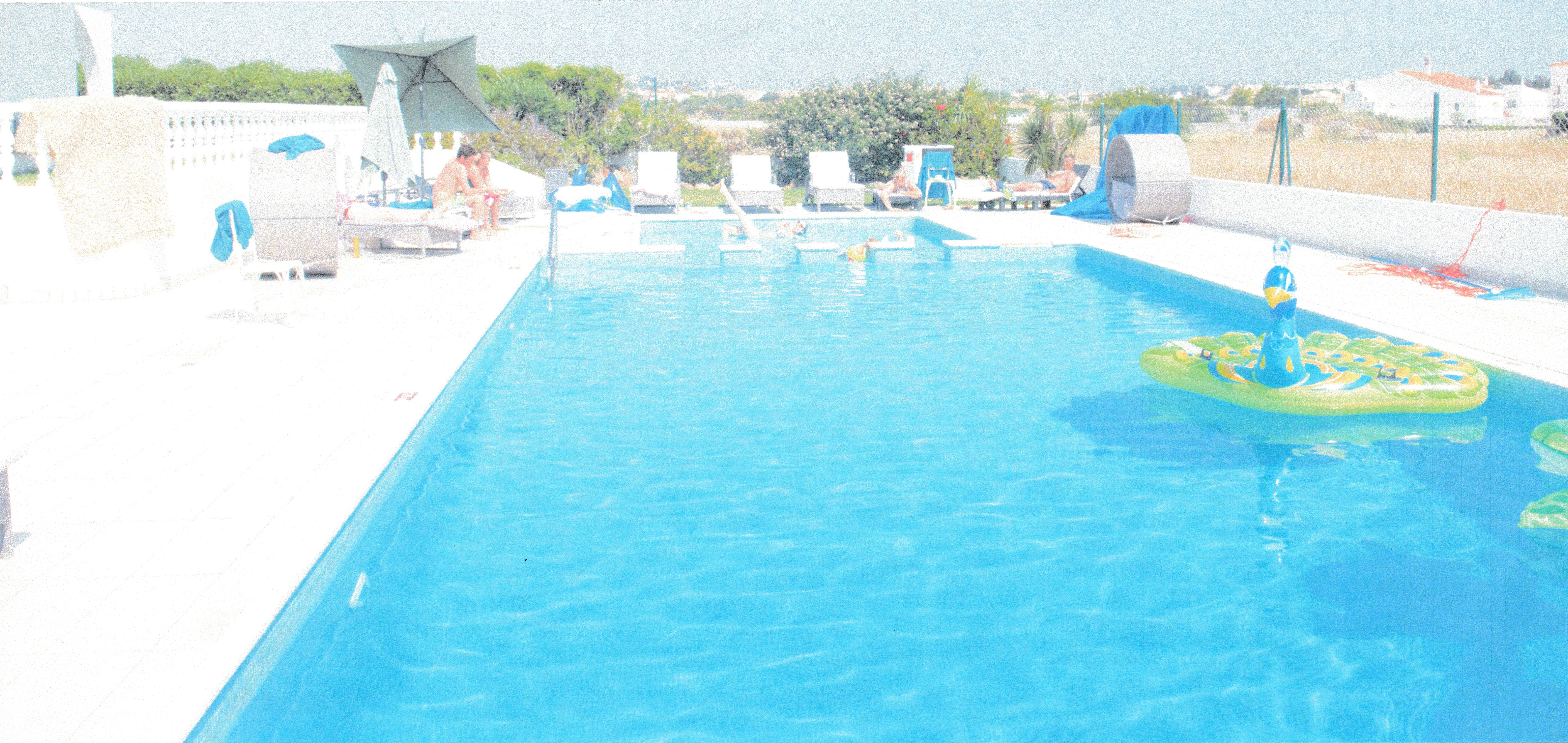
Composition 3 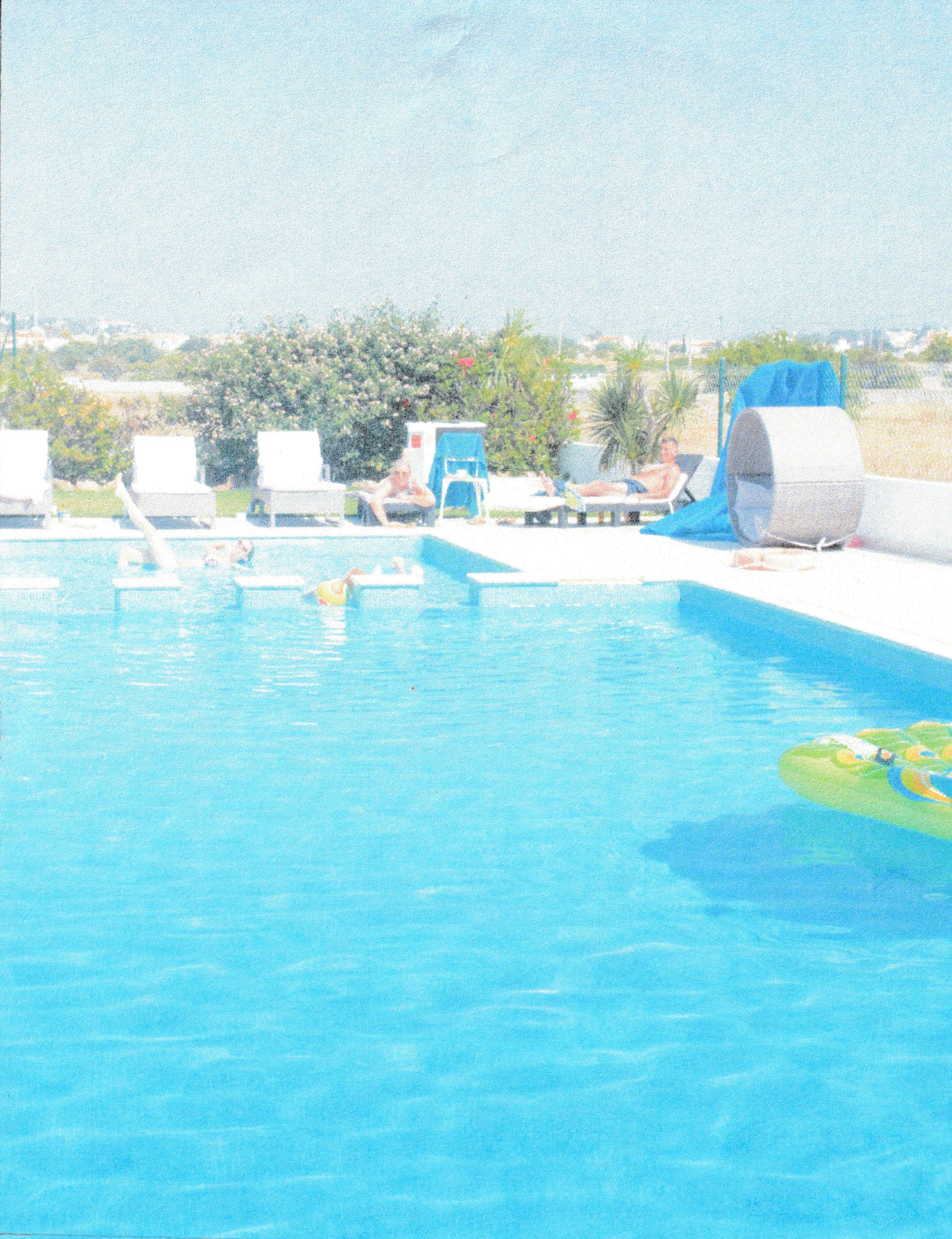
Composition 4 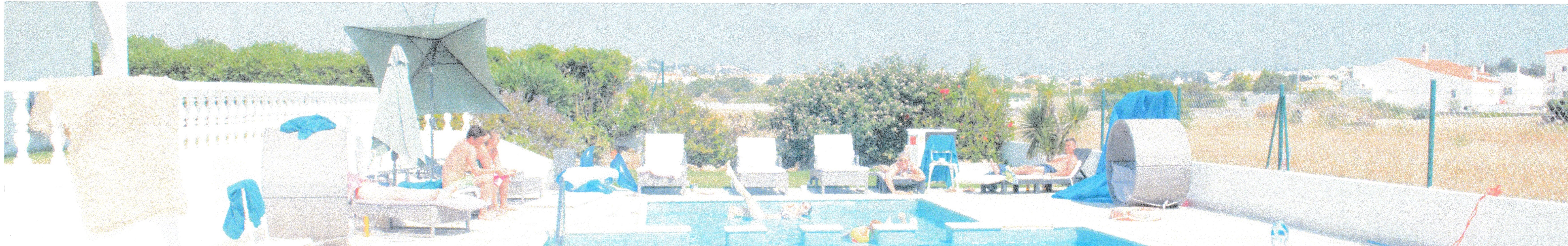
Composition 5 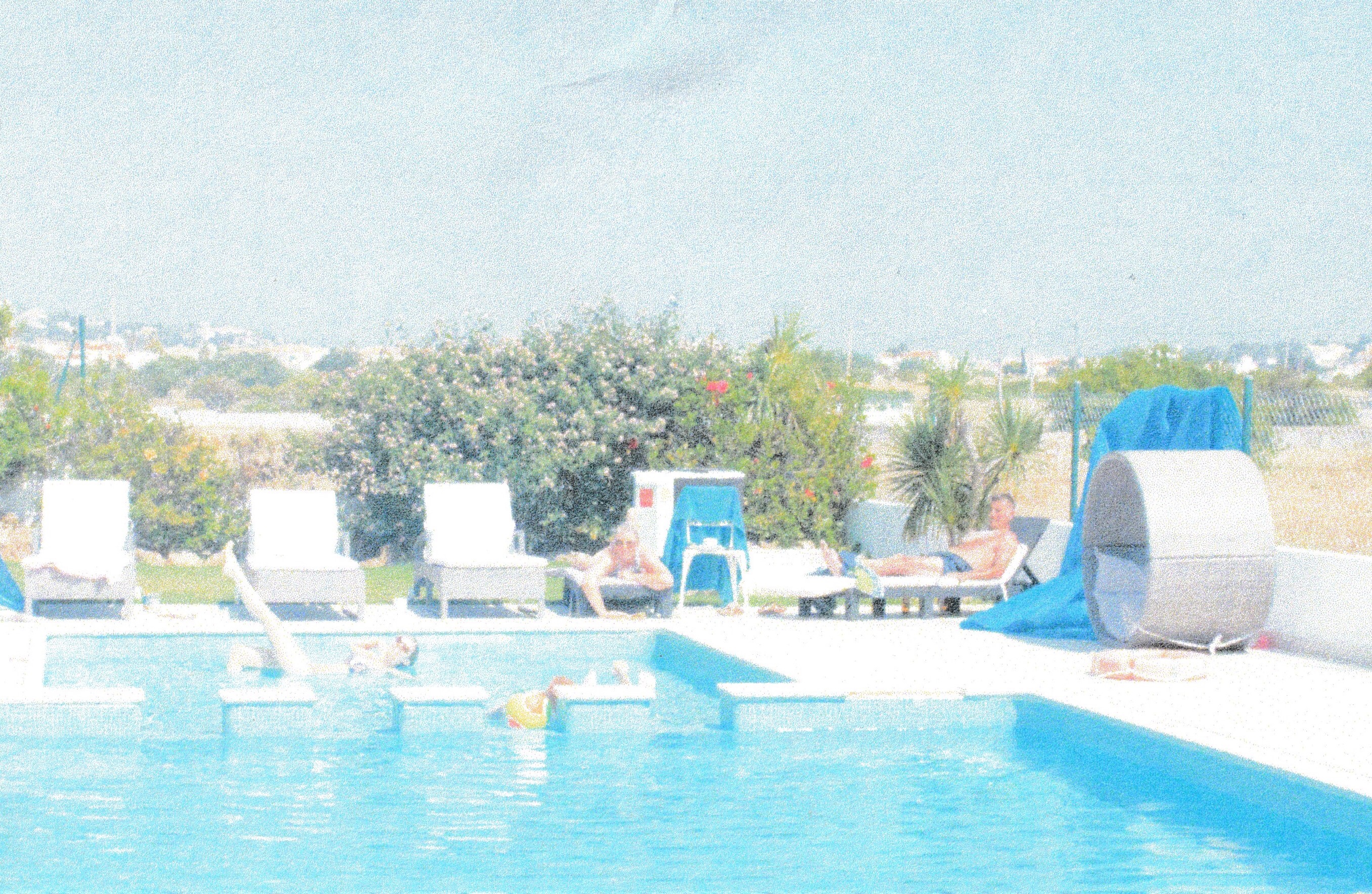
Composition 6 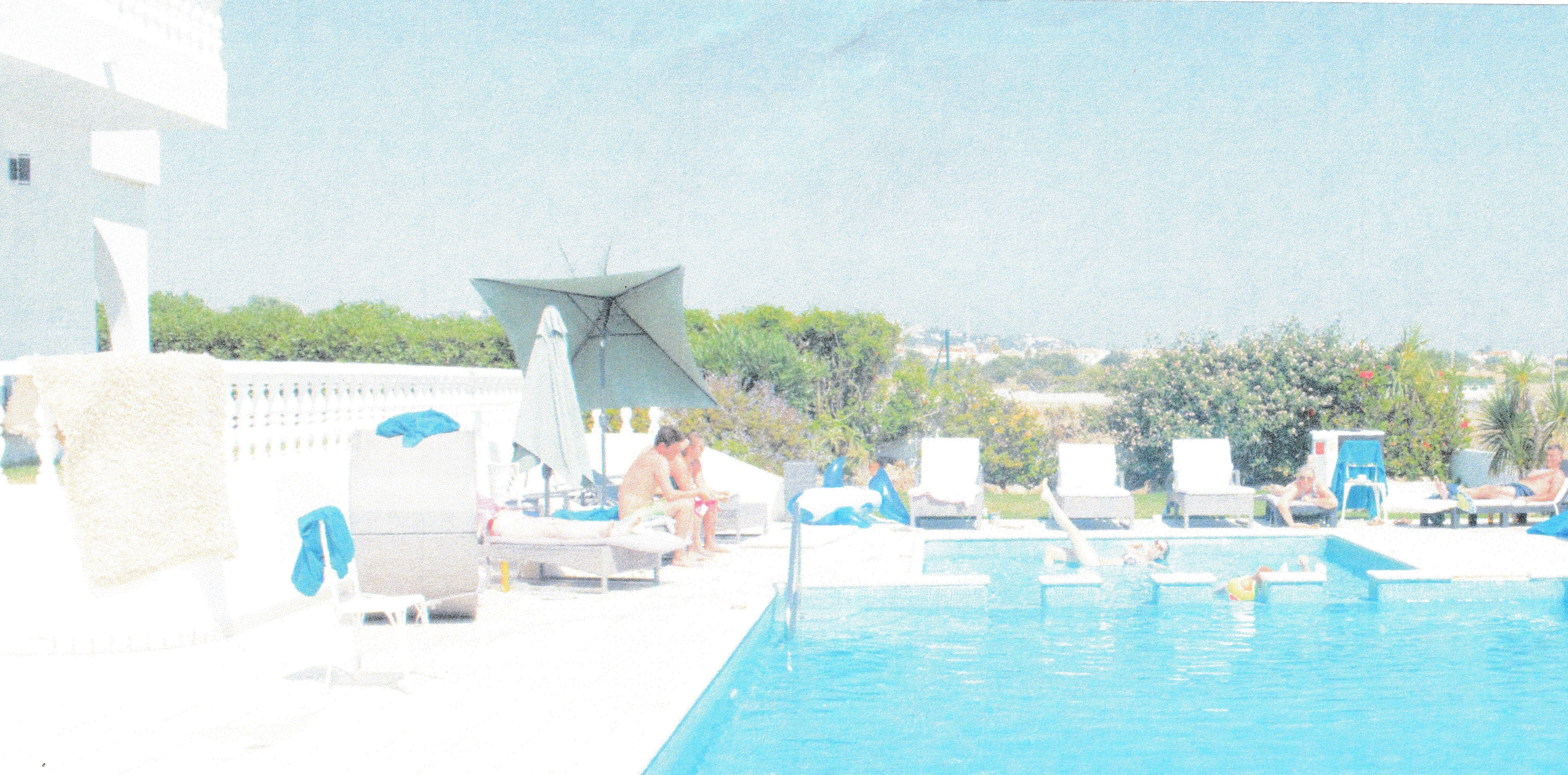
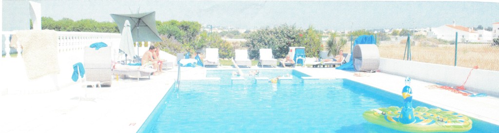
Composition 7 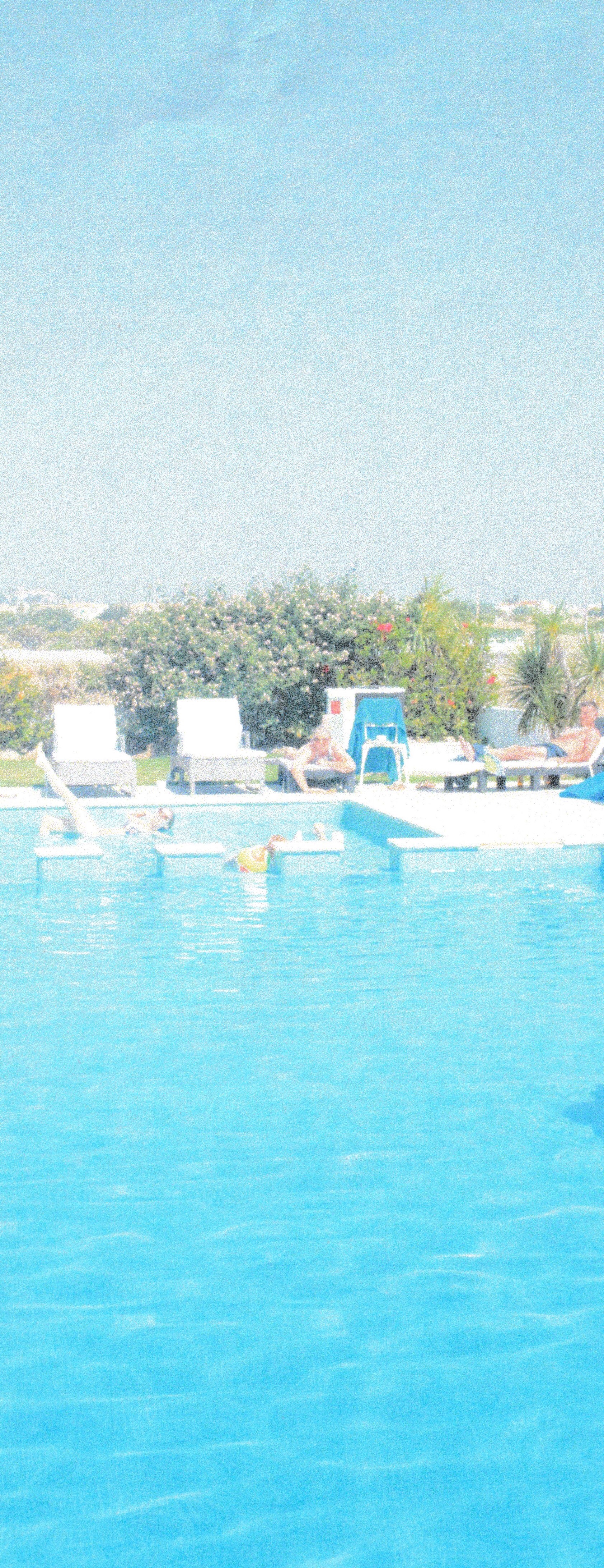
Composition 8 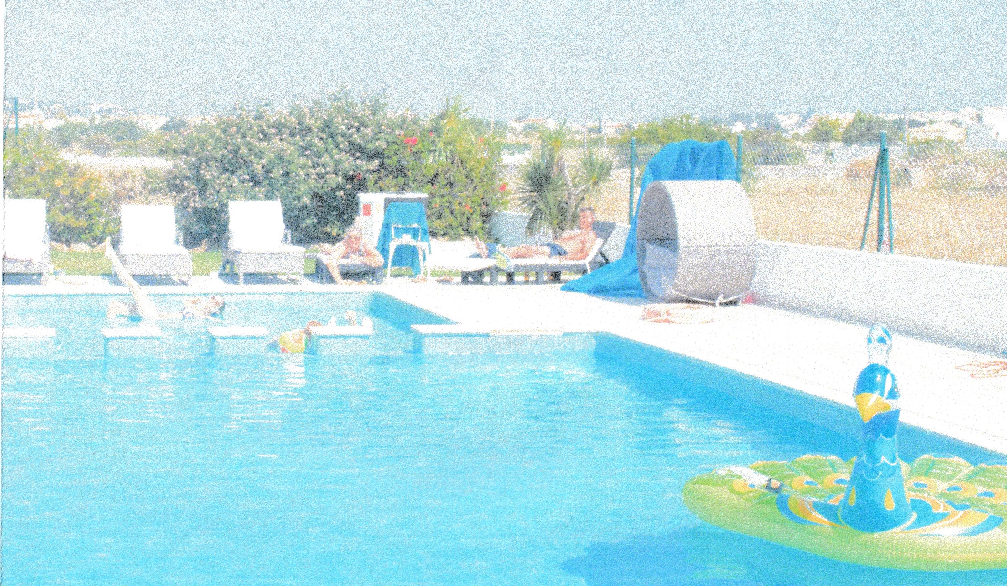
Composition 9 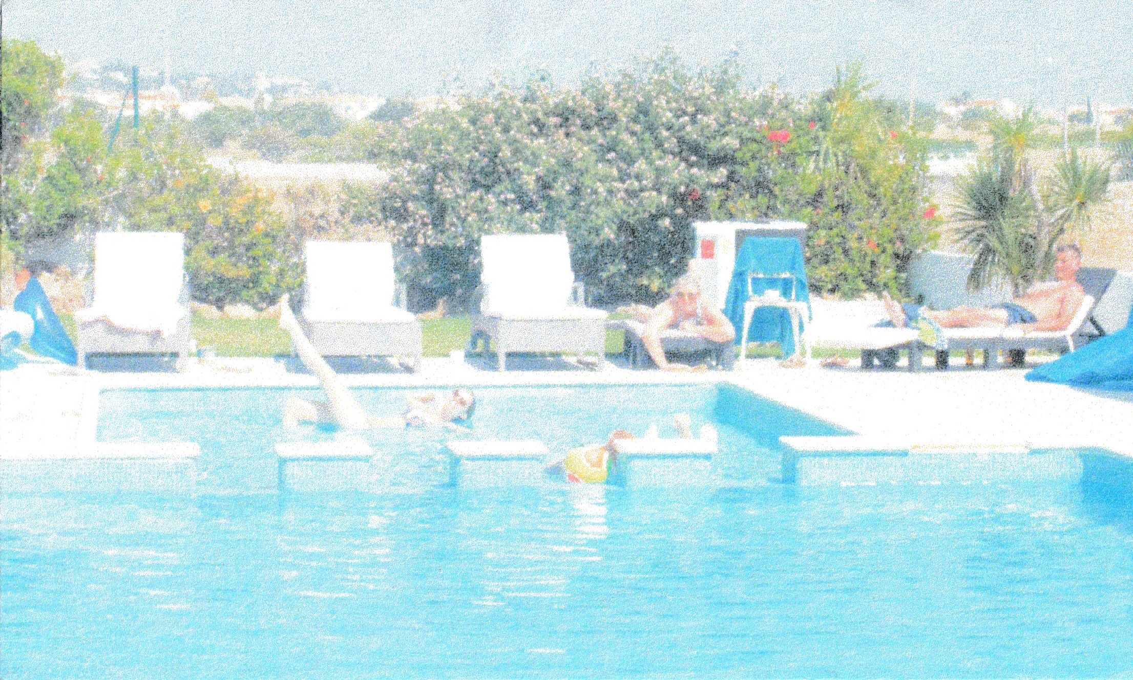
Composition 10
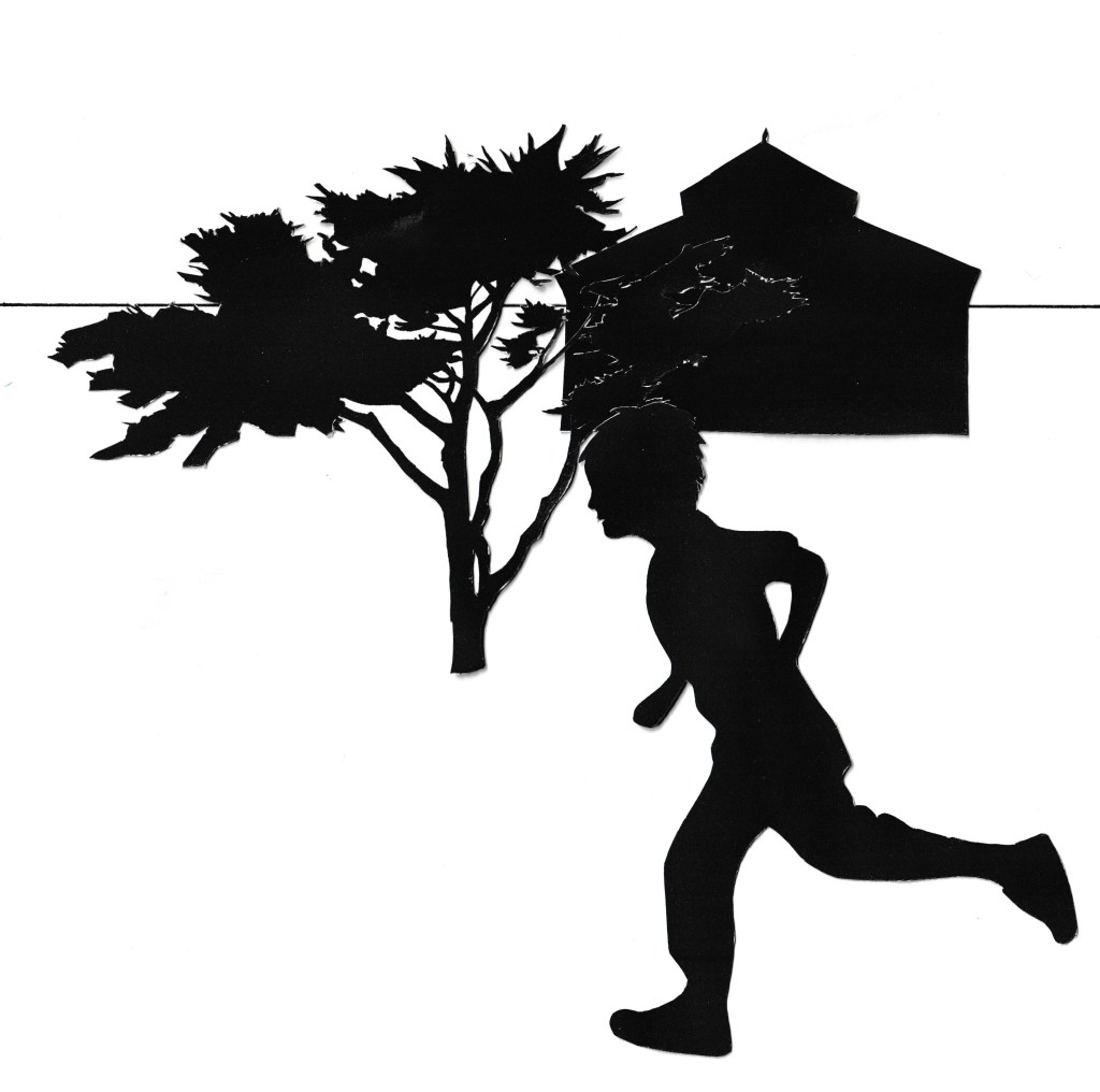
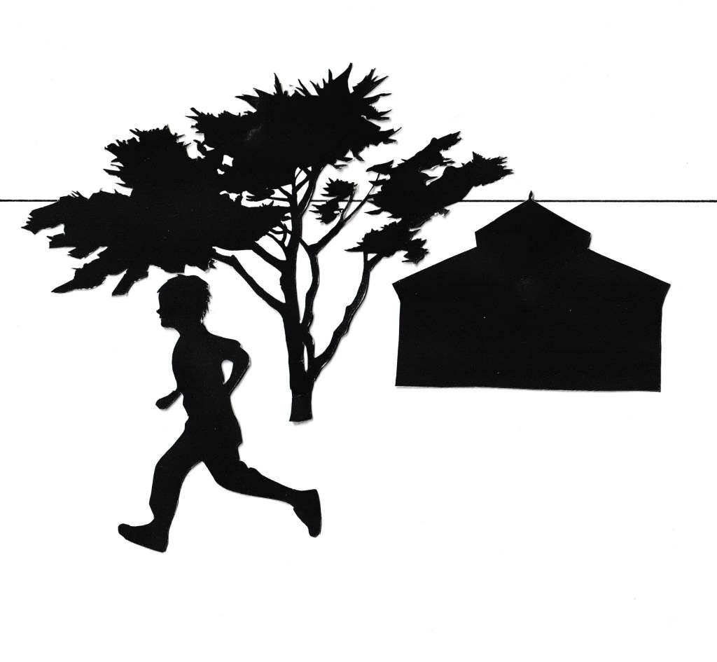
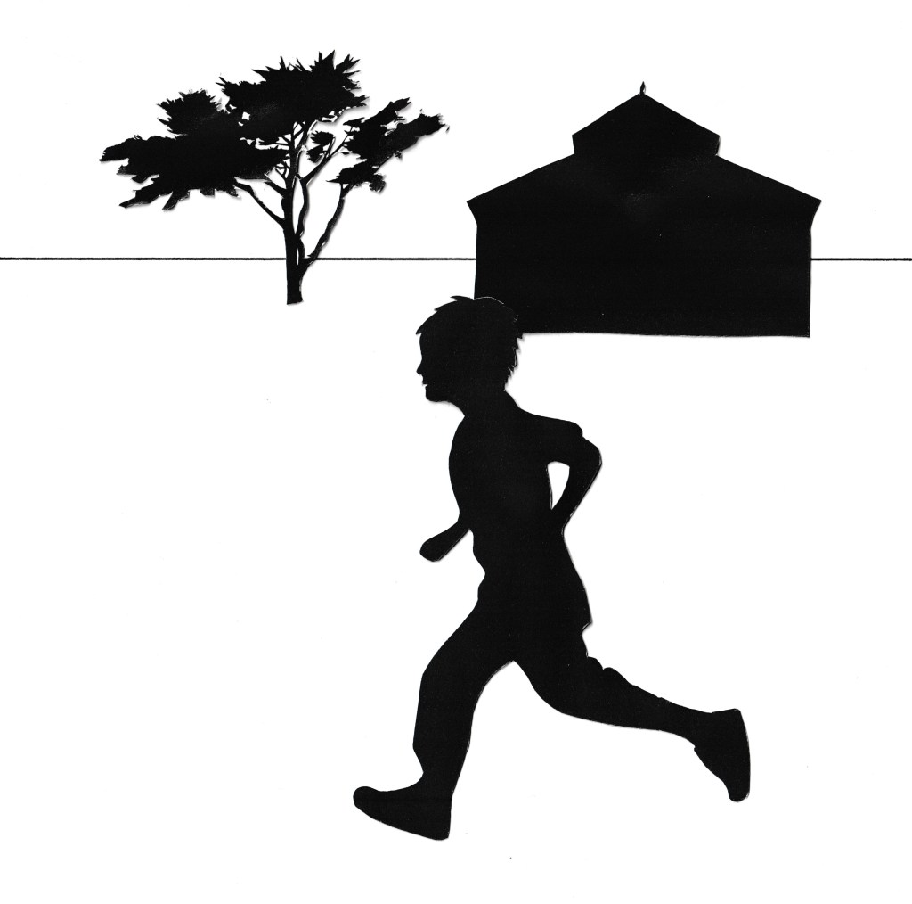
Although I found it quite easy to create different compositions with this image I found it difficult to find a way to create much interest within the composition. Although I had my main subject matter, which is the girl posing in the pool, it was hard to compose the image in a way that created much interest or focus within the image, without cutting out my main characters of interest. I found that the compositions that had the other people in I liked more, as it created more interest and with the way the framing is, it tends to lead the eye down the image to the main focus and helps set the scene. I feel like some of the compositions become more interesting due to the way they are cropped, particularly composition 9 which is a panoramic view, which creates more drama.
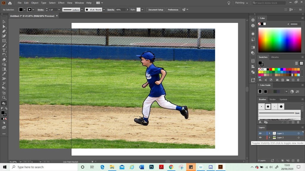
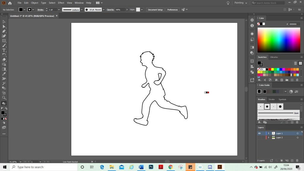
The image I have chosen to draw, is composition 10, where some of the characters are cropped out. Although I like the image better with the other characters and more scenery in the image. I think that in order to convey this as an illustration, I needed to use an image which was zoomed in more, otherwise my main character will be too small to stand out as the focus. Especially as the characters to the left are closer to the camera and therefore appear a lot bigger.
Once I had started to gather my materials and look at the composition more closely, I realised that it would not be very appealing, as an illustration, as the main character still looked too far away. I therefore decided to crop this photo even more to create a new composition.


For my final image, I decided to move the characters closer together as they felt a bit too far apart and separate before. I also left out certain elements in the background as it was quite busy and did not add much to the scene. Some of the things in the composition like the third character and the ball. I also removed, as the third character can barely be seen and I felt like they were doing nothing for the scene and would also perhaps look awkward in the frame.
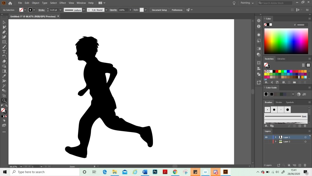
For this image. I researched cartoon women, including Disney characters to see how they drew facial features and hair. I wanted to keep this image quite simple and this is not a finished piece. My goal was to focus was on learning about composition rather than doing a technical drawing. Therefore, I chose to draw in a cartoon style as this was something fun to try and is not something I have done much of. Although I struggled to get a composition that I liked out of these photos, I enjoyed doing the illustration and the exercise has been useful for understanding composition and understanding what does and does not work. I also feel that it showed me the importance of moving things in different places in the image and trying different layouts as then I could improve the composition by moving the focus to elements of my illustration that I wish to bring to the forefront.

When I got to the end of this exercise and started to add to my learning log I read through the instructions again to check I hadn’t missed anything, and I realised that I had misinterpreted the brief. I remembered that I needed to make an illustration of my composition, but I had missed the part that had said a poster with text. I realise that my illustration does not lend itself to well to a poster, as that is not the purpose I had intended for it. I added a border and thought about the word and what text would work for this and decided on the word ‘stressed’ with a question mark. The word is contradictory to the scene as the characters look very happy and relaxed. Therefore, ‘stressed?’ Is intended as a question to the viewer, suggesting that perhaps if they are feeling stressed that this is what they need, i.e. a holiday.
I feel like overall this image works with the text as it does convey a meaning and this scene is eye-catching. I think if this was to be worked as a poster I would need to do lots of different sketches and mockups and play around with the colours and text a lot more. If I was to develop this image further. I would redraw the image as it is not technically sound and look at other colour options and mediums.