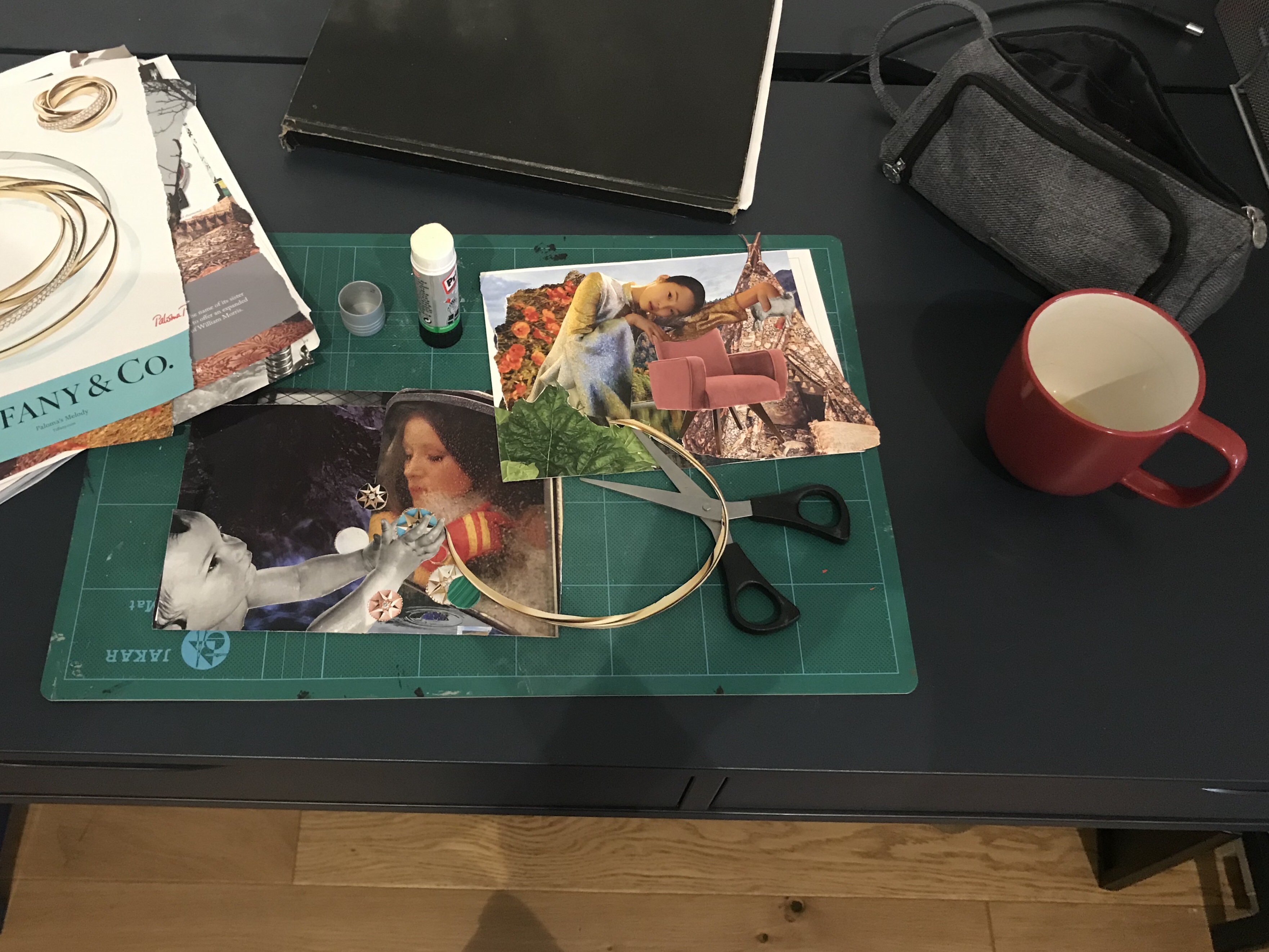
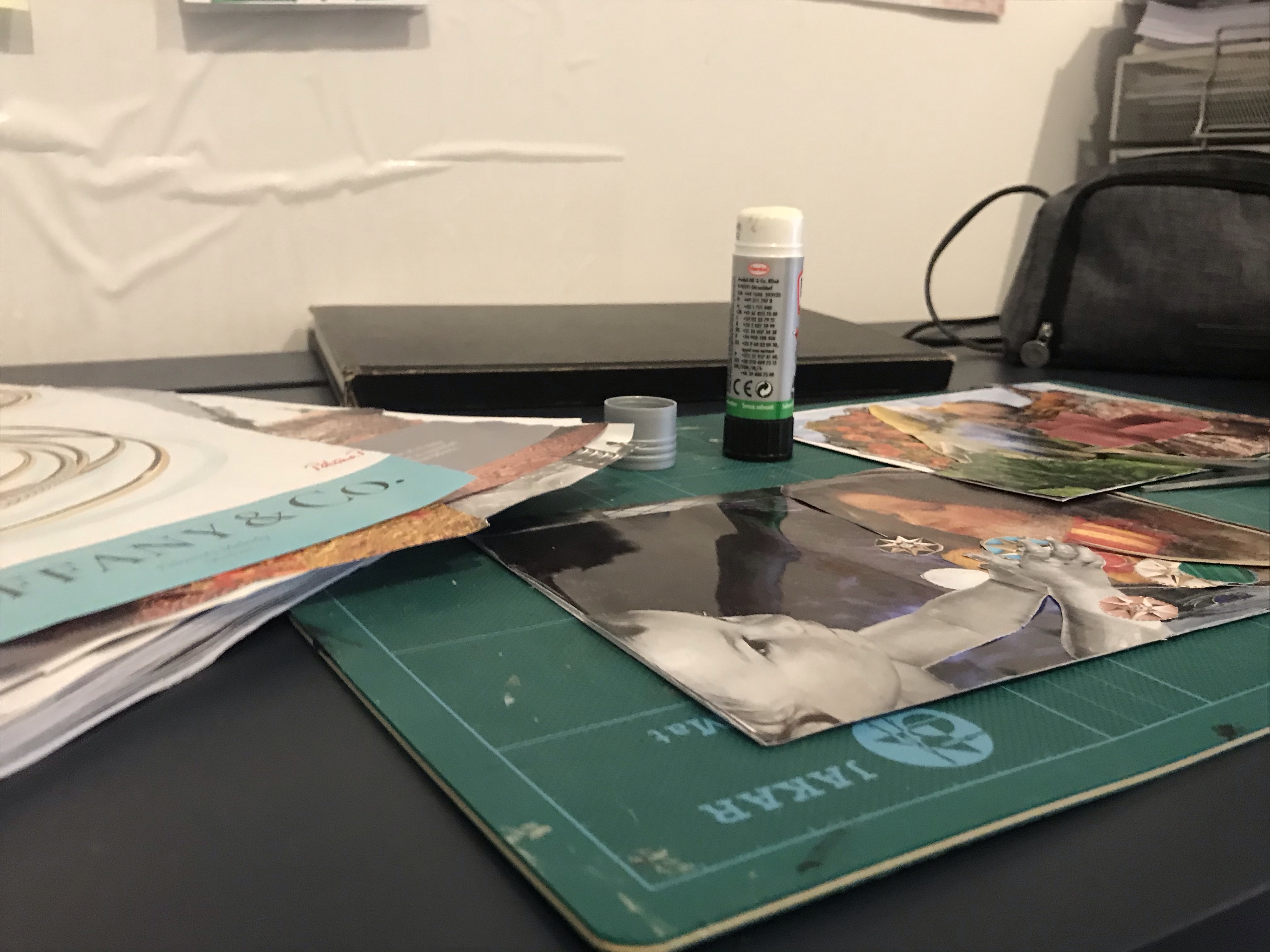
Exercise: Viewpoint

For this exercise I chose ‘workshop’. It was, not the most exciting theme from the selection. However, as I was staying at a friend’s house at the time I had very limited resources to create a collection of objects. I did have a desk that I was working at with my art equipment, which is why I chose this theme.

I tried to be unusual with the positioning of the camera in order to make the scene more interesting. I found that I quite liked the shots where the camera was lower and gave more of an interesting perspective of the objects. I did some sketches from my photos by cropping them into different frames.

My thumbnails
My final image

I chose the above as my final composition and frame and drew it in my A4 sketchbook. I tried to keep the lines clean and added a little shading to emphasise shapes. I felt that this frame was the most successful as it showed a range of objects where as some of the others, although more interesting, it was harder to see what the scene was meant to be. I felt that this one clearly showed that it was a ‘workshop’ or working desk.

I found this exercise valuable to teach me to find and experiment with new perspectives rather than settling for the first one I think of and to use this technique to find another more suitable one. I will bear this in mind as I go forward with my course to try to think more about the best perspective and layout for my illustrations.

Exercise: Reading an image

Picture content:

A Dragon

Treasure; gold coins, a throne, jewels.

Weapons and armour

People x2

A cave

A torchlight (fire)

Lit-up room from the fire

A stoney floor

Cave opening (doorway)

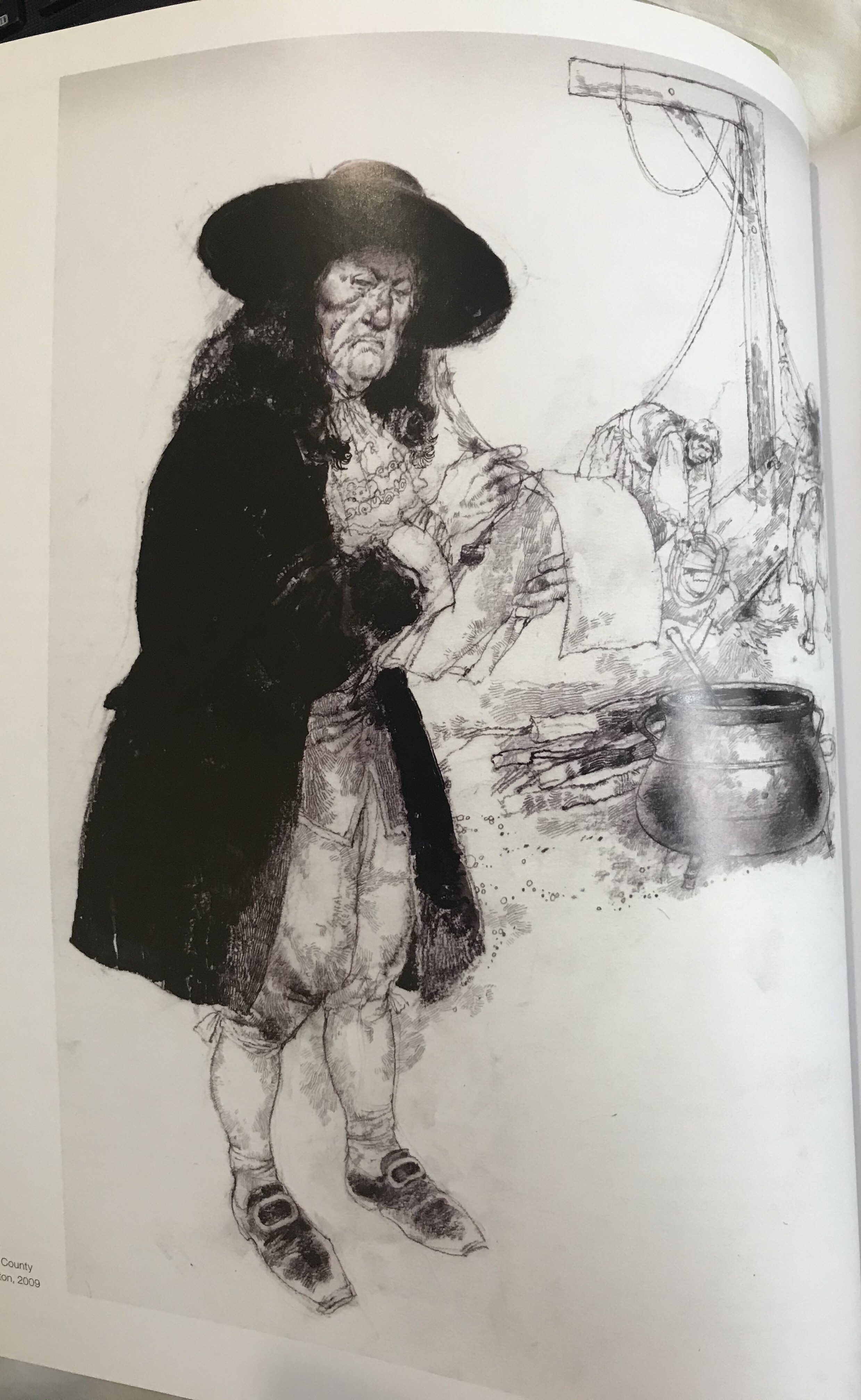
The image here by Mark Oliver, is of a dragon in a cave surrounded by treasure, armour and weapons, in the room with him are two characters. I am unclear about the gender of the lead character.I believe it may possibly be female due to the long hair, but the scene makes me initially assume that it is a male character. This could be simply due to the quality and size of the print as it is difficult to see. However, I do not feel that the gender of this character would explain nor take away anything from this narrative.

The scene seems to be about two characters that have either found or have intentionally been looking for a Dragon, in a cave that is guarding a pile of treasure. There are weapons and suits of armour in the cave in piles, which could suggest that they are there from the failed attempts of men that have come to take the treasure from the Dragon. In the scene, the Dragon is asleep and there is one character in the lead with a torch, that is pointing towards the Dragon and a second character that looks like he is hiding behind the first character and is pointing back in the other direction away from the Dragon, suggesting that they should go back and not wake the Dragon.

This image uses both a hot and cold pallete, the hot areas are used for the main subjects, i.e. the dragon and the fire which is lighting up the cave in hot tones. It is also used on the faces and hair of the characters which makes them stand out. Although the second character is cooler than the first, leading him to recede slightly. The core colours are used mainly for the actual cave e.g. the walls and the floor. A lot of texture is used in this image, particularly on the floor, which helps identify the scene as a cave and also on the cave walls. This is more subtle in the cool areas of the cave and quite dominant in the area of the cave that is lit by the torchlight. This makes this area stand out as a focal point. There is a lot of detail used on the Dragon himself and the most detail is in the foreground of the image with the background being slightly out of focus. There is a definite contrast and a stronger contrast with the hot elements that helps bring them into focus and pushes the cool colours that use less contrast into the background.

I believe there is significance in the colours used for the story. The hot colours bringing certain parts of the story into focus as a main element. In contrast the cool colours are used to push those areas back with less focus on them. The Dragon being a hot colour could imply the significance of Dragon’s breathing fire and the characters having a fire torch with them ties those two elements and ideas together. The torchlight is creating a warmer, brighter glow on the Dragon, whereas in the shaded parts of the Dragon, his colours are cooler.

The most significant part of this image that the artist seems to want you to focus on are all in warm colours, including the faces and hands of the two characters. The other elements in the image are cooler, which takes the focus off of them. There are a couple of the other elements standing out that are warm to medium tones in the throne that the Dragon is guarding and also the green of the character’s outfit. Perhaps this implies that that throne belongs to this character as the two are matching in colour and both highlighted in this bright green.

I believe that the Dragon is a significant part of this image. However, I think that perhaps the character in the bright green and the throne on the right that is in a matching green is the leading element to this story, as they are paired and different in colour to all of the other elements in the image. The Dragon and the fire, I believe, are secondary elements, with the armour and the second character being the third elements. This is because as although these do stand out amongst the background, they are both slightly duller and therefore do not appear to be leading element. I think that the coolest colours being the surrounding caves, sets the scene, but is the least dominant element.

I like the way the bright colours have been used to focus the viewer on certain elements within the image. I think that this image is successful in creating a story and leading the viewer through a journey, very well in just this one image. It gives a lot of information and I found I could easily create a big section of narrative around just this one image. The textured areas in this image seem to not necessarily be the most important areas and therefore the areas are not as in focus and the smooth, clean cut textures, used on the Dragon specifically help him to stand out as the main focus point. My eye on this image tends to lead from right to left, focusing first on the large Dragon and his treasure, that is bright and taking up the main portion of the image. My eye, then works its way across to the left up to the ceiling with the fire and down to the lead character. This then leads me to notice the armour either side and finally the second character. When I first looked at the image I did notice the green throne, but I did not instantly put any value on this. It made me wonder what significance it had, but it took me a while to see what the possible connection between the character and the throne could be. This created interest as the story unfolded gradually.

Exercise: Using black and white

For this exercise we had to produce a line visual around one of the following words: Sea, Extraordinary, Building or Journey. Before I started. I had a look through some of my books to find examples of black and white or high contrast illustrations. I have included a few of these here. These are from the book: Masters of Sketching by 3Dtotal Publishing.

I chose images that I liked and that were all quite different. The ones that stood out in reference to this assignment were the images by Daniel pudles and Jan Pienkowski. Daniel pudles work because it is a lino print and therefore lends itself very well to a two colour palette. I really love Jan Pienkowski’s illustrations and although one of them has colour. The main portion of the image would work also in just black and white and uses very interesting silhouettes and lots of varied shapes, that created a piece that really captures your attention. I really took my time looking at it thoroughly, to see all of the different elements and characters within the image. I did also look at some other lesser know artists on Instagram and on a general google search to find other examples until I felt more confident about what I was trying to acheive.

I then started by brainstorming each of the words so that I could come up with some ideas and choose the word I wanted to use for my image.

Once I had done my mind maps I chose a few of the ideas and did some quick sketches to see what would work and which ones I liked that I would want to develop more.

I liked the idea of under the sea, however, I could not think of an idea that would work with this style. The idea I had of the man walking down the street would have worked very well with the style, yet I did not want to create a piece that looked dated. I wanted to try creating something with the old style, but with subject matter that could represent the current day. I therefore settled on the scene with the toddler on a tricycle.

I took my initial sketch and did a perspective drawing. Once I was happy with how it was looking. I then inked over the pencil markings to create the final line drawing and rubbed out the pencil markings. After this I scanned it onto my computer and put it into Photoshop, where I removed the background so that only the line drawing was left and saved the file and printed a copy. I then changed the colours so that they were inverted, I saved this as a new file and then printed two copies.

Once I had both my original and my inverted copy, I then started to cut out shapes from my inverted copy and place them onto my original copy. I used white tack to keep the pieces in place. Whilst I experimented with the placement.

I really struggled with choosing the colours for the toddler and his tricycle as it was hard to see what balanced him well. I therefore spent a lot of time changing his clothes and hair around to see which would work best. The tricycle tyres dictated to some level, what colour I could use for the boys clothing, as I felt it important to keep the tyres black as this made more sense. I would have liked to have the car tyres black also, but then they would have been invisible against the road and the road was more important to have black. This was so that the grass surrounding it and the pavement stood out in contrast.

Final Image

Reflection

I spent a lot of time trying different layouts with the cutouts and found this to be quite challenging to get it to look right. I think that now I have tried the exercise I would perhaps have used a simpler design or designed it in a way that it was easier to colour. However, I would not have understood how to do this until I had tried the exercise myself and learnt from the problems I encountered. I am not entirely sure if I met the brief as it said that there should be no lines left by the end of the cutting and pasting. However, I found this impossible to do and do not think that I could achieve this or know how to achieve this on this particular drawing. In doing so, I would have lost a lot of the important elements like the curb and some of the details on the boy and his tricycle. I found this brief very difficult to and do not feel that the instructions were clear. It would have been helpful to have a simple example of the technique.

In conclusion, I can see how important it is to think more about the design process for each image I am producing. Overall, I am happy with my image, especially as it is the first time I have tried something like this and it is very different to my usual style and type of work that I do.

References: 3dtotal Publishing (2017) Masters of Sketching. (s.l.): 3DTotal.com.