For this exercise with asked to read an extract of a book by Michael Innes adapted from the Daffodil Affair. We were then asked to make notes on the following questions:
- If this were to be made into a film. What would the main character be like?
Firstly, I decided that my character was going to be based in the 1940s as the text said during wartime London. However, it did not specify which war. I answered this question based on the facts from the extract and then imagined my own character traits. The facts were that he is a middle-aged man, described as having a fixed contraction on his brow. My ideas without he had his hair neatly gelled back into the side parting is clean-shaven, stern -looking and serious with lines on his face showing years of seriousness and worry. He is clean and neat with a London accent and is a family man. The character is a man that works in Scotland Yard, it does not specify as to whether he is a detective or not. But it says that he controls ‘the file of police papers which dealt with the abduction and subsequent history of feeble minded girls.’ It was quite easy for me to imagine his style due to my extensive knowledge on this period due to my background as a make-up artist. Details like having a man’s side parting on the left is considered to be a defining feature of hairstyles of the period. This meant I had quite a clear image of my character in my head just from reading the story and by deciding what decade he was from.
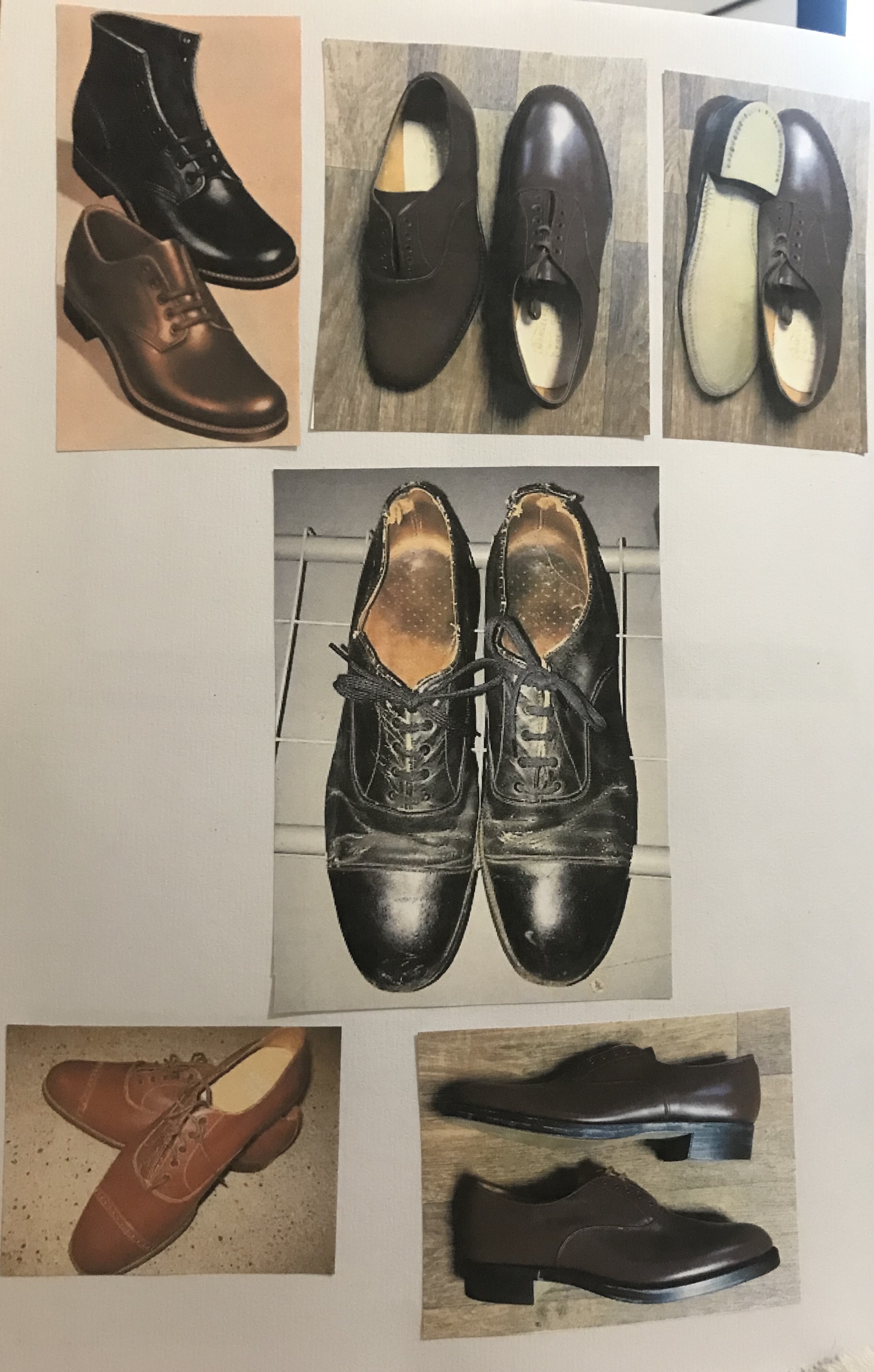
- What clothes with the character be wearing?
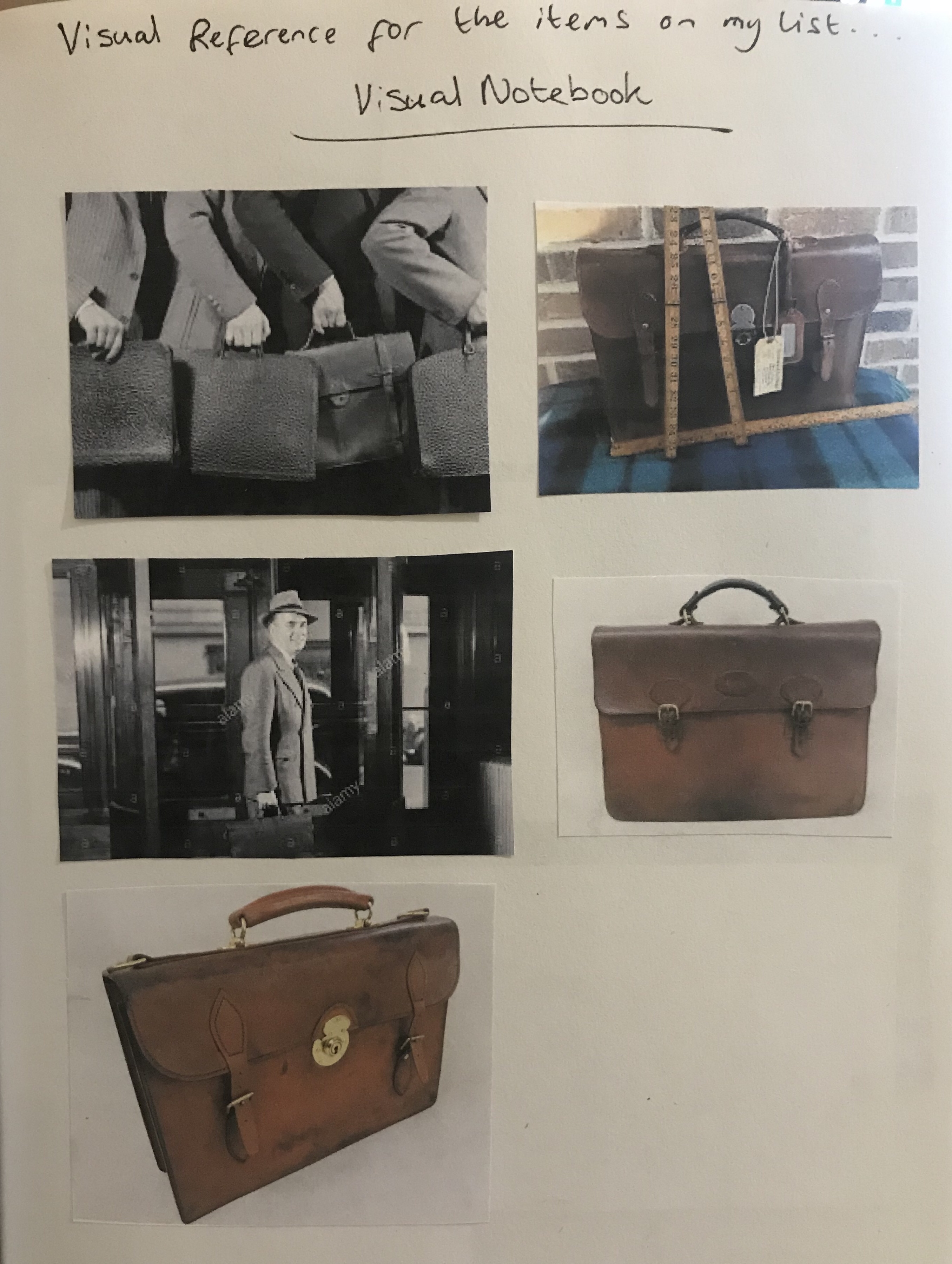
Brown suit, tie, polished shoes. Briefcase (on his desk). Smart/office worker.
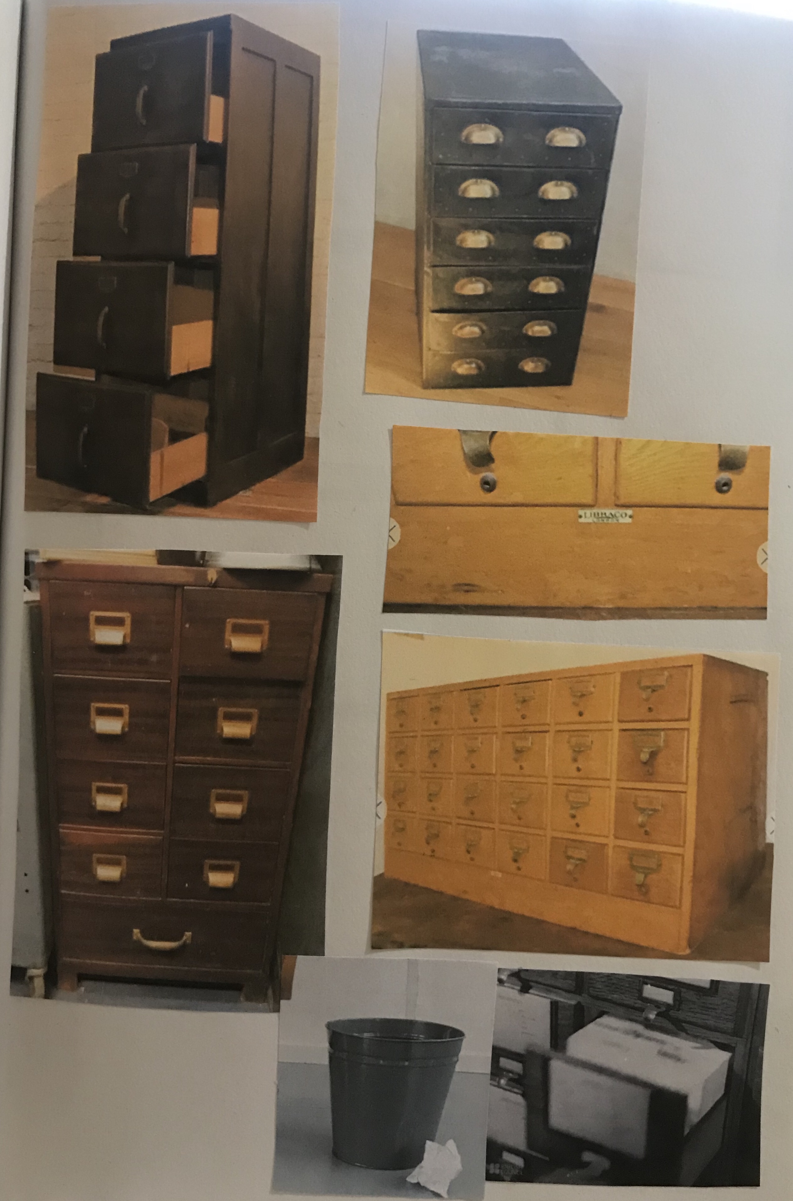
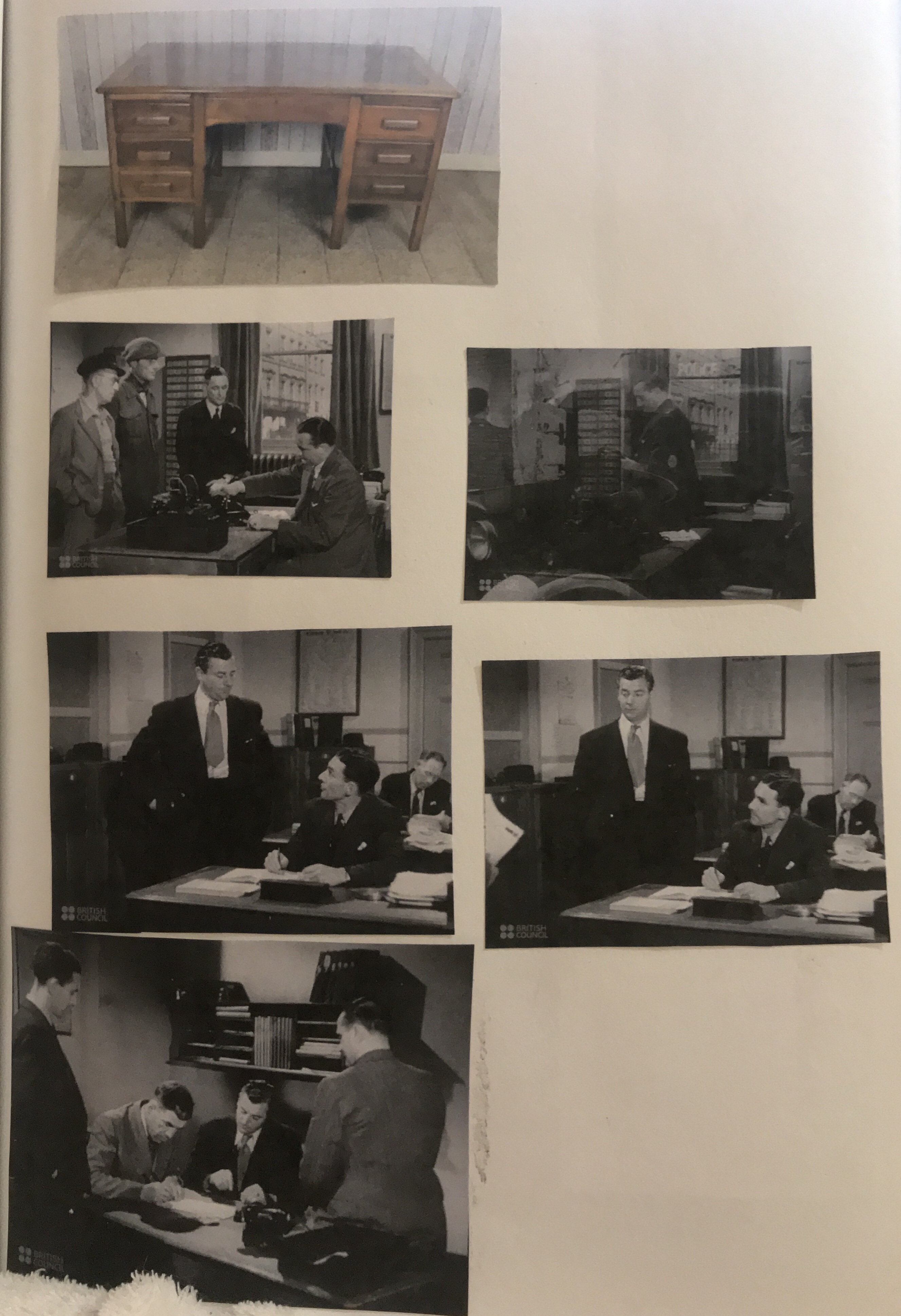
- What furniture is in the main area in which the action takes place?
In the excerpt, a big desk is mentioned. I also imagined some filing cabinets and file boxes as the man keeps files as part of his job. However, I did not imagine there to be anything else in the room as the description does say that the room is empty except a big desk.
For the next part of the exercise was asked to: Collect a visual reference for the items on our list. Find a reference book or website for this era. Use the Internet to do an image search. Be selective. Don’t go for the first image and counter try to remember your own vision of the story and reflect this in your choices. Stick these images onto a large sheet of paper or individual notebook. I did my visual notebook in my sketchbook and started finding images for the items I had on my list for the character either to be wearing or items of furniture in the room.
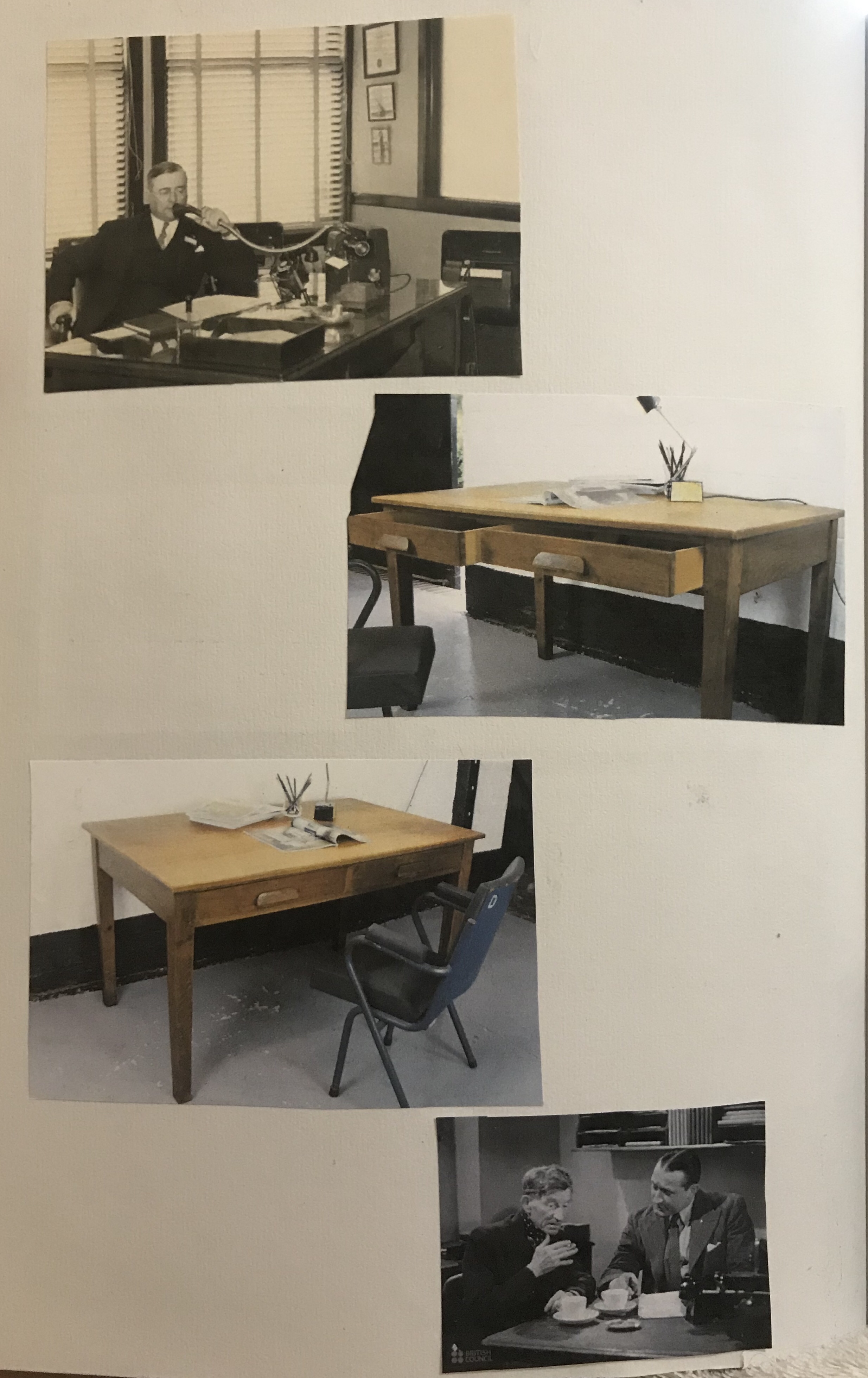
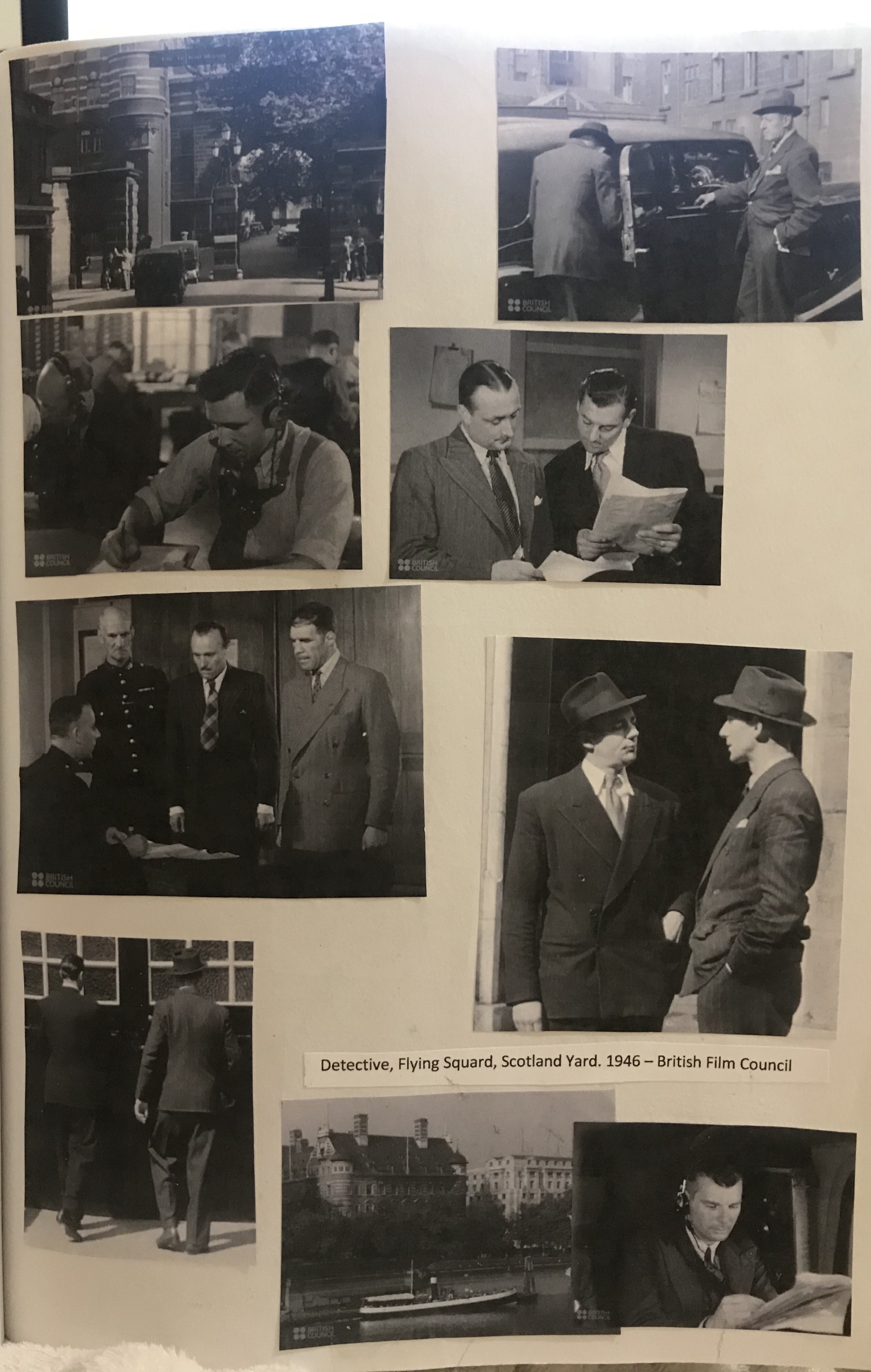
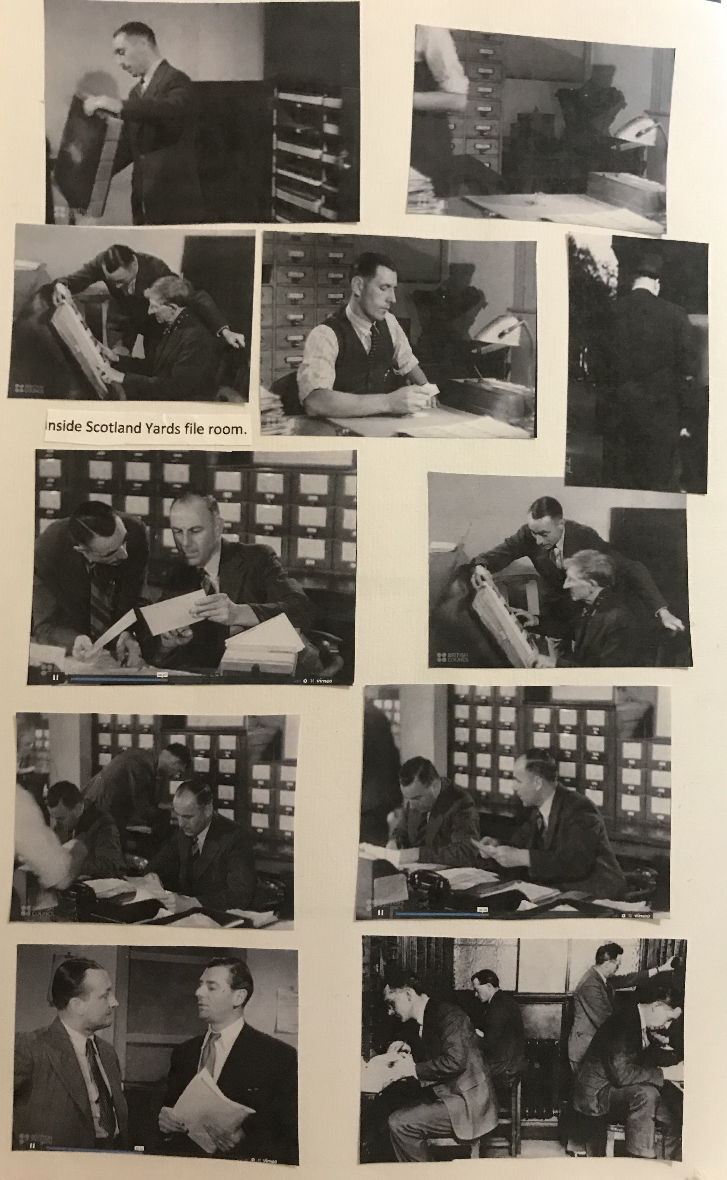
I then found some great films from wartime Britain on the ITV website, one of which was called; ‘Routine Job’. It was about detectives in the Flying Squad, Scotland Yard.1946. I am unsure if any of the characters in this film are real or just based on real characters, as I was unable to find any details on this. However, the locations are real and the costumes or clothes that the characters are wearing our typical of the 1940s, and therefore fit very well with how I imagined my character. This film is very interesting and shows a typical day of a detective from the flying squad. During the film, the file room at Scotland Yard is shown. This was very interesting to me as it is probably where the character in our excerpt would work. However, from the description given this is not at all how I imagined his office, nor how it is described. The rooms I saw in the film are occupied by multiple workers and are not in any way empty. I also included some pictures of Scotland Yard’s buildings as when I read the excerpt and imagined the scene, I imagined more modern windows than they actually were, due to the description given by the writer.
The next task was to explore textual and colouristic visual brainstorming and idea generation.
We were asked to ‘choose a word which we feel captures the mood we would like to convey. Collect and create textures and colours we associate with this word to make a mood board. Start with a broad vision to describe the overall colour or tone of the image, not specific elements of it. Be minimal and selective, and gradually add textures and colours that complement the general impression. ‘
I really enjoyed doing this mood board and had quite a different approach with it, from the ones I have done for previous exercises. My chosen word for my mood board was ‘stark’. I started my mood board by adding colours and textures with gouache paint. I also used patches of colour with metallic pencils and markers, then I went around the house and did some texture rubbings. I had seen my fellow students do these on my Lisbon trip and thought that it would be good to try that in order to add textures to my board. I did rubbings of an Artex wall, the steps of a metal ladder, wooden floorboards, the bottom of a saucepan, a woven basket and a couple of other items I found around the house. I really loved the one of the floorboards, but the one that interested me the most was the one of the metal ladder treads as it reminded me of pinstripe material.

My next task was to ‘create a simple portrait (figure, or head and shoulders) of the character, using the reference you have gathered.‘
‘Use sketchbooks to help you to select and edit from your reference materials and explore where to position your figure within the frame format of the picture make the shape based on any book you have to hand.
Use the colours, textures and qualities you assembled for your mood board to render the portrait. You may literally collage these textures into a drawing, or convey the tonal qualities of the mood bored through the way that use materials and mark making.’

A book I had to hand was this one called Mr Darcy, Vampyr by Amanda Grange. I liked the composition of this book cover and wanted to use this for the composition of my drawing. I did some test sketches of the composition and also some quick sketches to try to put on paper the image of my characters features that I had in my head. This was however quite hard to do.

It was at this point that I realised that it may be interesting to incorporate some of my rubbings directly into my drawing. As you can see from the top thumbnail I tested this out and really liked the result. I went and did some more rubbings of a couple of the textures I liked from before, with varying shades of pressure so that I had some dark for shaded areas and lighter for highlighted areas. I used the steps of the ladder again to create some rubbings for the tie and again for the blazer, but this time by moving the paper in small increments and re-rubbing I created a different looking texture and second type of pinstripe.
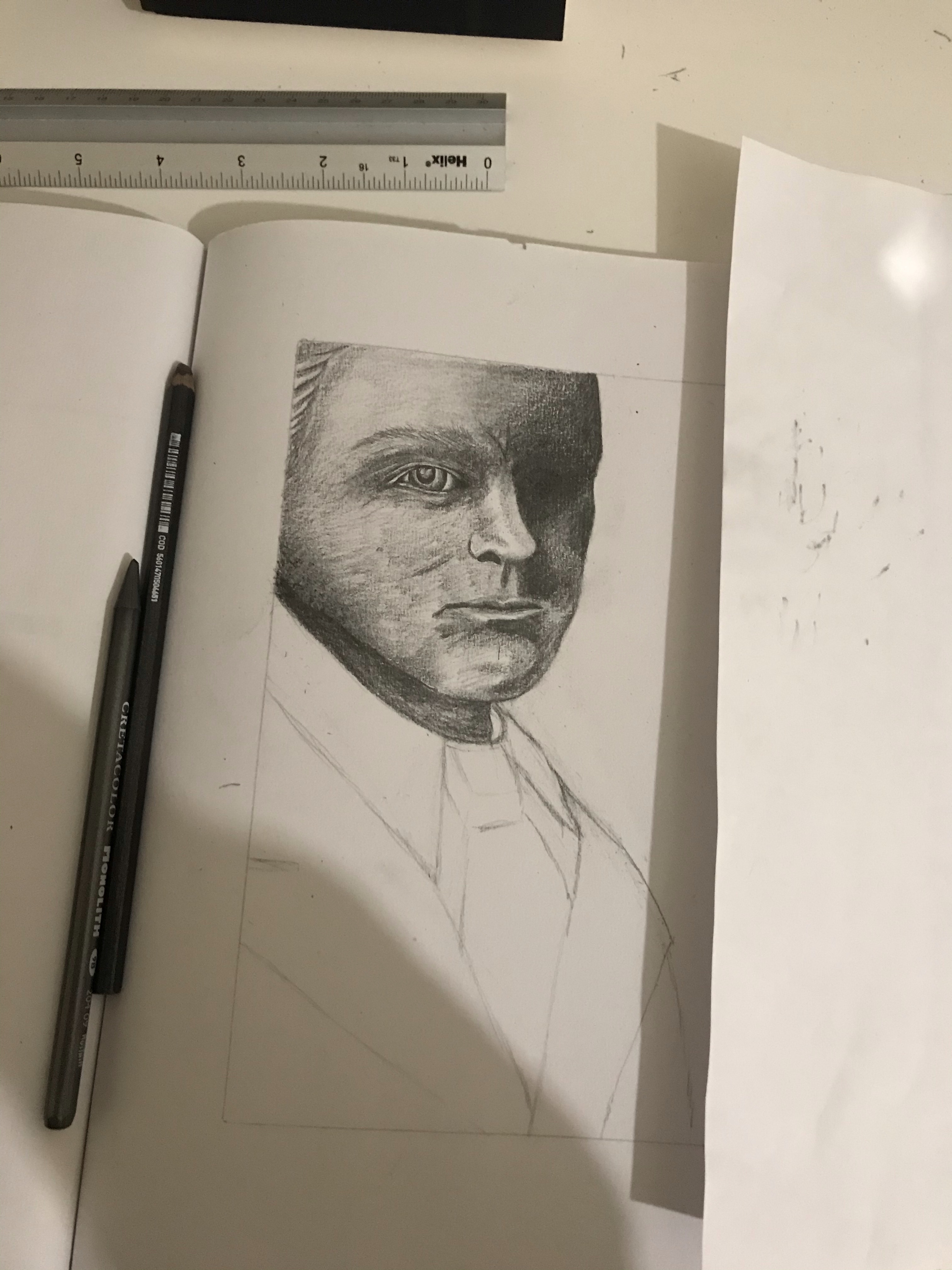
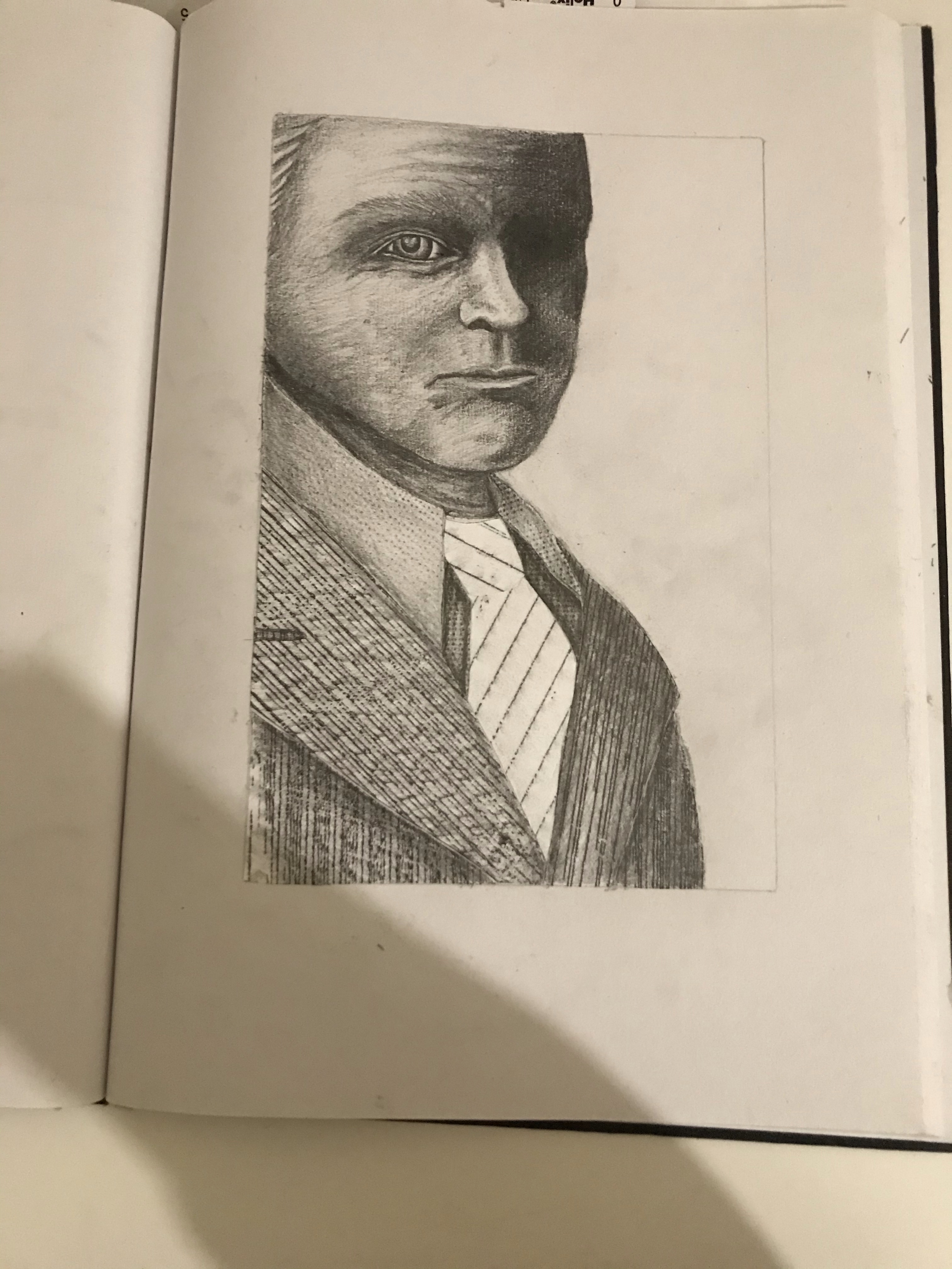
For my final image, I cut out sections of my rubbings and placed them on to my drawing. To create my characters suit. Once I had done this, I added shading with graphite to add a further dimension to the drawing.

Reflection
I am overall very happy with how my final image turned out. With each new exercise and assignment that I do. I am learning something new and this to me is very exciting, as most of the things I am doing, I would never have thought to try or bothered to try without these kind of briefs. Therefore, I am finding that my course is opening my mind up to new techniques and possibilities. Even if some of them I do and I then decide it is something that I would not like to do again, it is still good to try and each time there is something that I learn that I can take on to my next piece of work.
The reference material. I gathered was essential in making this piece seem realistic and fit with the era. Even though I did not need to use most of my references for my final image. It helped me to develop the character, and if I was to go on to draw this character in a room or in a story, I now have all of the visual information that I would need to start this process. I had sufficient reference material to create my image in terms of context. I kept it quite simple and the main focus was the suit in which I used my reference images to make sure that it was of the right cut and style as well as pattern and tone.
I would really like to further explore using rubbings in my illustrations in the way that I did here. I started the drawing of the face before I did the suit and then after thought that actually, I would have really liked to have found a way of perhaps using rubbings to create his face as well. I was quite impressed with how I managed to draw his face so well from memory as I did not use reference for his features, I just tried to picture my character in my mind. He did change and develop quite some bit in my head, as I considered the brief more. The biggest change being that I had originally envisioned him much younger, but later realised he would be a much more interesting character to draw if he was older. I realise that his eye is a little big and the other one I messed up and ended up having to shade out completely, when I had intended on shading it, but leaving some kind of pronunciation to suggest an eye.
This was the most enjoyable exercise so far, as I got to be creative and inventive. Had time permitted, I would have liked to have tried more versions of this character using the same techniques for his suit and seeing what else I could do with his face and also redrawing him in the way that I had intended, as well as experimenting with what rubbing textures I could use to create a human face. I do intend on trying this out again soon.