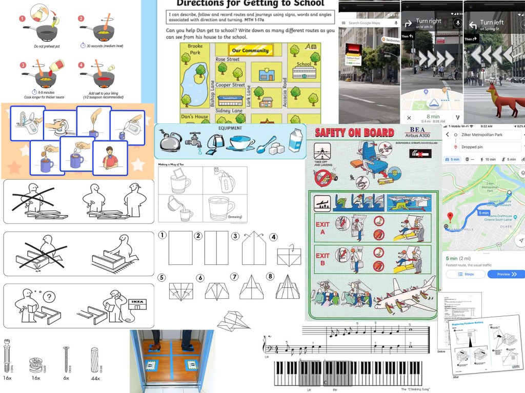
For this exercise I started by collecting reference material of a range examples of instructions. The thing I noticed most about these are that they tend to be in block colours or line drawings and tend to be clear and have images on a plain or solid colour background.
I chose ‘getting to my house’ as I liked the idea of doing something more personable to me. I started by doing loose sketches and seeing what bits I could cut out and identifying which were the important features or landmarks to be left in.


The design, I decided to go with was the more simplified version leaving in key landmarks that would be easily identifiable and therefore help direct the user.

I worked on an A3 format, which gave me just enough room to be able to draw the characters with enough detail. Once I had completed my initial painting, I decided that I wanted the colours to be bolder and more solid. I was trying to do a pastel colour palette. However, it did not work as intended, most likely due to the use of watercolour. I did want to achieve a hand drawn/hand-painted look. Once I started to re-colour in Photoshop, although I really like the colours I realised that I was not going to be able to achieve what I wanted that way either and decided not to proceed. I therefore have stuck with my initial hand-painted illustration. I think I could have improved this if I knew how to use a software such as illustrator, as then I could have kept the hand drawn feel, but change the colours. I also would have needed to have just a black and white outline drawing in order to digitally colour, this effectively as then the trace tool would have worked on Illustrator. However, as I hadn’t planned it this way from the beginning it was not going to work.
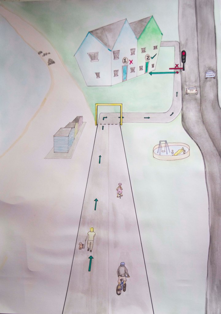
A as well as using a pastoral colour palette, I decided to use a traffic light system as a means of directing the map user. Green for the correct path and read for the incorrect path or stop points. I tried to make these brighter so that they stood out and made sure that everything else was more subtle. I showed this to a few of my close family members and asked them if they knew what it was. Each of them said that it was a map to our house, but recognised that I had removed many elements, which I had done to simplify the image so that it was not too busy and distracting.
I found this to be a useful exercise and with that I have recognised some limitations that I have. I also am starting to realise that I do not like to do commercial illustrations such as these, and that they do not fit my style or current skill set. However, I do hope to expand my skills so that I can find a task like this much more simple in future. In order to do this I need to set aside dedicated study time just for learning new programs and features that are not in conjunction with the assignment or exercise. At the moment I am struggling to schedule this in with working full-time and also trying to complete this module in such a short time frame. Once I have caught up. I intend on doing classes to improve my knowledge of digital art techniques.
