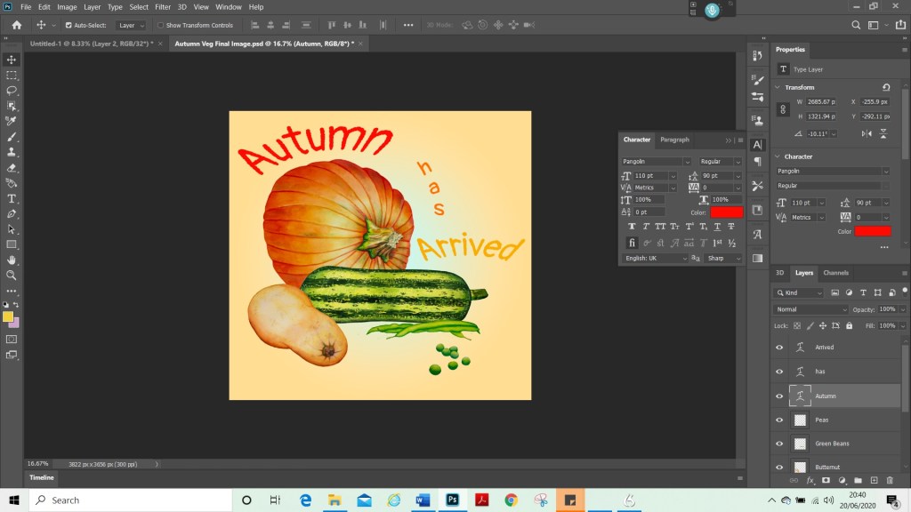
For this exercise I began by researching illustrators that use different mediums. I created folders on my computer for each medium. These were watercolour, digital, collage, ink, pencil and oil paint.
The artists that I researched were the following;
Claire Rollet, Dieter Braun, Tom Bonson, Will Terry, Annie Davidson, Chris Riddell, Chrissie Lau, Jake Parker, Jan Pienkowski, Quentin Blake, Christopher R.W. Nevinson, Kadir Nelson, Raymond Briggs, Richard Johnson, Agnes Ernoult, Beatrix Potter, Carter Goodrich, George Butler, Hannah Davies, Lee White, Lev Kaplan, Peter De Seve, and TS Spookytooth.
To research, I found a good aray of illustrators in Understanding Illustration, (Brazell and Davies, 2014), such as Richard Johnson, who is a reportage artist and travels with the military. His style is very particular and very detailed. He always tends to draw with a Prisma colour blue, indigo pencil and draws his subjects live or within a couple of hours of taking a photo, if that is not possible. He believes this helps him to capture the feeling and a moment in his drawings. He says, however, that he does not distort his images and draws only what he sees.
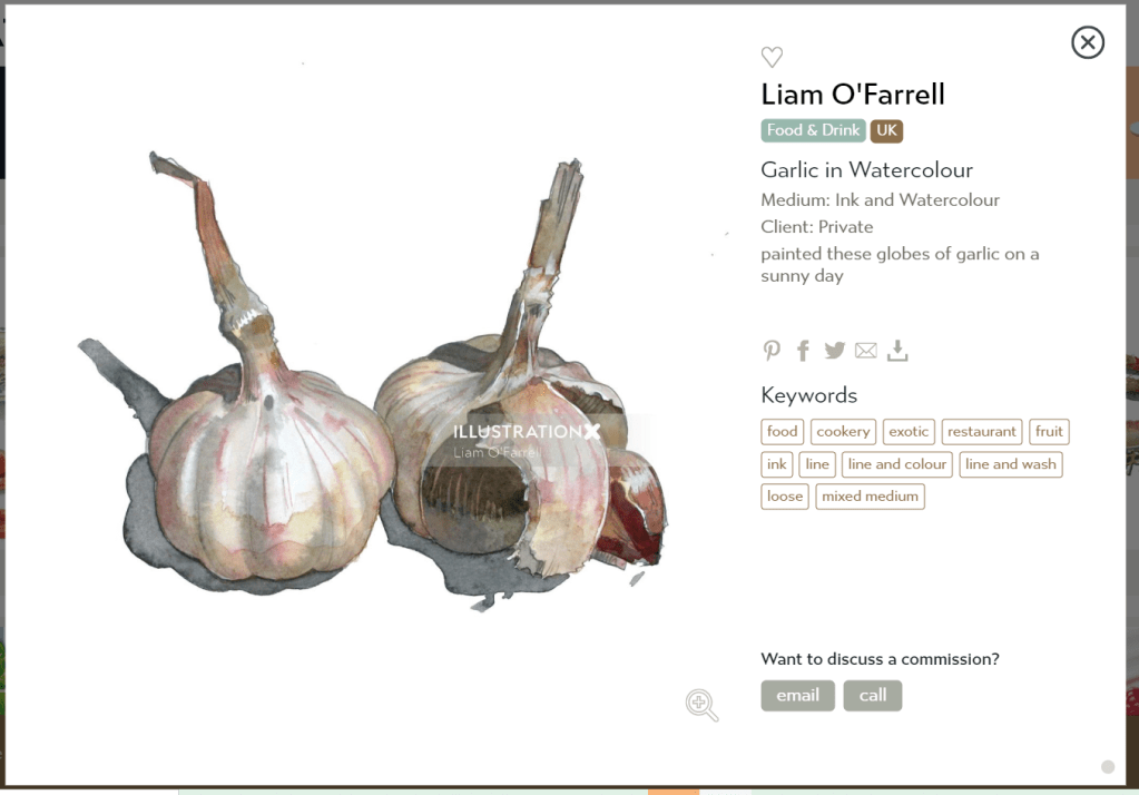
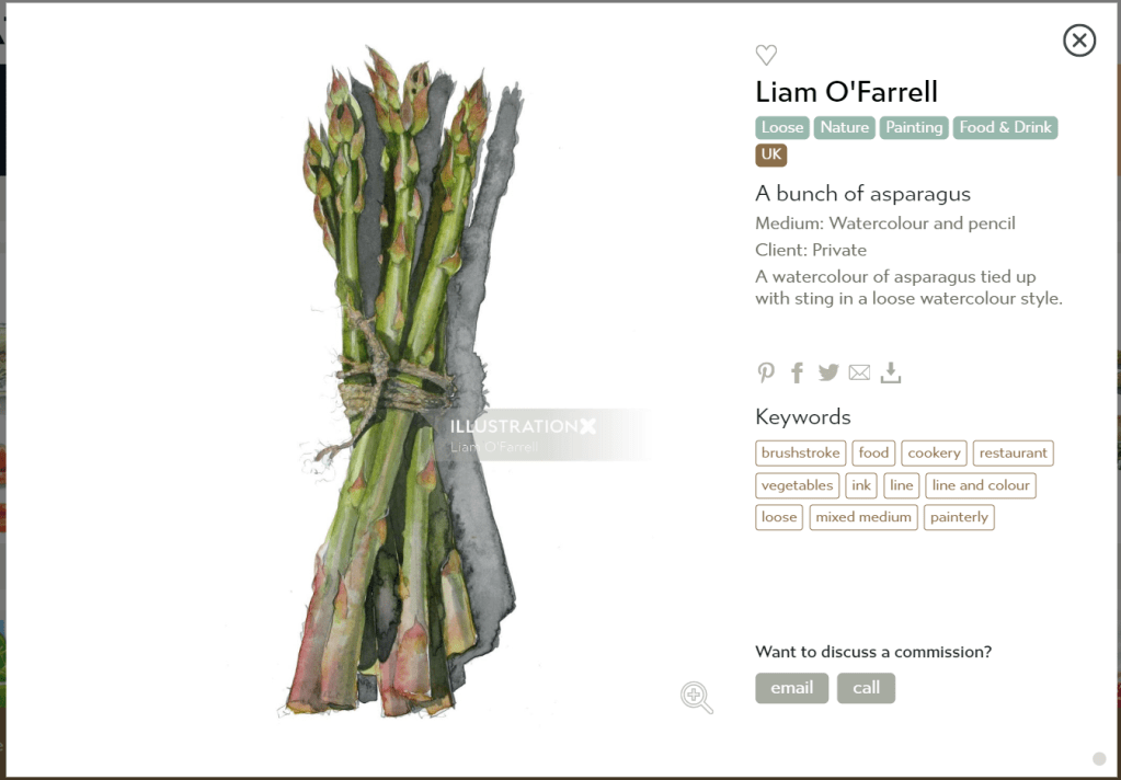
I browsed agent websites such as, ‘IllustrationX’ (Accessed, 10/10/2020). I found a search option to pick a medium and therefore was able to narrow my search down and find artists of interest, that used specific mediums. I used this to find more watercolour artists as I had collected a few, but none that I was particularly wanting to use for my illustration. The artists I made folders for, I chose because I liked their style or technique. I find Lev Kaplan’s work very striking. He creates images that are very dynamic and that have strong compositions. He tends to use a limited colour palette most of the time, and his subject matter tends to be historical. I do find, however, that his images also look slightly dated as opposed to modern twists on historical subjects. So although these are very beautiful images and extremely well executed technically, I did not select him as my final artist. I feel that my work sometimes can be too stiff and regimented and lacks flow and freedom of marks. Therefore, I was looking for artists that I could use as inspiration that would help me develop a style and move away from this. I catalogued each of the artists in folders with written information on their work and examples of their work, so that I can refer back to these in the future. I categorized them by medium.
I found so many amazing artists that I am feeling very inspired by each of them and eager to explore some of their techniques. I am a big fan of:
Chris Riddell
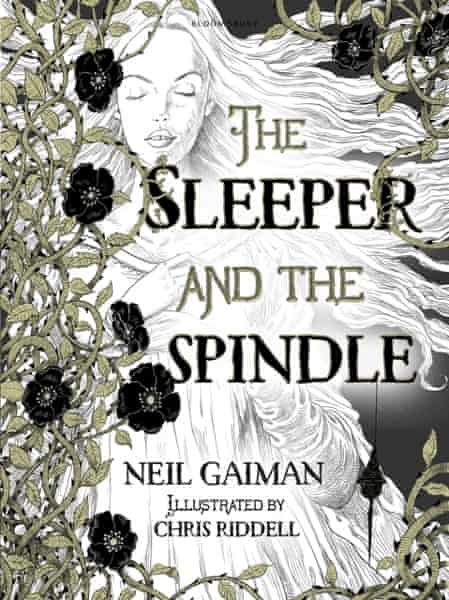
Fig 1.The Sleeper and the Spindle Book Cover (2014) 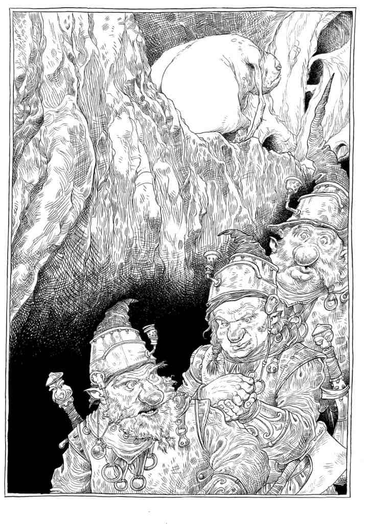
Fig2. The Sleeper and The Spindle Artwork (2014)- 
Fig 3. The Sleeper and the Spindle Text (2014). 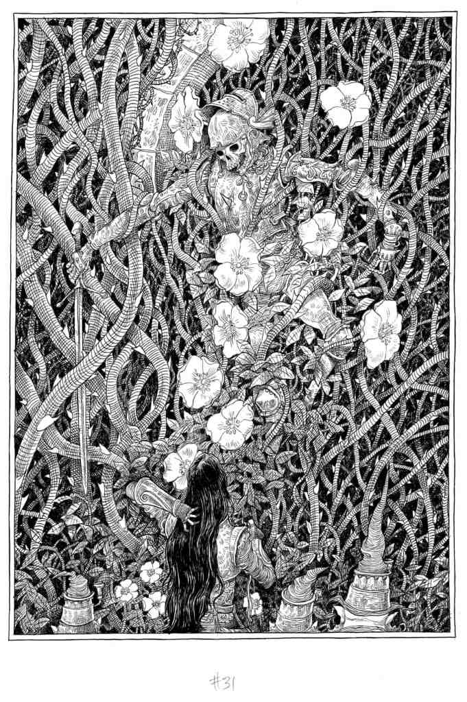
Fig 4. The Sleeper and the Spindle Artwork (2014) 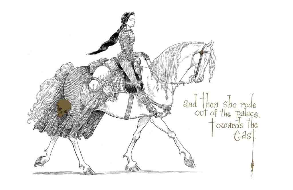
Fig 5. The Sleeper and the Spindle Artwork (2014) 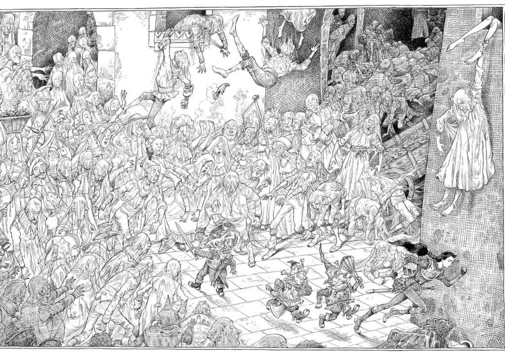
Fig 6. The Sleeper and the Spindle Artwork (2014). 
Fig 7. The Sleeper and the Spindle Artwork (2014) 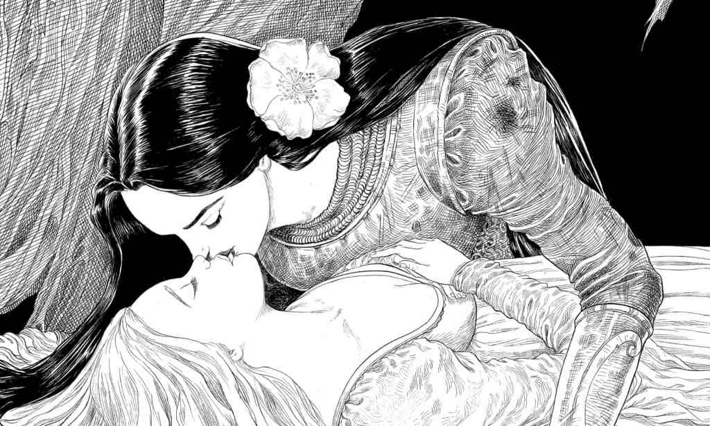
Fig. 8 The Sleeper and the Spindle Artwork (2014).
Riddell draws in pencil, inks over the lines with a brush and then adds colour, often blue and yellow, last Rustin, S. (2014) “I’m not a painter by any stretch of the imagination; I’m a dyed-in-the-wool traditional illustrator, and I begin with black and white. If I need colour, I add it over the top. There’s a calligraphic element to it … it’s about the texture of lines on the page.” The hectic schedule for The Pied Piper persuaded him to try a pastel pencil; occasionally he uses an art pen for very fine lines, “though I don’t like using them, because they’ve got a mechanical-looking line; the lovely thing about a paintbrush is its fluidity, it gives a lyrical quality”. The Guardian 19/12/2014. At: https://www.theguardian.com/books/2014/dec/19/chris-riddell-illustrator-neil-gaiman-jk-rowling-russell-brand-books-interview (Accessed 11/09/2020). I really love his graphic style and limited use of colour. He also tends to distort certain elements of his drawings as seen in Fig 7. with the cow that has been drawn with bulky muscles and bowed legs to show that the cow has been worked a lot and is now at the end of its use perhaps and is miserable and fed up. His limited use of colour is also used just where needed to make things stang out or elements to sink back as he has done so in Fig 7. to add depth to the image by placing black towards the back of the image.
Once I had done my research, I chose my artists. I selected two of my previous visuals to work on. The artists I chose were Claire Rollett and TS Spookytooth.
I had started my research with very traditional artists and as my search continued a came across Claire Rollett. Her work stood out from the other artists as it was something quite different that she does. She works with collage by using a photograph of a character and then drawing the background as a line drawing in ink. She uses a loose, sketchy, medium weight line style. From analysing the work I can see that she then adds colour digitally. This results in some really striking images. Sometimes these have colour. Sometimes they are just black and white, however the colour she does use is just in strategic places and never on the whole image, which really helps draw your eye to the characters. After recently doing a collage workshop with the OCA. I am keen to investigate this area further and was another reason for selecting this artist. Roulette seems to place her characters off to one side of her composition, which seems to add interest and create more dynamic images. As seen in Fig 8. She does tend to enlarge her characters slightly in the frame, perhaps to put them into focus and have them as the focal point which would work very well, particularly as these images are intended as part an editorial clothing/style story.

Fig 1. Couple Hotel Reception 
Fig 2. Ferris Wheel 
Fig 3. Johnny Rocket Jewellery Shop 
Fig 4. Lady Bicycle 
Fig. 5 Modern City 
Figure 6. Portobello Road 
Fig 7. Telephone Box 
Figure 8. Walking Couple
TS Spookytooth’s style is completely different to Clare Rollett. He is an acrylic artist and creates illustrations for children. His colour palette is very rich and striking and I am in awe of his ability to create striking images that incorporate a lot of texture and contrast. He is also quite unusual and intriguing as I read that no one has ever met him in the flesh. He is also using a pseudo-name. Therefore, he is working as an illustrator with an air of mystery. For this reason however, I could not find any interviews or information on his work other than from his agents page. He is the artist I chose to start with as I really admire his work. He uses a lot of texture in his paintings and shading to create dynamic images that take your eye straight to a focal point in the image. His work is all cartoonish in style and not at all realistic. He distorts his figures quite a lot by using round, large heads and smaller bodies, He also tends to use dots for the eyes and adds very little in the way of realism to the face of his characters. In some of his paintings he does not use shading on the characters and will use block colours, such as their hair and clothing. However, this is not consistent across all of his work.

Fig 9. Dinosaur 
Fig 10. Skeleton dog 
Fig 11. Beach 
Fig 12. Teeth 
Fig 13. Moon 
Fig 14. Sea 
Fig 15. Girl 
Fig 16. Crocadile 
Fig 17. Statue of liberty 
Fig 18. A king
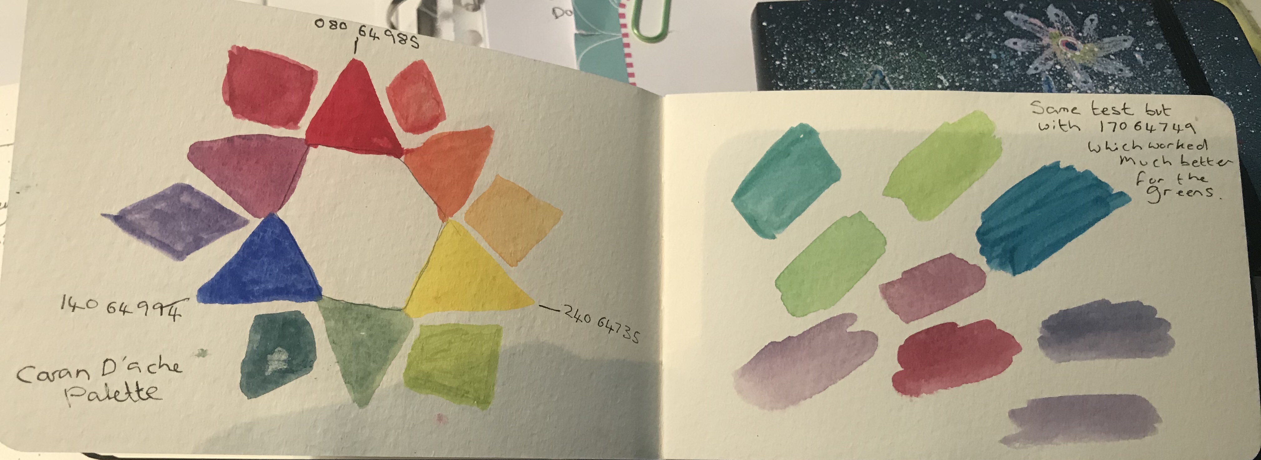
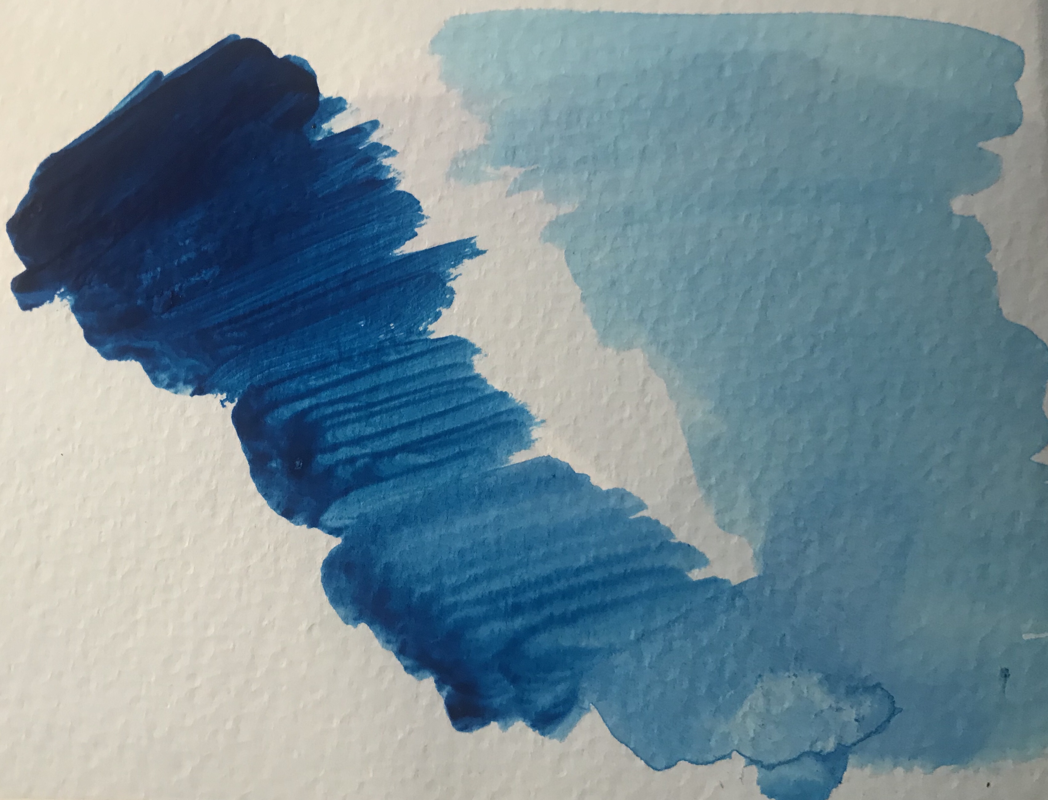
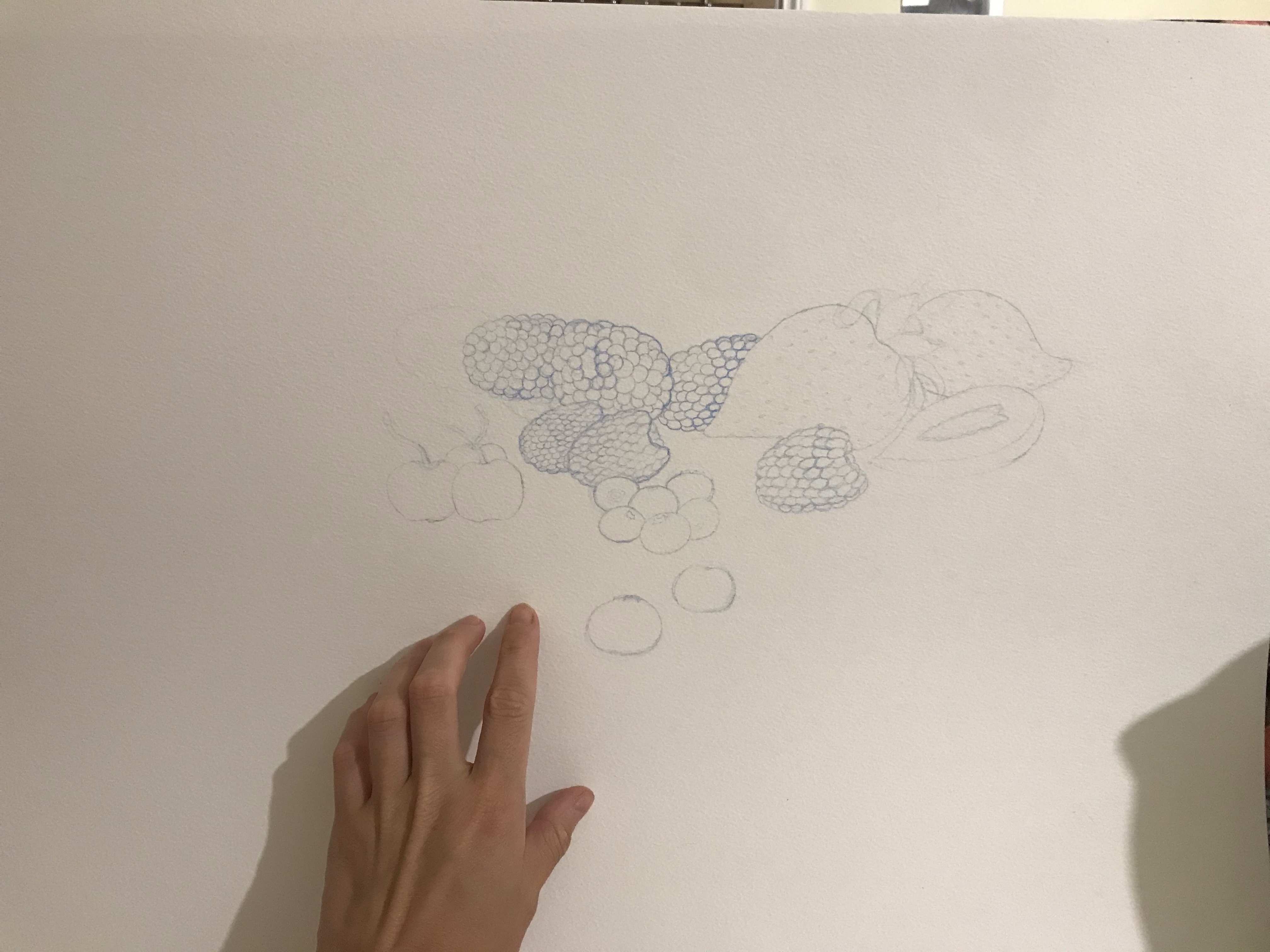
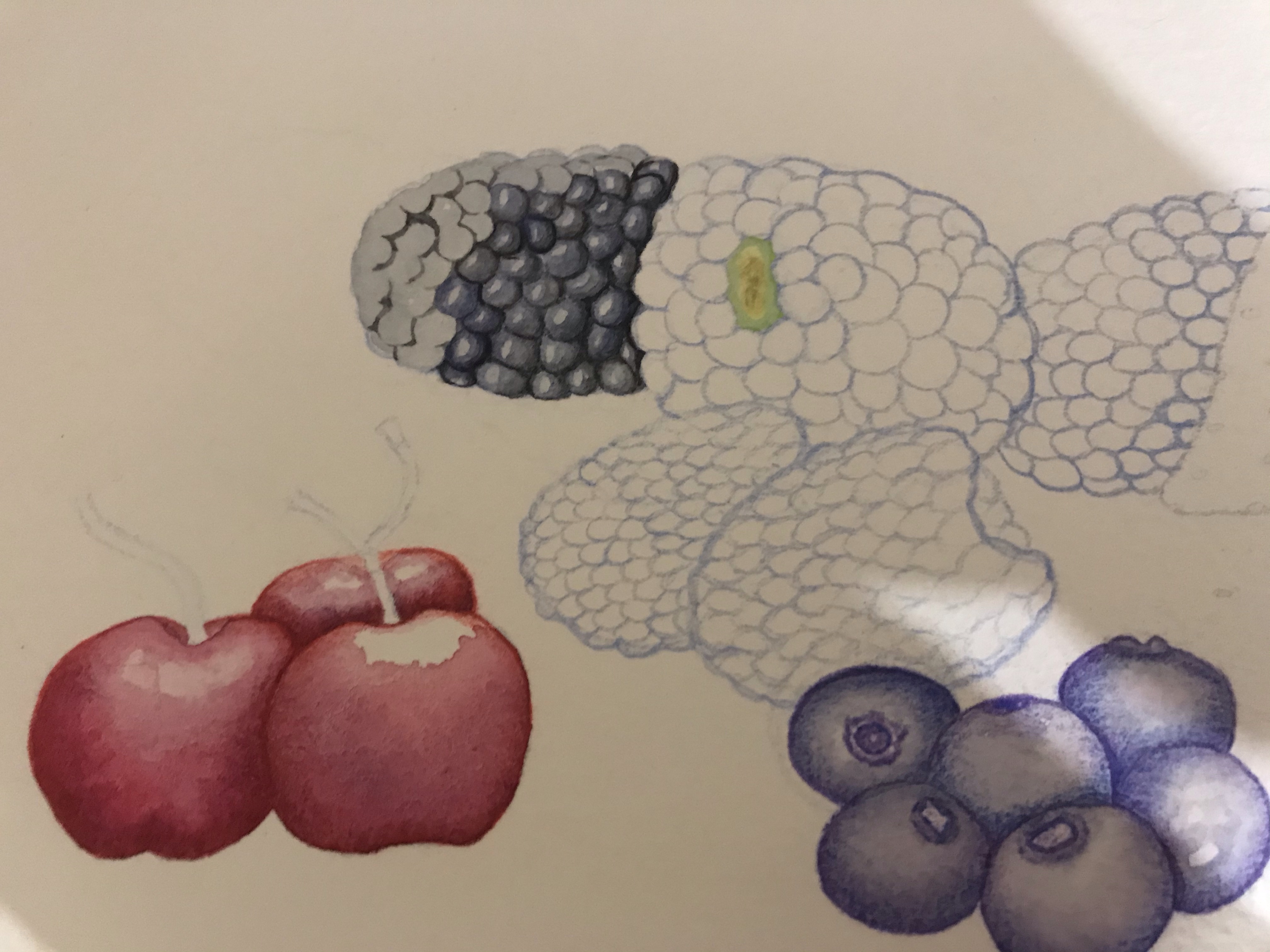
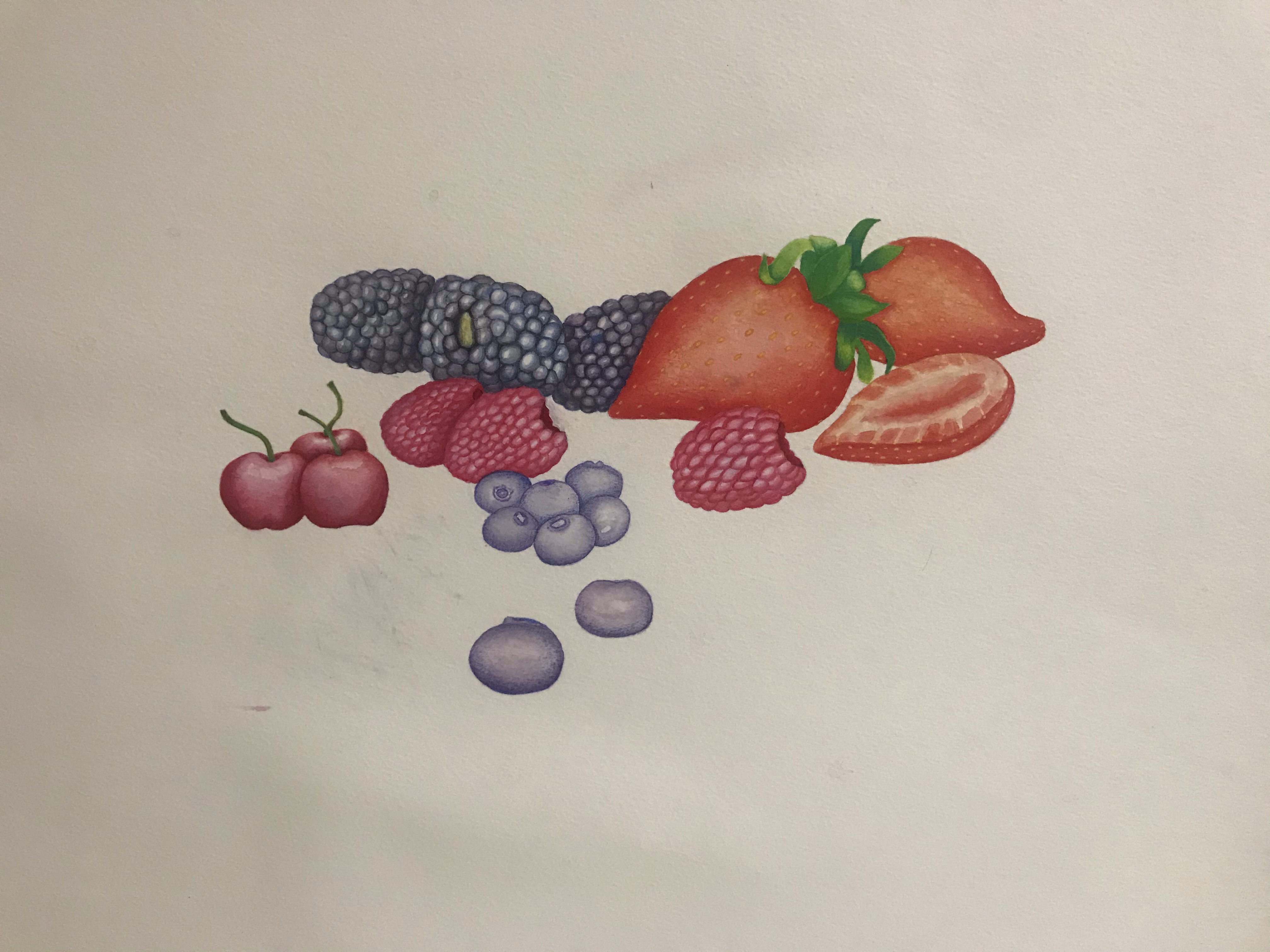
I decided to make a start by doing some tests and experiments in my watercolour sketchbook which I started a while back on the advice of my tutor. I decided to experiment with different techniques to work out how TS Spookytooth created the skies in his illustrations.

I then went on to do further tests in watercolour and acrylic paint and ink to see if I could replicate the effects of Spookytooth’s work. I found the tests I did on watercolour paper were much more effective than those done directly in my sketchbook and none of those done in my sketchbook came out well.


I chose to do 2 pieces as I wanted to really see how the artists work would be different with different subject matter.


I decided to try watercolour as i knew it would be easier to get the type of effects I wanted. However the colours were too weak and the tree blended too well with the background. I do quite like the sky and grass otherwise. But I do not see any of my chosen artists’ styles in it.

For my final piece (above) I used acrylic ink and then a brush pen to line in places. I did really struggle to strike a resemblance to Spookytooths work. I tried to use the colour palette from Fig 18. in both of my images to see how they translate. With my first attempt I tried to use the colour palette from Fig 10. however, this did not make sense with my visuals because of the activities of the characters. I feel that I have captured an essence of my chosen artist. I worked simultaneously on my two paintings, working on one part whilst the other was drying. Because of this, I made discoveries along the way and the two are quite different. Also working with more detail and on a smaller scale, such as in my painting below, made the techniques that much a harder to achieve the same results with. I am happier with my painting of the Girl under the tree than I am with the boy on his tricycle.

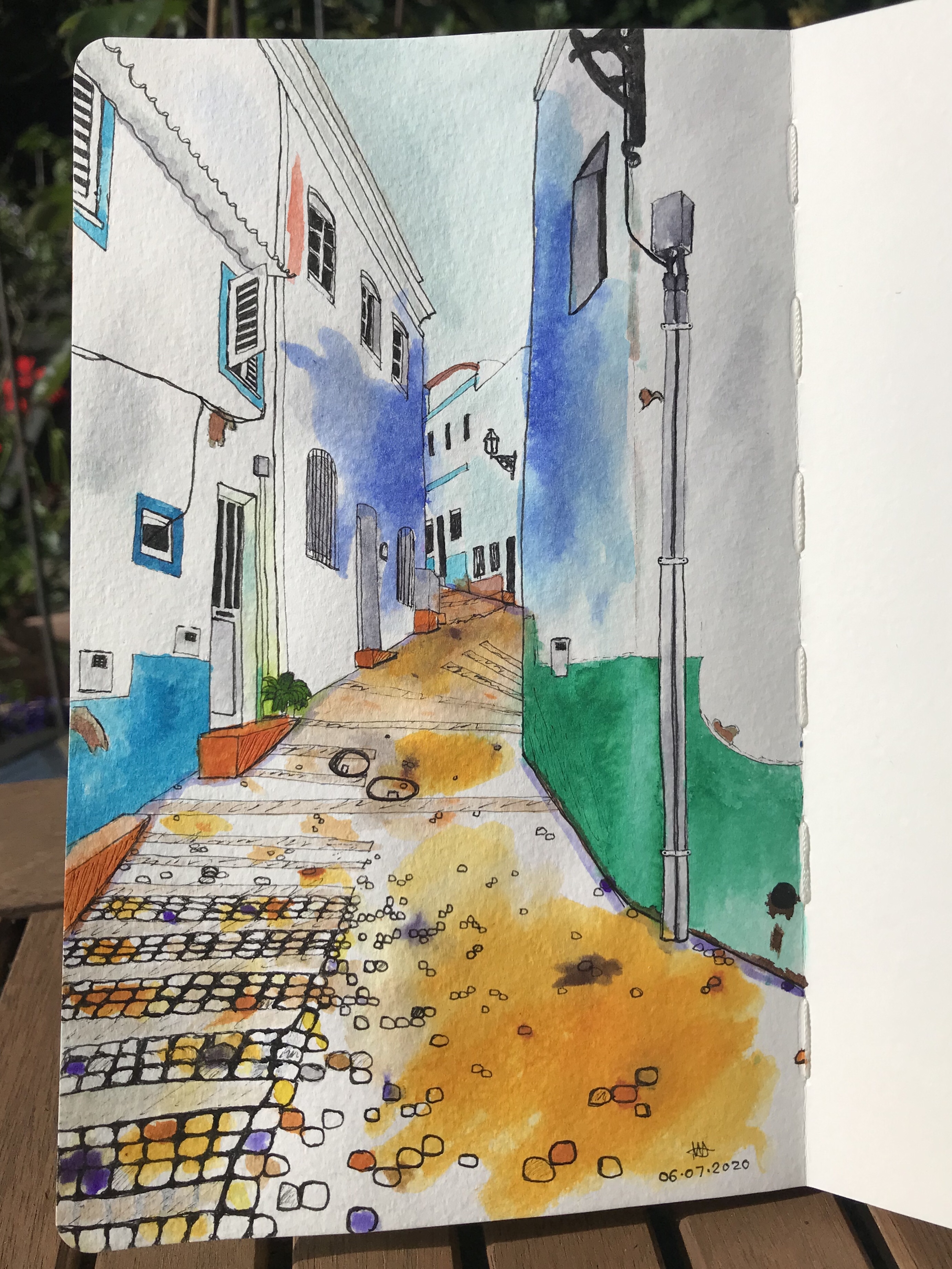
Once I had completed my first set of paintings I started on my next chosen artist which was Claire Rollett. I love her work as it is very different to what I would usually produce and very different from Spookytooth. I took the same two visuals as before and created artwork using the methods Rollett uses.


I had already uploaded my visual to my computer as a JPEG, therefore I just needed to remove the background and tidy it up. I then added layers to add colour and I used a stock image which was the closest to what my original drawing was.I could not find anything of a girl in the right pose, as initially I was going to try mesh two photos together to include the fox. In the end, I settled for the photo of the girl and her dog sleeping, which fit quite well into the style of Rollett as she tends to do editorial work and my visual was not editorial in style or design.

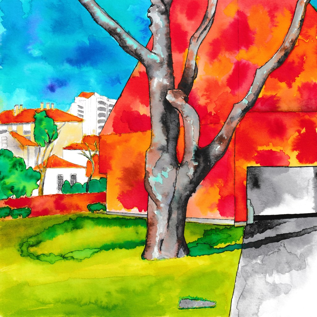
For my final image i traced over the dog in photoshop so that it was similar to the way Rollett had composed her illustration as in Fig 1. I was quite happy with this work. It is not as polished as Rollet’s work and my access to images were limited, however, it was a quick process and satisfying to work on. I think with more details/props in this scene, this would make a better image and I think the style worked much better with my second visual (below) as there was more going on in the scene. Which interesting was the opposite problem I had with Spookytooth’s style. Too much detail hindered the paintings with recreating his style.

I really liked this image, I think the level of detail works well to create an interesting scene. I could not find an image of a boy on a tricycle from the right angle to fit into my drawing, therefore I opted for this girl on a bike, which was a stock image. On reflection, I think that in order to make the image more interesting and give it more of a story I could add something like a snail to an object to the floor as it looks like the little girl could be looking at something and has stopped in her tracks. This would also make it more like Rollett’s work as she is telling a story with her images.I decided to add this in and am really happy that I did (see below), as it definetely does add a bit of interest and a story element.