Assignment three: A poster

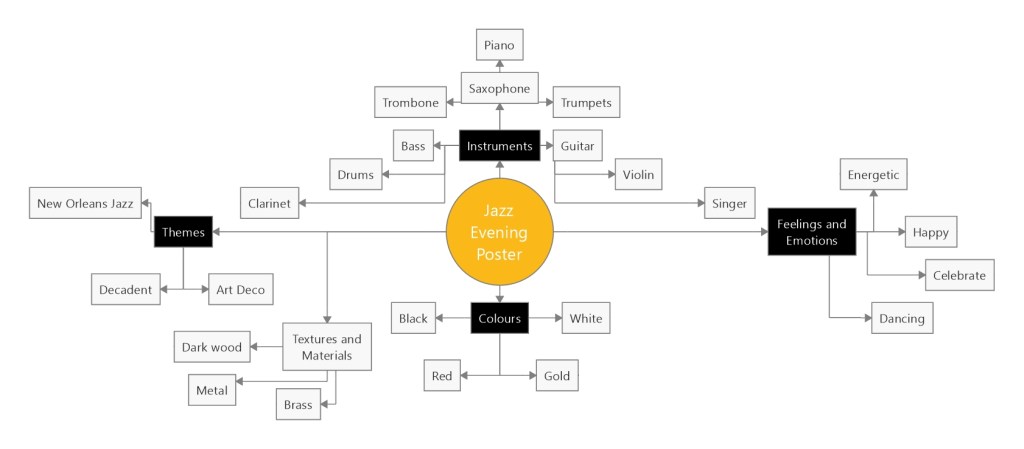
For my third assignment I chose the title ‘Jazz Evening’ for my poster. I started by doing a mind map of the things that I associate with jazz, which helped to give me a basis to start to trigger ideas. I really love the idea of going to new New Orleans and experiencing the culture there; of which music is a big part of. I decided to use New Orleans jazz as my concept and started to collect reference images. One of the first images I came across was a black-and-white image (as below), which had ink drip marks coming from the characters. I was inspired to try my own version of this and see where I could take it.

My moodboard

I collected images for my moodboard and realised that I really liked a simple colour palette. I wanted to have my poster combine old jazz vibes, but have the poster modern and crisp looking. For this reason I decided I would use modern text to make sure that my poster did not look dated. I collected images to use to for the poses of my characters from Adobe stock images. Quite a few of the ones I had found on my Google search were also on there.

Thumbnails

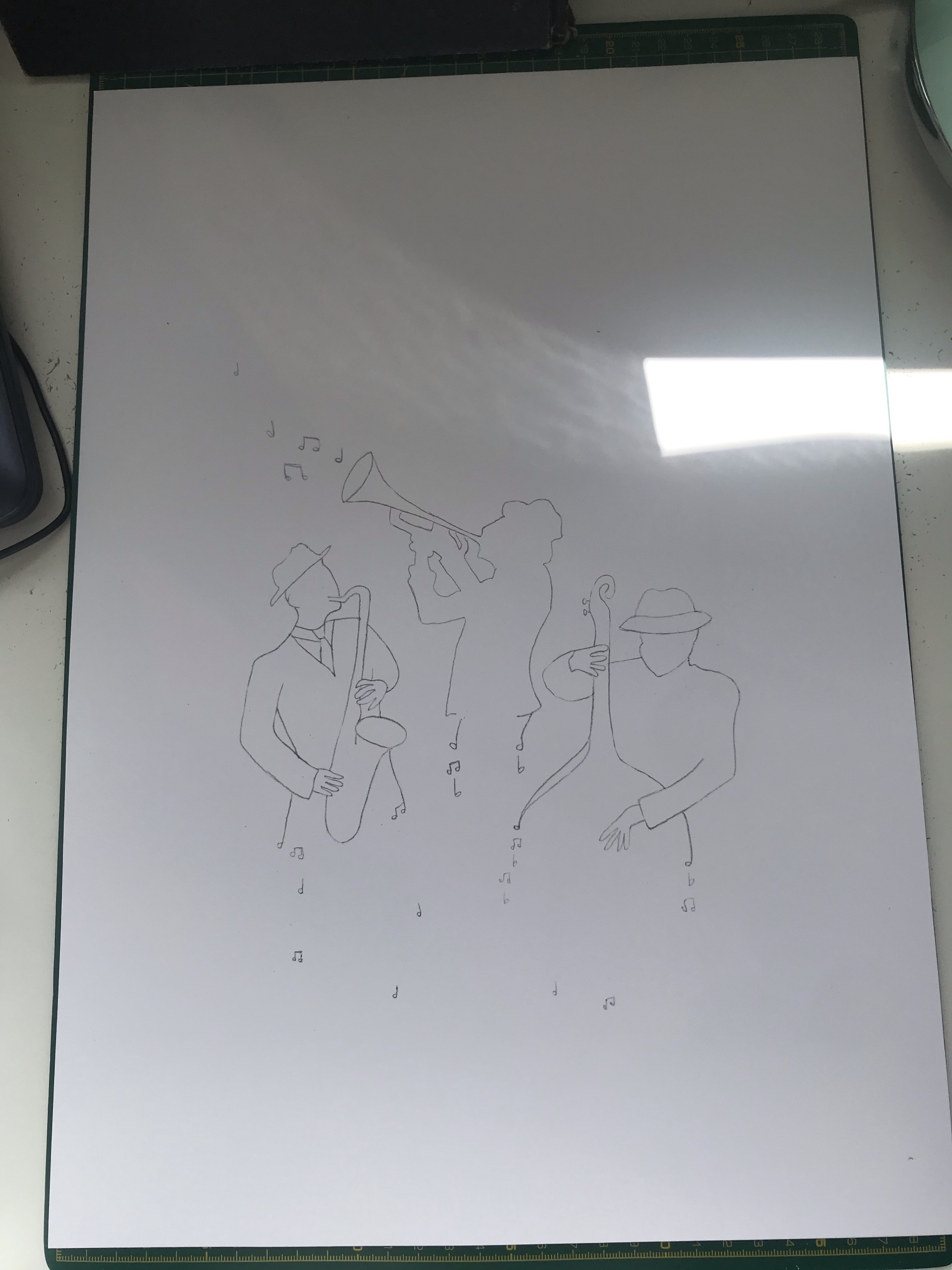
I started working on some thumbnails to develop my ideas. I was drawn to the thumbnails that included a group of individuals the most and selected my two favourites to try out as visuals.

Visual 1
Visual 2

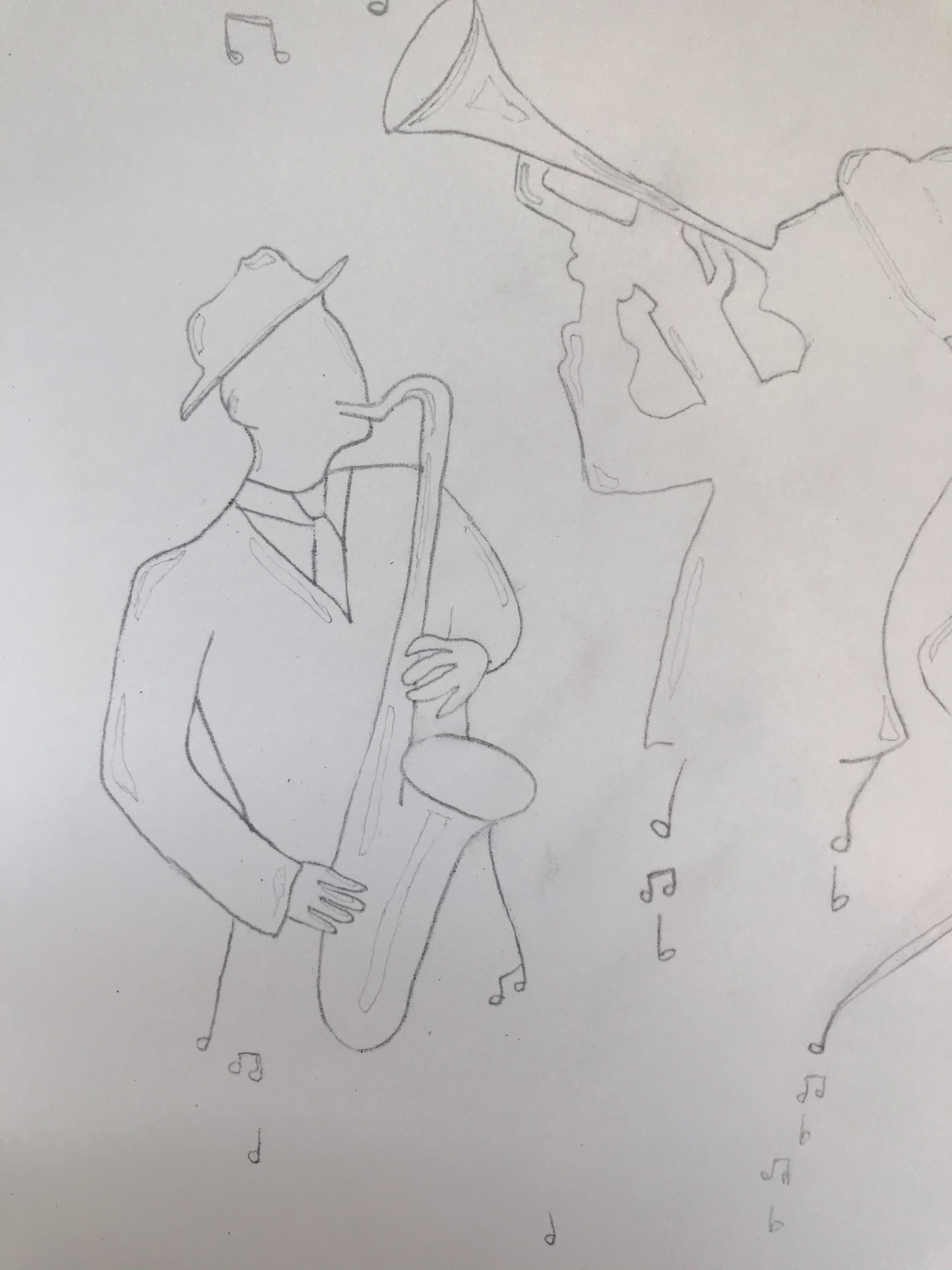
Though I liked the idea of having a pianist in my drawing for visual no.1, I did not feel that this would work for a poster and that the drawing had too much detail and too much going on. However, I really liked visual no.2. The design is more simplistic and stylised. I had done my visuals on A3 paper so was able to do a tracing of my chosen visual and used this to place my image onto fresh paper. I ended up doing three attempts of my final artwork. Originally I was trying to do this in India ink with dip pens on Bristol board, but the paper surface was disturbed when inking. Therefore, it was not working and I did not like the texture. On my second I switched to cotton watercolour paper to see if that worked any better. However, I was still not happy with the results. I ended up using acrylic ink on watercolour paper, using dip pens for smaller details and a paintbrush for the rest. I did ink the outline first in a technical ink pen. Before I got to my third attempt I kept making mistakes and this led me to think about my technique and process and rethink how I was working. I ended up going back and sketching in all of the areas that I needed to leave white so that I was not making decisions as I went and I had a clear guide of where to colour, and when not to. This lead me to think about the black and white exercise I had done previously and how much that also needed planning. I also worked from the left side of the page down and then across to the right so that I did not smudge my work. These were such simple things that I could have done from the beginning, but I guess not having done any illustrations like this before. I was not aware of these rookie mistakes. I have definitely learnt some good lessons from this assignment that have led to a more structured approach and forward planning.

My Final Illustration

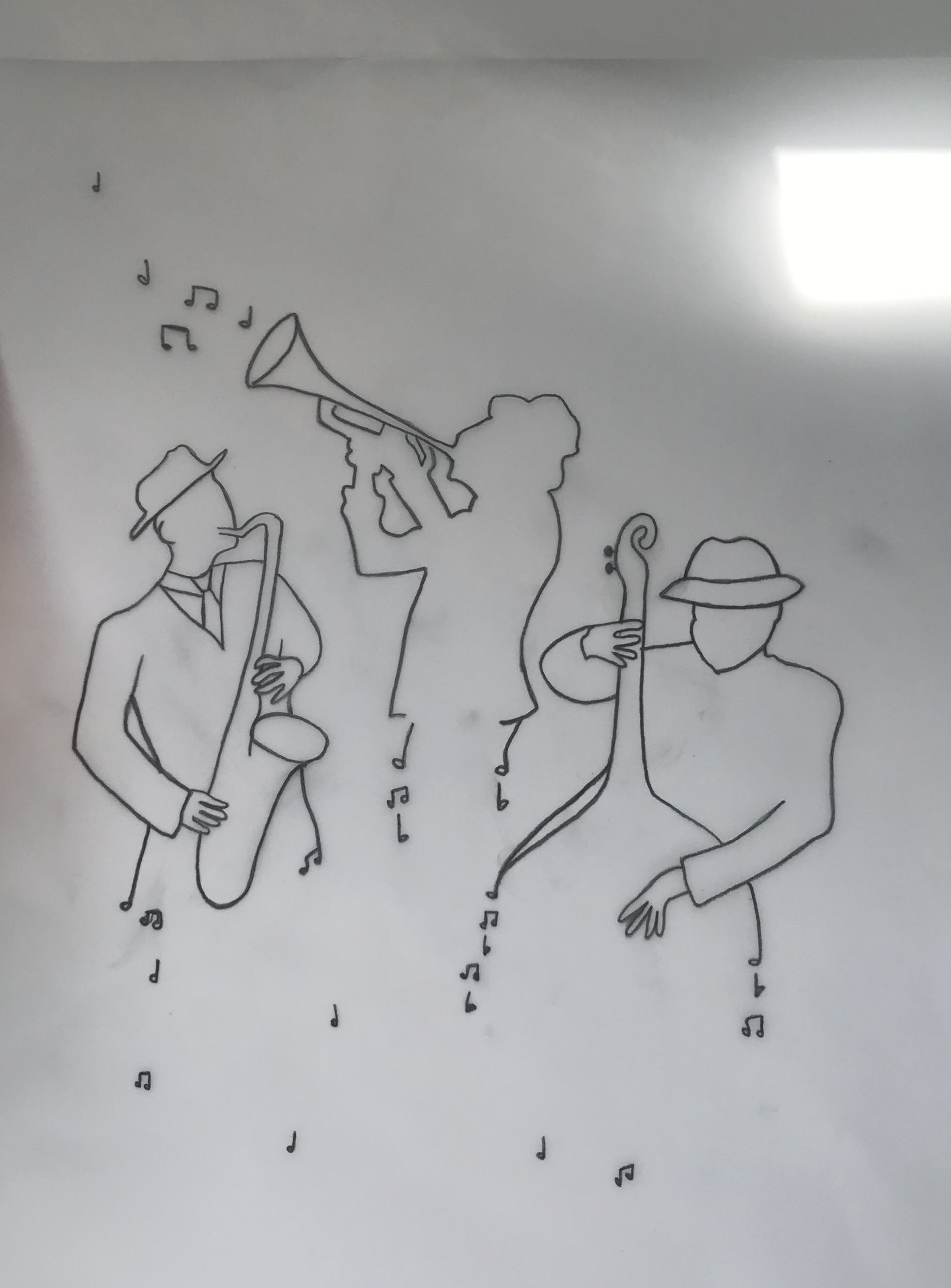
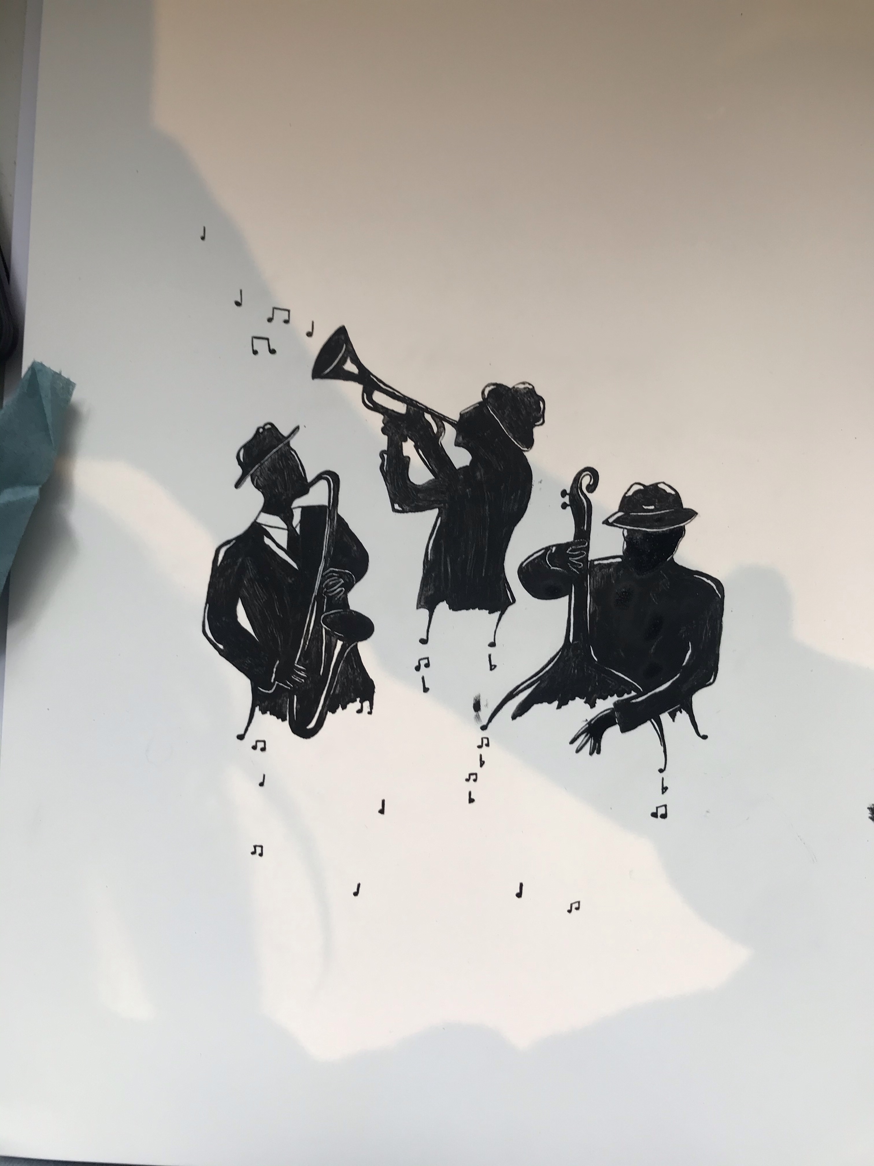
I am really happy with my final illustration. Although there are a few things that I would possibly tweak now looking back and did try to tweak once I had put them in photoshop. However, I did not want to spend any more time on the ink drawing as it was a very tricky process and I was going to be putting it into Adobe Illustrator anyway where I could edit it further if need be.

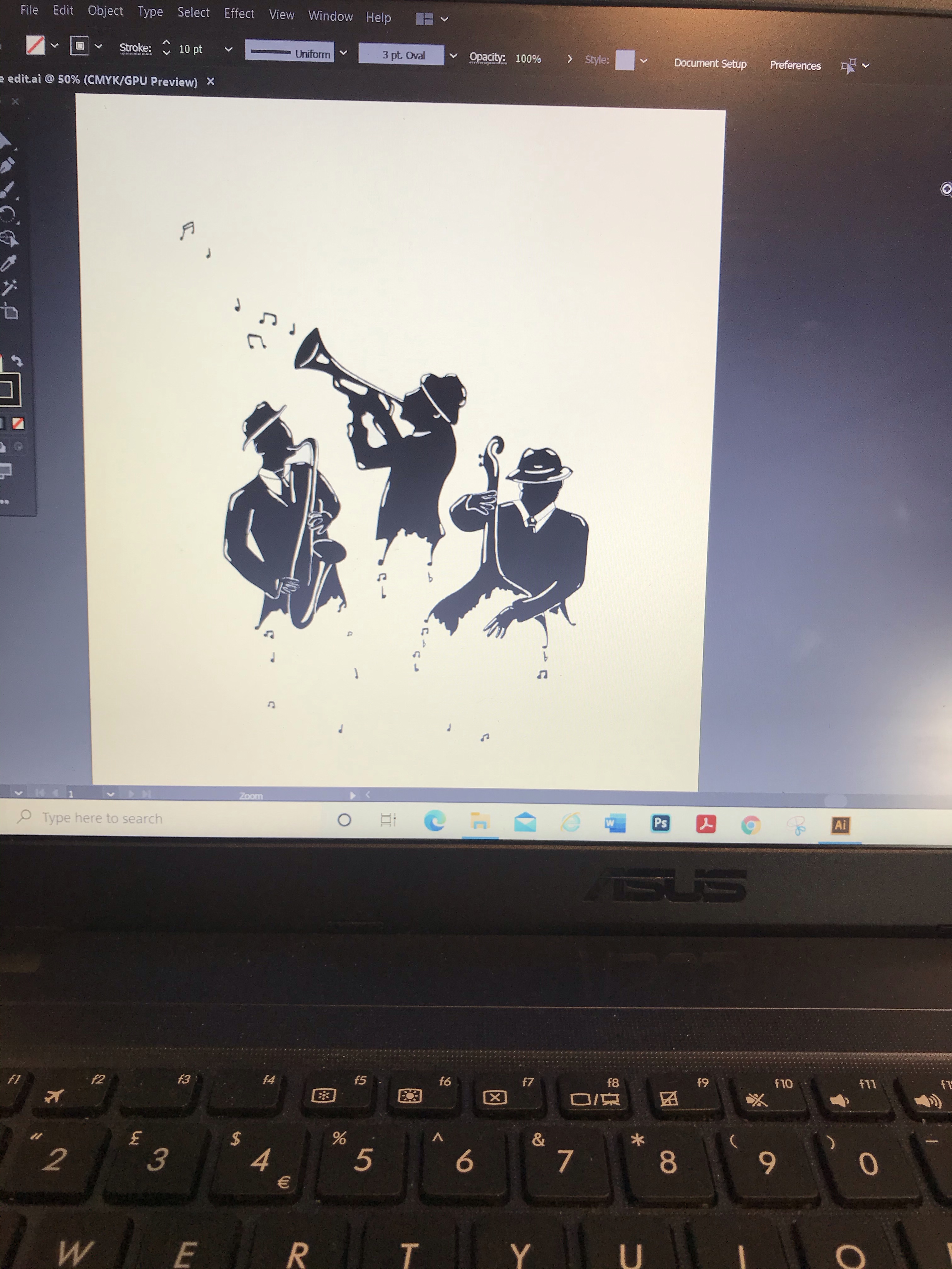
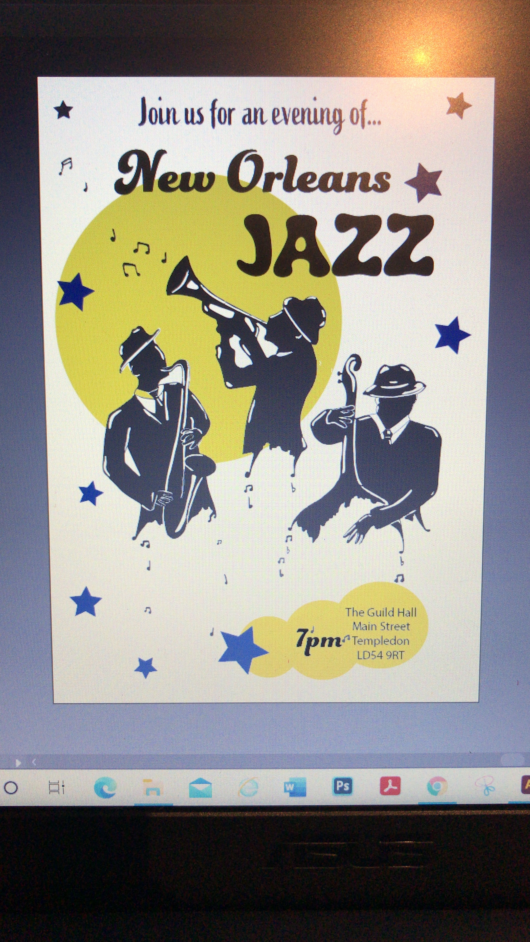
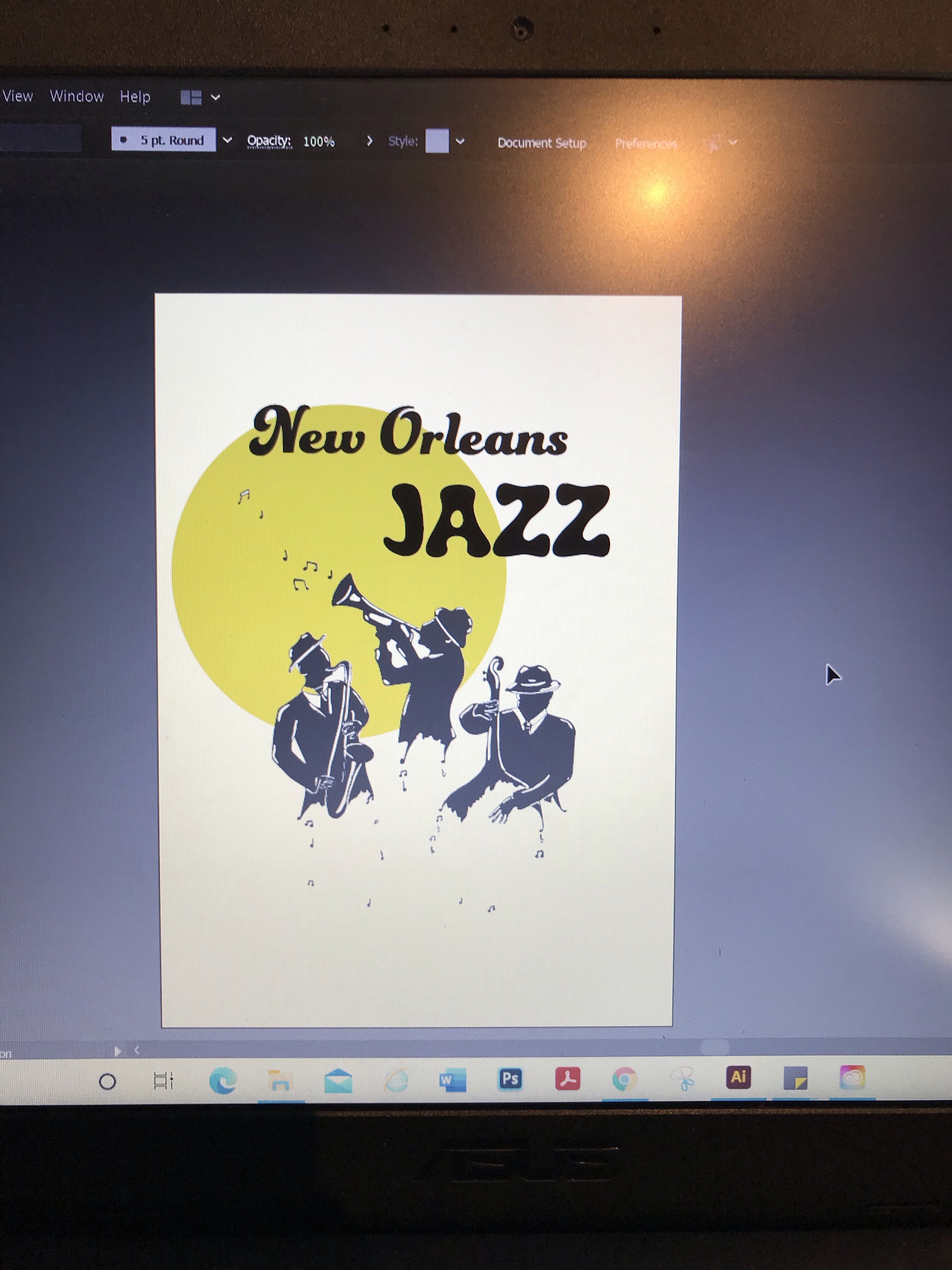
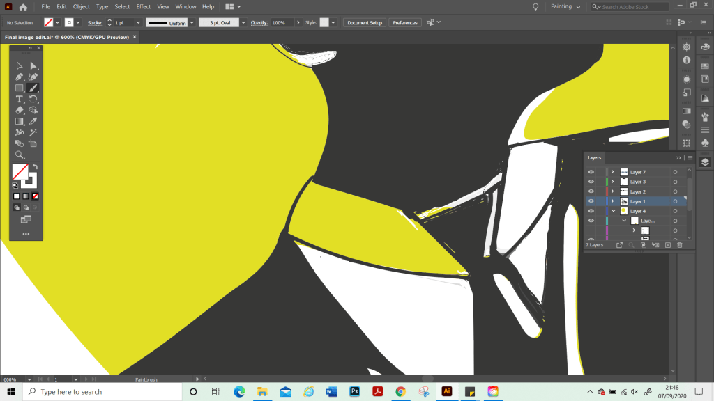
Once on Illustrator. I cleaned up the image as it did not scan very well and I pretty much had to redraw over the top of the whole thing to put some of the details and edges back in and recolour it as I went. At this point, I realise that although I had a strong plan and idea for my main illustration I did not actually have a plan as to how the poster would look as a final piece nor had I included these in my thumbnails. Partly this was due to my limited software knowledge and I wanted to just have a play with Illustrator to see what the possibilities were for me and to go from there. However, as I become more skilled with software programs, I know that this is something I will be able to plan more thoroughly at the beginning. I played around with different shapes such as stars. However, I felt that this made the image too busy and detracted from my illustration which I wanted to be the focus, and to make sure that the notes that are part of the image were clear and visible. Therefore, I decided to keep the poster more simple. Once I had found my final composition, I zoomed in again and did my final edit. Such as cleaning up the black-and-white sections and correcting where the background had come through on my illustration.

My Final Poster

In Summary

I am really proud of what I achieved with this assignment. A poster is not something I have done before. I also managed to master the basics of Adobe Illustrator, which I’ve been trying to learn. I did this by using short tutorials to learn different techniques and just played around with the different elements and fonts from the online library. I was unsure at first if my poster was too plain, or if a white background was the right way to go, but I had tried using different colour backgrounds also, and it did not look good.

Through doing this assignment, I feel it has given me more confidence. Although illustration part three has given me very valuable skills to carry on with, it did not lead me to produce any work that I was particularly proud of. It was also quite challenging for me as a lot of the exercises were more commercial types of artwork which I did not quite have all the skills to pull off successful illustrations in the style needed. I’m still working on developing a style and recognise that this is still early days. Sometimes this makes me feel a bit lost when it comes to some exercises as I have not developed my ways of ‘working’ yet. I am looking forward to moving on now to part four and continuing to develop my skills. Part three has made me feel more prepared for what is to come and that I am starting to develop processes and a way of working. Therefore, I am excited to see what is next.

Exercise: Image development

For this exercise, I was asked to cut to L shapes of card or stiff paper and use them to explore formats to zoom in and out of compositions.

The image I chose was a family photo from a holiday a few years ago. I spent a long time trying to find an image as I am very into photography and most of my photographs were already zoomed in and framed so a lot of these were not going to give me enough room to play with. I really wanted to use one of my own photographs however as I thought this would make the subject fun when it came time to draw it.

I created 10 edited versions of my image trying to retain the content, but presenting it in different ways and in different formats.

Although I found it quite easy to create different compositions with this image I found it difficult to find a way to create much interest within the composition. Although I had my main subject matter, which is the girl posing in the pool, it was hard to compose the image in a way that created much interest or focus within the image, without cutting out my main characters of interest. I found that the compositions that had the other people in I liked more, as it created more interest and with the way the framing is, it tends to lead the eye down the image to the main focus and helps set the scene. I feel like some of the compositions become more interesting due to the way they are cropped, particularly composition 9 which is a panoramic view, which creates more drama.

The image I have chosen to draw, is composition 10, where some of the characters are cropped out. Although I like the image better with the other characters and more scenery in the image. I think that in order to convey this as an illustration, I needed to use an image which was zoomed in more, otherwise my main character will be too small to stand out as the focus. Especially as the characters to the left are closer to the camera and therefore appear a lot bigger.

Once I had started to gather my materials and look at the composition more closely, I realised that it would not be very appealing, as an illustration, as the main character still looked too far away. I therefore decided to crop this photo even more to create a new composition.

Final composition crop – No. 11
My illustration

For my final image, I decided to move the characters closer together as they felt a bit too far apart and separate before. I also left out certain elements in the background as it was quite busy and did not add much to the scene. Some of the things in the composition like the third character and the ball. I also removed, as the third character can barely be seen and I felt like they were doing nothing for the scene and would also perhaps look awkward in the frame.

For this image. I researched cartoon women, including Disney characters to see how they drew facial features and hair. I wanted to keep this image quite simple and this is not a finished piece. My goal was to focus was on learning about composition rather than doing a technical drawing. Therefore, I chose to draw in a cartoon style as this was something fun to try and is not something I have done much of. Although I struggled to get a composition that I liked out of these photos, I enjoyed doing the illustration and the exercise has been useful for understanding composition and understanding what does and does not work. I also feel that it showed me the importance of moving things in different places in the image and trying different layouts as then I could improve the composition by moving the focus to elements of my illustration that I wish to bring to the forefront.

When I got to the end of this exercise and started to add to my learning log I read through the instructions again to check I hadn’t missed anything, and I realised that I had misinterpreted the brief. I remembered that I needed to make an illustration of my composition, but I had missed the part that had said a poster with text. I realise that my illustration does not lend itself to well to a poster, as that is not the purpose I had intended for it. I added a border and thought about the word and what text would work for this and decided on the word ‘stressed’ with a question mark. The word is contradictory to the scene as the characters look very happy and relaxed. Therefore, ‘stressed?’ Is intended as a question to the viewer, suggesting that perhaps if they are feeling stressed that this is what they need, i.e. a holiday.

I feel like overall this image works with the text as it does convey a meaning and this scene is eye-catching. I think if this was to be worked as a poster I would need to do lots of different sketches and mockups and play around with the colours and text a lot more. If I was to develop this image further. I would redraw the image as it is not technically sound and look at other colour options and mediums.

Exercise: Using Reference

For this exercise I was asked to collect as much reference as I could find the 1950s. And to catalogue the information according to these categories:
People and costume
Architecture and interiors
Art – painting, drawing, sculpture
Graphic design – posters, books, typography
Advertising
Transport
Film and TV
Surface pattern and decoration.

The brief was to be eclectic in my sources identify the visual qualities that are universal within the categories – shapes, textures, colours, style and other features.

For my research I chose to concentrate just on 1950s Britain. In Britain, the 1950s was an era where the economy was recovering from the effects of world War one and two. Because Britain was badly damaged by bombing there was a housing shortage which led to many temporary and fabricated houses being built. These were designed in a way that would be quick and easy to build and were pretty simple in design. As the economy grew, people were able to start purchasing items again which led to an booming industry of furniture, appliances and other household items. The 1950s style is quite distinctive from the hairstyles of the men and women, to the outfits that they wore which includes the nipped in waist and A-line skirts of the women and the rounded shapes of household furniture and appliances. Interestingly, one of the popular patterns on fabric that was used to make dresses and curtains etc. was that of the symbol of the atomic bomb.

The 1950s style once again become quite popular in recent years. This includes the rounded style of kitchen appliances and vintage furniture from the 1950s that would be repainted in pastel colours. There is a tendency to relate pastel colours to the 1950s however, from my research I found that this was not actually the case. The colour palette was actually more similar to that of the 1970s with the majority of the furniture including sofas and fabrics being in muted dark colours like Forest Green, dark red and dark blues with brown wooden flooring seeming quite common. In the 1950s they did however seem to like using bright colours, particularly in the kitchen with an example being where a bright blue would be used as the main colour for the work surface, with a matching table top and even matching tiles on the walls.

To go with my research I was asked to make an illustration of someone sitting in a chair surrounded by typical artefacts to give a teenager an idea of the 1950s. For my illustration I chose to draw a man sitting in a chair reading a newspaper, with a cup of tea and a cigarette besides him. Cigarettes were very popular in the 1950s and were even considered to have health benefits. I tried to keep the style of the room in keeping with the 1950s style of furniture and colours used for furniture. Behind the man we can see a doorway in which there is a woman (his wife) who is busy in the kitchen. Although women did work during the war due to necessity, once the war ended so did their careers and they went back to their wifely duties as before. Men were considered the providers and worked and provided income for the household and family. Women on the other hand were expected to care for their husband and the children and take care of the home, this included all cooking and cleaning. My aim was to reflect these gender roles within my illustration as this is a big contrast to how things are in the present day with gender roles.

In order to file my research I created folders on my computer for each of the topic headings and searched on the internet and on various online libraries, including the OCA library and the bridgemen library. Unfortunately my laptop broke a few days after I finished my research so although I had luckily backed up my documents before hand, I am missing the last few days of my research. I did however have the research to hand whilst I was planing out my illustration and drawing the initial pencil drawing. I also had my sketchbook to hand where I had already drawn and been experimenting with the colours I wished to use. At this time, I am writing from my new laptop and am presenting what I have of my research.

Someting I learned from this project is that I need to find a new way or software to keep my research that I am able to label individual images and keep those images on seperate files. For this project, I used a word document for each heading. But I realised that this is not going to be easy to find individual images when I need to go back and use this reference libray I was trying to create. I would also like to keep building on this library to create a vast reference base for all future work.

Work in Progress…

My finished Piece

I am quite pleased with how this turned out. I have not had a lot of practice drawing rooms and using perspective in this way, so it started with a bit of trial and error. I used watercolour and gouache to paint this. Paiting is a new medium to me and is one that I am gradually learning. I chose not to use ink on this piece as I wanted to tey to emphasise objects by using more contrast in my painting. I realised that I would like to start to learn how to deplict lighting in my work, be that from lamps or natural light and shadows and also how to paint faces and clothing. This is something that I would like to develop further with my study.